
In this tutorial, you’ll learn how to create pair plots in Seaborn, using the sns.pairplot() function. These visualizations plot pairwise relationships in a dataset so that each variable in a dataset will be plotted against each other variable in the dataset. This allows you to easily visualize the relationships between pairs of variables.
Seaborn is a Python data visualization library that is built on top of the Matplotlib library. Seaborn provides the ability to create complex statistical visualization with an easy-to-use syntax. Additionally, because Seaborn is built on top of Matplotlib, you can use all the extensive customizations available in Matplotlib, as you’ll learn later in the tutorial.
By the end of this tutorial, you’ll have learned:
- What a pair plot is and how to use it
- How to create a pair plot using the Seaborn pairplot() function
- How to customize your pair plot using the many parameters of the pairplot() function
Table of Contents
What is a Pair Plot and How Do You Use One?
A pair plot is a data visualization that plots pair-wise relationships between all the variables of a dataset. This allows you to better understand the relationships visually, while even layering in additional details (such as by using color). Each variable is plotted both in the rows and columns, showing the relationships between the variables.
Take a look at the example below, which shows a full pair plot created using Seaborn:

The diagonal line shows the distribution of values in that variable using a histogram. Each other cell shows the relationship as a scatterplot between the two variables at their intersection.
Loading a Sample Dataset to Visualize
To begin creating a pair plot, we’ll load our libraries and a sample dataset that we can use to follow along with. Of course, feel free to use your own dataset, though your results will of course vary.
# Loading Libraries and a Sample Dataset
import seaborn as sns
import pandas as pd
import matplotlib.pyplot as plt

df = sns.load_dataset('penguins')
print(df.head())

# Returns
#   species     island  bill_length_mm  bill_depth_mm  flipper_length_mm  body_mass_g     sex
# 0  Adelie  Torgersen            39.1           18.7              181.0       3750.0    Male
# 1  Adelie  Torgersen            39.5           17.4              186.0       3800.0  Female
# 2  Adelie  Torgersen            40.3           18.0              195.0       3250.0  Female
# 3  Adelie  Torgersen             NaN            NaN                NaN          NaN     NaN
# 4  Adelie  Torgersen            36.7           19.3              193.0       3450.0  Female
Let’s break down what we did here:
- We import the seaborn, pandas, and matplotlib libraries.
- We load the dataset ‘penguins’ using the
load_dataset()function - We print the first 5 rows of the dataset, using the
.head()method
Creating a Pairplot in Seaborn
Seaborn makes it very easy to create a pair plot using the pairplot() function. The only required argument is the DataFrame that you want to create a pair plot from. Let’s see how simple it can be to create a pair plot using the pairplot() function:
# Creating a Simple Pair Plot Using Seaborn
import seaborn as sns
import pandas as pd
import matplotlib.pyplot as plt

df = sns.load_dataset('penguins')

sns.pairplot(df)
plt.show()
Let’s break down what we did above:
- We use the
pairplot()function, passing in only our DataFramedf - We then use the
show()function to show the pair plot
This returns the following image:

By default, Seaborn will plot all of the different numeric variables in the dataset. In the following section, you’ll learn how to limit the variables that are plotted.
Plotting Only Some Variables in a Seaborn Pairplot
Sometimes, your dataset will be quite large and you may only be interested in visualizing some of the variables. In this section, you’ll learn how to limit the variables that are included in your Seaborn pair plot. This can be done by passing the in the vars= parameter, which takes a list of variable names to use.
Let’s see how we can plot only some variables:
# Plotting Only Select Variables in a Seaborn Pair Plot
import seaborn as sns
import pandas as pd
import matplotlib.pyplot as plt

df = sns.load_dataset('penguins')

sns.pairplot(df, vars=['bill_length_mm', 'body_mass_g'])
plt.show()
This returns the image below:
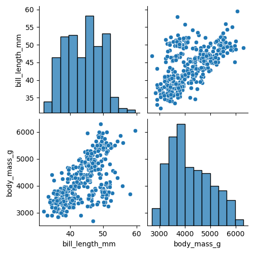
Keep in mind, that the function will only accept numeric variables. Because of this, you’ll need to be mindful of the data that you pass in.
Adding a Hue Color to a Seaborn Pairplot
A great way to add more information to your Seaborn pair plot is to add color to it. In this case, color represents a different variable, often a categorical variable that can help explain some differences in your data.
Keep in mind that the pairplot() function will plot numerical variables. By adding in a categorical variable, you can add significantly more info.
Let’s see how we can see Seaborn to add a hue to our plot:
# Adding Hue to a Seaborn Pairplot
import seaborn as sns
import pandas as pd
import matplotlib.pyplot as plt

df = sns.load_dataset('penguins')

sns.pairplot(df, hue='species')
plt.show()
This returns the following image:
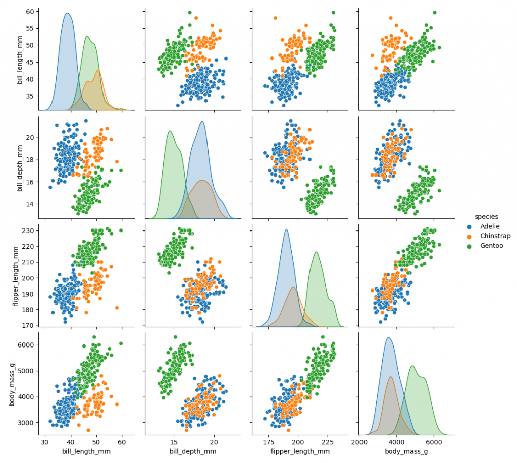
As you can see, the colors add a whole other dimension to the data and can help explain the variances in the data.
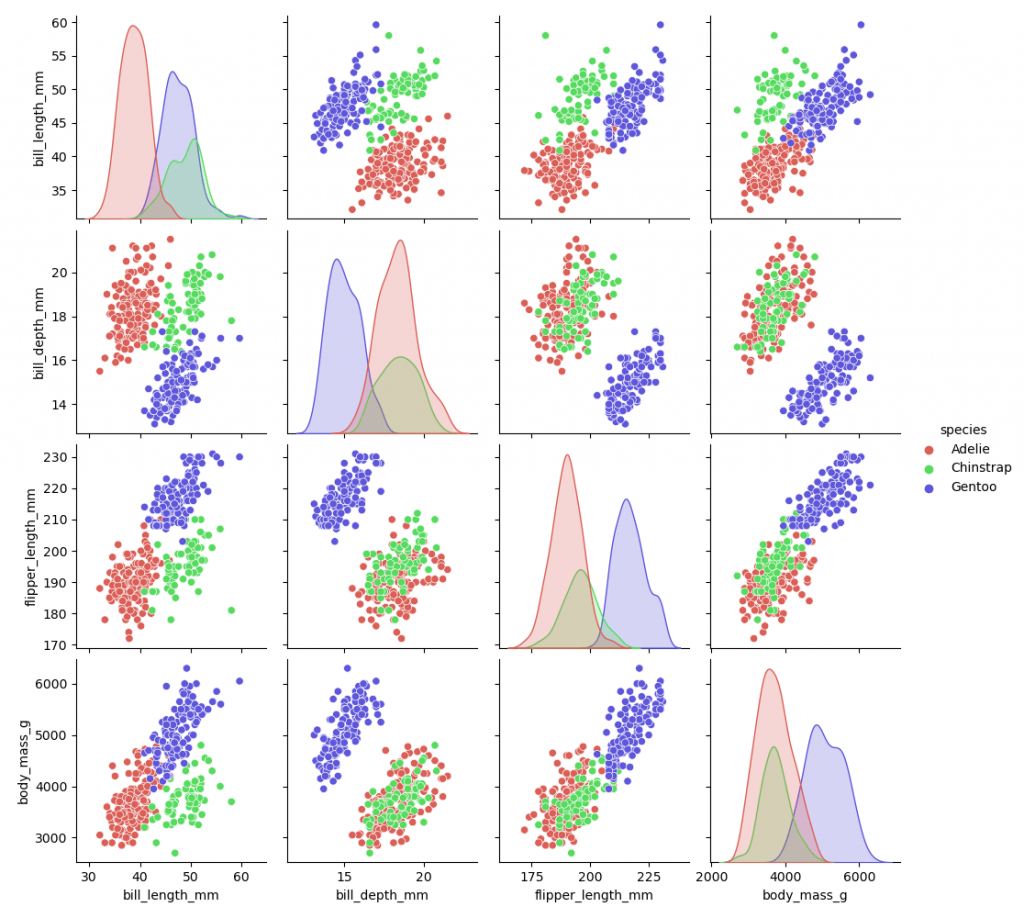
How to Modify Colors in a Seaborn Pairplot
In the previous section, you learned how to add color to a Seaborn pair plot. In this section, you’ll learn how to customize these colors with a Seaborn palette. This can be done using the palette= argument, which lets you pass in a dictionary or a Seaborn color palette.
Let’s see how we can modify the colors in a Seaborn pairplot:
# Adding a Color Palette to a Seaborn Pairplot
import seaborn as sns
import pandas as pd
import matplotlib.pyplot as plt

df = sns.load_dataset('penguins')

sns.pairplot(df, hue='species', palette='hls')
plt.show()
This returns the following image:
Showing a Histogram in a Seaborn Pairplot
The diagonal line of plots represents an overview of the distribution of a single variable. Seaborn lets you customize the graph type, either representing a density distribution or a histogram. You can set this using the diag_kind= parameter, which accepts either 'auto', 'kde', or 'hist'.
Let’s see how we can plot a histogram in a Seaborn pairplot:
# Plotting a Histogram in a Seaborn Pairplot
import seaborn as sns
import pandas as pd
import matplotlib.pyplot as plt

df = sns.load_dataset('penguins')

sns.pairplot(df, diag_kind='hist')
plt.show()
This returns the following image:

Conclusion
In this tutorial, you learned how to use Seaborn to create pair-wise plots using the pairplot() function. You first learned what pair plots are and how they are used. Then, you learned how to use the function for all variables and only a subset of variables. From there, you learned how to add and customize color to the visualizations, as well as how to modify the diagonal line charts.
Additional Resources
To learn more about related topics, check out the tutorials below: