In this tutorial, you’ll learn how to use the Python Seaborn library to create attractive data visualizations. You’ll learn how the library is different from Matplotlib, how the library integrates with Pandas, and how you can create statistical visualizations.
If you’ve used Matplotlib in the past, you’ll probably be familiar with writing tons of lines of code to produce a decent-looking visualization. This is where Seaborn comes in – it allows you to create visually pleasing plots with very few lines of code.
Table of Contents
Introduction to Seaborn in Python
Seaborn is a Python data visualization library used for making statistical graphs. While the library can make any number of graphs, it specializes in making complex statistical graphs beautiful and simple.
The library is meant to help you explore and understand your data. Because data in Python often comes in the form of a Pandas DataFrame, Seaborn integrates nicely with Pandas. The library even handles many statistical aggregations for you in a simple, plain-English way.
Seaborn is built on top of Matplotlib. Because of this, you gain access to the entire functionality and customizability of Matplotlib. However, it provides high-level functions to help you easily produce consistently attractive visualizations.
In short, some of the benefits of using Seaborn in Python are:
- Beautiful, default themes for different statistical purposes (such as divergent and qualitative), including the ability to define your own
- Strong integration with Pandas DataFrames to provide easy access to your data
- Default visualization styles to help you get consistent visualizations
- Strong emphasis on statistical visualizations to help you gain easy insight into your data
Because of this, Seaborn places a strong emphasis on exploratory data analysis. It aims to let you understand your data easily, finding nuances that may otherwise not be apparent.
This post is part of the Seaborn learning path! The learning path will take you from a beginner in Seaborn to creating beautiful, customized visualizations. Check it out now!
Installing and Loading Seaborn in Python
Seaborn can be installed using either the pip package manager or the conda package manager. To install Seaborn, simply use either of the commands below:
# Installing Seaborn
pip install seaborn
conda install seaborn
The package installer will install any dependencies for the library. Once the installation is complete, you can import seaborn in your Python script. Conventionally, the alias sns is used for Seaborn:
# Importing Seaborn
import seaborn as sns
If this code runs without a problem, then you successfully installed and imported Seaborn! Let’s get started with using the library.
Loading a Sample Seaborn Dataset
To follow along with this tutorial, we’ll be using a dataset built into the Seaborn library. These datasets are built deliberately to highlight some of the features of the library. For example, the datasets have unique statistical attributes that allow you to visualize them.
In order to follow along, you’ll need to import both pandas and matplotlib.pyplot. It may seem redundant to need to import Matplotlib. However, since Seaborn is built on top of Matplotlib, you’ll need some of the features to customize your plot. Let’s load all the libraries we’ll need:
# Import libraries
import seaborn as sns
import pandas as pd
import matplotlib.pyplot as plt
Seaborn comes with a function to load datasets built into the library. This function is aptly-named as load_dataset(). We’ll use the 'penguins' dataset throughout this tutorial. Because Seaborn works closely with Pandas, we can import the dataset directly as a DataFrame:
# Loading a Sample DataFrame
df = sns.load_dataset('penguins')
print(df.head())

# Returns:
#   species     island  bill_length_mm  bill_depth_mm  flipper_length_mm  body_mass_g     sex
# 0  Adelie  Torgersen            39.1           18.7              181.0       3750.0    Male
# 1  Adelie  Torgersen            39.5           17.4              186.0       3800.0  Female
# 2  Adelie  Torgersen            40.3           18.0              195.0       3250.0  Female
# 3  Adelie  Torgersen             NaN            NaN                NaN          NaN     NaN
# 4  Adelie  Torgersen            36.7           19.3              193.0       3450.0  Female
Here, we used the .head() method to return the first five records in the dataset. In the next section, you’ll learn how to create your first Seaborn plot: a scatter plot.
Python Seaborn Scatter Plots
In this section, you’ll learn how to create your first Seaborn plot – a scatter plot. Seaborn lets you create relational plots using the relplot() function. The function technically lets you create more than scatter plots. It provides a high-level wrapper to create scatter plots and line plots. Let’s take a look at some of the arguments the function provides:
# A highlight of the parameters of the sns.relplot() function
sns.relplot(
    x=None,             # The variable to use as the x-axis
    y=None,             # The variable to use as the y-axis
    hue=None,           # A grouping variable to use to color data points
    size=None,          # A grouping variable to define the size of data points
    data=None,          # The input data structure, such as a DataFrame
    legend='auto',      # How to draw the legend
    kind='scatter',     # Either 'scatter' or 'line'
)
In the code block above, seven parameters of the relplot() function are described. However, there are actually over twenty-five different parameters to help you customize your plot!
Let’s now create a basic scatter plot using the Seaborn relplot function:
# Creating Your First Seaborn Plot
sns.relplot(
    data=df,
    x='flipper_length_mm',
    y='body_mass_g'
)

plt.show()
This produces the image below:

In the example above, you only passed in three different variables:
data=refers to the DataFrame to usex=refers to the column to use as your x-axisy=refers to the column to use as your y-axis
Because the default argument for the kind= parameter is 'scatter', a scatter plot will be created.
This example highlights the deep integration that Seaborn has with Pandas. You were able to simply declare the DataFrame in the data= parameter. From there, making use of the variables available in that DataFrame became a matter of only referencing them by name.
Another thing you may notice is how much more modern the resulting graph is. Seaborn immediately styles the graph in a much more pleasant aesthetic!
Styling and Customizing Seaborn Plots
In this section, you’ll learn how to customize plots in Seaborn. While the visualizations are immediately nicer to look at than those produced with Matplotlib, Seaborn also provides an array of customization options. In fact, because Seaborn is built on top of Matplotlib, you can actually use the customization options from Matplotlib to customize your graph.
Customizing Seaborn Plots with Styles
Similar to Matplotlib, Seaborn comes with a number of built-in styles. Seaborn comes with five different styles built-in:
darkgridwhitegriddarkwhiteticks
You can apply these styles to your figures by using the set_style() function. The function takes one of these styles as its argument. Let’s see how you can change the style of a graph to the darkgrid style:
# Applying a Style to Your Seaborn Graph
sns.set_style('darkgrid')
sns.scatterplot(
    data=df,
    x='flipper_length_mm',
    y='body_mass_g'
)
plt.show()
In this example, you applied the darkgrid style to your Seaborn visualization. Everything else in the code remained exactly the same! Your graph now looks like this:

darkgrid style to your Seaborn scatterplotAdding Titles and Labels to Seaborn in Python
Now that you’ve modified the general look and feel of the graph, let’s take a look at how you can add titles axis labels to your Seaborn visualizations. Because Seaborn uses Matplotlib under the hood, you can use any of the same Matplotlib attributes to customize your graph.
Let’s use the attributes below to customize the titles used in Seaborn:
plt.title()customizes the title of the graphplt.xlabel()customizes the x-axis label, which defaults to the column nameplt.ylabel()customizes the y-axis label, which also defaults to the column name
# Adding a title and axis labels to Seaborn
sns.set_style('darkgrid')
sns.scatterplot(
    data=df,
    x='flipper_length_mm',
    y='body_mass_g'
)
plt.title('Flipper Length vs Body Mass')
plt.xlabel('Flipper Length (mm)')
plt.ylabel('Body Mass (g)')
This returns the following image:

Diving Deeper into Your Seaborn Scatterplot
Right now, you can see that as flipper length increases, as does the body mass. But the dataset you loaded provides significantly more information than just that. For example, you can use each dot on the visualization to represent a species and the sex of the penguin. This will allow you to see different trends in the data.
Let’s start by coloring each dot based on the species of the penguin. This can be done using the hue= parameter. The parameter expects a column name. So, since we want to color our data points using the species column, we simply pass in that column:
# Adding color to a Seaborn plot
sns.set_style('darkgrid')
sns.scatterplot(
    data=df,
    x='flipper_length_mm',
    y='body_mass_g',
    hue='species'
)
plt.title('Flipper Length vs Body Mass')
plt.xlabel('Flipper Length (mm)')
plt.ylabel('Body Mass (g)')
plt.show()
This returns the following chart:
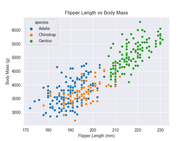
hue= parameterBy coloring the data points, the visualization makes a lot more sense. Larger penguins almost exclusively belong to one species.
What’s interesting here is that you didn’t need to manually create a legend! Because Seaborn can work readily with long DataFrames, passing in the hue parameter immediately created a legend. This is true because legend= parameter is set to 'auto' by default.
We can take this one step further by changing the shape of each data point to reflect another data attribute. For example, we can split the dataset by the sex variable to see if there are trends and differences in sex. This can be done by using the style= parameter. The parameter expects a DataFrame column being passed in.
# Modifying data point labels in Seaborn
sns.set_style('darkgrid')
sns.scatterplot(
    data=df,
    x='flipper_length_mm',
    y='body_mass_g',
    hue='species',
    style='sex'
)
plt.title('Flipper Length vs Body Mass')
plt.xlabel('Flipper Length (mm)')
plt.ylabel('Body Mass (g)')
plt.show()
This returns the following image:

style=Doing this modifies the legend to add a hierarchy to it. Now, both the colors and shapes are differentiated. This allows us to see that for the Gentoo species there are significantly higher variations in flipper length and body mass between the two sexes.
Creating Multiple Charts in Seaborn
Seaborn also makes creating multiple charts incredibly easy. Rather than needing to worry about creating figures and axes, you can easily split your data by a Pandas column. For example, let’s take a look at the example above again. While adding color and style to the graph can discern some data points, it resulted in a fairly busy visualization.
In order to split the data into multiple graphs based on the species column, you can modify the col= parameter. This parameter is only available in the relplot() function. Let’s see what this result looks like, by splitting the data into visualizations by species and coloring by gender.
# Splitting a graph into multiple Seaborn graphs
sns.relplot(
    data=df,
    x='flipper_length_mm',
    y='body_mass_g',
    hue='sex',
    col='species'
)
plt.title('Flipper Length vs Body Mass')
plt.xlabel('Flipper Length (mm)')
plt.ylabel('Body Mass (g)')
plt.show()
This returns the following image:
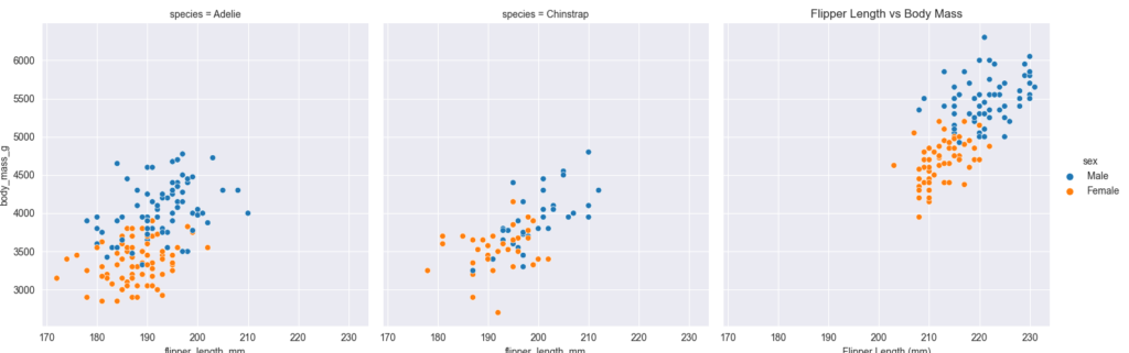
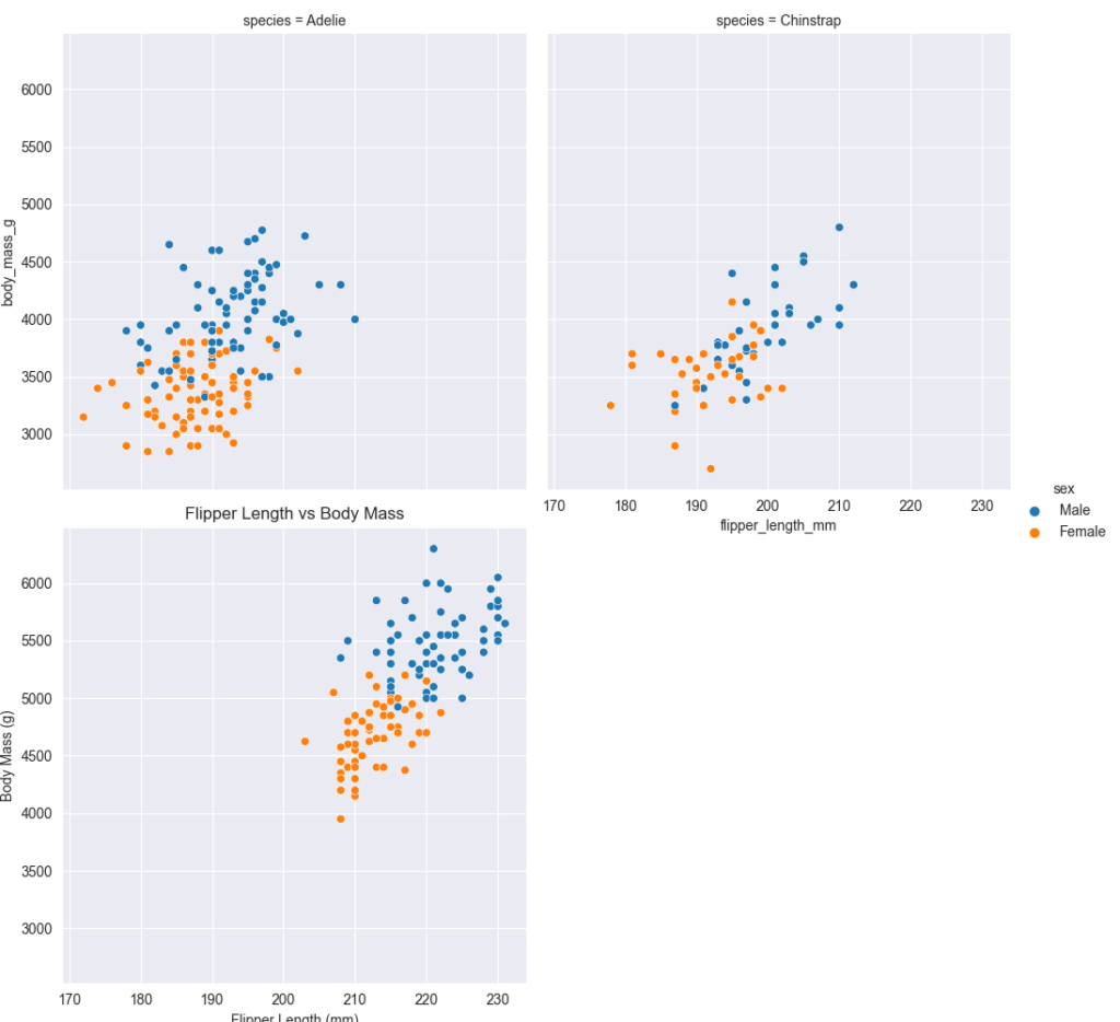
By using the col= parameter to pass in a column, the visualizations are split into multiple graphs. The function will, by default, continue appending graphs after one another. You can modify this behavior by using the col_wrap= parameter. The parameter expects an integer value, indicating how many items should be placed before a new row is created. Let’s see what happens when the value of 2 is passed in.
# Using the col_wrap= parameter
sns.set_style('darkgrid')
sns.relplot(
    data=df,
    x='flipper_length_mm',
    y='body_mass_g',
    hue='sex',
    col='species',
    col_wrap=2
)
plt.title('Flipper Length vs Body Mass')
plt.xlabel('Flipper Length (mm)')
plt.ylabel('Body Mass (g)')
plt.show()
This returns the image below:
Creating Categorical Plots in Seaborn
Similar to how the sns.relplot() function is meant to provide a high-level interface to relational plots, the sns.catplot() provides a similar interface to create categorical plots, such as bar charts and boxplots. Similar to the relplot() function, this can be controlled by the kind= parameter. Let’s take a look at creating these charts in Seaborn.
Creating Bar Charts in Seaborn
A bar chart is a categorical type chart where the bars represent a particular category, while their values are represented by the heights or lengths of the bars. These charts can be quite useful when you want to know the variances between different categories across some form of measure.
Let’s see how we can calculate the average body mass of a penguin, split out by the species, using the Seaborn catplot() function.
# Creating your first bar chart in Seaborn
sns.set_style('darkgrid')
sns.catplot(
    data=df,
    x='species',
    y='body_mass_g',
    kind='bar'
)
plt.title('Body Mass by Species')
plt.xlabel('Species')
plt.ylabel('Body Mass (g)')
plt.show()'
This returns the following image:

catplot()By default, Seaborn will calculate the mean of a category in a barplot. You may also notice the little black bar on the top of each bar. This is a process called bootstrapping. Seaborn is a statistical library that tries to simplify understanding your data. The library attempts to calculate through repeated sampling where a mean would fall 95% of the time.
Creating Grouped Bar Charts in Seaborn
We can further split our graph by creating a grouped bar chart. This means that for each higher level category (in this case, species) other bars would be added to split the data further. For example, you could split the data by sex. This can be done by using the hue= parameter. Let’s see how this works:
# Creating a Grouped Bar Chart in Seaborn
sns.set_style('darkgrid')
sns.catplot(
    data=df,
    x='species',
    y='body_mass_g',
    hue='sex',
    kind='bar'
)
plt.title('Body Mass by Species')
plt.xlabel('Species')
plt.ylabel('Body Mass (g)')
plt.show()
This returns the following image:

In the next section, you’ll learn how to use Seaborn palettes to use color in meaningful ways.
Customizing Seaborn Plots with Palettes
Seaborn comes with a number of built-in color palettes, that can be used for different purposes, depending on the type of data you’re visualizing.
These include:
- Qualitative Color Palettes,
- Sequential Color Palettes, and
- Diverging Color Palettes.
To see a color palette, Seaborn has a built-in function palplot() to display a particular palette.
One of the built-in palettes is the pastel palette. Let’s build a palplot with the pastel palette:
# Creating a palplot
palette = sns.color_palette("pastel")
sns.palplot(palette)
plt.show()
This returns the following palette:

By using the palplot(), you can get a good sense of what a palette looks like.
Let’s see how you can use a categorical palette such as 'pastel' to apply to the bar chart that you created earlier:
# Adding a palette to a bar plot
sns.set_style('darkgrid')
sns.set_palette('pastel')
sns.catplot(
    data=df,
    x='species',
    y='body_mass_g',
    hue='sex',
    kind='bar'
)
plt.title('Body Mass by Species')
plt.xlabel('Species')
plt.ylabel('Body Mass (g)')
plt.show()
This returns the following plot:

To learn more about palettes in Seaborn, check out the official documentation here.
Exercises
It’s time to check your learning. Try and complete the following exercises. If you need a hint or want to check your solution, simply toggle the question to reveal a solution.
What is the difference between a relplot function and a scatterplot function?
The relplot() function is a convenience function of scatterplot(). While you can create a scatterplot with relplot(), you can also create much, much more. Conversely, the scatterplot() function provides other helpful parameters, specific to scatter plots.
Try and find the function to create a histogram in Seaborn. How would you create a histogram of 10 bins showing the flipper length.
The documentation can be found here.
The code can be found below:
sns.histplot(
    data=df,
    x='flipper_length_mm',
    bins=10
)
plt.show()
Conclusion and Recap
In this tutorial, you learned the basics of using Seaborn for data visualization in Python. The section below provides a recap of what you learned:
- Seaborn provides a high-level wrapper on Matplotlib to provide access to create statistical visualizations
- The library provides tight integration with Pandas, allowing you to visualize Pandas DataFrames
- Seaborn provides the ability to use built-in themes, but also to customize low-level elements with Matplotlib
- The library provides three main types of plot: relational, categorical, and distribution plots
Additional Resources
To learn more about related topics, check out the tutorials below:
Pingback: 7 Ways to Sample Data in Pandas • datagy
Pingback: Pandas Describe: Descriptive Statistics on Your Dataframe • datagy
Pingback: Pandas: Number of Columns (Count Dataframe Columns) • datagy
Pingback: Calculate and Plot a Correlation Matrix in Python and Pandas • datagy
Pingback: Introduction to Scikit-Learn (sklearn) in Python • datagy
Excellent presentation .
I loved this so fun!!! U explain so well
Thanks Chis!! 🙂