In this tutorial, you’ll learn how to add titles and axis labels to Seaborn plots. Seaborn is built on top of Matplotlib, which allows you to add and customize titles in significant detail. Similarly, Seaborn makes adding and customizing titles or axis labels simple and intuitive.
Are you looking to do this in Matplotlib instead? Check out this complete guide to titles, fonts and axis labels in Matplotlib.
By the end of this tutorial, you’ll have learned the following:
- How to add and customize titles to Seaborn visualizations
- How to add and customize x-axis and y-axis labels to Seaborn visualizations
- How to add and customize titles for FacetGrid (multi-plot) plots in Seaborn
Table of Contents
How to Add a Title to a Seaborn Chart
In order to add a title to a Seaborn chart, you can use the .set_title() method. The method allows you to add and customize a title. Under the hood, Seaborn uses Matplotlib, which allows you to customize the titles to a great extent.
Let’s see how we can use the .set_title() method to add a simple title to a chart:
# Adding a Title
import seaborn as sns
import matplotlib.pyplot as plt

df = sns.load_dataset('tips')

sns.barplot(data=df, x='day', y='tip', ci=None).set_title('Sample Title')
plt.show()
This returns the following image:

By default, Seaborn won’t add very much styling to the title that you add. However, it’s simple to customize the title to the exact style you’re looking for. Let’s take a look at that next.
How to Customize a Title in a Seaborn Chart
In order to customize titles in Seaborn, you can use the fontdict= parameter of the .set_title() method. As the name implies, the method lets you pass in a dictionary that controls the font of the title. Let’s take a look at how we can customize the title font size, font weight, and font color.
Let’s start by looking at how we can customize the font size of a title in a Seaborn chart.
Customize Title Font Size in a Seaborn Chart
In order to customize the title font size we can pass in either the 'fontsize' or 'size' key into the fontdict= parameter.
The font size can either be a specific pixel size or a named font size. Seaborn supports the following font sizes: xx-small, x-small, small, medium, large, x-large, xx-large, larger, smaller, None.
Let’s see how we can customize the title font size in Seaborn with a practical example:
# Customizing Title Font Size
import seaborn as sns
import matplotlib.pyplot as plt
df = sns.load_dataset('tips')

chart = sns.barplot(data=df, x='day', y='tip', ci=None)
chart.set_title('Sample Title', fontdict={'size': 30})
plt.show()
Notice how we’re assigning the plot to a variable chart and then applying the .set_title() method to this object. We could also simply chain the method as we did before. However, this allows us to later customize the axis labels more easily.
This returns the following visualization:

In the following section, you’ll learn how to customize the title font-weight in a Seaborn chart.
Customize Title Font Weight in a Seaborn Chart
In order to customize the title font weight, you can use the 'fontweight' or 'weight' key in the fondtdict= parameter.
The font weight can be any of the following options: 'normal', 'bold', 'heavy', 'light', 'ultrabold', and 'ultralight'. By default, as the name implies, Seaborn will use 'normal'.
Let’s see how we can customize a Seaborn title by making it bold:
# Customizing Title Font Weight
import seaborn as sns
import matplotlib.pyplot as plt

df = sns.load_dataset('tips')

chart = sns.barplot(data=df, x='day', y='tip', ci=None)
chart.set_title('Sample Title', fontdict={'size': 30, 'weight': 'bold'})
plt.show()
This returns the following image:

We can see that the text has been bolded. We’re also using the larger font size that we applied earlier.
In the following section, you’ll learn how to customize the title font color in a Seaborn chart.
Customize Title Font Color in a Seaborn Chart
In order to customize the title font weight, you can use the 'color' key in the fondtdict= parameter.
Because Seaborn uses Matplotlib under the hood, you have access to pass in any of the many color options available in Matplotlib. Matplotlib provides a ton of different options of colors: for example, you can use any RGB value (such as (0.1, 0.1, 0.1)) or any HEX value (such as '#0f0f0f').
Similarly, you can use named colors that are provided from Matplotlib 'b' for blue or CSS4 named colors, such as 'aquamarine'.
Let’s see how we can change our font color to 'grey' in our Seaborn title:
# Customizing Title Font Color
import seaborn as sns
import matplotlib.pyplot as plt

df = sns.load_dataset('tips')

chart = sns.barplot(data=df, x='day', y='tip', ci=None)
chart.set_title('Sample Title', fontdict={'size': 30, 'weight': 'bold', 'color': 'grey'})
plt.show()
This returns the following image, where our title has been colored grey:

In the following section, you’ll learn how about some of the other customization options available in Seaborn title fonts.
Other Customization Options for Title Fonts in Seaborn
Seaborn provides a number of different options for customizing title fonts. For example, you can customize the rotation using the 'rotation' key and the background color using the 'backgroundcolor' key in the fontdict= parameter.
The table below breaks down all of the different options available in Seaborn font title options:
| Property | Description | Value Type |
|---|---|---|
| alpha | The transparency of your title | float |
| backgroundcolor | The background color of your title | any matplotlib color |
| bbox | The bounding box of the text | Rectangle prop dict plus key ‘pad’ which is a pad in points |
| clip_box | The clipping box of the title | a matplotlib.transform.Bbox instance |
| clip_on | Whether the artist should use clipping | bool |
| clip_path | The path to the clipper | a Path instance and a Transform instance, a Patch |
| color | The color of the text | any matplotlib color |
| family | The font family to use | 'serif', 'sans-serif', 'cursive', 'fantasy', 'monospace' |
| fontproperties | Different Matplotlib fontproperties | FontProperties |
| horizontalalignment or ha | The horizontal alignment of the text | 'center', 'right', 'left' |
| label | The label of the text | any string |
| linespacing | The line spacing to use | float |
| multialignment | How to align your text | 'center', 'right', 'left' |
| name or fontname | The font name | string e.g., 'Times New Roman' |
| picker | The artist picker | None, float, boolean |
| position | The specific position to place the text | (x, y) |
| rotation | The rotation to apply to the text | angle in degrees, 'vertical', 'horizontal' |
| size or fontsize | The font size to use | size in points or relative size |
| style or fontstyle | The font style to use | 'normal', 'italic', 'oblique' |
| text | The text to include | string or anything printable with ‘%s’ conversion |
| transform | Any Matplotlib Transform values | Transform subclass |
| variant | The variant to apply to your text | 'normal', 'small-caps' |
| verticalalignment or va | The vertical alignment of your text | 'center', 'top', 'bottom', 'baseline' |
| visible | Whether the title is visible or not | bool |
| weight or fontweight | The font weight of your text | 'normal', 'bold', 'heavy', 'light', 'ultrabold', 'ultralight' |
| x, y | The x, y position of the text | float |
| zorder | The z order of the text | any number |
In the following section, you’ll learn how to add and customize axis labels in Seaborn charts.
How to Add and Customize Axis Labels in Seaborn Charts
Seaborn also makes it simple to add and customize axis labels. We can add x-axis and y-axis labels using the .set_xlabel() and .set_ylabel() methods, respectively. Because they return Text objects similar to setting titles, we can apply the fontdict= parameter as we did before.
Let’s see how we can add and customize axis labels in Seaborn:
# Adding y-axis and x-axis label
import seaborn as sns
import matplotlib.pyplot as plt

df = sns.load_dataset('tips')
chart = sns.barplot(data=df, x='day', y='tip', ci=None)
chart.set_title('Sample Title', fontdict={'size': 30, 'weight': 'bold'})
chart.set_xlabel('Day of Week', fontdict={'size': 15})
chart.set_ylabel('Tip Amount', fontdict={'size': 15})
plt.show()
This returns the following visualization:

We can see that the x-axis and y-axis labels have been modified and customized.
If you’re just looking to add titles and axis labels, you can simply use the .set() method. This allows you to simply pass in strings for the title and axis labels. Let’s take a look at what this looks like:
# Adding Labels in an Easier Way
import seaborn as sns
import matplotlib.pyplot as plt

df = sns.load_dataset('tips')
sns.barplot(data=df, x='day', y='tip', ci=None).set(title='Sample Title', xlabel='Day', ylabel='Tip')
plt.show()
This returns the following image:

We can see that it’s an easier way to describe your data but doesn’t provide as much flexibility as the .set_title(), set_xlabel(), and .set_ylabel() methods.
How to Add and Customize Titles for Seaborn FacetGrid Plots
When working with Seaborn FacetGrid plots, adding titles works slightly differently. One of the ways in which to create these plots by passing additional variables into the col= (column) or row= parameters. This creates additional subplots based on the same data.
How to Add a Title to a Seaborn FacetGrid Plot
Let’s see how we can add a title to our FacetGrid plot. In the code below, take note of two lines. By using the .subplots_adjust(), we adjust the spacing to give the title a bit more room. This process is a bit heuristic and involves a little trial and error to find the best spacing.
Additionally, we use the .fig.suptitle() method to add a title to the figure as a whole (rather than to a single plot). Let’s see what this looks like:
# Adding a Title to a FacetGrid Plot
import seaborn as sns
import matplotlib.pyplot as plt

df = sns.load_dataset('tips')
scatter = sns.relplot(data=df, x='total_bill', y='tip', col='sex', row='smoker')

scatter.fig.subplots_adjust(top=0.92)
scatter.fig.suptitle('Tips Broken Out by Gender', size=15)
scatter.set_axis_labels('Total Bill Amount ($)', 'Tip Amount ($)')
plt.show()
This returns the following image:

In the following section, you’ll learn how to add and customize titles to the subplots in a Seaborn FacetGrid.
How to Customize Titles for Inner Seaborn Plots with Columns and Rows
In order to add titles to subplots in Seaborn, we can use the .set_titles() method. Note that this method references titles, rather than a single title.
The way that the method works is by passing in templates for the columns and rows of subplots that make reference to either the col_name or row_name, which allows you to use the column or row variable.
Let’s take a look at an example of how to add titles to subplots in Seaborn plots:
# Adding Titles to Subplots
import seaborn as sns
import matplotlib.pyplot as plt

df = sns.load_dataset('tips')
scatter = sns.relplot(data=df, x='total_bill', y='tip', col='sex', row='smoker')

scatter.fig.subplots_adjust(top=0.92)
scatter.fig.suptitle('Tips Broken Out by Gender', size=15)
scatter.set_axis_labels('Total Bill Amount ($)', 'Tip Amount ($)')
scatter.set_titles(col_template='{col_name} Visitors', row_template='Smoker: {row_name}', size=12)
plt.show()
In the example above, we joined the column name with the string ' Visitors', which allowed us to change the title to Male Visitors and Female Visitors. Similarly, we prefixed the smoker column with a descriptive label.
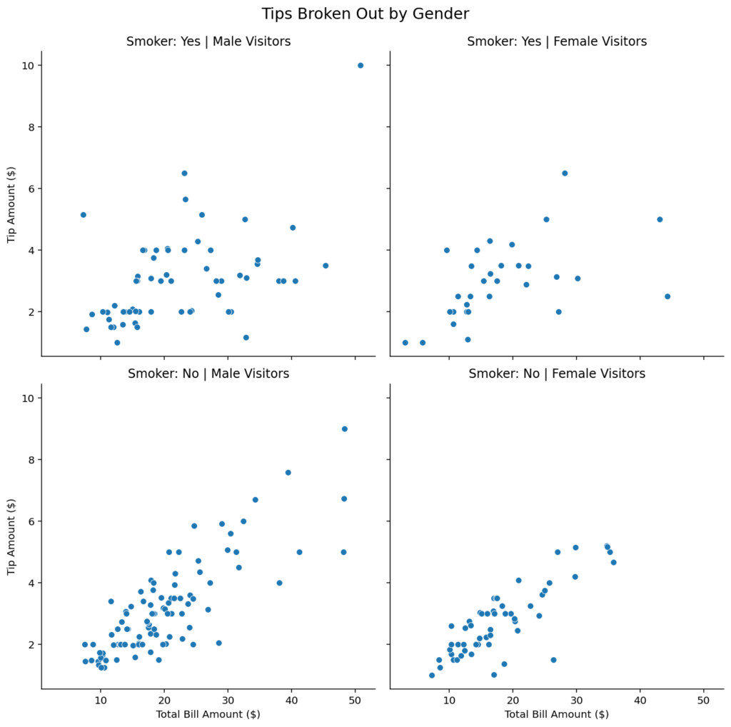
In the example above, we were able to add descriptive labels to the subplots in Seaborn. Note that we’re not specifying the exact title, but rather the labels based on the pattern breakdowns.
Frequently Asked Questions
In order to add a title to a Seaborn chart, you can use the .set_title() method, which lets you pass in a string.
In order to customize titles in Seaborn charts, you can pass a dictionary of customizations into the fontdict parameter of the .set_title() method. The dictionary accepts keys such as ‘weight’, ‘size’, and ‘color’.
To modify axis labels in Seaborn charts, you can use the .set_xlabel() and .set_ylabel() methods. The methods allow you to pass in strings to set the label. You can also customize the labels by passing a dictionary into the fontdict parameter of the method. The dictionary accepts keys such as ‘weight’, ‘size’, and ‘color’.
Conclusion
In this tutorial, you learned how to add and customize titles and axis labels in Seaborn visualizations. Seaborn makes it simple to create beautiful visualizations. Similarly, it’s equally simple to add and customize titles and axis labels. Because Seaborn uses Matplotlib under the hood, you get access to all of the customization options that the library has to offer.
You first learned how to add titles to Seaborn plots and how to customize them by using Matplotlib customizations. Then, you learned how to add and customize axis labels in Seaborn. Finally, you learned how to customize titles in Seaborn subplots in a FacetGrid.
Additional Resources
To learn more about related topics, check out the resources below: