
In this guide, you’ll learn how to use the Seaborn histplot() function to create histograms to visualize the distribution of a dataset. Histograms are valuable tools to visualize how datasets are distributed, allowing you to gain strong insight into your data. In this tutorial, you’ll learn about the different parameters and options of the Seaborn histplot function.
By the end of this tutorial, you’ll have learned the following:
- How the Seaborn
kdeplot()function works - How to customize your Seaborn KDE plots using color, smoothing, and different bins
- How to visualize two continuous variables using the Seaborn kdeplot function
Table of Contents
Understanding the Seaborn kdeplot Function
Before diving into creating kernel density plots in Seaborn, let’s explore the sns.kdeplot() function and its parameters. As the code block below shows, the function offers a ton of parameters, as well as default arguments.
# Understanding the Seaborn kdeplot() Function
seaborn.kdeplot(data=None, *, x=None, y=None, hue=None, weights=None, palette=None, hue_order=None, hue_norm=None, color=None, fill=None, multiple='layer', common_norm=True, common_grid=False, cumulative=False, bw_method='scott', bw_adjust=1, warn_singular=True, log_scale=None, levels=10, thresh=0.05, gridsize=200, cut=3, clip=None, legend=True, cbar=False, cbar_ax=None, cbar_kws=None, ax=None, **kwargs)
Don’t worry – you won’t need to know all of these parameters. In fact, we won’t even cover all of these parameters throughout this guide. However, we’ll explore the most important ones, including the ones below:
data=provides the data to plot via a Pandas DataFramex=andy=provide the variables to plot on the x- and y-axis respectivelyhue=adds an additional variable to plot via a color mappingmultiple=instructs how to handle multiple variable mapping, including stacking or creating 100% ranges
Now that you have a good understanding of some of the most essential parameters, let’s dive into how to create KDE plots in Seaborn.
Creating a Seaborn KDE Plot with kdeplot
In order to create a Seaborn kernel density estimate plot, you only need to provide a DataFrame in the data= argument and a column label in the x= argument. Seaborn then creates the kernel density estimate and plots the function on a graph. Let’s see what this looks:
# Creating a KDE Plot in Seaborn
import seaborn as sns
import matplotlib.pyplot as plt
df = sns.load_dataset('penguins')

sns.kdeplot(data=df, x='bill_depth_mm')
plt.show()
In the code block above, we instructed Seaborn to plot a KDE plot for the 'bill_depth_mm' column of our DataFrame. This returns the image below, representing the estimated function:
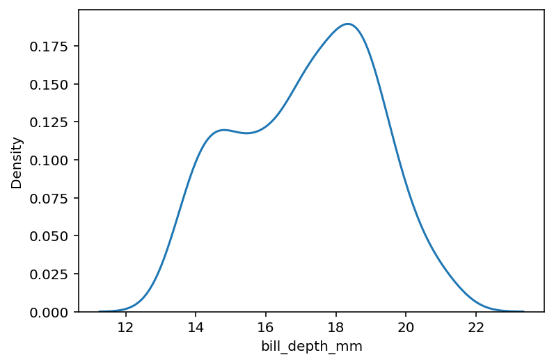
While the function doesn’t represent the actual distribution of data, it does try to create an estimate of what the function could look like.
Creating a Horizontal KDE Plot in Seaborn
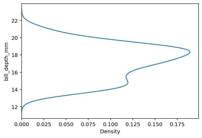
In the example above, our KDE plot was plotted vertically. Seaborn also allows you to create a horizontal kernel density estimate plot by simply placing the column you want to plot into the y= parameter, rather than the x= parameter.
Let’s see how we can create a horizontal KDE plot in Seaborn:
# Creating a Horizontal KDE Plot in Seaborn
import seaborn as sns
import matplotlib.pyplot as plt
df = sns.load_dataset('penguins')

sns.kdeplot(data=df, y='bill_depth_mm')
plt.show()
By modifying the parameter to y=, Seaborn creates the same plot we created in the earlier section and plotted it horizontallly.
By default, Seaborn uses automatic scaling to produce a smooth curve. In the following section, you’ll learn to customize the smoothing.
Modifying Bin Width in Seaborn KDE Plots
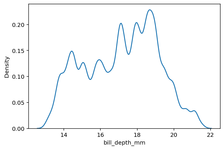
Seaborn allows you to customize the smoothing (or bin width) or a kernel density estimate by using the bw_adjust= parameter. The large the value, the smoother the curve. We can add more detail to the curve by lowering the value.
# Use Less Smoothing for Plots
import seaborn as sns
import matplotlib.pyplot as plt
df = sns.load_dataset('penguins')

sns.kdeplot(data=df, x='bill_depth_mm', bw_adjust=0.3)
plt.show()
In the code block above, we passed in bw_adjust=0.3. This reduces the smoothing and adds more detail in the fluctuations of the underlying function, as shown below:
Let’s now explore how we can produce plots that don’t extend beyond extreme values.
Prevent Extending Past Extreme Points in Seaborn KDE Plots
In order to create a smoothed line, Seaborn may need to extend the function line beyond extreme points. This factor is multiplied by the smoothing bandwidth. However, we can truncate the curve at the data limits by setting the cut= parameter to 0.
Let’s see what this looks like in Python:
# Prevent Cutting Extreme Points
import seaborn as sns
import matplotlib.pyplot as plt
df = sns.load_dataset('penguins')

sns.kdeplot(data=df, x='bill_depth_mm', cut=0, bw_adjust=3)
plt.show()
In the example above, we added cut=0 to our function. This then clipped the function at the extreme points (meaning they abruptly end along the x-axis). This can ensure that there is less inference about the underlying data distribution.

In the following section, you’ll learn how to add additional detail to KDE plots by using color.
Adding Colors in Seaborn KDE Plots
So far, we have created Seaborn KDE plots that plot a single estimate. However, we can add additional detail using the color semantic, by making use of the hue= parameter. We can pass in an additional Pandas DataFrame column into the hue= parameter.
# Adding Color for Additional Subcategories
import seaborn as sns
import matplotlib.pyplot as plt
df = sns.load_dataset('penguins')

sns.kdeplot(data=df, x='bill_depth_mm', hue='species')
plt.show()
In the code block above, we added the 'species' column to the hue= parameter. Because the column has three distinct values, Seaborn will draw three separate lines, as shown below:
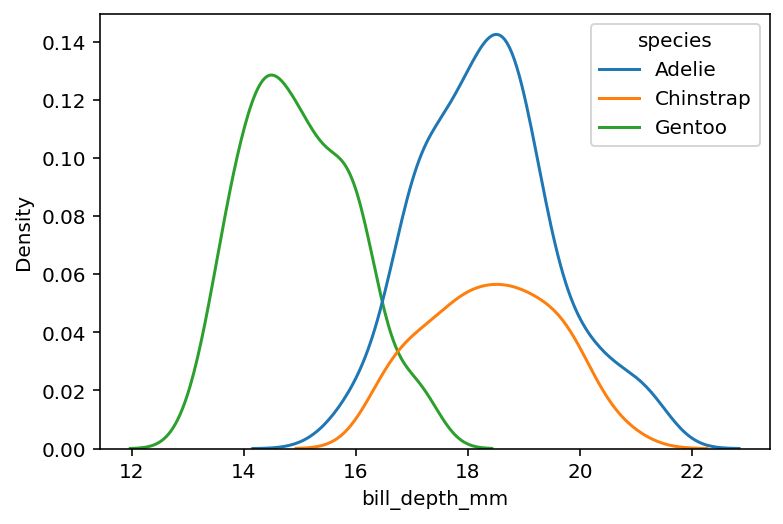
We can see that the data is shown as separate functions. While we can see the individual estimates, it can be harder to see the detail of the overall distribution. You’ll learn how to address this in the following section.
Stacking Data with Color in Seaborn KDE Plots
In the previous section, you learned how to plot separate kernel density estimates for a distribution broken out by another column. You can stack the separate distributions to provide detail about each category while representing the distribution as a whole.
In order to do this, you can pass in multiple='stack', which will stack each of the separate estimates. Let’s see what this looks like:
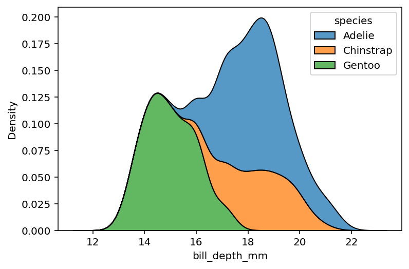
# Stacking for Additional Subcategories
import seaborn as sns
import matplotlib.pyplot as plt
df = sns.load_dataset('penguins')

sns.kdeplot(data=df, x='bill_depth_mm', hue='species', multiple='stack')
plt.show()
In the code block above, we specified that we wanted multiple overlapping categories to stack. This gives you a better sense of the overall distribution of data, while providing insight into the additional categories.
We can take this even further by stacking the colors to a 100% plot, which you’ll learn about in the next section.
Stacking Colors to 100% in Seaborn KDE Plots
Seaborn allows you to even stack the density estimate to 100%. This gives you a strong sense of how much each category is represented at each point in the distribution. In order to do this, you can pass in multiple='fill', which will fill the entire plot.
Let’s see what this looks like in Python:
# Stacking at 100% for Additional Subcategories
import seaborn as sns
import matplotlib.pyplot as plt
df = sns.load_dataset('penguins')

sns.kdeplot(data=df, x='bill_depth_mm', hue='species', multiple='fill')
plt.show()
When we modify the multiple= parameter to 'fill', the entire height of the plot is used. This allows you to see how much each element is represented along the distribution.

So far, we’ve added a categorical variable to our KDE plot using the color semantic, however, we can also use continuous variables.
Plotting Continuous Variables as a KDE Plot in Seaborn
Seaborn also makes it easy to add a continuous variable to the hue= semantic, meaning that each value will be represented by a scale of color.
This allows you to use color to see how a variable changes in scale. Let’s see what this looks like by using a different dataset:
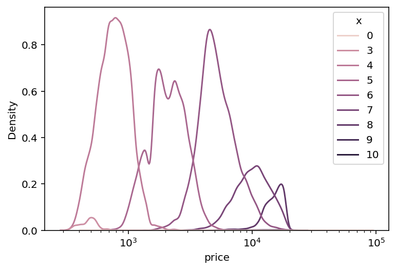
# Plotting Continuous KDE Plots
import seaborn as sns
import matplotlib.pyplot as plt
df = sns.load_dataset('diamonds')
df['x'] = df['x'].astype('int')
sns.kdeplot(data=df, x='price', hue='x', log_scale=True)
plt.show()
In the code block above, we modified one of the variables to an integer to make our visualization a little cleaner. We then passed that variable into the hue= parameter. As the value of 'x' grows, the color gets darker.
Now let’s dive into how to change additional parameters of the Seaborn kdeplot function by learning how to create cumulative plots.
Calculating Cumulative KDE Plots in Seaborn
Seaborn makes it easy to plot a cumulative kernel density estimate plot by using the cumulative= parameter. Creating a cumulative plot allows you to see which values are represented along the distribution, meaning you can better understand trends in the data.
Let’s see how we can modify the cumulative= parameter to create a cumulative KDE plot:
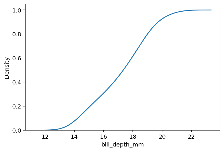
# Calculating Cumulative KDE Plots
import seaborn as sns
import matplotlib.pyplot as plt
df = sns.load_dataset('penguins')

sns.kdeplot(data=df, x='bill_depth_mm', cumulative=True)
plt.show()
By passing in cumulative=True, we can create a cumulative KDE plot, as shown below:
We can extend this even further by using a hue= argument. In order for the values to each extend to 100%, we will also need to set common_norm=False. Without this, the values will extend only to the total of the distribution they represent.
# Calculating Cumulative KDE Plots with Multiple Categories
import seaborn as sns
import matplotlib.pyplot as plt
df = sns.load_dataset('penguins')

sns.kdeplot(data=df, x='bill_depth_mm', cumulative=True, hue='species', common_norm=False)
plt.show()
In the code block above, we asked Seaborn to create cumulative KDE plots broken out by color, which returned the visualization below:

In the following section, let’s explore how to use a log scale in Seaborn kdeplots.
Using a Log Scale in a Seaborn KDE Plot
When working with large data scales it can be helpful to plot data using a log scale. In order to create a Seaborn KDE plot using a log scale, you can pass in log_scale=True. By default this is set to False, meaning that data aren’t plotted on a log scale.
Let’s see how we can do this by using the 'diamonds' dataset, which is included with Seaborn:
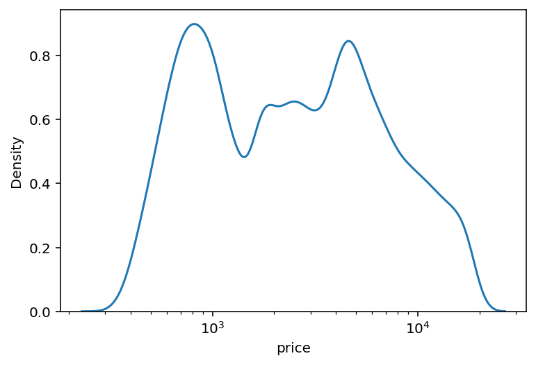
# Using a Log Scale for Values
import seaborn as sns
import matplotlib.pyplot as plt
df = sns.load_dataset('diamonds')

sns.kdeplot(data=df, x='price', log_scale=True)
plt.show()
Try running the code above without setting the log_scale=True argument and see how the visualization varies from the one shown below. When appropriate, log scales can help you better understand the distribution of the dataset.
Let’s now dive into how to plot a bivariate distribution using Seaborn KDE plots.
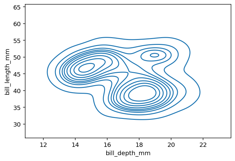
Plotting Bivariate Distributions in Seaborn KDE Plots
In order to plot a bivariate kernel density estimate plot in Seaborn, you can pass two variables into both the x= and y= respectively. This will demonstrate how the two variables behave together based on the data in the distribution.
Let’s see how we can do this in Python by passing in two variables:
# Plot a Bivariate Distribution
import seaborn as sns
import matplotlib.pyplot as plt
df = sns.load_dataset('penguins')

sns.kdeplot(data=df, x='bill_depth_mm', y='bill_length_mm')
plt.show()
This returns the following visualization, which can be interpreted as an altitude map.
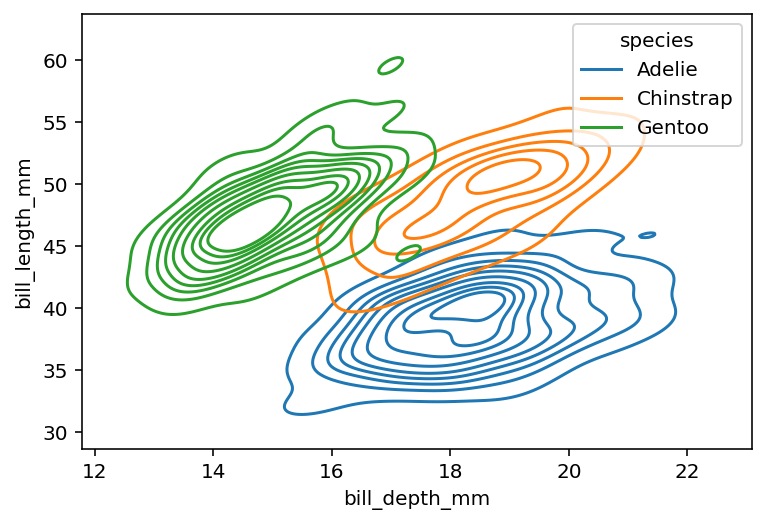
We can extend this plot even further by using a color semantic using the hue= parameter.
Plotting Bivariate Distributions in Seaborn KDE Plots with Color
The plot we generated in the previous section makes it easy to tell that there are different clusters in our data. We can explore these clusters by using the hue= semantic, which allows us to plot an additional variable using color.
Let’s see how we can add color to our bivariate KDE plot:
# Plot a Bivariate Distribution with Color
import seaborn as sns
import matplotlib.pyplot as plt
df = sns.load_dataset('penguins')

sns.kdeplot(data=df, x='bill_depth_mm', y='bill_length_mm', hue='species')
plt.show()
Take a look at the chart below! You can see that the three clusters correlate with our different species in this distribution.
It can still be difficult to see where data are clustered. Because of this, we can fill our bivariate KDE plot to see where data are clustered by passing in fill=True.
# Plot a Bivariate Distribution with Filled Color
import seaborn as sns
import matplotlib.pyplot as plt
df = sns.load_dataset('penguins')

sns.kdeplot(data=df, x='bill_depth_mm', y='bill_length_mm', hue='species', fill=True)
plt.show()
Personally, I find this the most intuitive to understand bivariate KDE plots when adding in a color semantic.
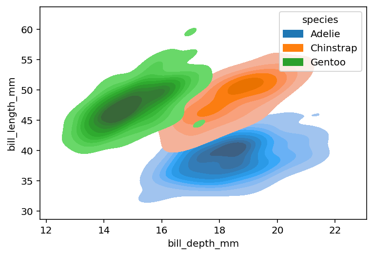
One thing to keep in mind is that some of the data are now covered.
Conclusion
In this guide, you learned how to use the Seaborn kdeplot() function to create informative kernel density estimate plots in Seaborn. KDE plots allow you to get a strong understanding of the distribution of data.
You first learned what the Seaborn kdeplot function offers in terms of parameters and default arguments. Then, you learned how to create simple KDE plots. From there, you built on what you learned to create more complex and informative KDE plots by adding colors, changing scales, and more. Finally, you learned how to create two-dimensional KDE plots.
Additional Resources
To learn more about related topics, check out the resources below:
- Seaborn displot – Distribution Plots in Python
- Seaborn histplot – Creating Histograms in Seaborn
- Seaborn kdeplot – Creating Kernel Density Estimate Plots
- Seaborn rugplot – Plotting Marginal Distributions
- Seaborn ecdfplot – Empirical Cumulative Distribution Functions
- Seaborn kdeplot() – Official Documentation