In this tutorial, you’ll learn how to create Seaborn relational plots using the sns.relplot() function. Relational plots show the relationship between two or more variables. For example, you might want to use Seaborn to create line plots to show the relationship between continuous variables. Similarly, you may want to create scatter plots.
Seaborn provides dedicated functions for both of these visualizations. So, why would you want to use the relplot() function? The Seaborn relplot() function is a figure-level function, rather than an axes-level function. This opens up different possibilities in terms of how you put together your visualizations.
By the end of this tutorial, you’ll have learned the following:
- What the Seaborn relplot() function is
- When to use the Seaborn relplot() function instead of
sns.lineplot()andsns.scatterplot() - How to plot multiple scatter plots and line plots using the
sns.relplot()figure-level function - How to customize titles, colors, and more
Table of Contents
Understanding the Seaborn relplot() Function
The Seaborn relplot() function is used to create figure-level relational plots onto a Seaborn FacetGrid. You can customize the type of visualization that is created by using the kind= parameter. The function provides access to the following axes-level functions:
- Seaborn
scatterplot()to create scatter plots (the default) - Seaborn
lineplot()to create line charts
The Seaborn relplot() function provides a figure-level interface for creating relational plots. This means that the function allows you to map to a figure, rather than an axes object. This opens up much more possibilities.
Let’s take a look at how the function is written:
# Understanding the Seaborn relplot() Function
seaborn.relplot(data=None, *, x=None, y=None, hue=None, size=None, style=None, units=None, row=None, col=None, col_wrap=None, row_order=None, col_order=None, palette=None, hue_order=None, hue_norm=None, sizes=None, size_order=None, size_norm=None, markers=None, dashes=None, style_order=None, legend='auto', kind='scatter', height=5, aspect=1, facet_kws=None, **kwargs)
The function has a very similar interface to the other relational plotting functions. Let’s take a look at some of the key options:
data=provides the data to plot via a Pandas DataFramex=andy=provide the variables to plot on the x- and y-axis respectivelyhue=adds an additional variable to plot via a color mapping
Additionally, the function offers some extra parameters available only in the relplot() function. Let’s explore these:
kind=determines what type of chart to create. By default, it will create a scatter plot, using the keyword argument'scatter'row=allows you to split your dataset into additional rows of visualizationscol=allows you to split your dataset into additional columns of visualizationsheight=andaspect=control the size of your data visualization
Now that you have a strong understanding of what’s possible, let’s dive into how we can use the function to create useful data visualizations.
Loading a Sample Dataset
To start things off, let’s load a sample dataset that we can use throughout this tutorial. The dataset is available on my Github page and provides stock information for Microsoft, Apple, and Google for 2020. We can load the dataset using Pandas. This is especially useful due to Seaborn’s tight integration with the library.
Let’s see how we can read the dataset and explore its first five rows:
# Read in the Sample Dataset
import seaborn as sns
import pandas as pd
df = pd.read_csv(
    'https://raw.githubusercontent.com/datagy/data/main/stocks-relplot.csv',
    parse_dates=['Date'])
print(df.head())

# Returns:
#         Date    Volume  Name  Open
# 0 2020-12-31  20.94213  MSFT   221
# 1 2020-12-30  20.27234  MSFT   225
# 2 2020-12-29  17.40321  MSFT   226
# 3 2020-12-28  17.93350  MSFT   224
# 4 2020-12-24  10.55057  MSFT   221
We can see that by using the .head() method, the first five rows of the dataset can be printed. We have four columns of data, covering the date, the name of the stock, the volume traded, and the opening price. Let’s see how we can learn more about this dataset using the Seaborn relplot() function.
Creating a Basic relplot with Seaborn
By default, the Seaborn relplot() function will create a scatterplot. In order to create the most basic visualization, we can simply pass in the following parameters:
data=to pass in our DataFramex=andy=to pass in the column labels that we want to explore in a scatterplot
Let’s see what this code looks like:
# Seaborn Will Default to Scatterplots
import seaborn as sns
import pandas as pd
import matplotlib.pyplot as plt

df = pd.read_csv(
    'https://raw.githubusercontent.com/datagy/data/main/stocks-relplot.csv',
    parse_dates=['Date'])

sns.relplot(data=df, x='Open', y='Volume')
plt.show()
In the code block above, we passed in our DataFrame df as well as the 'Open' and 'Volume' column labels. This returned the following visualization:

We can see that because we’re plotting two variables that a scatterplot has been created for us. The plot allows us to explore the relationship between two variables by identifying how the two variables interact.
But what if you’re working with continuous data, such as dates? In those cases, it can make a lot more sense to show the data as lines. Let’s explore that in the following section.
Creating a Line Chart with Seaborn relplot
While the Seaborn relplot() function will default to creating scatterplots, we can also create line charts by passing in kind='line'. This is especially useful when working with continuous data, such as dates. Since we have a date variable available in our dataset, let’s see how we can make use of it:
# Adding a Line Will Make Distribution Easier to Understand
import seaborn as sns
import pandas as pd
import matplotlib.pyplot as plt

df = pd.read_csv(
    'https://raw.githubusercontent.com/datagy/data/main/stocks-relplot.csv',
    parse_dates=['Date'])

sns.relplot(data=df, x='Date', y='Volume', kind='line')
plt.show()
In the code block above, we added one additional keyword argument: kind=. This allowed us to create an entirely different data visualization, as shown below:
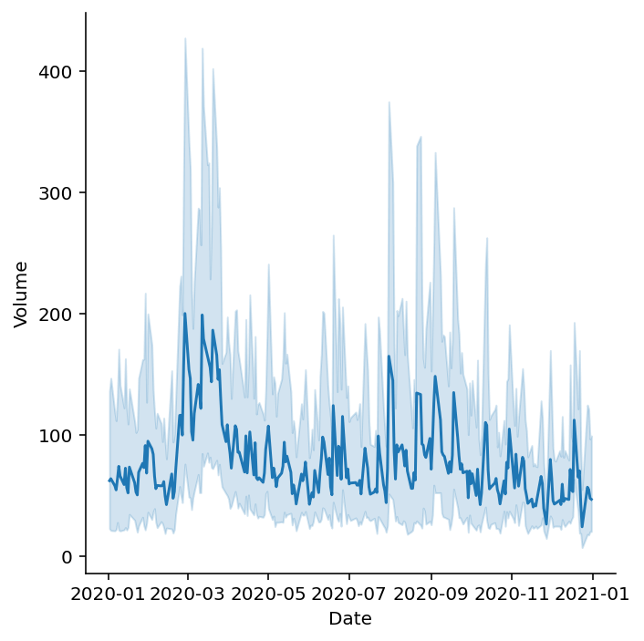
Because the relplot() function will actually use the lineplot() function under the hood, the behavior is the same. By default, the function will aggregate the data to a single marker. Because we have three different data points for each date, Seaborn will return the mean of each data point.
Doing this also introduces some need to understand how this data varies. This is why Seaborn adds the error bars to its visualization. Let’s explore these error bars a little further.
Understanding Error Bands in Seaborn relplot
When data are aggregated in Seaborn relplots, Seaborn will add an error bar to the visualization. In the example above, we created a line plot, which returned the mean value for each day (since we had three data points per day).
By default, Seaborn will use a process called bootstrapping to return a 95% confidence interval that new data will fall within the error band.
This means that Seaborn will use sampling with replacement to calculate a mean and repeat this process a number of times. By default, this is repeated a thousand times per value in on the x axis.
What this generates is a confidence band that new values have a 95% confidence of falling within this range. however, you also have the option to modify both the confidence interval and the number of bootstrap iterations Seaborn performs.
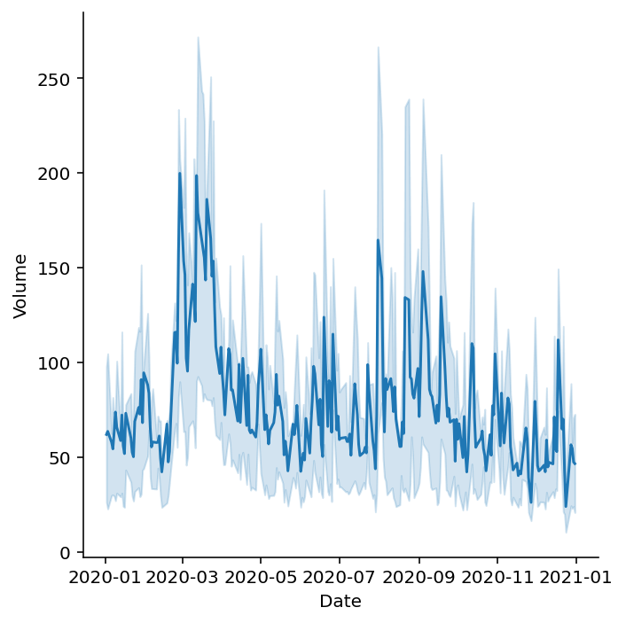
We can also modify the percentage to use in our confidence interval by passing in a tuple that contains ('ci', n) where n represents the percentage we want to use. Let’s modify our band to show a 50% confidence interval:
# Modifying the Error Bar in a Line Plot
import seaborn as sns
import pandas as pd
import matplotlib.pyplot as plt
df = pd.read_csv(
    'https://raw.githubusercontent.com/datagy/data/main/stocks-relplot.csv',
    parse_dates=['Date'])
sns.relplot(data=df, x='Date', y='Volume', kind='line', errorbar = ('ci', 50))
plt.show()
This returns the following visualization. Note that the band is now narrower since the error band is much less certain now.
You may also notice that the errorbar= parameter isn’t part of the definition of the relplot() function. However, it is part of the lineplot() function. Seaborn allows you to use any of the keyword arguments from that function when plotting a line plot.
What if we want to change the type of error calculation? Seaborn makes this easy as well!
Seaborn accepts the following error bar calculations: 'ci', 'pi', 'se', or 'sd', which represent the following calculations:
'ci': confidence interval, which calculates the non-parametric uncertainty'pi': percentile interval, which calculates the non-parametric spread'se': standard error, which calculates the parametric uncertainty'sd': standard deviation, which calculates the parametric spread
Let’s now dive back into customizing our relational plot by adding color, shapes, and sizes.
Modifying Seaborn relplot with Color, Shapes, and Sizes
We can add additional detail to our Seaborn graphs by using color, shapes, and sizes. All three of these options allow you to add additional dimensions (or columns of data) to your visualization. This means that, while our graphs will remain 2-dimensional, we can actually plot additional dimensions.
We can add these using the following parameters:
hue=is used to add additional parameters in color,size=is used to modify shape sizes using additional column data, andstyle=is used to modify how values are represented using marker or line styles
Let’s explore how we can add additional levels of detail using color.
Adding Color to Seaborn Relplot
To add an additional variable into your Seaborn relplot(), you can use the hue= parameter to pass in a DataFrame column that will break the data into multiple colors.
Seaborn will create a color for each of the different unique values in that column. If you’re working with categorical data, Seaborn will add one color for each unique value. If, on the other hand, you’re working with continuous data, Seaborn will shade the points differently.
Adding Color Styles versus Adding Color Dimensions
In this case, we’ll be adding color to represent a different dimension of data. If, instead, you wanted to control the styling of your plot, you could use the palette= parameter. For the remainder of the tutorial, we’ll apply a style to make the default styling a little more aesthetic.
Let’s see how we can use Seaborn to add more detail to our plot using the hue= parameter:
# Adding Color to Our Seaborn Scatter Plot
import seaborn as sns
import pandas as pd
import matplotlib.pyplot as plt

df = pd.read_csv(
    'https://raw.githubusercontent.com/datagy/data/main/stocks-relplot.csv',
    parse_dates=['Date'])

sns.relplot(data=df, x='Open', y='Volume', palette='Set2', hue='Name')
plt.show()
In the code block above, we passed in hue='Name'. This means that we want to color the points in our scatterplot differently based on the stock the data point belongs to. (Note: we’ve also applied the palette, though this is entirely for styling the plot). This returns the following image:
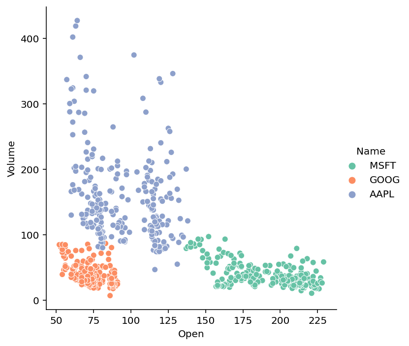
We can see that the data visualization is now much clearer. We can clearly see three different clusters of data, allowing us to better understand the patterns in the data.
Changing the Shapes in Seaborn Relplot
One important thing to note is that by adding color to our visualization is that our data may no longer be accessible for people with color blindness. Similarly, if we were to print the visualization with a black and white printer, the meaning may get lost.
Because of this, we can also modify the shape of each data point to use a different marker. Let’s see how we can use Seaborn to modify the shapes used:
# Changing Marker Styles within Seaborn
import seaborn as sns
import pandas as pd
import matplotlib.pyplot as plt

df = pd.read_csv(
    'https://raw.githubusercontent.com/datagy/data/main/stocks-relplot.csv',
    parse_dates=['Date'])

sns.relplot(data=df, x='Open', y='Volume', hue='Name', style='Name', palette='Set2')
plt.show()
In the code block above, we passed the 'Name' column into both the hue= and style= parameters. This means that the column is represented both by the marker style, as well as the marker color.
Creating a Line Chart Instead?
Were we creating line charts, this would modify the style of the line (e.g., dotted, dashed, solid, etc.). Because the relplot() function can be used to create either a scatter plot or line chart, it’s good to know what behavior to expect.
In this case, we return the following image:

In the following section, let’s explore how we can understand the distribution better by the marker size as a variable.
Modifying Sizes in Seaborn Relplot
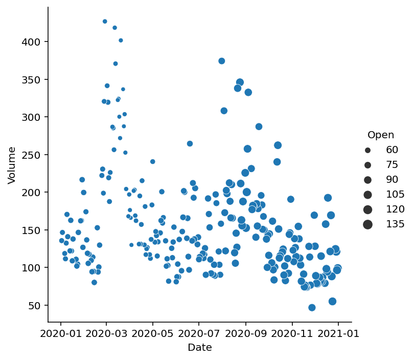
Finally, we can also add more detail to a relational plot by using the size= parameter. The parameter allows you to pass in another column, which will be used to determine the sizing of the markers.
In the example below, we filter our DataFrame to only show records for Apple. We also map the date onto the x-axis, which may not make too much sense. However, the example will illustrate how the size of the points is modified.
# Adding a Size Dimension to Our Scatter Plot
import seaborn as sns
import pandas as pd
import matplotlib.pyplot as plt

df = pd.read_csv(
    'https://raw.githubusercontent.com/datagy/data/main/stocks-relplot.csv',
    parse_dates=['Date'])

filtered = df[df['Name'] == 'AAPL']

sns.relplot(data=filtered, x='Date', y='Volume', size='Open')
plt.show()
Doing this returns the following visualization. We can see that the opening prices were higher for dates later in the year. Inversely, they were smaller for dates earlier in the year.
Let’s now take a look at how we can use this figure-level function to easily create subplots using rows and columns of visualizations.
Creating Subsets of Plots with Rows and Columns
Seaborn provides significant flexibility in creating subsets of plots (or, subplots) by spreading data across rows and columns of data. This allows you to generate “small-multiples” of plots.
Rather than splitting a visualization using color or style (though you can do this, too), Seaborn will split the visualization into multiple subplots. However, rather than needing to explicitly define the subplots, Seaborn will plot them onto a figure FacetGrid for you.
Let’s now explore how we can add columns of data visualizations first.
Adding Columns to Seaborn Relplot
In order to create columns of subplots, we can use the col= parameter. The parameter accepts either a Pandas DataFrame column label or an array of data. Let’s split our data visualization into columns based on the stock that they belong to:
# Using Columns to Split Data by a Variable
import seaborn as sns
import pandas as pd
import matplotlib.pyplot as plt
df = pd.read_csv(
    'https://raw.githubusercontent.com/datagy/data/main/stocks-relplot.csv',
    parse_dates=['Date'])

sns.relplot(data=df, x='Date', y='Volume', kind='line', col='Name')
plt.show()
In the code block above, we instructed Seaborn to create columns of small multiples with the 'Name' column. This means that Seaborn will create an individual subplot in the broader FacetGrid for each unique value in the 'Name' column.

But, what happens when we have a lot of unique values? Say we created a column that stored each individual month. Seaborn will actually keep adding more and more columns. In this case, Seaborn would create twelve different columns! This, however, becomes really difficult to read.
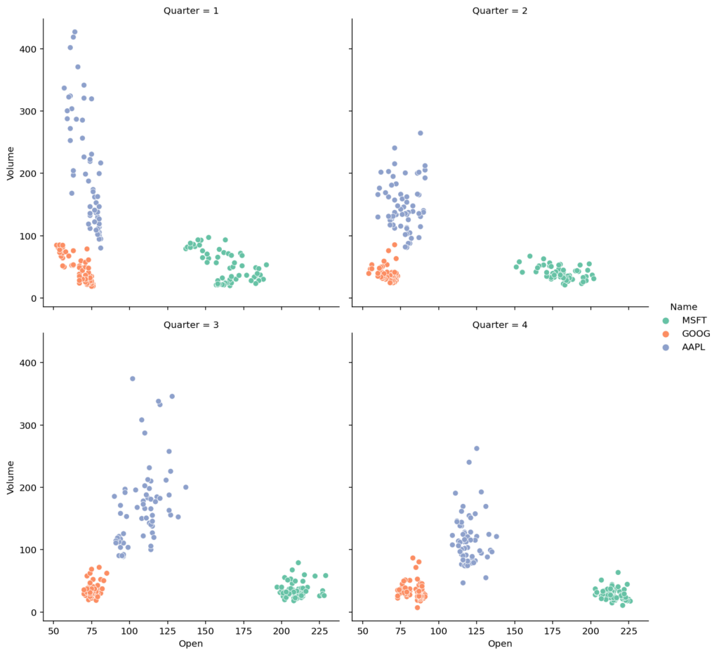
Because of this, we can wrap the columns using the col_wrap= parameter. The parameter accepts an integer representing how many columns we should have before the charts are wrapped down to another row.
Let’s create a column that represents the quarter of the date using Pandas and wrap the small multiples:
# Wrapping Columns in a Seaborn relplot()
import seaborn as sns
import pandas as pd
import matplotlib.pyplot as plt
df = pd.read_csv(
    'https://raw.githubusercontent.com/datagy/data/main/stocks-relplot.csv',
    parse_dates=['Date'])

df['Quarter'] = df['Date'].dt.quarter
sns.relplot(data=df, x='Open', y='Volume', col='Quarter', col_wrap=2, hue='Name', palette='Set2')
plt.show()
This returns the following data visualization, where our small multiples have been wrapped around the second column:
In the following section, you’ll learn how to also add additional rows of visualizations.
Adding Rows to Seaborn Relplot
Seaborn also allows you to pass in rows of small multiples. This works in the same way as adding columns. However, you can also combine the rows= parameter with the col= parameter to create rows and columns of small multiples.
Let’s see what this looks like:
# Creating Rows and Columns of Small Multiples
import seaborn as sns
import pandas as pd
import matplotlib.pyplot as plt
df = pd.read_csv(
    'https://raw.githubusercontent.com/datagy/data/main/stocks-relplot.csv',
    parse_dates=['Date'])

df['Quarter'] = df['Date'].dt.quarter
sns.relplot(data=df, x='Open', y='Volume', row='Quarter', col='Name')
plt.show()
In the code block above, we passed in row='Quarter' and col='Name' to split the small multiples based on both of these columns. This returns the following data visualization:

Let’s now take a look at how we can customize the data visualizations by adding titles and axis labels in our charts.
Changing Titles and Axis Labels in Seaborn Relplot
Adding titles and descriptive axis labels is a great way to make your data visualization more communicative. In many cases, your readers will want to know specifically what a data point and graph represent. Because of this, it’s important to understand how to customize these in Seaborn.
Adding a Title to a Seaborn Relplot
To add a title to a Seaborn relplot(), we can use the fig.suptitle() method available in Matplotlib. In order to do this, we’ll need to first adjust the spacing of our figure object. This process can be a bit heuristic and require some trial and error.
Take a look at the code block below:
# Customizing Titles in a relplot()
import seaborn as sns
import pandas as pd
import matplotlib.pyplot as plt
df = pd.read_csv(
    'https://raw.githubusercontent.com/datagy/data/main/stocks-relplot.csv',
    parse_dates=['Date'])

df['Quarter'] = df['Date'].dt.quarter
df = df[df['Quarter'] < 3]

scatter = sns.relplot(data=df, x='Open', y='Volume', row='Quarter', col='Name')

scatter.fig.subplots_adjust(top=0.92)
scatter.fig.suptitle('Stock Volume vs Open Price', size=15)
plt.show()
In the code block above, we made a number of important changes:
- We filtered the DataFrame to make the visual easier to see
- We assigned the
relplotto a variable,scatter - We then adjusted the top margin using
fig.subplots_adjust() - Then, we passed in a
suptitle()onto the figure object
This returned the following data visualization:

Similarly, we can customize the titles of each of the subplots that we create. Let’s take a look at that next.
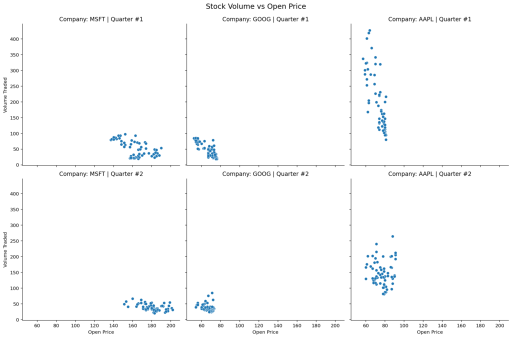
Adding Titles to Rows and Columns in Seaborn Relplot
Seaborn provides incredibly flexible formatting options for styling small multiples created with the col= and row= parameters.
# Customizing Subplot Titles in a relplot()
import seaborn as sns
import pandas as pd
import matplotlib.pyplot as plt
df = pd.read_csv(
    'https://raw.githubusercontent.com/datagy/data/main/stocks-relplot.csv',
    parse_dates=['Date'])

df['Quarter'] = df['Date'].dt.quarter
df = df[df['Quarter'] < 3]

scatter = sns.relplot(data=df, x='Open', y='Volume', row='Quarter', col='Name')
scatter.fig.subplots_adjust(top=0.92)
scatter.fig.suptitle('Stock Volume vs Open Price', size=15)

scatter.set_titles(row_template='Company: {col_name}', col_template="Quarter #{row_name}", size=12)
plt.show()
In the code block above, we used the .set_titles() method which is available to FacetGrid objects. The method allows you to use the row_template= and col_template= parameters which allow you to access the col_name and row_name variables in f-string like formatting.
This returns the data visualization below:

In the following section, you’ll learn how to customize the axis labels in a Seaborn relplot.
Changing Axis Labels in Seaborn Relplot
By default, Seaborn will use the column labels as the axis labels in the visualization. In many cases, however, this isn’t a very descriptive title to use. Because the relplot() function returns a FacetGrid object, we can use helper methods to solve this, including:
.set_xlabel()which sets the x-axis label.set_ylabel()which sets the y-axis label.set_axis_labels()which sets both the x- and y-axis labels at once
Let’s see what this looks like in Seaborn:
# Customizing Axis Labels in a Seaborn relplot
import seaborn as sns
import pandas as pd
import matplotlib.pyplot as plt
df = pd.read_csv(
    'https://raw.githubusercontent.com/datagy/data/main/stocks-relplot.csv',
    parse_dates=['Date'])

df['Quarter'] = df['Date'].dt.quarter
df = df[df['Quarter'] < 3]
scatter = sns.relplot(data=df, x='Open', y='Volume', row='Quarter', col='Name')
scatter.fig.subplots_adjust(top=0.92)
scatter.fig.suptitle('Stock Volume vs Open Price', size=15)
scatter.set_titles(row_template='Company: {col_name}', col_template="Quarter #{row_name}", size=12)

scatter.set_xlabels('Open Price')
scatter.set_ylabels('Volume Traded')
plt.show()
In the code block above, we added two additional lines of code toward the end to customize the axis labels of our data visualization. This returns the following data visualization:
In the section below, you’ll learn how to change the size of a Seaborn relplot.
Changing the Size of a Seaborn Relplot
Because the Seaborn relplot() function returns a FacetGrid object, we can easily modify the size of the figure object that is returned. In order to do this, we can use the two following parameters:
height=which determines the height in inches of each facetaspect=which determines the aspect ratio, so that the width isheight * aspect
Let’s see how we can change the size of a simpler data visualization in Seaborn:
# Changing the Size of a Seaborn Data Visualization
# Change the Size of the Visualization
import seaborn as sns
import pandas as pd
import matplotlib.pyplot as plt

df = pd.read_csv(
   'https://raw.githubusercontent.com/datagy/data/main/stocks-relplot.csv',
    parse_dates=['Date'])
df['Month'] = df['Date'].dt.month
sns.relplot(
    data=df, x='Month', y='Volume', kind='line',
    hue='Name', palette='Set2',
    height=5, aspect=1.6)
plt.show()
In the code block above, we passed in height=5, aspect=1.6. This means that the height of the facet will be 5 inches, while the width will be 8 inches (5 * 1.6). This returns the following data visualization:

It’s incredibly simply to modify the size of your visualization. This can be very useful when dealing with data that are spread horizontally or vertically while reducing whitespace.
Conclusion
In this tutorial, you learned how to use the Seaborn relplot() function to create figure-level relational visualizations. The function allows you to easily create scatterplots and line charts, while providing a familiar and consistent interface.
You first learned how to create simple figure-level objects, then worked through to more complex examples by adding additional detail using color, style, and size. From there, you learned how to create small multiples by adding rows and columns of charts. Finally, you learned how to customize the visualizations by modifying titles, axis labels, and the size of the visual.
Additional Resources
To learn more about related topics, check out the resources below: