In this guide, you’ll learn how to use the Seaborn countplot() function to create informative count plots. A count plot is similar to a bar plot and a histogram and provides counts of categorical values. Seaborn provides a simple and intuitive function to create informative count plots that are simple to produce and easy to understand.
By the end of this tutorial, you’ll have learned the following:
- How to use the Seaborn
countplot()function - How to create simple count plots, grouped count plots, and horizontal count plots
- How to customize count plots by changing sort order, adding value labels, and descriptive titles and axis labels
- How to change and customize colors used in Seaborn count plots
Table of Contents
Understanding the Seaborn countplot() Function
The Seaborn countplot() function provides a familiar API for creating count plots. This allows you to work with either vector data or, as you’re more likely to do, with Pandas DataFrame. The code block below provides an overview of the parameters and default arguments available to you in the sns.countplot() function:
# Understanding the Seaborn countplot() Function
seaborn.countplot(data=None, *, x=None, y=None, hue=None, order=None, hue_order=None, orient=None, color=None, palette=None, saturation=0.75, width=0.8, dodge=True, ax=None, **kwargs)
While we won’t explore all of the parameters listed above, we’ll explore the most important ones, including:
data=,x=, andy=provides the Pandas DataFrame and column labels to use for plotting your datahue=allows you to pass in an additional column to split data using colorcolor=andpalette=allow you to customize the styling of the plotorder=allows you to customize how bars in the count plot are ordered
Let’s now dive into how to create a simple Seaborn count plot and work our way up to customize it to provide more detail.
Creating a Simple Seaborn countplot()
To create a simple Seaborn count plot, you can simply provide the Pandas DataFrame that you want to use as well as the column you want to count values from.
This allows you to pass a DataFrame into the data= parameter and a column label into the x= parameter. By using the x= parameter, data will be plotted along the x-axis for a vertical count plot.
# Creating a Simple Count Plot
import seaborn as sns
import matplotlib.pyplot as plt
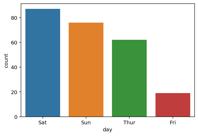
df = sns.load_dataset('tips')
sns.countplot(data=df, x='day')
plt.show()In the code block above, we used the 'tips' dataset available in Seaborn. The dataset provides information on the number of tips provided on different days of the week. By using the Seaborn countplot() function, we were able to create the countplot below.

We can see that Seaborn created a simple count plot for us. By default, Seaborn will use the following settings:
- Items are ordered in the order in which they appear in the dataset
- Each bar gets its own color
- Axis labels use the column labels provided by the DataFrame
Let’s see how we can customize this count plot, first by sorting the order of the bars.
Sorting Seaborn countplot() Bars
By default, Seaborn will sort bars in the count plot using the order in which they appear in the dataset. However, we can customize this order using the order= parameter. The parameter accepts a list of values representing the labels in the dataset.
Let’s take a look at how we can sort values from largest to smallest.
Sorting Bars From Largest to Smallest in a Seaborn Countplot
Seaborn provides a naive way to sort values, by allowing you to pass in a list of labels. This allows you to specify the exact order in which you want to sort the values. However, there’s also a much simpler way – that we’ll get to in just a second.
Say we wanted to order our bars from largest to smallest, we could determine the order ourselves. For example, the code block above has the order specified and hard coded.
# Changing Count Order From Most to Least Frequent
import seaborn as sns
import matplotlib.pyplot as plt

df = sns.load_dataset('tips')
sns.countplot(data=df, x='day', order=['Sat', 'Sun', 'Thur', 'Fri'])
plt.show()
This returns the data visualization below, where bars are sorted from tallest to shortest.
While this method works, it’s not dynamic. This means that if our data changes, that we need to specify a new order. Instead, we can use the Pandas value_counts method to get the order from largest to smallest.
# Changing Count Order From Most to Least Frequent
import seaborn as sns
import matplotlib.pyplot as plt

df = sns.load_dataset('tips')
sns.countplot(data=df, x='day', order=df['day'].value_counts().index)
plt.show()
By using the value_counts() method, we can access the category order by using the .index attribute. This returns a list-like object, where values are sorted from largest to smallest.
Sorting Bars From Smallest to Largest in a Seaborn Countplot
Similar to the example above, we can sort bars from smallest to largest by modifying the sort order in the .value_counts() method. Because we can pass in ascending=True, Pandas will return the order in reverse order.
# Changing Count Order From Least to Most Frequent
import seaborn as sns
import matplotlib.pyplot as plt

df = sns.load_dataset('tips')
sns.countplot(data=df, x='day', order=df['day'].value_counts(ascending=True).index)
plt.show()
By modifying how our values are counted (i.e., to be counted in ascending order, instead), our bars are now sorted from smallest to largest.

In the following section, you’ll learn how to create a grouped count plot in Seaborn.
Create a Grouped Count Plot in Seaborn
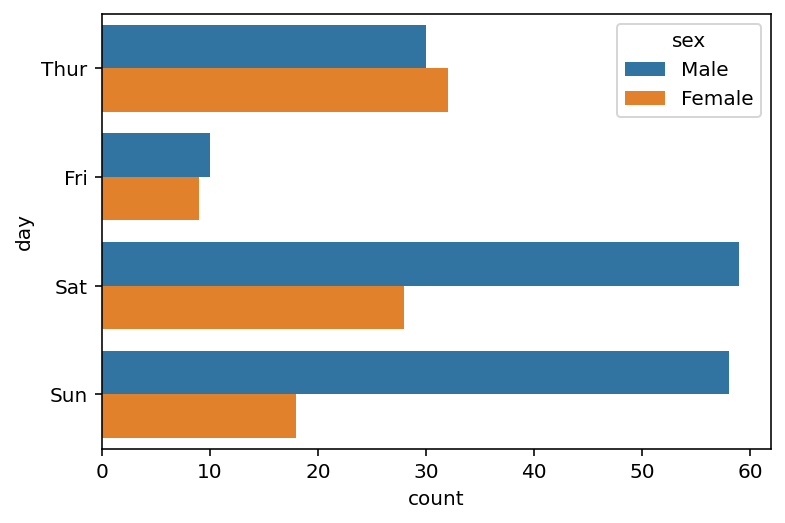
By creating a grouped count plot, you can add an additional dimension of data into the visualization. This allows you to compare one category within another category. To do this in Seaborn, you can use the hue= parameter. The parameter accepts a string column label, adding a split for each subcategory in the dataset.
# Creating Grouped Bars in a Seaborn Countplot
import seaborn as sns
import matplotlib.pyplot as plt

df = sns.load_dataset('tips')
sns.countplot(data=df, x='day', hue='sex')
plt.show()
In the code block above passed in hue='sex', which instructs Seaborn to split each of the day categories by the gender of the staff. Because that column has two unique values, Seaborn splits the bar for each day in two.

By creating this visualization, we can see how the number of transactions varied by day and by gender.
Create a Horizontal Count Plot in Seaborn
So far, we have created vertical count plots. Since we used x=, Seaborn had plotted the data along the x-axis. If we wanted to create a horizontal count plot, we could simply modify the function to use the y= parameter instead.
# Creating a Horizontal Count Plot
import seaborn as sns
import matplotlib.pyplot as plt

df = sns.load_dataset('tips')
sns.countplot(data=df, y='day', hue='sex')
plt.show()
In the code block above, we used the same code but used y= instead of x=. This plotted the categories along the y-axis instead, resulting in a horizontal count plot.
Showing values horizontally can make some data much easier to understand. Similarly, if your data is tall, but doesn’t have many categories, using a horizontal count plot can make the visualization more effective.
Add Values to a Seaborn Count Plot
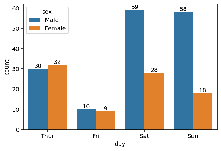
One of the features that appears to be missing from the Seaborn countplot function is the ability to add values to the bars, identifying the frequency of each item. However, because Seaborn is built on top of Matplotlib, we can use the underlying figure and axes objects to customize the graph significantly.
Since version 3.4.0, Matplotlib has made it simple to add values to bar objects. In order to do this, we can use the .bar_label() method to add a numeric label to our bars.
Take a look at the code block below to see how this works:
# Adding Values to Seaborn Count Plots
import seaborn as sns
import matplotlib.pyplot as plt

df = sns.load_dataset('tips')
ax = sns.countplot(data=df, x='day', hue='sex')
for label in ax.containers:
    ax.bar_label(label)
plt.show()
In the code block above, we loop over each label in the ax.containers object and add the label to our axes. This returns the visualization below, where frequencies have been added to the bars.
We only needed to loop over the containers because we’re using multiple containers (as we’re splitting by hue).
In the following sections, you’ll learn how to customize the count plots by changing the color of the bars.
Modify Colors in a Seaborn Count Plot
The simplest way to change the colors in a Seaborn count plot is to use the color= parameter. The parameter allows you to pass in any Matplotlib color, which includes CSS named colors and hex colors. Let’s see how we can change the color of our countplot:
# Modifying Colors in a Seaborn Count Plot
import seaborn as sns
import matplotlib.pyplot as plt

df = sns.load_dataset('tips')
sns.countplot(data=df, x='day', hue='sex', color='aquamarine')
plt.show()
In the code block above, we passed in color='aquamarine', which created the visualization below:
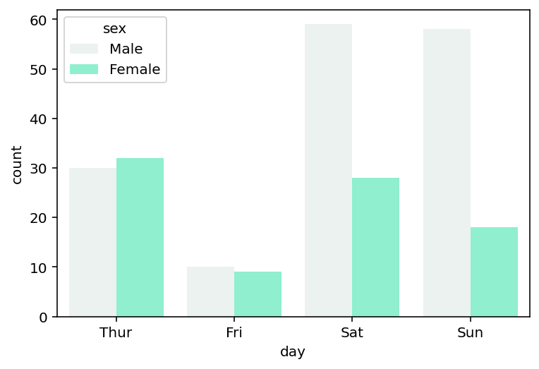
We can see that while we only passed in a single color (and this is the only option in the Seaborn), Seaborn modified the saturation for the different groups.
Change Saturation in a Seaborn Count Plot
By default, Seaborn will use a more muted saturation of 0.75 of the original color. We can modify this saturation by using the saturation= parameter, which accepts an optional float between 0 and 1. Let’s see how our visualization is changed by setting the value to 0.5.
# Changing Saturation in Seaborn Count Plot
import seaborn as sns
import matplotlib.pyplot as plt

df = sns.load_dataset('tips')
sns.countplot(data=df, x='day', hue='sex', color='aquamarine', saturation=0.5)
plt.show()
By lowering the saturation even further, Seaborn returns the visualization below:

In the following section, you’ll learn how to color a bar conditionally.
Color a Bar Conditionally in a Seaborn Count Plot
Because Seaborn uses Matplotlib under the hood, we can use the extensive flexibility of the library to modify the colors or bars conditionally.
In order to color the tallest (or smallest) bar in a Seaborn count plot, we can access the heights for each of the bars. In order to do this, we use the axes patches objects and use a list comprehension to get the height of each bar. We then find the index of the tallest using the NumPy argmax function.
# Coloring a Single Bar Conditionally
import seaborn as sns
import matplotlib.pyplot as plt
import numpy as np

df = sns.load_dataset('tips')
ax = sns.countplot(data=df, x='day', hue='sex', color='aquamarine', saturation=0.5)

# Get the patches and color the tallest
patch_h = [patch.get_height() for patch in ax.patches]
idx_tallest = np.argmax(patch_h)
ax.patches[idx_tallest].set_facecolor('slateblue')

plt.show()
Once we have the index of the tallest bar (as returned by the NumPy argmax() function), we use the .set_facecolor() method to set the color of the tallest bar to 'slateblue'.

In the chart above, we were able to color the tallest bar using a different color. This allows you to easily draw attention to a particular value.
Using a Color Palette in a Seaborn Count Plot
Seaborn also provides a large assortment of color palettes to style your plots in different ways. One of the most intuitive ways to modify the color palette is to use the palette= parameter of the countplot() function.
# Using a Palette in Seaborn Count Plots
import seaborn as sns
import matplotlib.pyplot as plt

df = sns.load_dataset('tips')
sns.countplot(data=df, x='day', hue='sex', palette='Set2')
plt.show()
In the example above, we passed in the palette 'Set2', which returned the visualization below:
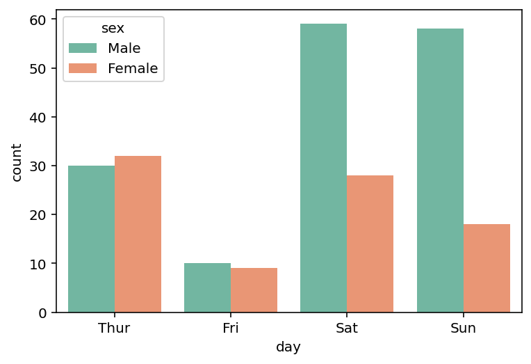
We can see that by shifting away from the default colors, that the visualization is much prettier and nicer to look at.
Add a Title and Axis Labels to a Seaborn Count Plot
By default, Seaborn will use the column label of the category you’re plotting. However, you may want to add a title and modify the axis labels.
This can be done by using axes functions from Matplotlib. In the code block below, we first create an axes object, ax. This allows you to modify the title and axis labels using the axes method.
# Adding a Title and Axis Labels to a Seaborn Count Plot
import seaborn as sns
import matplotlib.pyplot as plt

df = sns.load_dataset('tips')
ax = sns.countplot(data=df, x='day', hue='sex', palette='Set2')
ax.set_title('Number of Customers by Day and Waitstaff')
ax.set_xlabel('Day of Week')
ax.set_ylabel('# of Customers Served')
plt.show()
By adding descriptive titles and axis labels we can better understand the data that is being presented. This is especially true for the y-axis, which previously simply said “count”.

In the final section below, you’ll learn how to modify the legend location in a Seaborn count plot.
Modify Legend Location in a Seaborn Count Plot
Seaborn will try to find the optimal location for the legend based on the data that you’re working with. However, Seaborn also provides significant flexibility to modify the legend position and style.
In the code block below, we use the plt.legend() function to customize where the legend should be placed.
# Changing Legend Location in a Seaborn Count Plot
import seaborn as sns
import matplotlib.pyplot as plt

df = sns.load_dataset('tips')
ax = sns.countplot(data=df, x='day', hue='sex', palette='Set2')
ax.set_title('Number of Customers by Day and Waitstaff')
ax.set_xlabel('Day of Week')
ax.set_ylabel('# of Customers Served')
plt.legend(loc='upper left', bbox_to_anchor=(1, 1))
plt.show()
By placing the legend outside the plot, we can ensure that no data point is covered by the legend, as shown in the visualization below:

Changing the legend location can allow you to create much more styled plots.
Conclusion
In this tutorial, you learned how to use Seaborn to create count plots, using the countplot() function. We started by exploring the function and its most important parameters.
From there, we created a simple countplot and continued to iterate over it by making small improvements. We first learned how to style the plot by changing bar order and adding grouped count plots. From there, you learned how to style the plot with color, including coloring bars conditionally.
From there, you learned how to customize the graph further by adding value labels. You also learned how to customize chart titles, axis labels and the legend position.
Additional Resources
To learn more about related topics, check out the resources below:
- Seaborn catplot – Categorical Data Visualizations in Python
- Seaborn Boxplot – How to Create Box and Whisker Plots
- Seaborn Violin Plots in Python: Complete Guide
- Seaborn barplot() – Create Bar Charts with sns.barplot()
- Seaborn swarmplot: Bee Swarm Plots for Distributions of Categorical Data
- Seaborn stripplot: Jitter Plots for Distributions of Categorical Data
- Seaborn Pointplot: Central Tendency for Categorical Data
- Seaborn countplot – Official Documentation