In this tutorial, you’ll learn how to use the Seaborn pointplot function to create point plots. Point plots provide similar functions as bar plots, but provide more information, such as error bars around a measure of central tendency. That may sound like a lot to take in – don’t worry, this tutorial will make understanding the value of point plots and how to create them simple.
By the end of this tutorial, you’ll have learned the following:
- What a point plot is and why you would want to use one
- How to use the
sns.pointplot()function - How to create and customize point plots with Seaborn
Table of Contents
Understanding Point Plots
Before diving into how to create point plots in Seaborn, let’s first explore what point plots are. Because point plots are relatively uncommon, they can be a bit confusing at first glance. In essence, point plots aggregate a continuous variable (our y-axis) by a categorical variable (x-axis).
This makes them quite similar to bar plots. However, they also provide error bars to show different measures, such as confidence intervals. Similarly, they use lines between the measures (though they are different from line charts!). This makes it easier to see differences between the categories.
Take a look at the image below, which breaks down the aspects of a point plot:

Now that you have a good understanding of what point plots are and why you’d want to use them, let’s dive into how the sns.pointplot() function works.
Understanding the Seaborn pointplot Function
Before diving into creating our own point plots in Seaborn, let’s take a look at the function that lets you do this. Seaborn comes with a built-in function, sns.pointplot() that can be used to generate point plots. Take a look at the code block below to see how the function is written:
# Understanding the Seaborn pointplot() Function
seaborn.pointplot(data=None, *, x=None, y=None, hue=None, order=None, hue_order=None, estimator='mean', errorbar=('ci', 95), n_boot=1000, units=None, seed=None, markers='o', linestyles='-', dodge=False, join=True, scale=1, orient=None, color=None, palette=None, errwidth=None, ci='deprecated', capsize=None, label=None, ax=None)
We can see from the code block above that the function offers a lot of different parameters. These parameters provide significant flexibility in how your plots are created.
While we won’t cover all of the parameters, this tutorial will teach you about the most important ones that allow you to generate informative and good-looking plots.
Creating a Simple Point Plot with Seaborn
Let’s start this tutorial by creating a very simple point plot in Seaborn. We can do this by using only three parameters in the sns.pointplot() function:
data=specifies the pandas DataFrame we want to usex=represents the categorical column label we want to use. Even if we pass in a continuous variable, Seaborn will interpret this as categorical.y=represents the column that we want to aggregate data for
Let’s see how we can use what you just learned to create our first point plot:
# Creating a Simple Point Plot with Seaborn
import seaborn as sns
import matplotlib.pyplot as plt
df = sns.load_dataset('tips')

sns.pointplot(data=df, x='day', y='tip')
plt.show()
In the code block above, we imported by Seaborn and pyplot. Then, we used the sns.load_dataset() function to load the 'tips' dataset. Finally, we created a point plot using the sns.pointplot() function, which returned the image below:
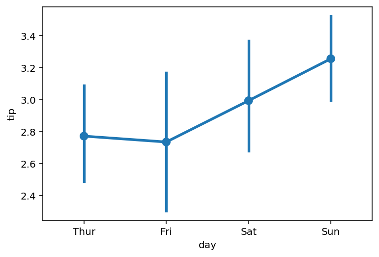
The graph, by default, shows us the following information:
- The average tip amount, broken out by day (represented by the points of the graph)
- The relative change between days (represented by lines connecting the dots)
- The 95% confidence interval based on bootlegged results (represented by the vertical lines intersecting with the points)
This graph, by itself, shows us a large amount of information! But we don’t have to stop there. We can use the many parameters that the function offers us to customize this further. Let’s see how we can add an additional categorical variable to our graph using the hue= parameter in the next section.
Adding Color for Additional Variables with Seaborn pointplot
A great way to add more detail to a Seaborn point plot is to add another variable to the visualization using the hue= parameter. The parameter allows you to split your categorical variable into additional groups, splitting the variable into relevant groups.
Let’s see how we can add another dimension to our plot by splitting the data again using the 'sex' column. This way, we can analyze how the average tip varied, not only by day but also by the sex of the wait staff.
# Adding Additional Variables with Color to Seaborn Point Plots
import seaborn as sns
import matplotlib.pyplot as plt
df = sns.load_dataset('tips')

sns.pointplot(data=df, x='day', y='tip', hue='sex')
plt.show()
In the code block above, we modified our original code by adding hue='sex'. Because we’re using a Pandas DataFrame as our data= argument, we can simply pass in column labels.
This splits each of our day’s data into the number of categories that exist in that column. In this case, it created a split for Male and Female. Take a look at how this changed the visualization below:
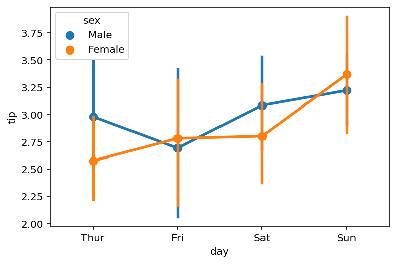
Right now, this visualization is quite hard to actually look at. Because our lines are overlapping, we actually lose quite a bit of detail. Let’s fix that in the next section.
Preventing Overlap in Seaborn Point Plots
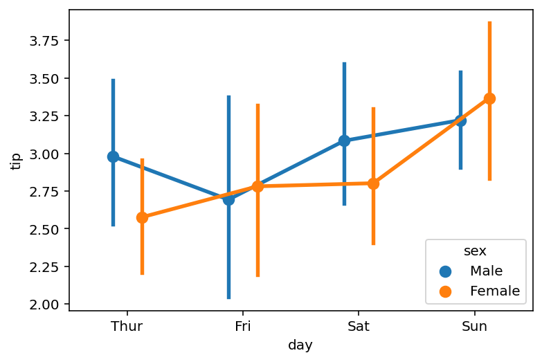
We can print lines from overlapping in Seaborn point plots by using the dodge= parameter. By default, this is set to False. By changing it to True, Seaborn will separate the lines.
# Doing Lines in Seaborn Point Plots
import seaborn as sns
import matplotlib.pyplot as plt
df = sns.load_dataset('tips')

sns.pointplot(data=df, x='day', y='tip', hue='sex', dodge=True)
plt.show()
By passing in dodge=True, we return the following image, where our point plot lines have been separated slightly.

The dodge= parameter doesn’t just accept a boolean value, however. We can customize the output further by passing in a float. Take a look at the code block below, where we do just that.
# Specifying the Dodge in Seaborn Point Plots
import seaborn as sns
import matplotlib.pyplot as plt
df = sns.load_dataset('tips')

sns.pointplot(data=df, x='day', y='tip', hue='sex', dodge=0.25)
plt.show()
In the code block above, we added the value of 0.25 to the dodge= parameter. This dodges the lines by 0.25 of the width of the category.
This process can be a bit heuristic. As your hue= parameter adds more splits, you may need to play around with this value to ensure it presents how you want the data to display.
In the following section, you’ll learn how to modify the estimator that Seaborn uses in creating point plots.
Modifying Estimator Calculation in Seaborn Point Plots
By default, the Seaborn pointplot() function will aggregate variables to their mean. However, we can customize the way in which data are aggregated, using the estimator= parameter. The parameter accepts either a string representing a statistical function (such as 'std' for standard deviation) or a callable that maps a vector.
Let’s see how we can ask Seaborn to show the standard deviation for each category, rather than the mean.
# Modifying Estimator Calculations in Seaborn Point Plots
import seaborn as sns
import matplotlib.pyplot as plt
df = sns.load_dataset('tips')

sns.pointplot(data=df, x='day', y='tip', hue='sex', dodge=0.25, estimator='std')
plt.show()
In order to modify the estimator, we only need to pass a string (or callable) into the estimator= parameter. By passing in 'std', we aggregated data to show the standard deviation for each day and gender.

We can take our visualization even further by adding in caps to our error bars. Let’s take a look at that in the following section.
Adding Caps to Error Bar in Seaborn Point Plots
Adding caps to our error bars can be a helpful way to make the ranges of the error clearer. Seaborn lets you do this by using the capsize= parameter, which accepts a float as its input. Similar to before, this represents the fractional representation of the width of our category.
# Modifying Cap Sizes in Seaborn Point Plots
import seaborn as sns
import matplotlib.pyplot as plt
df = sns.load_dataset('tips')

sns.pointplot(data=df, x='day', y='tip', hue='sex', dodge=0.25, capsize=0.25)
plt.show()
In the code block above, we passed in the value of 0.25, which created an error bar cap that is one quarter the width of the category. Take a look at the image below to see what this returns:

Now that we’ve learned how to add caps to our error bars, let’s take a look at modifying the calculation that the error bar uses.
Modifying Error Bar Calculation in Seaborn Point Plots
By default, Seaborn creates an error bar based on a calculated 95% confidence interval. Seaborn will bootstrap the result (meaning that it samples points with replacement) a set number of times (1000, by default). However, we can modify this by using a different error bar calculation.
Seaborn accepts the following error bar calculations: 'ci', 'pi', 'se', or 'sd', which represent the following calculations:
'ci': confidence interval, which calculates the non-parametric uncertainty'pi': percentile interval, which calculates the non-parametric spread'se': standard error, which calculates the parametric uncertainty'sd': standard deviation, which calculates the parametric spread
Let’s see what happens when we pass in 'sd' to calculate the standard deviation:
# Modifying Error Bar Calculations in Seaborn Point Plots
import seaborn as sns
import matplotlib.pyplot as plt
df = sns.load_dataset('tips')

sns.pointplot(data=df, x='day', y='tip', hue='sex', dodge=0.25, capsize=0.25, errorbar='sd')
plt.show()
By modifying the errorbar= parameter, we return the following visualization. The graph now shows the standard deviation for each category.

We can also remove error bars entirely – let’s see what this looks like in the following section.
Removing Error Bars in Seaborn Point Plots
The point plot can be a difficult plot for non-technical readers to understand. This is especially amplified by the inclusion of error bars, which add another layer of complexity (as well as useful data).
We can remove the error bars from a Seaborn point plot by passing in errorbar=None. This removes the bars completely.
# Removing Error Bars in Seaborn Point Plots
import seaborn as sns
import matplotlib.pyplot as plt
df = sns.load_dataset('tips')

sns.pointplot(data=df, x='day', y='tip', hue='sex', dodge=0.25, capsize=0.25, errorbar=None)
plt.show()
By passing None into the errorbar= parameter, we return the following image. We need to be mindful of the fact that this now looks like a line plot. This may actually confuse readers of your plot even further.

In the visualization above, we removed the error bars from our visualization completely. Let’s keep customizing our visualization, first by adding a title.
Adding a Title to a Seaborn Point Plot
We can easily add a title to our Seaborn point plot by using the .set_title() method. The method is applied directly to the axes object. This means that we can simply chain the method onto the sns.pointplot() function. Let’s see what this looks like:
# Adding a Title to a Seaborn Point Plot
import seaborn as sns
import matplotlib.pyplot as plt
df = sns.load_dataset('tips')

sns.pointplot(data=df, x='day', y='tip', hue='sex', dodge=0.25, capsize=0.25).set_title('Average Tip by Day and Sex')
plt.show()
In the code block above, we chained the .set_title() method to the point plot axes object. By passing in a string, we were able to add a title to our visualization, as shown below:

We can also customize the axis labels of our point plot. Let’s take a look at what this looks like in the following section.
Modifying Axis Labels in Seaborn Point Plots
Seaborn provides useful methods for modifying titles and labels. In the previous section, we added a title to our graph. Let’s now customize the axis labels.
By default, Seaborn will use the labels of the column as its axis labels. We can modify this using similar methods as you learned above.
In the previous section, we chained the .set_title() method to our function call. This was possible because the sns.pointplot() function returns an axes object. However, we can’t keep chaining the methods because of what the .set_title() method returns.
Because of this, we first need to create an axes object and add multiple method calls to modify our axis labels.
# Modifying Axis Labels in Seaborn Point Plots
import seaborn as sns
import matplotlib.pyplot as plt
df = sns.load_dataset('tips')

ax = sns.pointplot(data=df, x='day', y='tip', hue='sex', dodge=0.25, capsize=0.25)
ax.set_title('Average Tip by Day and Sex')
ax.set_xlabel('Day of Week')
ax.set_ylabel('Tip Amount ($)')
plt.show()
In the code block above, we first created ax, which represents the axes object. We then used the .set_xlabel() method to set the label for the x-axis and the .set_ylabel() method to set the label for the y-axis.
This returned the following visualization:

We can see that we were able to add custom labels to our point plot.
Using a Palette with Seaborn Point Plots
In this final section, we’ll explore how to customize the plot we create using a built-in palette. Seaborn provides significant flexibility in terms of how to style your plot. However, you can make it easy by using a built-in palette.
Let’s see how we can pass in the 'Set2' palette into our point plot function:
# Using a Palette in Seaborn Point Plots
import seaborn as sns
import matplotlib.pyplot as plt
df = sns.load_dataset('tips')

ax = sns.pointplot(data=df, x='day', y='tip', hue='sex', dodge=0.25, capsize=0.25, palette='Set2')
ax.set_title('Average Tip by Day and Sex')
ax.set_xlabel('Day of Week')
ax.set_ylabel('Tip Amount ($)')
plt.show()
By passing in a palette using the palette= parameter, we can easily style our plot, as shown below:

Seaborn provides many helpful palettes to make styling your graphs easy and intuitive. Keep track of your favourite ones to make this an easy process.
Conclusion
In this guide, you learned how to create point plots in Seaborn using the sns.pointplot() function. You first learned what point plots are and when they’re useful. Then, you learned about the different parameters in the function.
From there, you built point plots of increasing complexity. First by adding additional detail using color, then by customizing the estimator and error bar calculations available in the plot. You also learned how to customize the plot by adding a title, axis labels, and modifying the palette of the plot.
Additional Resources
To learn more about related topics, check out the resources below:
- Seaborn catplot – Categorical Data Visualizations in Python
- Seaborn Boxplot – How to Create Box and Whisker Plots
- Seaborn Violin Plots in Python: Complete Guide
- Seaborn barplot() – Create Bar Charts with sns.barplot()
- Seaborn Countplot – Counting Categorical Data in Python
- Seaborn swarmplot: Bee Swarm Plots for Distributions of Categorical Data
- Seaborn stripplot: Jitter Plots for Distributions of Categorical Data
- Seaborn Pointplot: Central Tendency for Categorical Data
- Seaborn pointplot: Official Documentation