In this tutorial, you’ll learn how to use Seaborn to create a boxplot (or a box and whisker plot). Boxplots are important plots that allow you to easily understand the distribution of your data in a meaningful way. Boxplots allow you to understand the attributes of a dataset, including its range and distribution.
By the end of this tutorial, you’ll have learned:
- What boxplots are and how they can be interpreted
- How to create a basic boxplot in Seaborn
- How to add multiple columns and rows to a boxplot
- How to style a boxplot in Seaborn
- How to order and rotate your Seaborn boxplot
Check out the sections below If you’re interested in something specific. If you want to learn more about Seaborn, check out my other Seaborn tutorials, like the bar chart tutorial or line chart tutorial.
Table of Contents
What is a boxplot?
Boxplots are helpful charts that clearly illustrate the distribution in a dataset, by visualizing the range, distribution, and extreme values. A boxplot is a helpful data visualization that illustrates five different summary statistics for your data. It helps you understand the data in a much clearer way than just seeing a single summary statistic.
Specifically, boxplots show a five-number summary that includes:
- the minimum,
- the first quartile (25th percentile),
- the median,
- the third quartile (75th percentile),
- the maximum
Additionally, boxplots will identify any outliers that exist in the data. Outliers are generally classified as being outside 1.5 times the interquartile range.
This post is part of the Seaborn learning path! The learning path will take you from a beginner in Seaborn to creating beautiful, customized visualizations. Check it out now!
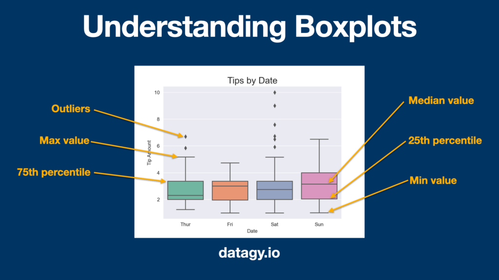
The median line can be very descriptive as well. If the line is higher in the interquartile range (the box), the data is said to be negatively skewed. Inversely, if the median line is lower in the box, the data is said to be positively skewed.
Understanding the Seaborn Boxplot Function
Before diving into creating boxplots with Seaborn, let’s take a look at the function itself and the different parameters that it offers. This can be an important first step that allows you to better understand what can be done with the function and how you can customize your code:
# Understanding the sns.boxplot() Function
import seaborn as sns

sns.boxplot(x=None, y=None, hue=None, data=None, order=None, hue_order=None, orient=None, color=None, palette=None, saturation=0.75, width=0.8, dodge=True, fliersize=5, linewidth=None, whis=1.5, ax=None)
Let’s break down what each of these parameters does:
x=Nonerepresents the data to use for the x-axisy=Nonerepresents the data to use for the y-axishue=Nonerepresents the data to use to break your data by breakdata=Nonerepresents the DataFrame to use for your dataorder=Nonerepresents how to order your datahue_order=Nonesimilar toorder, represents how to order your dataorient=Noneindicates whether data should be horizontal or verticalcolor=Nonerepresents the color(s) to usepalette=Nonerepresents the pallette to usesaturation=0.75represents the saturation of the colorwidth=0.8represents the width of an elementdodge=Truerepresents when hue nesting is used, how to shift categorical datafliersize=5represents the size of the markers for outlierslinewidth=Nonerepresents the width of the lines in the graphwhis=1.5represents the proportion of the interquartile range to extend the plot whiskersax=Nonerepresents the axes object to draw on
Loading a Sample Dataset
To follow along with this tutorial, let’s load a sample dataset that we can use throughout this tutorial. Seaborn comes with a number of built-in datasets, including a valuable tips dataset that shows tips given to restaurant workers.
Let’s load the dataset using the Seaborn load_dataset() function and take a quick look at it:
# Loading a Sample Dataset
import seaborn as sns
import pandas as pd
import matplotlib.pyplot as plt

df = sns.load_dataset('tips')
print(df.head())

# Returns:
#    total_bill   tip     sex smoker  day    time  size
# 0       16.99  1.01  Female     No  Sun  Dinner     2
# 1       10.34  1.66    Male     No  Sun  Dinner     3
# 2       21.01  3.50    Male     No  Sun  Dinner     3
# 3       23.68  3.31    Male     No  Sun  Dinner     2
# 4       24.59  3.61  Female     No  Sun  Dinner     4
Now that we have a dataset loaded, let’s dive into how to use Seaborn to create a boxplot.
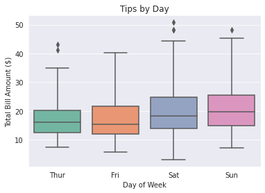
How to Create a Boxplot in Seaborn
Creating a boxplot in Seaborn is made easy by using the sns.boxplot() function. Let’s start by creating a boxplot that breaks the data out by day column on the x-axis and shows the total_bill column on the y-axis. Let’s see how we’d do this in Python:
# Creating our first boxplot
sns.boxplot(data=df, x='day', y='total_bill')
plt.show()
This returns the following image:
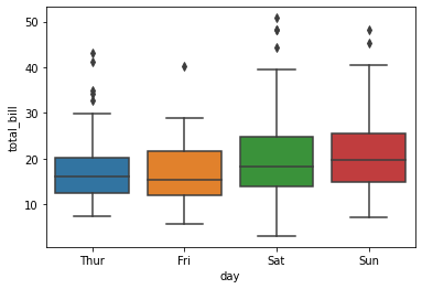
sns.boxplot() functionWe can see that by using just two lines of code, we were able to create and display a boxplot! Because Seaborn is designed to handle Pandas DataFrames easily, we can simply refer to the column names directly, as long as we pass the DataFrame into the data parameter.
By default, the styling of a Seaborn boxplot is a little uninspiring. In the following section, you’ll learn how to modify the styling of your plot.
Styling a Seaborn boxplot
Seaborn makes it easy to apply a style and a color palette to our visualizations. This can be done using the set_style() and set_palette() functions, respectively.
Let’s learn how we can apply some style and a different color palette to the Seaborn boxplot. Let’s apply the 'darkgrid' style and the 'Set2' palette to our visualization:
# Styling our Seaborn boxplot
import seaborn as sns
import pandas as pd
import matplotlib.pyplot as plt

df = sns.load_dataset('tips')

sns.set_style('darkgrid')
sns.set_palette('Set2')

sns.boxplot(data=df, x='day', y='total_bill')
plt.show()
This returns a much nicer-looking visualization, as shown below:
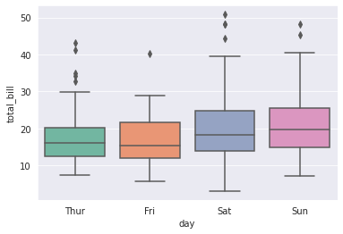
Let’s break down exactly what we did in our code:
- We used the
sns.set_style()function to apply the'darkgrid'style - We then applied the
'Set2'palette to apply a muted color-scheme to our visualizations.
Both of these changes were made globally, meaning that any subsequent visualizations would have these changes applied as well.
In the following section, you’ll learn how to add titles and modify axis labels in a Seaborn boxplot.
Adding titles and axis labels to Seaborn boxplots
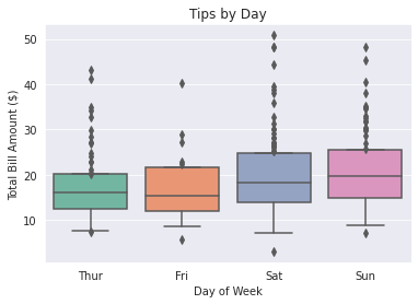
In this section, you’ll learn how to add a title and descriptive axis labels to your Seaborn boxplot. By default, Seaborn will attempt to infer the axis titles by using the column names. This may not always be what you want, especially when you want to add something like unit labels.
Because Seaborn is built on top of Matplotlib, you can use the pyplot module to add titles and axis labels. S
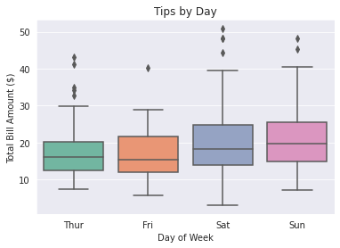
We can also use Matplotlib to add some descriptive titles and axis labels to our plot to help guide the interpretation of the data even further. Let’s now add a descriptive title and some axis labels that aren’t based on the dataset.
# Adding a Title to a Seaborn Boxplot
import seaborn as sns
import pandas as pd
import matplotlib.pyplot as plt

df = sns.load_dataset('tips')

sns.set_style('darkgrid')
sns.set_palette('Set2')

sns.boxplot(data=df, x='day', y='total_bill')

plt.title('Tips by Day')
plt.xlabel('Day of Week')
plt.ylabel('Total Bill Amount ($)')

plt.show()
This returns our chart, with a helpful title and some axis labels added. Matplotlib gives you a lot of control over how you add titles and axis labels.
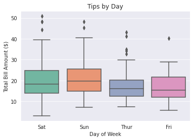
How to Change the Order of Seaborn Boxplots
The Seaborn boxplot() function gives you significant control over how you order items in the plot. Because Seaborn will, by default, try to order items numerically or alphabetically, you may end up with unexpected results.
In our earlier example, There may be times when you want to sort your data in different ways. Currently, Seaborn is inferring the order us, but we can also specify a particular order.
To do this, we use the order= parameter. For example, if we wanted to place the weekend days first, we could write:
import seaborn as sns
import pandas as pd
import matplotlib.pyplot as plt

df = sns.load_dataset('tips')

sns.set_style('darkgrid')
sns.set_palette('Set2')

sns.boxplot(data=df, x='day', y='total_bill', order=['Sat', 'Sun', 'Thur', 'Fri'])

plt.title('Tips by Day')
plt.xlabel('Day of Week')
plt.ylabel('Total Bill Amount ($)')

plt.show()
In the code above, we passed in a list of items to the order= parameter. This allowed us to override the default behavior to define a custom sorting order. This returns our updated boxplot:
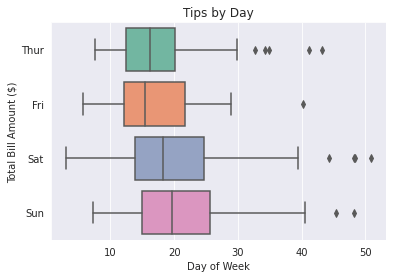
How to Rotate a Seaborn Boxplot
In some cases, your data will be easier to understand if it is in a horizontal format. This can be particularly true when you’re dealing with a large number of variables and want to be able to easily scan down the data.
By default, Seaborn will infer the orientation of your boxplot based on the data that exists in the dataset. Seaborn provides two different methods to do this. If both your variables are numerical (or if you’re using a wide-dataset) you can specify orient='h' to display your data in a horizontal format.
Alternatively, if you’re not plotting two numerical variables, you can simply flip the x= and y= parameters. Let’s see how we can do this in Python:
# Rotating the Values of a Seaborn Boxplot
import seaborn as sns
import pandas as pd
import matplotlib.pyplot as plt

df = sns.load_dataset('tips')

sns.set_style('darkgrid')
sns.set_palette('Set2')

sns.boxplot(data=df, y='day', x='total_bill')

plt.title('Tips by Day')
plt.xlabel('Day of Week')
plt.ylabel('Total Bill Amount ($)')

plt.show()
This returns the following boxplot:
In the following section, you’ll learn how to change the whisker length in a boxplot.
Changing Whisker Length in Seaborn Boxplot
By default, Seaborn boxplots will use a whisker length of 1.5. What this means, is that values that sit outside of 1.5 times the interquartile range (in either a positive or negative direction) from the lower and upper bounds of the box.
Seaborn provides two different methods for changing the whisker length:
- Changing the proportion which determine outliers, and
- Setting upper and lower percentile bounds to capture data
Setting Interquartile Range Proportion in Seaborn Boxplots
Say we wanted to include data points that exist within the range of two times the interquartile range, we can specify the whis= parameter.
Let’s try this in Python:
# Changing the Whisker Length in Seaborn
import seaborn as sns
import pandas as pd
import matplotlib.pyplot as plt

df = sns.load_dataset('tips')

sns.set_style('darkgrid')
sns.set_palette('Set2')

sns.boxplot(data=df, x='day', y='total_bill', whis=2)

plt.title('Tips by Day')
plt.xlabel('Day of Week')
plt.ylabel('Total Bill Amount ($)')

plt.show()
This returns the following boxplot:
In the code sample above, we increased the range of the whiskers to include values that fall within 2 times the interquartile range.
In the following section, you’ll learn how to set percentile limits on Seaborn boxplot whiskers.
Setting Percentile Limits on Seaborn Boxplot Whiskers
There may be times when you want to set upper and lower limits on the percentages of data points to include.
For example, if you wanted to include everything except for the bottom and top 5% of your data within the box and whiskers, you could write:
# Setting Percentile Limits on Seaborn Boxplot Whiskers
import seaborn as sns
import pandas as pd
import matplotlib.pyplot as plt

df = sns.load_dataset('tips')

sns.set_style('darkgrid')
sns.set_palette('Set2')

sns.boxplot(data=df, x='day', y='total_bill', whis=[0.05, 0.95])

plt.title('Tips by Day')
plt.xlabel('Day of Week')
plt.ylabel('Total Bill Amount ($)')

plt.show()
This returns the following boxplot:
How to Create a Grouped Seaborn Boxplot
Seaborn makes it easy to add another dimension to our boxplots, using the hue= parameter. In the example we have been using, it may be helpful to split the data also by gender to see how the data differs based on different genders.
We can do this, similar to other Seaborn plots, using the hue= parameter. Let’s add this to our plot to see how this changes the plot:
# Creating a Grouped Seaborn Boxplot
import seaborn as sns
import pandas as pd
import matplotlib.pyplot as plt

df = sns.load_dataset('tips')

sns.set_style('darkgrid')
sns.set_palette('Set2')

sns.boxplot(data=df, x='day', y='total_bill', hue='sex')

plt.title('Tips by Day')
plt.xlabel('Day of Week')
plt.ylabel('Total Bill Amount ($)')

plt.show()
This returns the following image:
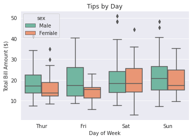
This allows us to see how the spread of data differs, not only by the day of the week but also by gender.
Conclusion
In this post, you learned what a boxplot is and how to create a boxplot in Seaborn. Specially, you learned how to customize the plot using styles and palettes, adding a title and axis labels to the chart, as well as modifying different data elements within the chart. Finally, you learned how to plot a second dimension to create a grouped boxplot.
To learn more about related topics, check out the tutorials below:
- Seaborn catplot – Categorical Data Visualizations in Python
- Seaborn Violin Plots in Python: Complete Guide
- Seaborn barplot() – Create Bar Charts with sns.barplot()
- Seaborn Countplot – Counting Categorical Data in Python
- Seaborn swarmplot: Bee Swarm Plots for Distributions of Categorical Data
- Seaborn Pointplot: Central Tendency for Categorical Data
- Seaborn stripplot: Jitter Plots for Distributions of Categorical Data
Pingback: Seaborn in Python for Data Visualization • The Ultimate Guide • datagy