
Principal Component Analysis (PCA) is a cornerstone technique in data analysis, machine learning, and artificial intelligence, offering a systematic approach to handle high-dimensional datasets by reducing complexity. By distilling data into uncorrelated dimensions called principal components, PCA retains essential information while mitigating dimensionality effects. With diverse applications including dimensionality reduction, feature selection, data compression, and exploration, PCA plays a pivotal role in extracting meaningful insights from large datasets.
By the end of this tutorial, you’ll have learned the following:
- What Principal Component Analysis (PCA) is an why it matters
- How Principal Component Analysis works
- How to conduct PCA in Sklearn
- How to visualize principal components and better understand your data
Table of Contents
Understanding Principal Component Analysis
Principal Component Analysis (or PCA for short) is a technique used in data analysis, machine learning, and artificial intelligence, for reducing the dimensionality of datasets while retaining important information.
PCA works by transforming higher-dimensionality data into new, uncorrelated dimensions called principal components. It has many widespread applications, including:
- Dimensionality Reduction: PCA extracts the essential information from data, while allowing you to remove the less relevant information
- Feature Selection: in PCA, the components are ranked by the variance in data that is explained by each of them; this allows you to remove less relevant components
- Data Compression: because PCA can reduce the dimensionality of your data by finding the most variable information, it can be used to compress data, including images
- Data Exploration: PCA can help you find new patterns and insights in your data through visual means that wouldn’t have been possible using higher dimensions
How Does Principal Component Analysis Work?
There are quite a few inner workings to Principal Component Analysis. In this section, we’ll break down how PCA works in plain terms, allowing you to build your intuition.
Understanding how Principal Component Analysis Works
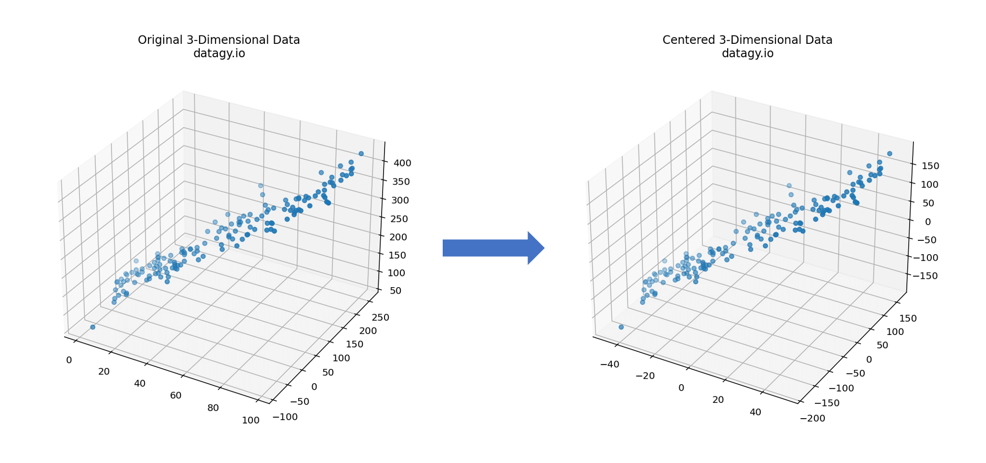
- Centring Data
PCA begins by entering data, which involves subtracting the mean of each feature from the data points. This ensures that the mean of each feature becomes zero, allowing us to later more easily identify the directions of maximum variance. (Note, it’s often a good idea to scale your data as well!)
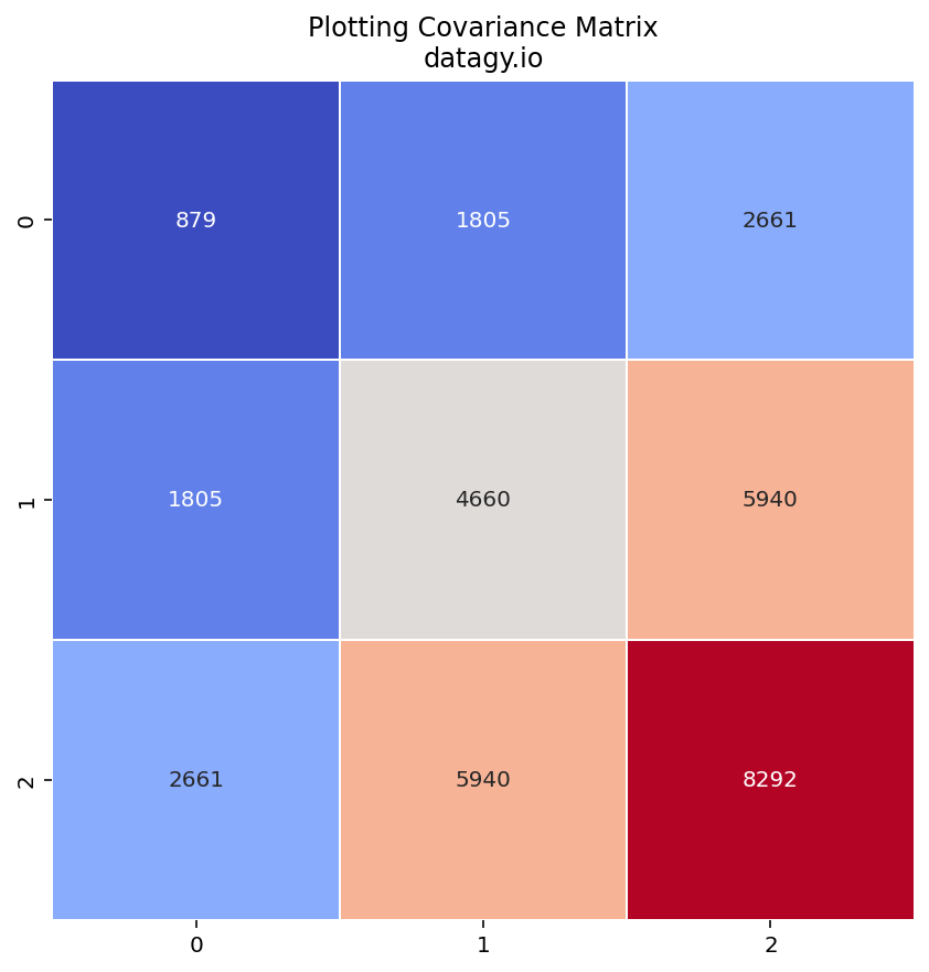
- Calculating a Covariance Matrix
The covariance matrix describes the relationships between different features and how they change together.
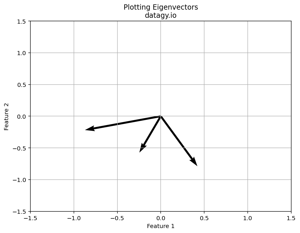
- Eigenvalue Decomposition
Next, we perform eigenvalue decomposition on the covariance matrix, which yields eigenvectors and eigenvalues. Eigenvectors are used to represent the directions (the principal components) of maximum variance of the data. The eigenvalues represent the amount of variance explained by each principal component.

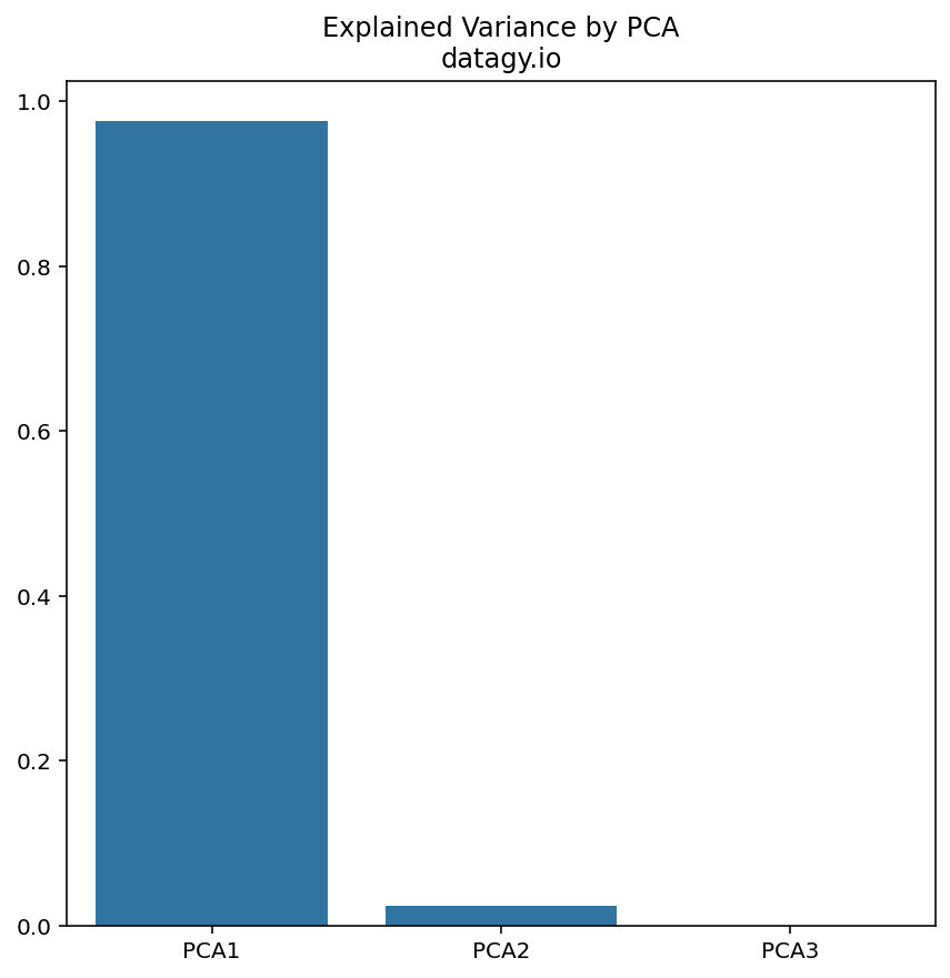
- Selecting Principal Components
Next, we sort the eigenvectors based on their corresponding eigenvalues in decreasing order. We choose the top n eigenvectors that represent the highest eigenvalues to capture most of the variance in the dataset.

- Projection of Data
We then project the original data onto the subspace spanned by the selected principal components. To do this, we multiply the centred data matrix by the matrix of principal components. The resulting transformed data has reduced dimensionality, where each data point is represented by the PCs.

In the next section, you’ll learn how to use Scikit-Learn to reduce the dimensionality of your data using PCA! Let’s get started.
Principal Component Analysis in Sklearn
In Python, we can abstract away many of the complexities of Principal Component Analysis using sklearn. The popular machine-learning library provides many helpful algorithms for supervised and unsupervised learning, as well as decomposing your datasets.
In order to conduct PCA in sklearn, we can make use of the PCA() class. The class allows you to conduct and explore PCA of your dataset to find the optimal number of components.
This will make more sense as we walk through an example. We’ll use a dataset covering decathlon data from the 1988 Olympics. Each athlete in the dataset competed in ten different events:
- Running: 100m, 100m hurdles, 400m, and 1500m
- Jumping: long jump, high jump, and pole vault
- Throwing: javelin, discus, and shot put
You can find the dataset here, if you want to follow along.
Scaling Data for PCA
We can load the data into a Pandas DataFrame to simplify viewing our data. Let’s see how we can do this using the read_csv function:
# Reading Our Dataset into a DataFrame
df = pd.read_csv('https://raw.githubusercontent.com/nik-pi/Datasets/main/decathlon.csv', index_col='Athlete')
print(df.head())

# Returns:
#           100m  110m Hurdle   400m  1500m  Pole Vault  Long Jump  High Jump  \
# Athlete
# SEBRLE   11.04        14.69  49.81  291.7        5.02       7.58       2.07
# CLAY     10.76        14.05  49.37  301.5        4.92       7.40       1.86
# KARPOV   11.02        14.09  48.37  300.2        4.92       7.30       2.04
# BERNARD  11.02        14.99  48.93  280.1        5.32       7.23       1.92
# YURKOV   11.34        15.31  50.42  276.4        4.72       7.09       2.10
I have included a truncated version of the data in the code block above. One thing you’ll notice right away is that the scales of our data are quite different. We can verify this by using the .describe() method to get high-level statistics of our dataset:
# Getting Descriptive Statistics for Our Data
print(df.describe())

# Returns:
#             100m  110m Hurdle       400m       1500m  Pole Vault  Long Jump  \
# count  41.000000    41.000000  41.000000   41.000000   41.000000  41.000000
# mean   10.998049    14.605854  49.616341  279.024878    4.762439   7.260000
# std     0.263023     0.471789   1.153451   11.673247    0.278000   0.316402
# min    10.440000    13.970000  46.810000  262.100000    4.200000   6.610000
# 25%    10.850000    14.210000  48.930000  271.020000    4.500000   7.030000
# 50%    10.980000    14.480000  49.400000  278.050000    4.800000   7.300000
# 75%    11.140000    14.980000  50.300000  285.100000    4.920000   7.480000
# max    11.640000    15.670000  53.200000  317.000000    5.400000   7.960000

#        High Jump    Javelin   Shot Put     Discus
# count  41.000000  41.000000  41.000000  41.000000
# mean    1.976829  58.316585  14.477073  44.325610
# std     0.088951   4.826820   0.824428   3.377845
# min     1.850000  50.310000  12.680000  37.920000
# 25%     1.920000  55.270000  13.880000  41.900000
# 50%     1.950000  58.360000  14.570000  44.410000
# 75%     2.040000  60.890000  14.970000  46.070000
# max     2.150000  70.520000  16.360000  51.650000
We can see that across different events, our values range from being clustered around 1 (say for High Jump) to being clustered around 270 (say for 1500m). Thankfully, we don’t have any missing data, but if you did, you could explore different ways of dealing with missing data.
It’s a good idea to scale our data so that it doesn’t inadvertently throw off our analysis. Thankfully, we can use sklearn’s StandardScaler class to do this! Let’s take a look at how we can do this:
# Scaling Our Dataset
from sklearn.preprocessing import StandardScaler
scaler = StandardScaler()
scaled_data = scaler.fit_transform(df)

print(scaled_data[0])

# Returns:
# [ 0.16147779  0.18057156  0.16998066  1.09931561  0.93798841  1.02393687
#   1.06045671  1.022196    0.43340505 -0.17252435]
In the code above, we first imported the StandardScaler class from the preprocessing module. We then instantiated the class into the scaler variable. Finally, we used the .fit_transform() method to pass in our DataFrame. This returns a NumPy array, where I’m showing only the first record of the scaled data.
Now that our data is scaled, we can begin our PCA work!
Exploring PCA in Sklearn
In this section, we’ll take a look at how we can use the PCA class in sklearn to make informed decisions about decomposing our data. Let’s begin by created a PCA object and fitting it to our data:
# Fitting Our Data to a PCA Model
from sklearn.decomposition import PCA
pca = PCA()
pca.fit(scaled_data)
In the code block above, we first imported the PCA class. We then created a PCA object and fitted our data to it, using the .fit() method.
When you run this code, it may look like nothing is happening. Under the hood, however, there is quite a lot going on. We can access many different attributes of the fitted model. For example, we can see how much variance each component explains by using the .explained_variance_ratio_ attribute, as shown below:
# Exploring Explained Variance
print(pca.explained_variance_ratio_)

# Returns:
# [0.32719055 0.1737131  0.14049167 0.10568504 0.06847735 0.05992687
#  0.04512353 0.03968766 0.02148149 0.01822275]
This is incredibly useful information! We can see that the first component explains 32.7% of the data’s variance. However, it’s a little hard to read, so let’s create a Pandas DataFrame our of the data:
# Exploring our PCA Data
expl_var = pca.explained_variance_ratio_
df_expl_var = pd.DataFrame(
    data=zip(range(1, len(expl_var) + 1), expl_var, expl_var.cumsum()),
    columns=['PCA', 'Explained Variance (%)', 'Total Explained Variance (%)']
    ).set_index('PCA').mul(100).round(1)
print(df_expl_var)

# Returns:
#      Explained Variance (%)  Total Explained Variance (%)
# PCA
# 1                      32.7                          32.7
# 2                      17.4                          50.1
# 3                      14.0                          64.1
# 4                      10.6                          74.7
# 5                       6.8                          81.6
# 6                       6.0                          87.5
# 7                       4.5                          92.1
# 8                       4.0                          96.0
# 9                       2.1                          98.2
# 10                      1.8                         100.0
In the code block above, we created a DataFrame that contains each PCA, its explained variance, and the cumulative sum of the PCAs.
From this, we can see that 50% of the data’s variance is explained by only two components! We can also see that 100% of the variance is explained by ten components (which makes sense since we are working with ten columns of data!).
Let’s plot this data to get a better sense of it:
# Plotting our explained variance
import matplotlib.pyplot as plt

fig, ax = plt.subplots(figsize=(8,8))
ax.bar(x=df_expl_var.index, height=df_expl_var['Explained Variance (%)'], label='Explained Variance', width=0.9, color='#AAD8D3')
ax.plot(df_expl_var['Total Explained Variance (%)'], label='Total Explained Variance', marker='o', c='#37B6BD')

plt.ylim(0, 100)
plt.ylabel('Explained Variance (%)')
plt.xlabel('PCA')
plt.grid(True, axis='y')
plt.title('Understanding Explained Variance in PCA\ndatagy.io')
plt.legend()
This returns the following graph:
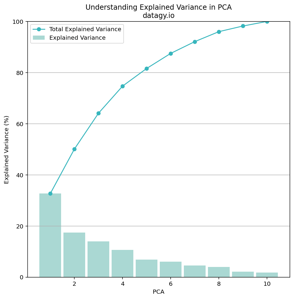
While explaining 50% of the variance in 2 components may not seem like a lot, we can take into the context of our data. We have very few data points compared to other, larger datasets. We also have differing disciplines covered by our data. Because of this, let’s go ahead with 2 principal components to better visualize our data.
There are a number of ways to accomplish this, but since we are working with small data, I would recommend just re-creating our PCA object:
# Fitting and Transforming Our Data Using PCA
pca = PCA(2)
X_r = pca.fit_transform(scaled_data)
In the code block above, we passed in 2 as our number of components into the PCA class. We then used the .fit_transform() method to both fit and transform our data into the principal components. We can explore this data by slicing it:
# Exploring our transformed data
print(X_r[:2])

# Returns:
# [[0.79162772 0.7716112 ]
#  [1.23499056 0.57457807]]
We can see that by diving into the data that each record has been reduced to 2 dimensions (compared the the previous ten). Similarly, the data seems a little non-sensical compared to the previous data, but let’s go with it for now!
One question you may have at this point is how to understand these components. What variables, for example, feed into each component? How can you explain some of this to yourself and to the end consumers of your data? This where the concept of loadings comes into play.
Understanding Loadings in PCA
Recall, in PCA, the original variables are transformed into a new set of uncorrelated variables called principal components. These components represent linear combinations of the original features and are ordered by the amount of variance that they explain.
Loading scores are the coefficients of the original variables in the linear combinations that form each principal component. This means that they represent the weights assigned to each variable to create the principal component.
When we look at loading scores, we can glean a lot of information about the influence of one variable on a principal component:
- Large loading values (either positive or negative) indicate that the corresponding original variable has a strong influence on that particular principal component.
- Small loading values indicate that the original variable has a weaker influence on the principal component.
- Loadings close to zero suggest that the original variable has little relevance to the formation of that principal component.
What’s important to understand here is that loadings help us interpret the meaning of each principal component. By examining which variables have high loadings on which principal components, we can begin to understand the underlying structure of the data and find meaningful patterns.
In sklearn, we can access the loading scores for each principal component by using the .components_ attribute. When we print out the loading scores, we return an array that has as many items as you have principal components (in our case, 2), and each many items in each as there are columns in the original dataset (in our case, 10).
# Printing Loading Scores
print(pca.components_)

# Returns:
# [[-0.42829627 -0.41255442 -0.3757157  -0.03210733  0.02783081  0.41015201
#    0.31619436  0.15319802  0.34414444  0.30542571]
#  [ 0.14198909  0.17359096  0.432046    0.35980486 -0.13684105 -0.26207936
#    0.2657761   0.24050715  0.45394697  0.4600244 ]]
We can see that by printing out the components, we can get information about each principal component. However, reviewing these arrays can be quite difficult, so let’s visualize the data. This is a great example for which a heat map generated in Seaborn would be useful:
# Plotting a Heatmap of Our Loadings
import seabird as sns
fig, ax = plt.subplots(figsize=(8,8))

ax = sns.heatmap(
    pca.components_,
    cmap='coolwarm',
    yticklabels=[f'PCA{x}' for x in range(1,pca.n_components_+1)],
    xticklabels=list(df.columns),
    linewidths=1,
    annot=True,
    fmt=',.2f',
    cbar_kws={"shrink": 0.8, "orientation": 'horizontal'}
    )

ax.set_aspect("equal")
plt.title('Loading for Each Variable and Component', weight='bold')
plt.show()
The code above returns the following image:
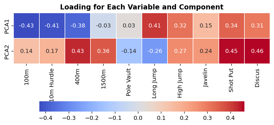
We can see from the image above which variables (the x-axis) influence which components (the y-axis). Keep in mind from earlier, large values (either positive or negative) have more influence on a principal component. Similarly, keep in mind that each component captures a different amount of variation.
In simple terms, we can see that variables such as short distance running and long jump have large effects on PC1 (which explains a significant amount of the data’s variation), while variables like 1500m and pole vault influence it very little.
Since we only have two components, it can also be helpful to visualize this in a scatterplot. We can do this using Matplotlib, as shown below:
# Visualizing Loading in a Scatterplot
fig, ax = plt.subplots(figsize=(10, 8))
plt.scatter(
    x=loadings['PC1'],
    y=loadings['PC2'],
)

plt.axvline(x=0, c="black", label="x=0")
plt.axhline(y=0, c="black", label="y=0")

for label, x_val, y_val in zip(loadings.index, loadings['PC1'], loadings['PC2']):
    plt.annotate(label, (x_val, y_val), textcoords="offset points", xytext=(0,10), ha='center')

plt.title('Visualizing PCA1 and PCA2 Loadings', weight='bold')
ax.spines[['right', 'top', ]].set_visible(False)
plt.show()
This returns the following image:
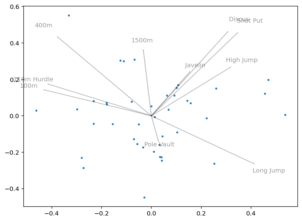
What we can get from this image is how closely correlated some variables will be. For example, we can see that 100m and 110m Hurdle are clustered very closely together. Similarly, Discus and Shot Put are very close together. Intuitively this makes sense, since they have logical overlap in physical skills required.
Visualizing Data Following PCA
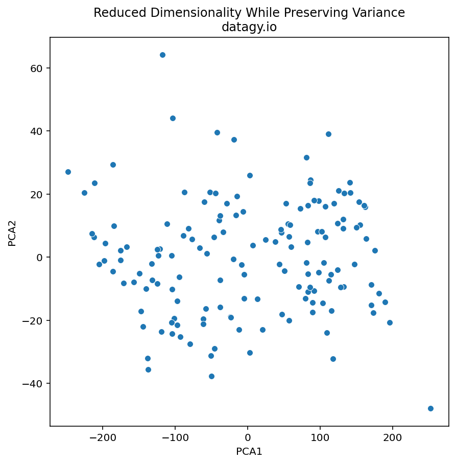
The next step in PCA is to visualize our data and to see if we can find underlying meaning behind it. To make this process simpler, we can turn our transformed array into a Pandas DataFrame that contains the information about each athlete.
# Converting Our PCA Array into a DataFrame
X_r_df = pd.DataFrame(X_r, columns=['PCA1', 'PCA2'], index=df.index)
print(X_r_df.head())

# Returns:
#              PCA1      PCA2
# Athlete
# SEBRLE   0.791628  0.771611
# CLAY     1.234991  0.574578
# KARPOV   1.358215  0.484021
# BERNARD -0.609515 -0.874629
# YURKOV  -0.585968  2.130954
Let’s plot this data using a scatterplot to see if we can get some interesting insights from the data:
# Plotting Our Data Using a Scatterplot
fig, ax = plt.subplots(figsize=(10,10))
sns.scatterplot(data=X_r_df, x='PCA1', y='PCA2', ax=ax, s=100, alpha=0.5)
plt.title('Visualizing Original Data Follow PCA\ndatagy.io')
sns.despine()
This returns the following image:
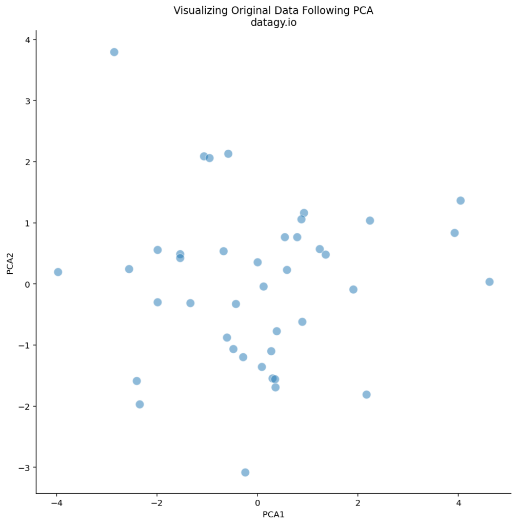
We can see that there are some logical outliers in the data. Let’s take a look at three points in particular, as shown below:
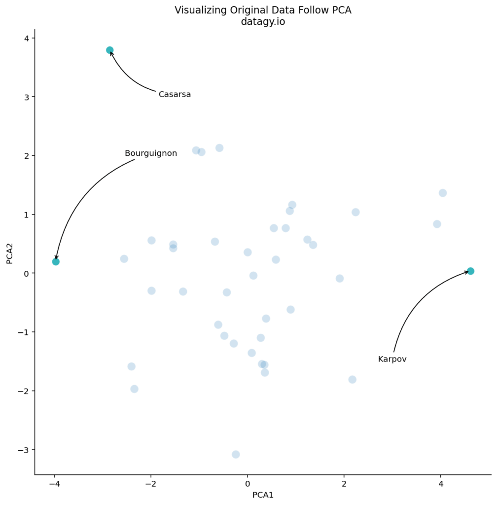
We can see that Bourguignon and Karpov vary dramatically along the first principal component. Meanwhile, Bourguignon and Casarsa are similar along PC1, but vary quite a bit along PC2.
From our loading scores, we know that there is a lot variation in sports such as 100m running and shot put. Let’s take a look at how Bourguignon and Karpov compare across these two disciplines:
# Looking at two athletes
print(df[['100m', 'Shot Put']].rank()[df.index.isin(['Karpov', 'BOURGUIGNON'])])

# Returns:
#              100m  Shot Put
# Athlete
# BOURGUIGNON  38.5       5.0
# Karpov        2.0      40.0
In the code block above, we ranked the two columns to see how the two athletes compared. Because they’re showing as quite different along the first component, we would expect that their rankings in 100m running and shot put would be quite different. By reviewing the rankings, we can see that this is true!
Now, let’s take a look at two other athletes: Bourguignon and Casarsa. They are similar along the first component, but quite different along the second component. We know that the second component is influenced quite a bit by throwing sports, such as Discus and Shot Put. Let’s compare the rankings of these two athletes to see how true that holds:
# Comparing Athletes Along the Second Component
print(df[['Discus', 'Shot Put']].rank()[df.index.isin(['Casarsa', 'BOURGUIGNON'])])

# Returns:
#              Discus  Shot Put
# Athlete
# BOURGUIGNON     7.0       5.0
# Casarsa        35.0      30.0
We can see that both of these athletes ranked quite differently along sports that vary along the second component.
What Can Visualizing PCA Tell Us?
Visualizing the data along different principal components can tell us a number of different things, including:
- Identifying outliers: In the example above, we can see that Casarsa is a bit of an outlier, since he is on the extreme side of both principal components.
- Identifying clusters: points that are close together should share very similar profiles.
- Identifying differences: just as how we say that Bourguignon and Karpov were on different ends of the first component, visualizing PCA results can tell us which points are very dissimilar.
In short, visualizing data along principal components can help tell us data points are most similar and dissimilar from one another along the variables with the greatest variation.
Conclusion
In conclusion, Principal Component Analysis (PCA) offers a powerful toolkit for dimensionality reduction, feature selection, data compression, and data exploration in various fields including data analysis, machine learning, and artificial intelligence. By transforming high-dimensional data into uncorrelated dimensions called principal components, PCA enables us to extract essential information while discarding less relevant details.
Throughout this exploration, we’ve delved into the inner workings of PCA, from centering and scaling data to calculating covariance matrices, performing eigenvalue decomposition, and selecting principal components. We’ve also demonstrated practical implementation using Python’s Scikit-Learn library, examining a dataset on decathlon performances from the 1988 Olympics.
By visualizing explained variances, loading scores, and transformed data, we gained insights into the underlying structure of our dataset. Through scatterplots and heatmaps, we identified outliers, clusters, and differences among data points, facilitating a deeper understanding of athlete performances and their relationships across different events.
In essence, PCA serves as a valuable tool for uncovering patterns, reducing complexity, and gaining actionable insights from high-dimensional datasets, ultimately enhancing decision-making processes across various domains.
Additional Resources
To learn more about related topics, check out the tutorials below: