In this tutorial, you’ll learn how to calculate a correlation matrix in Python and how to plot it as a heat map. You’ll learn what a correlation matrix is and how to interpret it, as well as a short review of what the coefficient of correlation is.
You’ll then learn how to calculate a correlation matrix with the pandas library. Then, you’ll learn how to plot the heat map correlation matrix using Seaborn. Finally, you’ll learn how to customize these heat maps to include certain values.
The Quick Answer: Use Pandas’ df.corr() to Calculate a Correlation Matrix in Python
# Calculating a Correlation Matrix with Pandas
import pandas as pd

matrix = df.corr()
print(matrix)

# Returns:
#           b_len     b_dep     f_len     f_dep
# b_len  1.000000 -0.235053  0.656181  0.595110
# b_dep -0.235053  1.000000 -0.583851 -0.471916
# f_len  0.656181 -0.583851  1.000000  0.871202
# f_dep  0.595110 -0.471916  0.871202  1.000000
Table of Contents
What a Correlation Matrix is and How to Interpret it
A correlation matrix is a common tool used to compare the coefficients of correlation between different features (or attributes) in a dataset. It allows us to visualize how much (or how little) correlation exists between different variables.
This is an important step in pre-processing machine learning pipelines. Since the correlation matrix allows us to identify variables that have high degrees of correlation, they allow us to reduce the number of features we may have in a dataset.
This is often referred to as dimensionality reduction and can be used to improve the runtime and effectiveness of our models.
That’s the theory of our correlation matrix. But what does it actually look like? A correlation matrix has the same number of rows and columns as our dataset has columns.
This means that if we have a dataset with 10 columns, then our matrix will have ten rows and ten columns. Each row and column represents a variable (or column) in our dataset and the value in the matrix is the coefficient of correlation between the corresponding row and column.
What is a Correlation Coefficient? A coefficient of correlation is a value between -1 and +1 that denotes both the strength and directionality of a relationship between two variables.
- The closer the value is to 1 (or -1), the stronger a relationship.
- The closer a number is to 0, the weaker the relationship.
A negative coefficient will tell us that the relationship is negative, meaning that as one value increases, the other decreases. Similarly, a positive coefficient indicates that as one value increases, so does the other.
Let’s see what a correlation matrix looks like when we map it as a heat map. Here, we have a simply 4×4 matrix, meaning that we have 4 columns and 4 rows.

The values in our matrix are the correlation coefficients between the pairs of features. We can see that we have a diagonal line of the values of 1. This is because these values represent the correlation between a column and itself. Because these values are, of course, always the same they will always be 1.
If you have a keen eye, you’ll notice that the values in the top right are the mirrored image of the bottom left of the matrix. This is because the relationship between the two variables in the row-column pairs will always be the same. It’s common practice to remove these from a heat map matrix in order to better visualize the data. This is something you’ll learn in later sections of the tutorial.
Calculate a Correlation Matrix in Python with Pandas
Pandas makes it incredibly easy to create a correlation matrix using the DataFrame method, .corr(). The method takes a number of parameters. Let’s explore them before diving into an example:
matrix = df.corr(
    method = 'pearson',  # The method of correlation
    min_periods = 1      # Min number of observations required
)
By default, the corr method will use the Pearson coefficient of correlation, though you can select the Kendall or spearman methods as well. Similarly, you can limit the number of observations required in order to produce a result.
Loading a Sample Pandas Dataframe
Now that you have an understanding of how the method works, let’s load a sample Pandas Dataframe. For this, we’ll use the Seaborn load_dataset function, which allows us to generate some datasets based on real-world data. We’ll load the penguins dataset. Seaborn allows us to create very useful Python visualizations, providing an easy-to-use high-level wrapper on Matplotlib.
# Loading a sample Pandas dataframe
import pandas as pd
import seaborn as sns

df = sns.load_dataset('penguins')

# We're renaming columns to make them print nicer
df.columns = ['species', 'island', 'b_len', 'b_dep', 'f_len', 'f_dep', 'sex']
print(df.head())

# Returns:
#   species     island  b_len  b_dep  f_len   f_dep     sex
# 0  Adelie  Torgersen   39.1   18.7  181.0  3750.0    Male
# 1  Adelie  Torgersen   39.5   17.4  186.0  3800.0  Female
# 2  Adelie  Torgersen   40.3   18.0  195.0  3250.0  Female
# 3  Adelie  Torgersen    NaN    NaN    NaN     NaN     NaN
# 4  Adelie  Torgersen   36.7   19.3  193.0  3450.0  Female
Let’s break down what we’ve done here:
- We loaded the Pandas library using the alias pd. We also loaded the Seaborn library using the alias sns.
- We then created a DataFrame,
df, using the load_dataset function and passing in'penguins'as the argument. - Finally, we printed the first five rows of the DataFrame using the
.head()method
We can see that our DataFrame has 7 columns. Some of these columns are numeric and others are strings.
Calculating a Correlation Matrix with Pandas
Now that we have our Pandas DataFrame loaded, let’s use the corr method to calculate our correlation matrix. We’ll simply apply the method directly to the entire DataFrame:
# Calculating a Correlation Matrix with Pandas
matrix = df.corr()
print(matrix)

# Returns:
#           b_len     b_dep     f_len     f_dep
# b_len  1.000000 -0.235053  0.656181  0.595110
# b_dep -0.235053  1.000000 -0.583851 -0.471916
# f_len  0.656181 -0.583851  1.000000  0.871202
# f_dep  0.595110 -0.471916  0.871202  1.000000
We can see that while our original dataframe had seven columns, Pandas only calculated the matrix using numerical columns. We can see that four of our columns were turned into column row pairs, denoting the relationship between two columns.
For example, we can see that the coefficient of correlation between the body_mass_g and flipper_length_mm variables is 0.87. This indicates that there is a relatively strong, positive relationship between the two variables.
Rounding our Correlation Matrix Values with Pandas
We can round the values in our matrix to two digits to make them easier to read. The matrix that’s returned is actually a Pandas Dataframe. This means that we can actually apply different DataFrame methods to the matrix itself. We can use the Pandas round method to round our values.
matrix = df.corr().round(2)
print(matrix)

# Returns:
#        b_len  b_dep  f_len  f_dep
# b_len   1.00  -0.24   0.66   0.60
# b_dep  -0.24   1.00  -0.58  -0.47
# f_len   0.66  -0.58   1.00   0.87
# f_dep   0.60  -0.47   0.87   1.00
While we lose a bit of precision doing this, it does make the relationships easier to read.
In the next section, you’ll learn how to use the Seaborn library to plot a heat map based on the matrix.
How to Plot a Heat map Correlation Matrix with Seaborn
In many cases, you’ll want to visualize a correlation matrix. This is easily done in a heat map format where we can display values that we can better understand visually. The Seaborn library makes creating a heat map very easy, using the heatmap function.
Let’s now import pyplot from matplotlib in order to visualize our data. While we’ll actually be using Seaborn to visualize the data, Seaborn relies heavily on matplotlib for its visualizations.
# Visualizing a Pandas Correlation Matrix Using Seaborn
import pandas as pd
import seaborn as sns
import matplotlib.pyplot as plt

df = sns.load_dataset('penguins')
matrix = df.corr().round(2)
sns.heatmap(matrix, annot=True)
plt.show()
Here, we have imported the pyplot library as plt, which allows us to display our data. We then used the sns.heatmap() function, passing in our matrix and asking the library to annotate our heat map with the values using the annot= parameter. This returned the following graph:
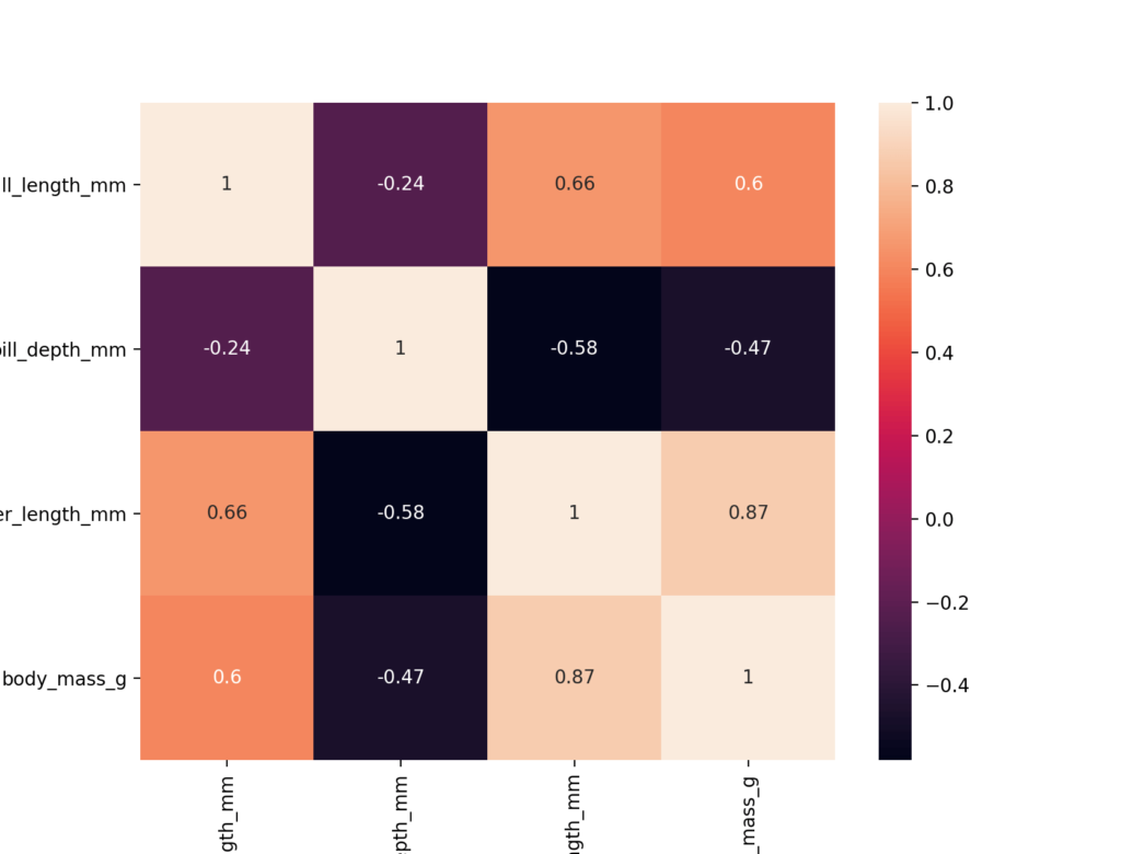
We can see that a number of odd things have happened here. Firstly, we know that a correlation coefficient can take the values from -1 through +1. Our graph currently only shows values from roughly -0.5 through +1. Because of this, unless we’re careful, we may infer that negative relationships are strong than they actually are.
Further, the data isn’t showing in a divergent manner. We want our colors to be strong as relationships become strong. Rather, the colors weaken as the values go close to +1.
We can modify a few additional parameters here:
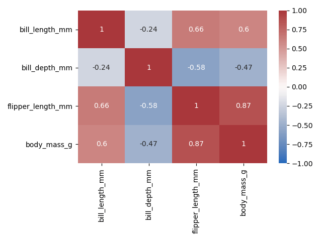
vmin=,vmax=are used to anchor the colormap. If none are passed, the values are inferred, which led to the negative values not going beyond 0.5. Since we know that the coefficients or correlation should be anchored at +1 and -1, we can pass these in.center=species the value at which to center the colormap when we plot divergent data. Since we want the colors to diverge from 0, we should specify 0 as the argument here.- cmap= allows us to pass in a different color map. Because we want the colors to be stronger at either end of the divergence, we can pass in vlag as the argument to show colors go from blue to red.
Let’s try this again, passing in these three new arguments:
# Visualizing a Pandas Correlation Matrix Using Seaborn
import pandas as pd
import seaborn as sns
import matplotlib.pyplot as plt

df = sns.load_dataset('penguins')
matrix = df.corr().round(2)
sns.heatmap(matrix, annot=True, vmax=1, vmin=-1, center=0, cmap='vlag')
plt.show()
This returns the following matrix. It diverges from -1 to +1 and the colors conveniently darken at either pole.
In this section, you learned how to format a heat map generated using Seaborn to better visualize relationships between columns.
Looking for other uses of the Seaborn heatmap function? I have a complete guide on calculating and plotting a confusion matrix for evaluating classification machine learning problems.
Plot Only the Lower Half of a Correlation Matrix with Seaborn
One thing that you’ll notice is how redundant it is to show both the upper and lower half of a correlation matrix. Our minds can only interpret so much – because of this, it may be helpful to only show the bottom half of our visualization. Similarly, it can make sense to remove the diagonal line of 1s, since this has no real value.
In order to accomplish this, we can use the numpy triu function, which creates a triangle of a matrix. Let’s begin by importing numpy and adding a mask variable to our function. We can then pass this mask into our Seaborn function, asking the heat map to mask only the values we want to see:
# Showing only the bottom half of our correlation matrix
import pandas as pd
import seaborn as sns
import matplotlib.pyplot as plt
import numpy as np

df = sns.load_dataset('penguins')
matrix = df.corr().round(2)
mask = np.triu(np.ones_like(matrix, dtype=bool))
sns.heatmap(matrix, annot=True, vmax=1, vmin=-1, center=0, cmap='vlag', mask=mask)
plt.show()
This returns the following image:
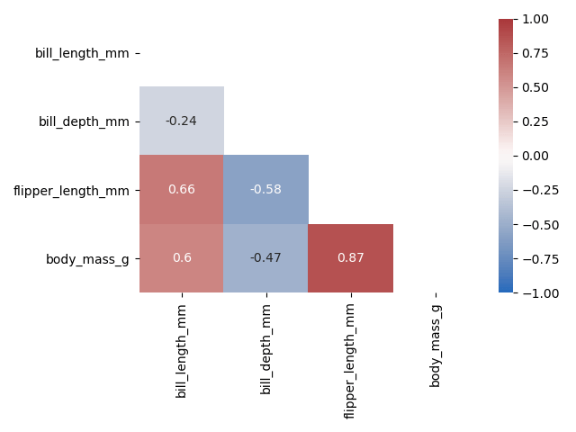
We can see how much easier it is to understand the strength of our dataset’s relationships here. Because we’ve removed a significant amount of visual clutter (over half!), we can much better interpret the meaning behind the visualization.
How to Save a Correlation Matrix to a File in Python
There may be times when you want to actually save the correlation matrix programmatically. So far, we have used the plt.show() function to display our graph. You can then, of course, manually save the result to your computer. But matplotlib makes it easy to simply save the graph programmatically use the savefig() function to save our file.
The file allows us to pass in a file path to indicate where we want to save the file. Say we wanted to save it in the directory where the script is running, we can pass in a relative path like below:
# Saving a Heatmap
plt.savefig('heatmap.png')
In the code shown above, we will save the file as a png file with the name heatmap. The file will be saved in the directory where the script is running.
Selecting Only Strong Correlations in a Correlation Matrix
In some cases, you may only want to select strong correlations in a matrix. Generally, a correlation is considered to be strong when the absolute value is greater than or equal to 0.7. Since the matrix that gets returned is a Pandas Dataframe, we can use Pandas filtering methods to filter our dataframe.
Since we want to select strong relationships, we need to be able to select values greater than or equal to 0.7 and less than or equal to -0.7 Since this would make our selection statement more complicated, we can simply filter on the absolute value of our correlation coefficient.
Let’s take a look at how we can do this:
matrix = df.corr()
matrix = matrix.unstack()
matrix = matrix[abs(matrix) >= 0.7]

print(matrix)

# Returns:
# bill_length_mm     bill_length_mm       1.000000
# bill_depth_mm      bill_depth_mm        1.000000
# flipper_length_mm  flipper_length_mm    1.000000
#                    body_mass_g          0.871202
# body_mass_g        flipper_length_mm    0.871202
#                    body_mass_g          1.000000
Here, we first take our matrix and apply the unstack method, which converts the matrix into a 1-dimensional series of values, with a multi-index. This means that each index indicates both the row and column or the previous matrix. We can then filter the series based on the absolute value.
Selecting Only Positive / Negative Correlations in a Correlation Matrix
In some cases, you may want to select only positive correlations in a dataset or only negative correlations. We can, again, do this by first unstacking the dataframe and then selecting either only positive or negative relationships.
Let’s first see how we can select only positive relationships:
matrix = df.corr()
matrix = matrix.unstack()
matrix = matrix[matrix > 0]

print(matrix)

# Returns:
# bill_length_mm     bill_length_mm       1.000000
#                    flipper_length_mm    0.656181
#                    body_mass_g          0.595110
# bill_depth_mm      bill_depth_mm        1.000000
# flipper_length_mm  bill_length_mm       0.656181
#                    flipper_length_mm    1.000000
#                    body_mass_g          0.871202
# body_mass_g        bill_length_mm       0.595110
#                    flipper_length_mm    0.871202
#                    body_mass_g          1.000000
We can see here that this process is nearly the same as selecting only strong relationships. We simply change our filter of the series to only include relationships where the coefficient is greater than zero.
Similarly, if we wanted to select on negative relationships, we only need to change one character. We can change the > to a < comparison:
matrix = matrix[matrix < 0]This is a helpful tool, allowing us to see which relationships are either direction. We can even combine these and select only strong positive relationships or strong negative relationships.
Conclusion
In this tutorial, you learned how to use Python and Pandas to calculate a correlation matrix. You learned, briefly, what a correlation matrix is and how to interpret it. You then learned how to use the Pandas corr method to calculate a correlation matrix and how to filter it based on different criteria. You also learned how to use the Seaborn library to visualize a matrix using the heatmap function, allowing you to better visualize and understand the data at a glance.
To learn more about the Pandas .corr() dataframe method, check out the official documentation here.
Additional Resources
To learn about related topics, check out the articles listed below: