
Heatmaps are valuable tools to quickly visualize large amounts of data across a scale. In this tutorial, you’ll learn how to use Seaborn to create beautiful and informative heatmaps using the sns.heatmap() function. Seaborn makes it incredibly easy and intuitive to create heatmaps, allowing you to customize them with a familiar function.
By the end of this tutorial, you’ll have learned the following:
- How to use the
sns.heatmap()function to create a heatmap in Seaborn - How to customize the heatmap using colors, spacing, and labels
- How to modify labels and titles of your heatmap
Table of Contents
What You’ll Learn to Make in This Guide
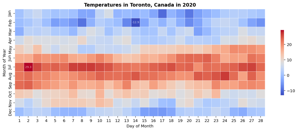
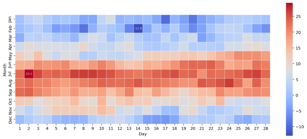
Let’s take a look at what you’ll learn to create in this guide. The image below shows a truncated view of the average temperature in Toronto, Canada over the course of a year. Right off the bat, you can notice a few things that make this visualization stand out:
- Colors use a conventional blue to red for temperature
- Extreme values are labeled in the visualization, allowing users to find and identify maximum and minimum values
- Values are square and have a slight line between them, making the visualization cleaner
If you’re looking for other uses for heatmaps using Seaborn, check out my guide on calculating and visualizing a confusion matrix in Python.
Looking to Plot a Correlation Matrix Instead?
Check out this specific tutorial
If you’re looking to plot a correlation matrix instead, check out my complete guide to using heatmaps to plot them.
Understanding the Seaborn heatmap() Function
Let’s take a moment to explore all that the sns.heatmap() function has to offer. There a lot of parameters that allow you to customize your visualization. While we won’t cover all of them, we will cover the most important ones.
seaborn.heatmap(data, *, vmin=None, vmax=None, cmap=None, center=None, robust=False, annot=None, fmt='.2g', annot_kws=None, linewidths=0, linecolor='white', cbar=True, cbar_kws=None, cbar_ax=None, square=False, xticklabels='auto', yticklabels='auto', mask=None, ax=None, **kwargs)As you can see from the code block above, there are a lot of different parameters. Some of the most important parameters of the Seaborn heatmap() function include:
data=refers to the Pandas DataFrame to usecmap=allows you to customize the colormap used in the visualizationannot=allows you to customize whether or not to annotate the heatmap (or which data to use to annotate)square=allows you to create square values in the heatmap
Let’s get started by loading a sample dataset that we’ll use throughout this tutorial.
Loading a Sample Dataset
What makes the sns.heatmap() function different from many of the other Seaborn functions is that it explicitly uses a 2-dimensional array, such as a DataFrame. Rather than specifying x= and y= columns, Seaborn will use the entire DataFrame.
Because of this, let’s create a customized DataFrame. We’ll use a dataset that covers the average daily temperature of Toronto, Canada in 2020, which you can find here. Take a look at the read_data() function below that returns a DataFrame in the format we want it to be in.
# Loading a Sample Dataset
import pandas as pd

def read_data():
    url = 'https://github.com/datagy/mediumdata/raw/master/toronto-weather.xlsx'
    cols = ['LOCAL_DATE', 'MEAN_TEMPERATURE']
    renames = {'LOCAL_DATE': 'Date', 'MEAN_TEMPERATURE': 'Temperature'}
    df = pd.read_excel(url, usecols=cols, parse_dates=['LOCAL_DATE'])
    df.rename(columns=renames, inplace=True)
    df['Day'] = df['Date'].dt.day
    df['Month'] = df['Date'].dt.month
    df = df[df['Day'] <= 28]

    summary = pd.pivot_table(data=df,index='Month',columns='Day',values='Temperature')
    return summary

df = read_data()
print(df.iloc[:3, :3])

# Day      1    2    3
# Month
# 1      0.5  3.3  5.1
# 2     -0.5  1.3  3.1
# 3     -2.2  3.5  3.0
In the function above, we create a DataFrame that has rows for each month and columns for each day of the month. Note that so that we can create a rectangular heatmap, we’re removing days greater than 28. This is only for illustration purposes and, of course, creates some overall problems with the data.
Creating a Heatmap in Seaborn
The Seaborn heatmap() function expects a 2-dimensional DataFrame (or array of data). Because of this, we created the function above to return a DataFrame that contains the months and days of the month are rows and columns, respectively.
In order to create a heatmap in Seaborn, we can simply pass this DataFrame into the sns.heatmap() function. Seaborn will infer a lot about the data, which you’ll learn to customize later on this guide.
# Creating a Simple Heatmap in Seaborn
import seaborn as sns
import matplotlib.pyplot as plt
import pandas as pd
df = read_data()
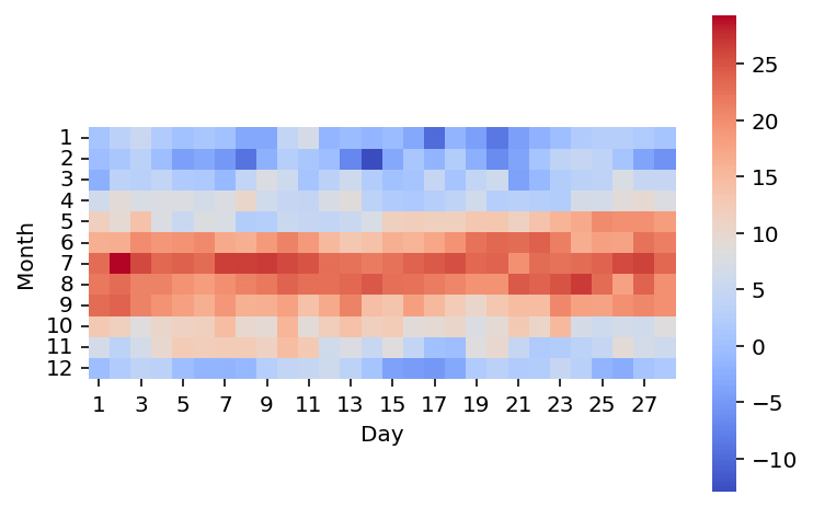
sns.heatmap(df)
plt.show()In the code block above, we loaded our libraries, which in this case included Seaborn, Matplotlib, and Pandas. We then loaded our DataFrame using the custom function we created earlier.
Finally, we passed the DataFrame into the sns.heatmap() function, which returned an axes object. We can then display the plot using the plt.show() function.
This returns the image below:

We can see immediate trends in the data. However, we can really build on what we have here and customize the visualization to make it even clearer. Let’s start by exploring how to customize the colormap used in the visualization.
Changing the Colormap in a Seaborn Heatmap
Seaborn provides a number of built-in colormaps and allows you to build your own as well. In order to pass in a different colormap, you can use the cmap= parameter, which accepts a Seaborn colormap as input.
Conventionally, you might see temperatures going from blue to red, for cold to hot colors respectively. Seaborn provides a colormap that does exactly this! Let’s see how we can use the 'coolwarm' colormap to change the colors of our heatmap.
# Applying a Colormap to a Seaborn Heatmap
import seaborn as sns
import matplotlib.pyplot as plt
import pandas as pd

df = read_data()
sns.heatmap(df, cmap='coolwarm')
plt.show()
In the code block above, we used the same code as before, only passing in the additional cmap parameter. This returns the image below:
In the image above, we can see that our heatmap now has a new colormap applied to it. This allows us to better visualize which days were colder and which were warmer.
Changing Seaborn Heatmap Items to Square Format
Another common task is converting each item in the heatmap to be of a square format. This can be done by passing in square=True into the sns.heatmap() function.
Showing items as squares can be very helpful in terms of creating a more evenly spaced visual. Let’s see what this looks like in Python:
# Converting Seaborn Heatmap Items to Square
import seaborn as sns
import matplotlib.pyplot as plt
import pandas as pd

df = read_data()

sns.heatmap(df, cmap='coolwarm', square=True)
plt.show()
In the code block above, we again modified our sns.heatmap() function call – by instructing Seaborn to show values as squares. This returned the image below:
We can see that the values are now all squares. However, this has also modified the size of the heatmap itself. In the following section, you’ll learn how to change the size of a Seaborn heatmap plot.
Changing the Size of a Seaborn Heatmap Plot
The Seaborn heatmap() function returns a Matplotlib axes object. Because of this, we can actually change the size of the underlying figure object using Matplotlib. In order to do this, we can use the figsize= argument in the subplots() function.
Let’s take a look at how we can change the size of a heatmap plot:
# Changing the Size of a Seaborn Heatmap
import seaborn as sns
import matplotlib.pyplot as plt
import pandas as pd

df = read_data()
fig, ax = plt.subplots(figsize=(14, 6))

sns.heatmap(df, cmap='coolwarm', square=True)
plt.show()
In the code block above, we use the subplots() function from Matplotlib to create both a figure and an axes object. In this case, we passed in the size of 14 by 6 inches.
Because Seaborn maps to the active axes, we don’t need to specify this explicitly. However, if you’re working with multiple axes, you can pass this into the ax= parameter of the sns.heatmap() function.
This returns the following image:

We can see that the heat map now more effectively fills the visualization, allowing you to get a better sense of the distribution of colors. Let’s now take a look at how we can add labels to the plots.
Add Labels to a Seaborn Heatmap Plot
Adding labels can be an informative way to enhance your heatmap. Seaborn provides two ways of adding labels to a heatmap, using the annot= parameter:
- By using a boolean value, the function will use the values from the DataFrame that is passed into the function, or
- Using a separate set of data, you can plot different labels.
Let’s first take a look at how we can add the labels of our current DataFrame.
# Adding Labels to a Seaborn Heatmap
import seaborn as sns
import matplotlib.pyplot as plt
import pandas as pd
df = read_data()
fig, ax = plt.subplots(figsize=(14, 6))
sns.heatmap(df, cmap='coolwarm', square=True, annot=True)
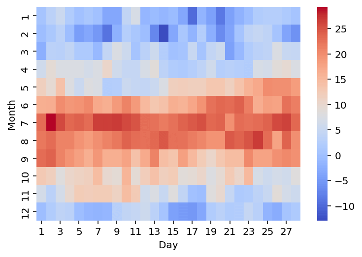
plt.show()In the code block above, we passed in annot=True. This instructs Seaborn to use the labels from the DataFrame that is used for the heatmap itself. This returns the image below:
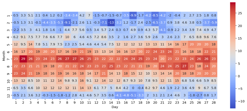
We can see that in the image above that some values are shown as integers while others are shown as floating point values. Seaborn allows you to apply string formatting to the values in the heatmap, which is what you’ll learn in the following section.
Applying Custom String Formatting to a Seaborn Heatmap Plot
Seaborn allows you to apply custom string formatting to the labels that it creates. In order to do this, we can use the fmt= parameter, which uses regular number formatting.
Say we wanted to ensure that all of our values were shown as integers, we could use the string formatting of ',.0f'. This will use commas to separate thousands and ensure that no values follow the decimal places.
# Applying Formatting to Seaborn Heatmap Labels
import seaborn as sns
import matplotlib.pyplot as plt
import pandas as pd

df = read_data()
fig, ax = plt.subplots(figsize=(14, 6))

sns.heatmap(df, cmap='coolwarm', square=True, annot=True, fmt=',.0f')
plt.show()
In the code block above we only added in fmt=',.0f', which instructs Seaborn to drop any values following the decimal place, as shown below:

In the image below, we can now see all of the labels are consistently labeled. However, they can be a bit distracting and take away from the image itself. Let’s see how we can customize them further.
Format Labels in a Seaborn Heatmap Plot
Seaborn provides extensive opportunities to format your annotations in a heatmap. To format annotations in a Seaborn heatmap, you can use the annot_kws= parameter, which allows you to use any keywords from a Matplotlib Text object.
Let’s see how we can modify the size and transparency of these values:
# Modifying Annotations in a Seaborn Heatmap
import seaborn as sns
import matplotlib.pyplot as plt
import pandas as pd

df = read_data()
fig, ax = plt.subplots(figsize=(14, 6))

sns.heatmap(df, cmap='coolwarm', square=True,
    annot=True, fmt=',.0f',
    annot_kws={'size': 'x-small', 'alpha': 0.25})
plt.show()
In the code block above, instructed Seaborn to use the size of 'x-small' and an alpha value of 0.25. This returns the image below:

We can see that the text has been formatted. While it’s a little harder to read and likely less accessible, it does give insight into the values without being distracting.
Applying Custom Labels in a Seaborn Heatmap Plot
We can further customize the labels in a Seaborn heatmap by passing in a separate set of values to use entirely. We can pass in a separate set of labels into the heatmap by using the annot= parameter.
Let’s take a look at how we can only highlight the minimum and maximum values in the heatmap:
# Applying a Custom Label for a Seaborn Heatmap
import seaborn as sns
import matplotlib.pyplot as plt
import pandas as pd

df = read_data()
fig, ax = plt.subplots(figsize=(14, 6))

extremes = df.values.max(), df.values.min()
labels = df.applymap(lambda v: v if v in (extremes) else '')

sns.heatmap(df, cmap='coolwarm', square=True,
    annot_kws={'size': 'x-small', 'alpha': 0.75},
    annot=labels, fmt = '')
plt.show()
There are a couple of items that we have changed in the code block above:
- We created a tuple of values containing the maximum and minimum values
- We then used the
.applymap()to apply a custom lambda function to the entire DataFrame. The function checks if the value is either of the extreme values. If it is, it returns the number, otherwise it returns a blank value. - We pass our new DataFrame into the
annot=parameter. We also need to pass infmt='', which is necessary since the function expects numeric labels.
This returns the image below:

We can see that this returns a heatmap where only the highest and lowest values are labeled.
Adding Lines Between Seaborn Heatmap Items
We can further customize our heatmaps by adding lines to separate each item. By using the linewidths= parameter, you can add a line of a provided width to separate each item in the Seaborn heatmap.
Let’s see how we can add a line to separate items in the visualization:
# Adding Lines to a Seaborn Heatmap
import seaborn as sns
import matplotlib.pyplot as plt
import pandas as pd

df = read_data()
fig, ax = plt.subplots(figsize=(14, 6))

sns.heatmap(df, cmap='coolwarm', square=True,
    annot=True, fmt=',.0f', linewidths=0.5)
plt.show()
In the code block above, we added linewidths=0.5, which uses a width of 0.5 to separate the lines.

This makes each item a little more distinct, making the overall values to be easier to discern.
Modifying Tick Labels in a Seaborn Heatmap Plot
In order to pass custom tick labels into a Seaborn heatmap, you can use the yticklabels= (or xticklabels= parameter.
Let’s see how we can customize the y-axis to use an abbreviate month name, rather than the month number. In order to do this, we’ll use the calendar module and grab the first three letters of the month’s name using a Python list comprehension.
# Changing Tick Labels in a Seaborn Heatmap
import seaborn as sns
import matplotlib.pyplot as plt
import pandas as pd
import calendar
months = [month[:3] for month in calendar.month_name[1:]]

df = read_data()
fig, ax = plt.subplots(figsize=(14, 6))

extremes = df.values.max(), df.values.min()
labels = df.applymap(lambda v: v if v in (extremes) else '')

sns.heatmap(df, cmap='coolwarm', square=True,
    linewidths=0.5, annot_kws={'size': 'x-small', 'alpha': 0.75},
    annot=labels, fmt = '', yticklabels=months)
plt.show()
Let’s break down what we did in the code block above:
- We imported the calendar module
- We created a list of names using a list comprehension that grabs the first three letters of each month’s name
- We then passed this list into the
yticklabels=parameter in order to apply these labels to our heatmap
This returned the image below:
We can see that this makes the visualization significantly cleaner and more easy to understand.
Customizing the Size of a Colorbar in a Seaborn Heatmap
In our current visual, the colorbar is quite large. We can easily customize the colorbar of a Seaborn heatmap using the cbar_kws= parameter, which accepts arguments from the Matplotlib colorbar function.
Let’s see how we can shrink the colorbar by using the shrink parameter.
# Customizing Colorbar Size in a Seaborn Heatmap
import seaborn as sns
import matplotlib.pyplot as plt
import pandas as pd
import calendar
months = [month[:3] for month in calendar.month_name[1:]]

df = read_data()
fig, ax = plt.subplots(figsize=(14, 6))

extremes = df.values.max(), df.values.min()
labels = df.applymap(lambda v: v if v in (extremes) else '')

sns.heatmap(df, cmap='coolwarm', square=True,
    linewidths=0.5, annot_kws={'size': 'x-small', 'alpha': 0.75},
    annot=labels, fmt = '',
    yticklabels=months,cbar_kws={"shrink": 0.8})
plt.show()
In the code block above, we added cbar_kws={"shrink": 0.8}, which reduces the size of the colorbar by 20%. This allows the bar to fit perfectly with the height of the heatmap, as shown below.
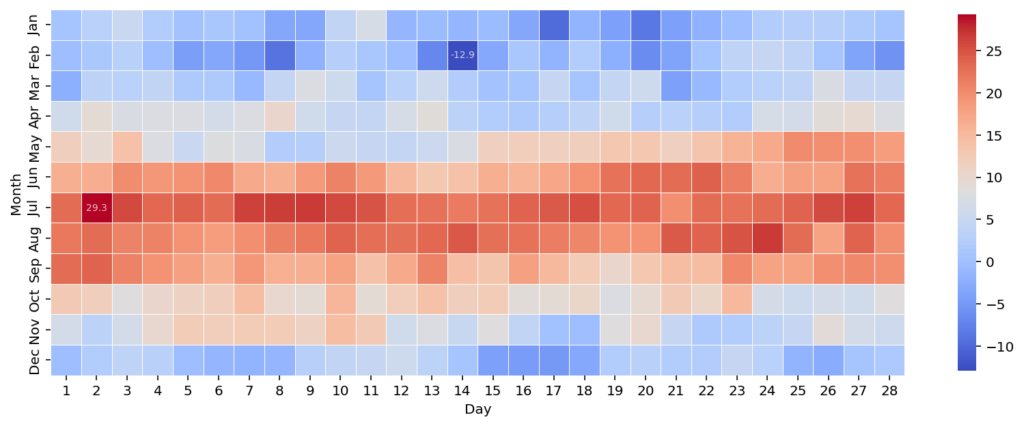
The process of fitting a colorbar size can be a bit heuristic. Because of this, it’s important to play around with the values a bit until you find a size that fits best.
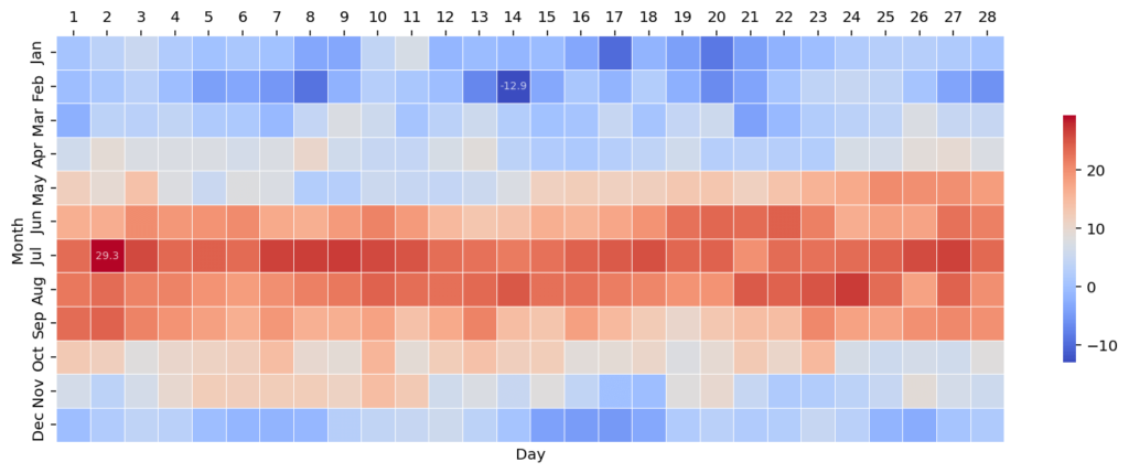
Moving Heatmap Labels to the Top of a Heatmap Plot
We can also move the heatmap labels to the top of the visualization by using the ax.xaxis.tick_top() method. Because the heatmap() function returns a Matplotlib axes object, we can use the axes methods available via Matplotlib.
In order to move axis labels to the top, we can simply pass in ax.xaxis.tick_top(), which moves all the x-axis labels to the top of the visualization.
# Moving Heatmap Labels to the Top
import seaborn as sns
import matplotlib.pyplot as plt
import pandas as pd
import calendar
months = [month[:3] for month in calendar.month_name[1:]]

df = read_data()
fig, ax = plt.subplots(figsize=(14, 6))

extremes = df.values.max(), df.values.min()
labels = df.applymap(lambda v: v if v in (extremes) else '')

sns.heatmap(df, cmap='coolwarm', square=True,
    linewidths=0.5, annot_kws={'size': 'x-small', 'alpha': 0.75},
    annot=labels, fmt = '', yticklabels=months,
    cbar_kws={"shrink": 0.5}, )
ax.xaxis.tick_top()

plt.show()
This returns the image below, where the values for the day have been moved to the top of the visualization.
In the following section, you’ll learn how to change the spread of a Seaborn heatmap.
Changing the Extreme Values in a Seaborn Heatmap Plot
So far in this tutorial, we have allowed Seaborn to customize the spread of the colormap that it generates. In order to customize the minimum and maximum values used in a heatmap, we can use the vmax= and vmin= parameters.
This can be particularly helpful in preventing extreme values from affecting the heatmap. Let’s see how we can customize the spread of our values:
# Changing Extreme Values of a Color Range
import seaborn as sns
import matplotlib.pyplot as plt
import pandas as pd
import calendar
months = [month[:3] for month in calendar.month_name[1:]]

df = read_data()
fig, ax = plt.subplots(figsize=(14, 6))

extremes = df.values.max(), df.values.min()
labels = df.applymap(lambda v: v if v in (extremes) else '')

sns.heatmap(df, cmap='coolwarm', square=True, linewidths=0.5,
    annot_kws={'size': 'x-small', 'alpha': 0.75}, annot=labels,
    fmt = '', yticklabels=months,cbar_kws={"shrink": 0.5},
    vmax=extremes[0], vmin=-extremes[0])

plt.show()
In the code block above, we passed in positive and negative value from our extremes tuple. We need to be mindful here that we don’t accidentally clip values. This process works with our current dataset because the absolute value for our high temperature is higher than that of our low temperature.
In the resulting image below, zero has been made our midpoint, since it falls between the extreme high and low, in this case. This allows the image to be better understood since it doesn’t amplify colder values below zero.

In the final section below, you’ll learn how to customize the visualization by adding a title and axis labels.
Adding a Title and Axis Labels to a Seaborn Heatmap Plot
Seaborn provides significant opportunity to add titles and axis labels to a visualization. In this section, you’ll learn how to add a title and modify the axis labels of the heatmap. This can be done using the following axes methods:
.set_title()will set a title of the heatmap.set_xaxis()and.set_yaxis()will set the labels of the x-axis and y-axis respectively
In order to make this work, we need to first create an explicit axes object. So far, we have worked with an implicit axes object, but in order to apply these methods, we need a declared object.
# Adding a Title to a Seaborn Heatmap
import seaborn as sns
import matplotlib.pyplot as plt
import pandas as pd
import calendar
months = [month[:3] for month in calendar.month_name[1:]]

df = read_data()
fig, ax = plt.subplots(figsize=(14, 6))

extremes = df.values.max(), df.values.min()
labels = df.applymap(lambda v: v if v in (extremes) else '')

sns.heatmap(df, cmap='coolwarm', square=True, linewidths=0.5, annot_kws={'size': 'x-small', 'alpha': 0.75}, annot=labels, fmt = '', yticklabels=months,cbar_kws={"shrink": 0.5})

ax.set_title('Temperatures in Toronto, Canada in 2020', weight='bold')
ax.set_xlabel('Day of Month')
ax.set_ylabel('Month of Year')
plt.show()
In the code block above, we added a title and axis labels. We were also able to apply styling using the weight= keyword argument. This returned the visualization below:
By adding a title and modifying the axis labels, our data visualization becomes much simpler to understand.
Conclusion
Heatmaps are valuable tools to quickly visualize large amounts of data across a scale. In this tutorial, you’ll learn how to use Seaborn to create beautiful and informative heatmaps using the sns.heatmap() function. Seaborn makes it incredibly easy and intuitive to create heatmaps, allowing you to customize them with a familiar function.
In this guide, you first learned how to create a simple heatmap using Seaborn. We then built on this simple heatmap by customizing it step-by-step to create a resulting beautiful visualization.
Additional Resources
To learn more about related topics, check out the resources below: