
In this tutorial, you’ll learn how to create Seaborn line plots using the sns.lineplot() function. Line plots are used to show relational, continuous data. Thankfully, Seaborn makes it simple and intuitive to create and customize line plots, including adding additional lines, modifying colors, and changing aggregations.
By the end of this tutorial, you’ll have learned the following:
- How the Seaborn
sns.lineplot()function works to create line plots - How to create line plots with multiple lines
- How to customize confidence interval error bars
- How to customize aggregation methods to combine data
- How to customize colors, line types, markers, etc.
Table of Contents
Understanding Line Plots for Continuous Relational Data
Line plots are generally used to show how information changes over time. Generally, the data in the x-axis represents a continuous variable (such as dates) and is sorted in a meaningful way.
This all sounds quite similar to a scatterplot – and that’s true. What separates a line plot from a scatterplot is that lines are used to connect the dots to help in the visualization and interpretation of the data.
In the visualization above, you can see a line plot created and customized with Seaborn. In this tutorial, we’ll use line plots to visualize changes to the volume of different stocks over time.
Understanding the Seaborn lineplot() Function
This post is part of the Seaborn learning path! The learning path will take you from a beginner in Seaborn to creating beautiful, customized visualizations. Check it out now!
The Seaborn lineplot() function is used to create line plots, using a simple function. The function accepts both long and wide data and works well with Pandas DataFrames.
The function allows you to plot the continuous relationship between an independent and a dependent variable, x and y. In addition, you can use semantic mappings to further break down variables by using line styles, line color, and marker styles.
Let’s take a look at the function:
seaborn.lineplot(data=None, *, x=None, y=None, hue=None, size=None, style=None, units=None, palette=None, hue_order=None, hue_norm=None, sizes=None, size_order=None, size_norm=None, dashes=True, markers=None, style_order=None, estimator='mean', errorbar=('ci', 95), n_boot=1000, seed=None, orient='x', sort=True, err_style='band', err_kws=None, legend='auto', ci='deprecated', ax=None, **kwargs)We can see that function accepts a lot of different arguments. Let’s take a look at some of the most important ones in more detail:
datarepresents the input data, which can either be long-form or wide-form. The parameter accepts Pandas DataFrames, NumPy arrays, mappings, or simpler sequences.xandyrepresent the vectors or column headers that specify the data on the x and y axeshuelets you pass in a vector or column indatato produce lines of different colorssizelets you pass in a vector or column indatato produce lines of different sizesstylelets you pass in a vector or column indatato produce lines of different styleserrorbarlets you customize the error bar method or remove it entirelyestimatorlets you define how to aggregate across multipleyobservations for the samex, if any
Now that you have an understanding of how the important parameters of the sns.lineplot() function work, let’s dive into how to use the function to create beautiful line plots.
Seaborn lineplt() can also be called using sns.relplot()
The sns.lineplot() function is an axes-level function. If you need to draw figures instead, you can use the sns.relplot() function. This gives you more flexibility in drawing small multiples and controlling figure aesthetics.
How to Create a Line Plot with Seaborn
You can create a simple line plot in Seaborn by simply passing data into the x and y parameters of the sns.lineplot() function. However, we’ll use the data= parameter to pass in a DataFrame – that way, we can simply reference the columns of the DataFrame when indicating the x and y parameters.
For this tutorial, we’ll use a dataset that provides stock volume information for Apple, Google and Microsoft for 2020. The dataset can be found here. You can explore the data using the code below:
# Loading a Sample Dataset
import seaborn as sns
import matplotlib.pyplot as plt
import pandas as pd

df = pd.read_csv(
   'https://raw.githubusercontent.com/datagy/data/main/stocks.csv',
   parse_dates=['Date'])
print(df.head())

# Returns:
#          Date    Volume  Name
# 0  2020-12-31  20.94213  MSFT
# 1  2020-12-30  20.27234  MSFT
# 2  2020-12-29  17.40321  MSFT
# 3  2020-12-28  17.93350  MSFT
# 4  2020-12-24  10.55057  MSFT
The dataset contains three columns: the date, the trade volume, and the name of the stock ticker.
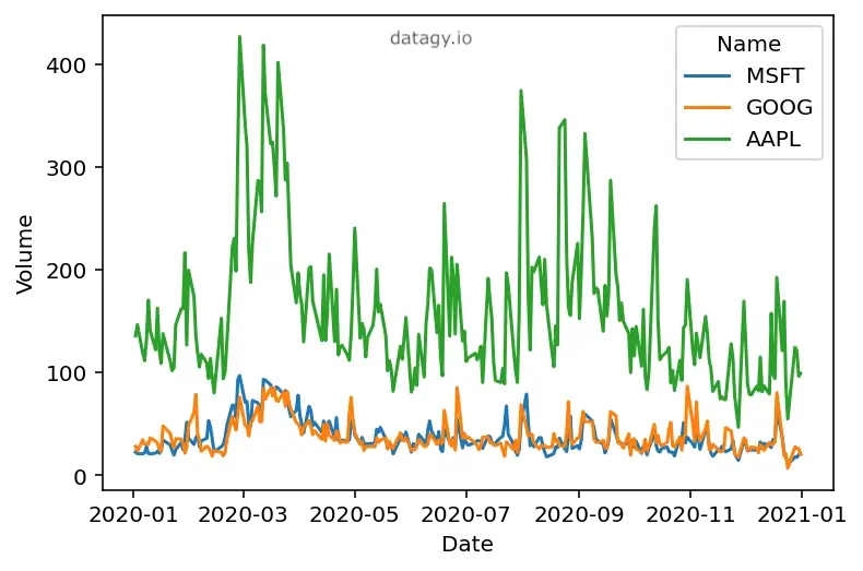
Let’s see how we can use the sns.lineplot() function to create a simple line plot in Seaborn:
# Loading a Generic Line Plot
import seaborn as sns
import matplotlib.pyplot as plt
import pandas as pd

df = pd.read_csv(
   'https://raw.githubusercontent.com/datagy/data/main/stocks.csv',
   parse_dates=['Date'])

sns.lineplot(data=df, x='Date', y='Volume')
plt.show()
In the example above, we passed the DataFrame into the data= parameter. We then used the column labels from the DataFrame to pass in our x= and y= parameters. This returns the following visualization:

We can see that Seaborn generates a line chart in its default style. There are a couple of additional things to note about this:
- Because we have three different stock volumes per day, these values are aggregated to produce a single line. By default, Seaborn uses the
estimator='mean'argument. This means that the average value is calculated for eachxpoint where there are multipleyvalues. - Seaborn includes additional shading. This indicates the confidence interval of 95% by default, meaning that 95% of the time the values are expected to land within these bands. We’ll dive into how this works soon.
Let’s take a look at how we can use Seaborn semantic mapping to add additional lines to our data visualization.
Adding Multiple Lines to Seaborn Line Charts
Seaborn makes it incredibly simple to add additional lines to our line charts. We can add additional lines by passing a variable into the hue= parameter. This assumes that our data are in a long format (which our sample dataset is).
Let’s take a look at how we can use the hue= parameter to add multiple lines to a Seaborn line chart:
# Splitting by a Variable with Color
import seaborn as sns
import matplotlib.pyplot as plt
import pandas as pd

df = pd.read_csv(
   'https://raw.githubusercontent.com/datagy/data/main/stocks.csv',
   parse_dates=['Date'])

sns.lineplot(data=df, x='Date', y='Volume', hue='Name')
plt.show()
In the code above, we pass the 'Name' column into the hue= parameter. Seaborn will split the data into the different unique values found in that column. Because we have three unique values in the column (representing the three stocks), Seaborn creates a graph with three lines.
This creates the following visualization, where we have added multiple lines to our Seaborn graph:
We can see that the error bars have been removed, in this case. This happens because we only have a single observation per record now. This means that there is nothing to estimate any longer.
Speaking of error bars, let’s dive into this a little further in the following section.
Understanding Confidence Intervals in Seaborn Line Plots
When generating line plots in Seaborn, Seaborn will add a confidence interval band to the visualization. By default, Seaborn generates the mean value for observations that have multiple values and creates a band of the 95% confidence interval.
Under the hood, Seaborn uses a process named bootstrapping to generate these confidence intervals. This means that Seaborn will use sampling with replacement to calculate a mean and repeat this process a number of times. By default, this is repeated a thousand times per value in on the x axis.
What this generates is a confidence band that new values have a 95% confidence of falling within this range. however, you also have the option to modify both the confidence interval and the number of bootstrap iterations Seaborn performs.
Let’s dive into how we can modify the confidence intervals in Seaborn line plots.
Modifying Confidence Intervals in Seaborn Line Plots
We can modify the type of confidence interval and the precision it uses by using the errorbar= parameter of the Seaborn lineplot function. In older versions of Seaborn, this was controlled by the ci= parameter. However, beginning with version 0.12.1, this parameter is deprecated. The errorbar= parameter provides significantly more flexibility.
We can modify the number of bootstrap iterations that Seaborn uses by modifying the n_boot= parameter. By default, Seaborn will use 1000 iterations. While this produces more robust results, it can also slow downs in your scripts.
Let’s see how we can modify both the confidence interval and the number of iterations that Seaborn uses:
# Changing the Confidence Interval and Number of Bootstraps
import seaborn as sns
import matplotlib.pyplot as plt
import pandas as pd

df = pd.read_csv(
   'https://raw.githubusercontent.com/datagy/data/main/stocks.csv',
   parse_dates=['Date'])

sns.lineplot(data=df, x='Date', y='Volume', errorbar=('ci', 90), n_boot=100)
plt.show()
In the example above, we’re using a confidence interval of 90%. Note that we’re using 90% as a whole number, rather than as a fractional. Similarly, we’re using n_boot=100, which means that Seaborn will only run the bootstrapping 100 times.
This returns the following image:

Visually, very little is different. The error band will now be a bit wider to accommodate the lowered precision. Similarly, because we’re reducing the number of bootstrapping iterations, reproducing the graph multiple times may result in fluctuations in how these confidence interval bands display.
Removing Confidence Interval Error Bars in Seaborn Line Plots
In many cases, you’ll actually want to remove the confidence interval error bars altogether. Not only will this make your program run significantly faster, but it will also yield more expected results from a user experience perspective.
In order to do this, we can again use the errorbar= parameter, but pass in None into it as an argument. Let’s see what this looks like:
# Removing the Error Band in Seaborn Line Plots
import seaborn as sns
import matplotlib.pyplot as plt
import pandas as pd

df = pd.read_csv(
   'https://raw.githubusercontent.com/datagy/data/main/stocks.csv',
   parse_dates=['Date'])

sns.lineplot(data=df, x='Date', y='Volume', errorbar=None)
plt.show()
In the code above, we passed in errorbar=None. This instructs Seaborn to remove the confidence interval altogether. If you’re running the code, you’ll also notice how much faster the plot is now generated. Running the code returns the following image:

In the following section, you’ll learn how to use error bars instead of confidence interval bands in Seaborn line plots.
Using Error Bars instead of Confidence Bands in Seaborn Line Plots
In some industries, using error bars to indicate the confidence interval will be a preferred approach. Seaborn allows you to change the display of the confidence interval to error bars by using the err_style= parameter.
By default, Seaborn will use a value of 'band'. In order to use error bars instead of the confidence interval band, you can pass in the string 'bar'. Let’s see what this looks like in our Python code:
# Changing Confidence Interval to Error Bar
import seaborn as sns
import matplotlib.pyplot as plt
import pandas as pd

df = pd.read_csv(
   'https://raw.githubusercontent.com/datagy/data/main/stocks.csv',
   parse_dates=['Date'])
df['Month'] = df['Date'].dt.month

sns.lineplot(
   data=df, x='Month', y='Volume', errorbar=('ci', 90),
   err_style="bars")
plt.show()
By modifying the err_style= parameter, we return the following data visualization:

Now that we’ve explored the idea of bootstrapping confidence intervals for calculating the default mean, let’s see how we can change the estimator that is used for aggregations in Seaborn line charts.
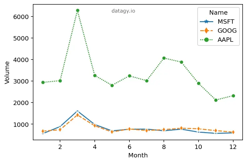
Changing Estimator Aggregations in Seaborn Line Chart Calculations
When your line plot has multiple values for the same value on the x-axis, Seaborn will aggregate the value. In our sample dataset, for example, each day may include the trade volume for Apple, Google, and Microsoft stock.
By default, Seaborn will calculate the mean value of each day’s value. In some cases, this is the preferred estimator – but not always. Seaborn makes modifying the aggregation method very intuitive. In order to modify the aggregation Seaborn uses in line plots, we can use the estimator= parameter.
The estimator= parameter is incredibly versatile and allows you to pass in a Pandas method name or any other callable. For example, we can modify the estimator to calculate the sum of all shared data points by passing in the string 'sum'. Let’s see what this looks like:
# Changing the Estimator
import seaborn as sns
import matplotlib.pyplot as plt
import pandas as pd

df = pd.read_csv(
   'https://raw.githubusercontent.com/datagy/data/main/stocks.csv',
   parse_dates=['Date'])

sns.lineplot(data=df, x='Date', y='Volume', errorbar=None,
   estimator='sum')
plt.show()
In the code above, we’re asking Seaborn to calculate the sum for each repeated value. This returns the following visualization:

Keep in mind that we can actually use any Pandas method. This means that we could similarly return the minimum value (using estimator='min') or even the median value (by using estimator='median').
Customizing Line Colors in Seaborn Line Plots
In a previous section, we explored how to use semantic mapping in Seaborn line plots to add additional lines to our line plot by breaking a variable out in different colors. We learned that to do this, we can simply pass the column header of a Pandas DataFrame into the hue= parameter, which will split the data into lines of different colors. Seaborn will choose the colors from the palette that it’s currently using. However, you can go further and choose specific colors to use. This can be done using the palette= parameter. This allows you to pass in a list of colors, including named colors from CSS, hex, and RGB values. Let’s see how we can customize the colors of our Seaborn line chart:
# Changing the Colors Used
import seaborn as sns
import matplotlib.pyplot as plt
import pandas as pd

df = pd.read_csv(
   'https://raw.githubusercontent.com/datagy/data/main/stocks.csv',
   parse_dates=['Date'])
df['Month'] = df['Date'].dt.month

sns.lineplot(data=df, x='Month', y='Volume',
   errorbar=None, estimator='sum',
   hue='Name', palette=['green', 'red', 'grey'])
plt.show()
In this example, we passed in the colors ['green', 'red', 'grey']. This returns the following image:

Seaborn will apply these colors in the order in which they appear in the data. In order to change this order, you can either change the ordering in the underlying dataset or you can pass in a dictionary of color mappings. Let’s see how we can do this by passing in different colors using a dictionary:
# Changing the Colors Used by Using a Dictionary
import seaborn as sns
import matplotlib.pyplot as plt
import pandas as pd

df = pd.read_csv(
   'https://raw.githubusercontent.com/datagy/data/main/stocks.csv',
   parse_dates=['Date'])
df['Month'] = df['Date'].dt.month
df = df.sort_values(by='Name')

sns.lineplot(
   data=df, x='Month', y='Volume', errorbar=None,
   estimator='sum', hue='Name',
   palette={'AAPL': 'red', 'GOOG': 'yellow', 'MSFT': 'purple'})
plt.show()
This returns the following image:

Similarly, you can modify the line styles that Seaborn uses in its line plots. Let’s dive into this next.
Customizing Line Styles in Seaborn Line Plots
Seaborn can use semantic mapping to add additional variables into the line plot as different line styles. This can be done using the style= parameter, which will use a different line style for each unique value in the column that’s passed into it. Let’s see how we can add additional lines of different styles to our line chart in Seaborn:
# Splitting by a Variable with Style
import seaborn as sns
import matplotlib.pyplot as plt
import pandas as pd

df = pd.read_csv(
   'https://raw.githubusercontent.com/datagy/data/main/stocks.csv',
   parse_dates=['Date'])
df['Month'] = df['Date'].dt.month

sns.lineplot(
   data=df, x='Month', y='Volume', errorbar=None,
   estimator='sum', hue='Name', style='Name')
plt.show()
In this case, we’re adding three additional lines to our line chart. Each line, rather than having its own color, has a different line style. This returns the following image:

This can be a great way to communicate data when you need to print in black and white. However, it can also be used in conjunction with the hue= parameter in order to make your visualizations much more accessible.
Similarly, we can go even further by adding markers to our line chart. Let’s dive into this now.
Adding Markers to Seaborn Line Plots
Seaborn allows you to include markers in your line plots as well. This will allow readers to understand where the true data points lie in your dataset. In order to do this, we can modify the boolean markers= parameter, which defaults to False. By setting the argument to True, we can add markers to our data visualization:
# Splitting by a Variable with Style and Adding Markers
import seaborn as sns
import matplotlib.pyplot as plt
import pandas as pd

df = pd.read_csv(
   'https://raw.githubusercontent.com/datagy/data/main/stocks.csv',
   parse_dates=['Date'])
df['Month'] = df['Date'].dt.month

sns.lineplot(
   data=df, x='Month', y='Volume', errorbar=None,
   estimator='sum', hue='Name', style='Name', markers=True)
plt.show()
By setting this argument to True, Seaborn adds markers to the visualization, as shown below:

We can even customize what markers Seaborn uses. This is something you’ll learn in the following section.
Customizing Markers in Seaborn Line Plots
Seaborn will choose default markers for showing its data points. However, you will likely want to customize these to better meet your needs. Because Seaborn uses Matplotlib under the hood, we can use any of the marker styles that Matplotlib provides. We can pass in a list of markers or a dictionary of marker mappings into the markers= parameter to customize the markers we want to use. Let’s see how we can do this using Python:
# Customizing Markers Used in Seaborn Line Plots
import seaborn as sns
import matplotlib.pyplot as plt
import pandas as pd

df = pd.read_csv(
   'https://raw.githubusercontent.com/datagy/data/main/stocks.csv',
   parse_dates=['Date'])
df['Month'] = df['Date'].dt.month

sns.lineplot(
   data=df, x='Month', y='Volume', errorbar=None,
   estimator='sum', hue='Name',
   style='Name', markers=['*', 'd', 'o'])
plt.show()
Similar to customizing colors, when we pass in a list of markers, Seaborn will apply these markers in the order in which the labels appear in the dataset. This returns the following image:
We can see that our custom markers have been applied. This can be a great way to make sure your data is accessible and even able to be printed in black and white.
Creating Line Plots in Seaborn with Wide Datasets
One of the great things about Seaborn is its ability to work both with long datasets (as we have so far in this tutorial) and wide datasets. Let’s create a wide dataset out of our data using the Pandas pivot_table() function.
# Pivoting Our Dataset
import seaborn as sns
import matplotlib.pyplot as plt
import pandas as pd

df = pd.read_csv(
   'https://raw.githubusercontent.com/datagy/data/main/stocks.csv',
   parse_dates=['Date'])
pivot = pd.pivot_table(
   data=df, index='Date',
   values='Volume', columns='Name')

# Returns:
# Name             AAPL      GOOG      MSFT
# Date
# 2020-01-02  135.64744  28.13462  22.63455
# 2020-01-03  146.53552  23.74012  21.12168
# 2020-01-06  118.57856  34.66298  20.82670
# 2020-01-07  111.51064  30.23386  21.88174
# 2020-01-08  132.36380  30.58354  27.76203
In this case, our dataset has now changed from a long dataset into a wide dataset. Rather than having a 'Name' column that identifies which stock the volume is for, the data are now split into columns belonging to each stock.
In order to create a line chart out of this data, we can simply pass the new Pandas DataFrame into the Seaborn lineplot function:
# Plotting Wide Data
import seaborn as sns
import pandas as pd
df = pd.read_csv(
   'https://raw.githubusercontent.com/datagy/data/main/stocks.csv',
   parse_dates=['Date'])
pivot = pd.pivot_table(
   data=df, index='Date',
   values='Volume', columns='Name')

sns.lineplot(data=pivot)
plt.show()
Seaborn will use the index (in this case 'Date') as the x-axis and the remaining columns as the y-axis mappings. Because we have three columns, Seaborn generates a line graph with three lines, as shown below:

Plotting with wide datasets removes a little bit of the flexibility that the Seaborn lineplot() function provides. However, it also allows you to more easily work with prepared data, without first needing to melt the dataset into a long format.
Creating Multiple Lines Plots in Seaborn with relplot
Seaborn also allows you to plot multiple line plots from a single dataset. While the sns.lineplot() function doesn’t have a parameter to allow you to do this, we can use the figure-level sns.relplot() function to accomplish this. The Seaborn relplot() function is used to map relational data, such as scatter plots and, as in our case, line plots. However, rather than returning an axes object, the figure-level relplot() function will return a FacetGrid figure.
This, then, allows you to add multiple line plots onto the same figure. To better understand how FacetGrids grid work, check out this complete guide on FacetGrids. Let’s see how we can use the relplot() function in Seaborn to add multiple line charts in Seaborn:
# Using relplot() to Create Small Multiples
import seaborn as sns
import matplotlib.pyplot as plt
import pandas as pd

df = pd.read_csv(
   'https://raw.githubusercontent.com/datagy/data/main/stocks.csv',
   parse_dates=['Date'])
df['Month'] = df['Date'].dt.month

sns.relplot(data=df, x='Date', y='Volume', col='Name', kind='line')
plt.show()
By passing variables into the col= parameter of the relplot() function, we were able to three line plots to the same figure. Similarly, we could use the row= parameter to split a variable into rows (or even both). This returns the following image:

In the following section, you’ll learn how to combine these different options to create a customized line plot in Seaborn.
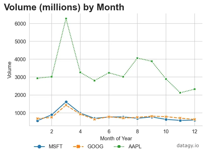
Creating a Customized Seaborn Line Plot
Take a look at the code below to see how to create a customized line plot in Seaborn using the sns.lineplot() function:
# Customizing a Line Plot in Seaborn
import seaborn as sns
import matplotlib.pyplot as plt
import pandas as pd

df = pd.read_csv(
   'https://raw.githubusercontent.com/datagy/data/main/stocks.csv',
   parse_dates=['Date'])
df['Month'] = df['Date'].dt.month

# Set a Style
sns.set_style('whitegrid')

# Create plot
ax = sns.lineplot(data=df, x='Month',
   y='Volume', errorbar=None, estimator='sum',
   hue='Name', style='Name', markers=True)

# Set Title and Labels
ax.set_title('Volume (millions) by Month',
   fontdict={'size': 18, 'weight': 'bold', 'x': 0.2, 'y': -1})
ax.set_xlabel('Month of Year')

# Adjust the Legend
plt.legend(frameon=False, loc='lower left',
   bbox_to_anchor=(0, -0.25), ncol=3)

# Remove the Spines
sns.despine()
plt.show()
This returns the following image:
In the code above, we’re using the following features:
- We’re setting the style of our Seaborn plot to
'whitegrid' - We’re using
lineplot()customizations to modify our line plot - We use the
.set_title()and.set_xlabel()methods to modify our title and x-axis label - We use the
plt.legend()function to customize our Seaborn plot’s legend - We remove the top and right spines from our plot by using
sns.despine()
There’s quite a bit that’s gone into the plot, but the intent of this is to illustrate how we can use Seaborn and Matplotlib together to customize our line plots.
Conclusion
In this guide, you learned how to use the Seaborn lineplot() function to create line charts. The function provides extensive customization options to visualize continuous data. You learned how line charts are different from scatter plots. You then walked through how the Seaborn lineplot() function can be used by exploring its important parameters.
From there, you learned how to use the function to create line plots by walking through practical examples. Seaborn uses a process known as bootstrapping to find the best estimate given new data. You learned how to customize the line chart by adding a single or multiple lines, as well as how to modify colors in the graph. You then learned how to use line styles and markers to change how data are presented in your line chart.
You also learned how to add multiple line charts into the same chart and how to create line charts using wide datasets. Finally, you walked through a customized line chart example from the top down to see how everything you’ve learned can be combined to create a final chart.
Additional Resources
To learn more about related topics, check out the tutorials below:
Pingback: Seaborn Boxplot - How to create box and whisker plots • datagy