In this tutorial, you’ll learn all you need to know about the Seaborn barplot. We’ll explore the sns.barplot() function and provide examples of how to customize your plot.
Check out the sections below If you’re interested in something specific. If you want to learn more about Seaborn, check out my other Seaborn tutorials, like the scatterplot tutorial.
Table of Contents
What are bar plots?
A bar chart is a chart or graph that represents numerical measures (such as counts, means, etc.) broken out by a categorical variable. It does this by using rectangular bars with heights (or lengths) that are proportional to different values.
You would generally use a barplot when you have at least one categorical variable and one numeric variable. Barplots are used to display the differences (and similarities) between the categories.
By default, Seaborn will calculate the mean (the “average”) of a value, split into different categories. Let’s take a look at what a bar plot looks like and what we can expect to learn from it.
If you’re looking to simply count the number of values in each category, Seaborn provides the helpful countplot to accomplish this.

Understanding the Seaborn barplot() Function
This post is part of the Seaborn learning path! The learning path will take you from a beginner in Seaborn to creating beautiful, customized visualizations. Check it out now!
Before diving into creating our own bar plots in Seaborn, let’s take a look at the function that lets you do this. Seaborn comes with a built-in function, sns.barplot() that can be used to generate bar plots. Take a look at the code block below to see how the function is written:
# Understanding the Seaborn barplot() Function
seaborn.barplot(data=None, *, x=None, y=None, hue=None, order=None, hue_order=None, estimator='mean', errorbar=('ci', 95), n_boot=1000, units=None, seed=None, orient=None, color=None, palette=None, saturation=0.75, width=0.8, errcolor='.26', errwidth=None, capsize=None, dodge=True, ci='deprecated', ax=None, **kwargs)
We can see from the code block above that the function offers a lot of different parameters. These parameters provide significant flexibility in how your plots are created.
While we won’t cover all of the parameters, this tutorial will teach you about the most important ones that allow you to generate informative and good-looking plots.
Create a Bar Plot with Seaborn barplot()
In order to create a bar plot with Seaborn, you can use the sns.barplot() function. The simplest way in which to create a bar plot is to pass in a pandas DataFrame and use column labels for the variables passed into the x= and y= parameters.
Let’s load the 'tips' dataset, which is built into Seaborn. For this, we can use the sns.load_dataset() function. The function returns a DataFrame that contains information about tips given by customers during different days of the week.
Let’s create our first Seaborn bar plot using the sns.barplot() function.
# Create a Simple Bar Plot in Seaborn
import seaborn as sns
import matplotlib.pyplot as plt

df = sns.load_dataset('tips')
sns.barplot(data=df, x='day', y='tip')
plt.show()
In the example above, we imported both Seaborn and peplos. We then loaded our dataset. Finally, we created a bar plot by passing in our DataFrame and the column labels for the columns we want to use.
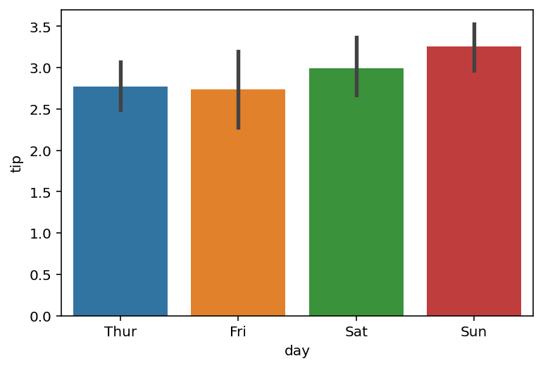
Let’s break down what the chart above is telling us:
- The data are broken down by the categorical variable,
'day' - Seaborn creates an aggregation of data, which by default returns the average value
- Seaborn also includes an error bar, which represents the 95% confidence interval that new data would fall into that range
Let’s now create a grouped bar plot to add another dimension of data to our data visualization.
Create a Grouped Bar Plot in Seaborn
In order to create a grouped bar plot in Seaborn, you can pass an additional variable into the hue= parameter, such as a column label from a pandas DataFrame. This splits each bar into multiple bars, each representing the aggregation in the multiple categories.
Let’s see how we can use Seaborn to create a grouped bar plot:
# Create a Grouped Bar Plot in Seaborn
import seaborn as sns
import matplotlib.pyplot as plt
df = sns.load_dataset('tips')
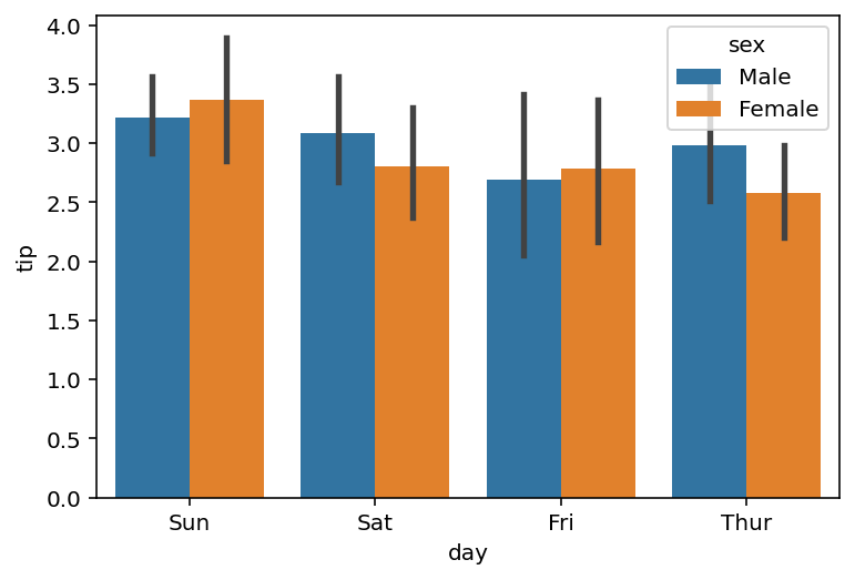
sns.barplot(data=df, x='day', y='tip', hue='sex')
plt.show()By passing in hue='sex', we split the day into additional bars. Because this column contains two unique values, each day’s bar is split into two separate bars.

By creating a grouped bar plot in Seaborn, we’re able to better understand how the average tip amount changes, not just by day, but also by gender.
Change the Estimator (Aggregation) In Seaborn Bar Plots
By default, Seaborn will return the mean value for each category – meaning that the height of the bar represents the mean value in that given category. In order to change the estimator (or aggregation) that Seaborn uses in its bar plot, we can use the estimator= parameter.
The parameter accepts either a string representing the estimator or a callable that can map to a vector. Let’s take a look at how we can calculate the standard deviation by passing in the string 'std'.
# Change the Estimator in a Seaborn Bar Plot
import seaborn as sns
import matplotlib.pyplot as plt

df = sns.load_dataset('tips')
sns.barplot(data=df, x='day', y='tip', hue='sex', estimator='std')
plt.show()
In the code block above, we passed in the additional estimator='std' argument. This calculated the standard deviation for each category and returns the following image:

We can see that in addition to updating the heights of the bars, the error bars were also recalculated. This means that now the error bars represent the 95% confidence interval that the standard deviation will fall into these categories when shown new data.
Change the Ordering in Seaborn Bar Plots
Seaborn also makes it simple to change the ordering of the bars in the bar plots created with sns.barplot(). In order to do this, we can pass in a list of values representing the order of the categories into the order= parameter.
In the example below, we order the days of the week in reverse order and pass this into the order= parameter:
# Change the Ordering in Seaborn Bar Plots
import seaborn as sns
import matplotlib.pyplot as plt

df = sns.load_dataset('tips')
sns.barplot(data=df, x='day', y='tip', hue='sex',
    order=['Sun', 'Sat', 'Fri', 'Thur'])
plt.show()
We can see that by modifying the order, Seaborn respects this order and returns the image below.
In the chart below, we were able to re-order the columns of our bar plot.
Want to change the order of the subcategories?
If, instead, you wanted to change the order of the subcategories (those passed in using the hue= parameter, you can use the hue_order= parameter. This parameter, similar to the order= parameter, accepts a list of values, representing the unique values in that column.
In the following section, you’ll learn how to turn the bar graph on its side and create a horizontal bar plot.
Create a Horizontal Bar Plot in Seaborn
In order to create a horizontal bar plot in Seaborn, you can simply reuse your x= and y= parameters to pass categorical data into the y= parameter. Seaborn, however, let’s you also be more explicit in this by passing in a value into the orient= parameter. The parameter accepts either 'h' for horizontal or 'v' for vertical.
Let’s now create a horizontal bar plot by passing in orient='h' into our sns.barplot() function:
# Create a Horizontal Seaborn Bar Plot
import seaborn as sns
import matplotlib.pyplot as plt
df = sns.load_dataset('tips')
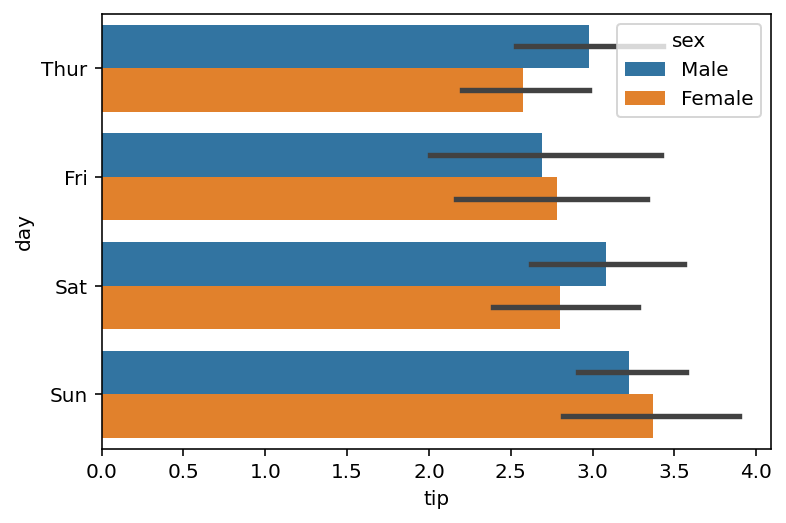
sns.barplot(data=df, y='day', x='tip', hue='sex', orient='h')
plt.show()By using the code block above, we were able to instruct Seaborn to create a horizontal bar plot, as shown below:
So far, we’ve spent quite a bit of time learning about the sns.barplot() function. However, we can customize it even further by modifying the error calculation used. Let’s take a look at that in the following section.
Change the Error Calculation in Seaborn Bar Plots
By default, Seaborn will show an error bar that represents the 95% confidence interval. Seaborn uses a method called bootstrapping. Using this, it samples a set number of data points per group 1000 times (with replacement) to create a 95% confidence interval that new data would fall in this range.
Seaborn let’s you modify the error bar calculation using the errorbar= parameter. Note that in previous versions, Seaborn used a ci= parameter, but this is being deprecated and should not be used.
We can pass in a tuple of information that represents the calculation we want to make and the percentile we want to calculate. Let’s take a look at an example of what this looks like:
# Change the Error Calculation in a Seaborn Bar Plot
import seaborn as sns
import matplotlib.pyplot as plt

df = sns.load_dataset('tips')
sns.barplot(data=df, x='day', y='tip', hue='sex', errorbar=('ci', 50))
plt.show()
In the code block above, we passed in errorbar=('ci', 50), which calculates the 50% confidence interval. We can see that the because our measurement is less precise, the error bar can be narrower.

Similarly, we can change the calculation entirely. Seaborn accepts the following error bar calculations: 'ci', 'pi', 'se', or 'sd', which represent the following calculations:
'ci': confidence interval, which calculates the non-parametric uncertainty'pi': percentile interval, which calculates the non-parametric spread'se': standard error, which calculates the parametric uncertainty'sd': standard deviation, which calculates the parametric spread
Let’s see what it looks like to calculate the standard deviation using our error bar:
# Use a Different Error Bar Calculation
import seaborn as sns
import matplotlib.pyplot as plt

df = sns.load_dataset('tips')
sns.barplot(data=df, x='day', y='tip', hue='sex', errorbar='sd')
plt.show()
In the code block above, we passed in 'sd' which represents standard deviation. This returned the following visualization:

We can see that the error bar now represents the standard deviation for each category, rather than a confidence interval.
Add Caps to the Error Bar in Seaborn Bar Plots
We can also add caps to the error bars to make the visualization a little easier to understand. For non-technical audiences, the bars without caps can be a little more difficult to understand. We can add caps to the error bars by using capsize= parameter.
# Add Caps to Error Bars in Seaborn Bar Plots
import seaborn as sns
import matplotlib.pyplot as plt

df = sns.load_dataset('tips')
sns.barplot(data=df, x='day', y='tip', hue='sex', capsize=0.1)
plt.show()
In the code block above, we added capsize=0.1. The parameter accepts a float that represents the proportion of the width the error bar should take up.

If you want to take this one step further and remover the error bar entirely.
Remove the Error Bar in Seaborn Bar Plots
In order to remove the error bar completely in a Seaborn bar plot, you can pass in errorbar=None. This will remove the error bar and also remove the underlying calculation, making your plot render much faster.
# Remove the Error Bar In a Seaborn Bar Plot
import seaborn as sns
import matplotlib.pyplot as plt

df = sns.load_dataset('tips')
sns.barplot(data=df, x='day', y='tip', hue='sex', errorbar=None)
plt.show()
In the code block above, we removed the error bar in our Seaborn bar plot by passing in errorbar=None. This returned the following data visualization:

Now that we have covered some of the technical components, let’s take a look at how we can style our Seaborn bar plots.
Change the Palette in Seaborn Bar Plots
Seaborn provides a number of different ways to style your plots. One of the simplest ways is to add a color palette into the sns.barplot() function call using the palette= parameter. This allows you to name a Seaborn color palette and style the bar plot using it.
# Change the Color Palette in a Seaborn Bar Plot
import seaborn as sns
import matplotlib.pyplot as plt

df = sns.load_dataset('tips')
sns.barplot(data=df, x='day', y='tip', hue='sex', palette='pastel')
plt.show()
In the code block above, we passed in the palette named 'pastel', which uses more muted colors.

In the following section, you’ll learn how to highlight a bar conditional in a Seaborn bar plot.
Highlight a Bar Conditionally in Seaborn Bar Plots
In order to highlight a bar conditionally in a Seaborn bar plot, we can use Matplotlib patches to find the bar with the tallest height. Let’s take a look at what this looks like first, and then explore how it works.
# Highlight a Column Conditionally in a Seaborn Bar Plot
import seaborn as sns
import matplotlib.pyplot as plt
import numpy as np

df = sns.load_dataset('tips')
ax = sns.barplot(data=df, x='day', y='tip', color='grey')

patch_h = [patch.get_height() for patch in ax.patches]
idx_tallest = np.argmax(patch_h)
ax.patches[idx_tallest].set_facecolor('green')

plt.show()
Let’s break down how we can color bars conditionally in a Seaborn bar plot:
- Import the required libraries: Seaborn, Matplotlib, and NumPy
- Create the bar plot using the
sns.barplot()function - We then created a list containing the heights of the bars using a list comprehension and the
patch.get_height()method - We used the NumPy argmax function to find the index of the tallest bar
- Finally, we use the
.set_facecolor()method to modify the color of the tallest bar
This returns the following visualization:

In the following section, you’ll learn how to add a title and axis labels to Seaborn bar plots.
Add a Title and Axis Labels to Seaborn Bar Plots
In this section, you’ll learn how to add a title and axis labels to a Seaborn bar plot. By default, Seaborn will use the column label to create the axis labels. In most cases, you’ll want to use something more informative if you’re using this as a presentation tool.
We’ll change our approach a little bit and use the function to return an axes object and assign it to the a variable ax. This allows you to use axes methods to modify the title and axis labels, including:
ax.set_title()to set the title of the visualizationax.set_xlabel()to set the x-axis label of the visualizationax.set_ylabel()to set the y-axis label of the visualization
Let’s see how we can do this in Seaborn:
# Add a Title and Axis Labels to a Seaborn Bar Plot
import seaborn as sns
import matplotlib.pyplot as plt

df = sns.load_dataset('tips')
ax = sns.barplot(data=df, x='day', y='tip', hue='sex', palette='pastel')
ax.set_title('Average Tip Amount by Day')
ax.set_xlabel('Day of Week')
ax.set_ylabel('Average Tip Amount ($)')
plt.show()
When we modify our visualization using the code block above, we return the following data visualization:

We can see that this is much more informative. For example, we can now see the currency that the tip amount uses as well as the underlying calculation that it represents.
Conclusion
In this guide, you learned how to create bar plots in Seaborn using the sns.barplot() function. You first learned what bar plots are and when they’re useful. Then, you learned about the different parameters in the function.
From there, you built bar plots of increasing complexity. First by adding additional detail using color, then by customizing the estimator and error bar calculations available in the plot. You also learned how to customize the plot by adding a title, axis labels, and modifying the palette of the plot.
Additional Resources
To learn more about related topics, check out the resources below:
- Seaborn catplot – Categorical Data Visualizations in Python
- Seaborn Boxplot – How to Create Box and Whisker Plots
- Seaborn Violin Plots in Python: Complete Guide
- Seaborn Countplot – Counting Categorical Data in Python
- Seaborn swarmplot: Bee Swarm Plots for Distributions of Categorical Data
- Seaborn Pointplot: Central Tendency for Categorical Data
- Seaborn stripplot: Jitter Plots for Distributions of Categorical Data