In this tutorial, you’ll learn how to get started with plotting in Python with the matplotlib library. You’ll learn how the matplotlib library works and gain an understanding of its “anatomy”. You’ll learn how to plot and customize some simple graphs and how to use the matplotlib library with Pandas. Finally, you’ll learn how to plot and discover different plot types.
Making graphs, or plots, is an incredibly important skill in your data science journey. There’s a reason people say that a picture is worth a thousand words. Whether you’re using plotting as part of your exploratory data analysis or for the final presentation of your results, matplotlib provides an extensive toolset to let you customize your graphs.
By the end of reading this tutorial, you’ll have learned:
- How to install and import the matplotlib library
- The anatomy of matplotlib objects
- How to create your first plot in matplotlib
- How to customize your plots with titles, legends, and colors
- How to create different types of plots
Table of Contents
What is Python’s Matplotlib?
Matplotlib is a plotting package designed to create plots in a similar fashion to MATLAB. The library makes it easy to create a chart with a single line of code, but also provides an extensive (really, it’s huge!) set of customization options. This is great, but it can also make the library very confusing to use. This tutorial is meant to provide an easy, simple-to-follow introduction to matplotlib, allowing you to build and customize charts in Python.
What’s more, is that many other data visualization libraries in Python, such as Seaborn, are built on top of Matplotlib. Because of this, understanding how Matplotlib works will increase your ability to work with these other libraries.
How to Install and Import Python Matplotlib
Matplotlib is not part of the standard Python library. Because of this, we need to install it before we can use it. Matplotlib is available to install via pip (or conda). Copy the code below into your terminal to install the Matplotlib library:
pip install matplotlibOnce you have successfully installed Matplotlib, you can load the library in your Python file. Instead of loading the entire library, however, you’ll only import the pyplot interface. Conventionally, this is imported as plt.
# Importing Matplotlib
import matplotlib.pyplot as plt
If this code runs without an error, then you successfully load Matplotlib!
The Anatomy of a Matplotlib Objects
Before diving into creating your first plot using Matplotlib, let’s cover off a bit of theory. In this tutorial, you’ll be using two main components of Matplotlib:
Figure: the outermost container for graphing in Matplotlib, which contains one or more axes objectsAxes: which contains the region for plotting data, including all individual elements such as the different axis
Note: the term of Axes can be easily confused with the term axis. The Axes object, confusingly doesn’t relate to the plural of axis. An Axes contains the individual plot, which can contain multiple axis.
The image below is provided from the Matplotlib documentation:

You can see that the Figure contains, in this case, a single Axes. Below the Axes, there are individual axis, spines, lines, markers, and so much more. The reason this is being covered off in such detail is that each of these elements is customizable.
Understanding the concept of a Figure and Axes is important to properly and conventionally create Matplotlib graphics. It may seem overly verbose and redundant when all you want is to create a chart, but learning these pieces will make progressing in Matplotlib much easier.
Creating Your First Matplotlib Plot: A Line Chart
Now, let’s create your first Matplotlib graphic! In order to do this, you’ll load a simple Figure containing only one Axes. From there, you can easily pass in two lists of data to plot your data. Let’s first create the Figure and Axes objects and confirm their types:
# Creating a Figure and Axes
import matplotlib.pyplot as plt

fig, ax = plt.subplots()

print('The type of fig is: ', type(fig))
print('The type of ax is: ', type(ax))

# Returns:
# The type of fig is:  <class 'matplotlib.figure.Figure'>
# The type of ax is:  <class 'matplotlib.axes._subplots.AxesSubplot'>
Here, we created a Figure and an Axes using the subplots() method. Now that we have our containers, we can start adding data to them. In this case, we’ll load some simple lists that contain data to be able to plot them onto our Axes:
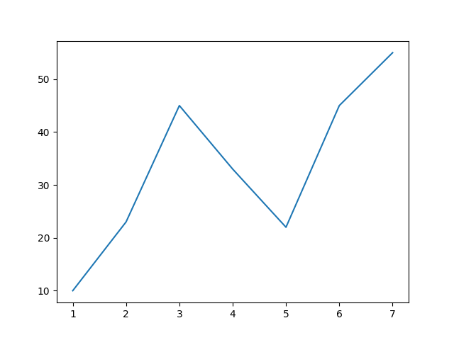
# Adding Data to an Axes
x = [1, 2, 3, 4, 5, 6, 7]
y = [10, 23, 45, 33, 22, 45, 55]

ax.plot(x, y)
You have now plotted the x and y values to the Axes ax. But, when you run your code, nothing shows up! Why is that? You need to explicitly pass in instructions to show your plot! You can do this by passing the .show() method.
# Displaying your plot
plt.show()
This returns the following image:
A new window will pop up showing your plot. In order for your script to finish running, you need to close the window itself. The graphic itself isn’t very inspirational from a design perspective. A little later in this tutorial, you’ll learn how to customize labels and titles, legends, and colors, as well as styling your graph with built-in styles.
Are you working with Jupyter Notebooks?
When working inside a Jupyter notebook, you don’t actually have to call the plt.show() command. Instead, you can use a Jupyter magic to display your plots in-line. In order to do this, you can simply include %matplotlib inline in a cell prior to creating your charts.
Using Pandas with Python’s Matplotlib
In many cases, your data won’t simply be stored in lists. It’s much more likely that you’ll find yourself working with a data science library, like Pandas. Because of this, this section will teach you how to work with Matplotlib using data stored in a Pandas DataFrame.
Loading a Sample Pandas DataFrame
Let’s begin by loading a sample Pandas DataFrame to use throughout the rest of this tutorial. We’ll keep the data deliberately simple in order to allow the visualization to be easy to follow. We’ll load a sample dataset covering sales over a period of ten years, containing different product categories:
# Loading a Sample Pandas DataFrame
import pandas as pd

df = pd.DataFrame.from_dict({
    'Year': [2012, 2013, 2014, 2015, 2016, 2017, 2018, 2019, 2020, 2021, 2022],
    'Computer Sales': [12500, 13000, 13500, 15000, 14000, 16000, 17000, 18000, 16500, 17000, 19000],
    'TV Sales': [13000, 20000, 18000, 19000, 19500, 21000, 23000, 24000, 22000, 22500, 25000]
})

print(df.head())

# Returns:
#    Year  Computer Sales  TV Sales
# 0  2012           12500     13000
# 1  2013           13000     20000
# 2  2014           13500     18000
# 3  2015           15000     19000
# 4  2016           14000     19500
By printing out the first five records of our DataFrame, you can see that there are three columns. One column contains the year of the sales, while the others contain sales figures.
Plotting Pandas Data with Matplotlib
Because Pandas data are stored in list-like Series containers, we can easily parse out the data we want to plot. In order to create our x-axis, we can parse out the Year column. Similarly, to plot the Computer Sales, we can simply access that column. Let’s now plot our Pandas data:
# Plotting a Pandas DataFrame
fig, ax = plt.subplots()
ax.plot(df['Year'], df['Computer Sales'])
plt.show()
This returns the following image:

Adding a Second Line to Your Matplotlib Line Chart
Our Pandas DataFrame contains two columns data that we may want to plot. Thankfully, Matplotlib makes it incredibly easy (though not immediately intuitive) to add a second line of data to your graph. Because our data is stored in a wide format (i.e., the data is a second column, rather than an attribute of another), we can easily simply add that data to our plot! Let’s see what this looks like:
# Adding a second line to your Line Chart
fig, ax = plt.subplots()
ax.plot(df['Year'], df['Computer Sales'])
ax.plot(df['Year'], df['TV Sales'])
plt.show()
This returns the following image:

Let’s break down what we did here:
- We used the exact same code as before, for three of the four lines of code
- Prior to calling the
.show()function, we inserted another series of data into theaxobject. This instructed Matplotlib to draw a second line. Note that the x-axes match between the two series of data.
At this point, the chart you’ve created is no longer understandable. It’s not clear which color refers to which data series. In order to make the graph easier to read, you’ll learn how to customize Matplotlib plots using titles, legends, and other customizations in the following section.
Customizing Python Matplotlib Plots
Matplotlib provides an incredibly large amount of customization options. It would be impractical to cover off every customization option here, so we will focus on some of the key elements. You’ll learn how to add titles and axis labels, as well as how to modify axis ranges. You’ll also learn how to add legends to your plots and how to change element colors. Finally, you’ll learn how to use built-in styles to keep your charts looking consistent.
Adding Titles and Axis Labels to Matplotlib
Let’s start off by learning how to add a title and axis labels to a Matplotlib plot. The axis object has a number of methods that allow us to add these elements. Let’s take a look at three main ones:
ax.set_title()allows you to add a title to your chartax.set_xlabel()allows you to add a title to your x-axisax.set_ylabel()allows you to add a title to your y-axis
Let’s use these methods to add descriptive titles to our chart:
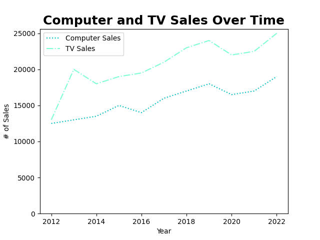
# Adding Title to a Matplotlib Axes Object
ax.set_title('Computer and TV Sales Over Time')
ax.set_xlabel('Year')
ax.set_ylabel('# of Sales')
This returns the following image:

We can further customize these titles and labels by applying formatting to them. For example, let’s take a look at how we can stylize the title text and font:
# Styling Matplotlib Titles
ax.set_title('Computer and TV Sales Over Time', size=18, fontweight='bold')
ax.set_xlabel('Year', style='italic')
ax.set_ylabel('# of Sales', style='italic')
In the code above, we simply added additional parameters to the methods. For example, we were able to use the size= parameter to set the size. The fontweight= and style= parameters allowed you to modify the styles applied to the text. This returns the following image:

Now, let’s move on to learning how to add a helpful legend to our plot.
Adding a Legend to Matplotlib Plots
While it’s now clear what our entire graph is showing, it’s still not clear to readers of our graph what each line represents. For example, there’s no way of knowing whether the blue line represents Computer Sales or TV Sales. We can fix this by adding a legend to our graph.
Matplotlib provides an ax object method, .legend() which allows us to create a legend. We can pass in an ordered list of items that our legend should contain. In this case, we’ll pass in the labels of the data in the order that they were added to the plot. Let’s add it now:
# Adding a Legend to Our Axes
ax.legend(['Computer Sales', 'TV Sales'])
This returns the following image:

When we show our graph following this, we can see that the legend was successfully added. There is another way to add legends to a plot, which is, in my opinion, much less error-prone. When we add our initial data, we can pass in a label= argument which allows Matplotlib to simply parse out how to color each series.
This approach is much less error prone because it’s not dependent on us knowing the order in which data were added to our graphs. This allows us to move code around and not need to worry about modifying the hard-coded legend values. Let’s modify our code a little bit to use this approach:
fig, ax = plt.subplots()
ax.plot(df['Year'], df['Computer Sales'], label='Computer Sales')       # Added label=
ax.plot(df['Year'], df['TV Sales'], label='TV Sales')                   # Added label=

# Adding Title to a Matplotlib Axes Object
ax.set_title('Computer and TV Sales Over Time', size=18, fontweight='bold')
ax.set_xlabel('Year')
ax.set_ylabel('# of Sales')

# Adding a Legend to Our Axes
ax.legend()                                              # Removed hard-coded legend
plt.show()
Running this code returns the exact same image! But it is a much more flexible and much less error-prone approach!
Changing Axis Ranges in Matplotlib
In this section, you’ll learn how to modify the axis ranges of your data. Why would you want to do this? Currently, the y-axis starts at 12,000. While it allows us to visualize the nuaces between our two series, it also exagerates any differences. It’s often good practice to set the y-axis to start at 0 to prevent misleading your readers.
In Matplotlib, this can be done using the .set_ylim() methood. The method can take a tuple of data, meaning that you can specify a bottom and top value. However, since we don’t always know the top, we can also pass in a value only for the bottom, using the bottom= parameter. Let’s set our y-axis to start at the value of 0.
# Setting the y-axis to start at 0
ax.set_ylim(bottom=0)
By hard coding in this value, Matplotlib will overwrite the default auto-setting of the axis bottom limit. This returns the following image:

In the next section, you’ll learn how to change colors in a Matplotlib chart.
Changing Colors and Linestyles in Matplotlib
Matplotlib’s default colors are a little, for lack of a better word, uninspiring. That said, as with everything else in Matplotlib, you have full control over how to style your colors. When we define a new line being added to our chart, we can modify both the color and the linestyle using the color= and linestyle= parameters.
Colors, in particular, offer incredibly flexibility. You’re not limited to passing in strings of color names, but you can specify RGB values (as tuples) or even hex values as strings. Let’s take a look at a few below, but the full array of colors can be found in the official documentation.
| Format | Example |
|---|---|
| RGB Values in a format of float values in a tuple | (0.1, 0.3, 0.5) |
| Hex values in a three or six character strings | '#0f0f0f' or '#fb1' |
| Grayscale values from a range of 0 through 1 | '0' as black'0.7' as light gray |
| CSS4 color names with no spaces | 'aquamarine', 'coral' |
| Single level colors | 'b' as blue, 'c' as cyan |
| Tableau-style colors | ‘tab:blue', 'tab:cyan' |
Similarly, we have a number of line styles available to use. For example, we can use a '-' or 'solid' to represent a solid line, or '--' or 'dashed' to represent a dashed line. Let’s apply some color and linestyles to our graph:
# Adding color and linestyles to our lines
ax.plot(df['Year'], df['Computer Sales'], label='Computer Sales', color='c', linestyle='dotted')
ax.plot(df['Year'], df['TV Sales'], label='TV Sales', color='aquamarine', linestyle='-.')
In the code above, we modified our initial line creation to include different colors and linestyles. Our resulting graph looks like this:
We can see that Matplotlib not only updated our lines, but also the lines in our legend.
Using Styles in Matplotlib
While it’s great that we can customize the colors of our graphs, there will be a lot of times when you simply want to create a graph that follows a particular style. Because of this, Matplotlib comes with a number of different styles that can be applied to any type of chart. This allows your graphics to look consistent.
To see a list of available styles, you can access the styles.available attribute in the pyplot object. Let’s print these out to see what we have avialable to choose from:
# Seeing Styles Available in Matplotlib
print(plt.style.available)

# Returns:
# ['Solarize_Light2', '_classic_test_patch', '_mpl-gallery', '_mpl-gallery-nogrid', 'bmh', 'classic', 'dark_background', 'fast', 'fivethirtyeight', 'ggplot', 'grayscale', 'seaborn', 'seaborn-bright', 'seaborn-colorblind', 'seaborn-dark', 'seaborn-dark-palette', 'seaborn-darkgrid', 'seaborn-deep', 'seaborn-muted', 'seaborn-notebook', 'seaborn-paper', 'seaborn-pastel', 'seaborn-poster', 'seaborn-talk', 'seaborn-ticks', 'seaborn-white', 'seaborn-whitegrid', 'tableau-colorblind10']
You can see that there are quite a few styles available! Let’s use the ggplot style, that’s been borrowed from the popular R language. We can apply a style by using the style.use() method, where we simply need to pass in the style name. We’ll pass this in before you create the first figure and axes. In the code below, you’ll find the entire code to create our graph, with any subsequent styling removed.
import matplotlib.pyplot as plt
import pandas as pd

df = pd.DataFrame.from_dict({
    'Year': [2012, 2013, 2014, 2015, 2016, 2017, 2018, 2019, 2020, 2021, 2022],
    'Computer Sales': [12500, 13000, 13500, 15000, 14000, 16000, 17000, 18000, 16500, 17000, 19000],
    'TV Sales': [13000, 20000, 18000, 19000, 19500, 21000, 23000, 24000, 22000, 22500, 25000]
})

# Adding style to our graph
plt.style.use('ggplot')
fig, ax = plt.subplots()

ax.plot(df['Year'], df['Computer Sales'], label='Computer Sales')
ax.plot(df['Year'], df['TV Sales'], label='TV Sales')

ax.set_title('Computer and TV Sales Over Time')
ax.set_xlabel('Year')
ax.set_ylabel('# of Sales')
ax.set_ylim(bottom=0)

ax.legend()
plt.show()
We can see that the graph is significantly prettier than the original we started with.

Creating Pie Charts with Python Matplotlib
In this section, we’ll apply what you learned in the previous sections to create and style a pie chart. Creating a pie chart is very similar to creating a line chart, only instead of using the .plot() method, we use the .pie() method.
Matplotlib will expect a series of data that it should plot. Because our DataFrame is a wide format, we can’t simply add in the data. What we can do however, is create a list that stores the sums of each of the columns. This can then be passed into the .pie() method!
# Creating our first pie chart
fig, ax = plt.subplots()
ax.pie([df['Computer Sales'].sum(), df['TV Sales'].sum()])

plt.show()
This returns the following plot:

To customize our pie chart, let’s apply a style and add in a few additional parameters. You can find all the parameters in the official documentation. Try and take a few moments to read through and see if there are additional parameters you may want to modify.
# Styling and Modifying Our Pie Chart
plt.style.use('ggplot')
fig, ax = plt.subplots()
ax.pie([df['Computer Sales'].sum(), df['TV Sales'].sum()], labels=['Computer Sales', 'TV Sales'], autopct='%1.1f%%')
ax.set_title('Computer and TV Sales Compared')

plt.show()
In the code above, we accomplished the following:
- Applied the
'ggplot'style - Added labels to the chart as well as a percent formatter
- Added a title
The resulting chart looks like this:

Creating Bar Charts with Python Matplotlib
To close off the tutorial, let’s look at a more complex example. We’ll work our way through creating the multiple bar chart below. Throughout this section, you’ll learn more about the .bar() method and how positioning works in Python’s Matplotlib. Insofar, you’ve focused on overlaying lines over one another. In the case of bar charts, this won’t do, as we will want to display the bars beside one another.

Let’s first take a look at how what would happen if we followed the sample code provided for line charts, where data are simply overlayed:
fig, ax = plt.subplots()
ax.bar(df['Year'], df['Computer Sales'])
ax.bar(df['Year'], df['TV Sales'])

plt.show()
This returns the following image.

We can see that this doesn’t look great! In fact, you can’t actually see any data related to computer sales, as it’s consistently lower. What we’ll need to do is make use of the width= paramter and the x positioning of one of the series. Thankfully, this is quite easy to do!
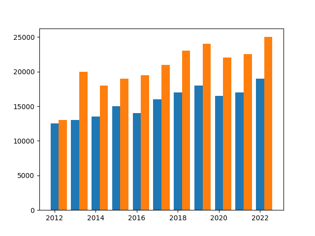
fig, ax = plt.subplots()
width = 0.4
ax.bar(df['Year'], df['Computer Sales'], width=width)
ax.bar(df['Year'] + width, df['TV Sales'], width=width)

plt.show()
This returns the following chart:
This looks much better! But what exactly did we do here? Let’s break this down a little bit:
- We created a variable
width=, which stores a proportion out of 1. This proportion is the width that the bar is meant to take up. - We then pass that width into both sets of bars
- Finally, we add the width to the
xpositioning of our second bar, asking Python to move the bar over 40%.
Now that we know how to place two bars beside one another, let’s add some style and descriptive characteristics, like a title and a legend.
# Our final code
plt.style.use('ggplot')
fig, ax = plt.subplots()
width = 0.4
ax.bar(df['Year'], df['Computer Sales'], width=width, label='Computer Sales')
ax.bar(df['Year'] + width, df['TV Sales'], width=width, label='TV Sales')
ax.set_title('Computer and TV Sales Over Time')
ax.legend()

plt.show()
With these changes, we end up with the desired graph!
Exercises
It’s time to test your learning! Use the exercises below to check your understanding of what you’ve learned in this tutorial. If you need help or want to check your solution, click the question to see a potential solution.
An Axes is just the plural for axis (like y-axis) – True or False?
While it’s true that the plural for axis is axes, in Matplotlib an Axes object refers to the container for holding a visualization. A Figure can hold one or more Axes objects.
Given a third series of data, how would you add it to the bar chart you created. Imagine the series comes from df[‘Phone Sales’]
fig, ax = plt.subplots()
width = 0.3
ax.bar(df['Year'], df['Computer Sales'], width=width)
ax.bar(df['Year'] + width, df['TV Sales'], width=width)
ax.bar(df['Year'] + (2* width), df['Phone Sales'], width=width)

plt.show()
Try and find a way to programmatically save your plots to your computer.
The documentation mentions the .savefig() method, which can be used to save images. By passing in a filename and extension, Matplotlib will save the image to the destination folder.
Conclusion and Recap
In this tutorial you learned how to use Python and Matplotlib to dive into the world of data visualization. Being able to articulate and explore your data using visualizations can make you a much stronger Pythonista. The section below provides a recap of what you learned:
- Matplotlib can be installed using
piporconda - The
pyplotmodule provides a low-level access to create highly customizable data visualizations pyplotvisualizations are comprised of aFigureand one or moreAxes. TheAxesobject holds the visualization.- A line chart can be added via the
pyplot.plot()method, a pie chart with the.pyplot.pie()method, and a bar chart with thepyplot.bar()method - The
Axesobject can control many elements such as titles, axis labels, and more
Additional Resources
To learn more about related topics, check out the articles listed below:
Pingback: Seaborn in Python for Data Visualization • The Ultimate Guide • datagy