A histogram is a chart that uses bars represent frequencies which helps visualize distributions of data.
In this post, you’ll learn how to create histograms with Python, including Matplotlib and Pandas.
Table of Contents
Video Tutorial
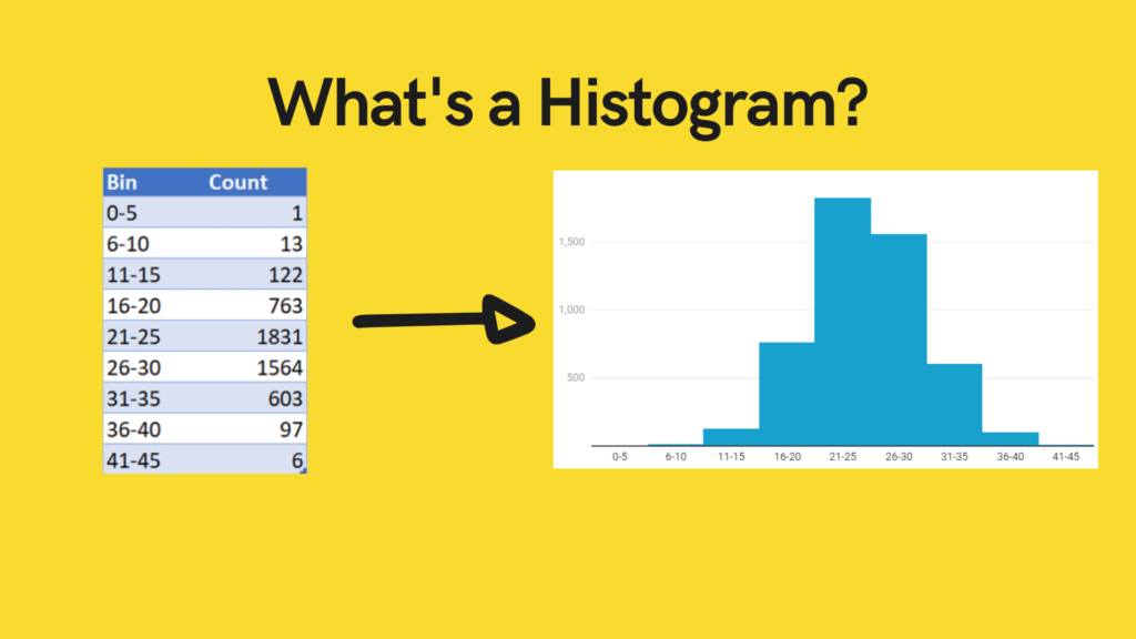
What is a Histogram?
A histogram is a chart that uses bars represent frequencies which helps visualize distributions of data.
Bars can represent unique values or groups of numbers that fall into ranges. The taller the bar, the more data falls into that range.
The shape of the histogram displays the spread of a continuous sample of data.
If you want to learn how to create your own bins for data, you can check out my tutorial on binning data with Pandas.
The histogram can turn a frequency table of binned data into a helpful visualization:
Loading our Dataset
Let’s begin by loading the required libraries and our dataset. We can then create histograms using Python on the age column, to visualize the distribution of that variable.
import pandas as pd
import matplotlib.pyplot as plt
df = pd.read_excel('https://github.com/datagy/Intro-to-Python/raw/master/sportsdata.xls', usecols=['Age'])

print(df.describe())

# Returns:
# 	Age
# count 	5000.000000
# mean 	25.012200
# std 	5.013849
# min 	4.000000
# 25% 	22.000000
# 50% 	25.000000
# 75% 	28.000000
# max 	43.000000
We can see from the data above that the data goes up to 43. It might make sense to split the data in 5-year increments.
If you want to learn how to check if a distribution is normal, check out my guide on using Python to test for normality.
Creating a Histogram in Python with Matplotlib
To create a histogram in Python using Matplotlib, you can use the hist() function.
This hist function takes a number of arguments, the key one being the bins argument, which specifies the number of equal-width bins in the range.
Tip! If you’re working in the Jupyter environment, be sure to include the %matplotlib inline Jupyter magic to display the histogram inline.
The easiest way to create a histogram using Matplotlib, is simply to call the hist function:
plt.hist(df['Age'])This returns the histogram with all default parameters:

Define Matplotlib Histogram Bin Size
You can define the bins by using the bins= argument. This accepts either a number (for number of bins) or a list (for specific bins).
If you wanted to let your histogram have 9 bins, you could write:
plt.hist(df['Age'], bins=9)This creates the following image:

Define Matplotlib Histogram Bins
If you want to be more specific about the size of bins that you have, you can define them entirely. For example, if you wanted your bins to fall in five year increments, you could write:
plt.hist(df['Age'], bins=[0,5,10,15,20,25,35,40,45,50])This allows you to be explicit about where data should fall. This code returns the following:

Limit Matplotlib Histogram Bins
You can also use the bins to exclude data. If you were only interested in returning ages above a certain age, you can simply exclude those from your list.
For example, if you wanted to exclude ages under 20, you could write:
plt.hist(df['Age'], bins=[20,25,35,40,45,50])
Matplotlib Histogram Logarithmic Scale
If your data has some bins with dramatically more data than other bins, it may be useful to visualize the data using a logarithmic scale. This can be accomplished using the log=True argument:
plt.hist(df['Age'], bins=range(0,55,5), log=True)This returns the following image:

Changing Matplotlib Histogram Appearance
In order to change the appearance of the histogram, there are three important arguments to know:
- align: accepts mid, right, left to assign where the bars should align in relation to their markers
- color: accepts Matplotlib colors, defaulting to blue, and
- edgecolor: accepts Matplotlib colors and outlines the bars
To change the alignment and color of the histogram, we could write:
plt.hist(df['Age'], bins=9, align='right', color='purple', edgecolor='black')This generates the following histogram:

To learn more about the Matplotlib hist function, check out the official documentation.
Creating a Histogram in Python with Pandas
When working Pandas dataframes, it’s easy to generate histograms. Pandas integrates a lot of Matplotlib’s Pyplot’s functionality to make plotting much easier.
Pandas histograms can be applied to the dataframe directly, using the .hist() function:
df.hist()This generates the histogram below:

We can further customize it using key arguments including:
- column: since our dataframe only has one column, this isn’t necessary
- grid: defaults to True
- bins: defaults to 10
Check out some other Python tutorials on datagy, including our complete guide to styling Pandas and our comprehensive overview of Pivot Tables in Pandas!
Let’s change our code to include only 9 bins and removes the grid:
df.hist(grid=False, bins=9)This returns the dataframe below:

You can also add titles and axis labels by using the following:
df.hist(grid=False, bins=9)
plt.xlabel('Age of Players')
plt.ylabel('# of Players')
plt.title('Age Distribution')
Which returns the following:

Similarly, if you want to define the actual edge boundaries, you can do this by including a list of values that you want your boundaries to be.
This can be sped up by using the range() function:
df.hist(grid=False, bins=range(0,55,5))
plt.xlabel('Age of Players')ac
plt.ylabel('# of Players')
plt.title('Age Distribution')
This returns the following:

If you want to learn more about the function, check out the official documentation.
Conclusion
In this post, you learned what a histogram is and how to create one using Python, including using Matplotlib, Pandas, and Seaborn. Each of these libraries come with unique advantages and drawbacks. If you’re looking for a more statistics-friendly option, Seaborn is the way to go.
To learn more about related topics, check out the tutorials below:
Pingback: Seaborn in Python for Data Visualization • The Ultimate Guide • datagy
Pingback: Plotting in Python with Matplotlib • datagy