In this tutorial, you’ll learn how to check the assumption that data in a dataset are distributed normally, meaning that they follow a Gaussian distribution. This is an incredibly important topic to understand, given how many statistical tests make the assumption that a distribution is normally distributed.
By the end of this tutorial, you’ll have learned the following:
- How to visually check whether your data are normally distributed using a histogram
- How to check if your data follows a Gaussian distribution using a Q-Q plot
- How to use two statistical tests, the Shapiro-Wilk test and the D’Agostino K2 test, to check whether your data are normally distributed
Let’s get started!
Table of Contents
Loading a Sample Dataset
To follow along with this tutorial, we’ll create two different datasets:
- A normally distributed dataset, allowing us to see what our tests look like when data follow a normal distribution, and
- A log-normally distributed dataset, which allows to see how our tests operate for non-normal data
We’ll use the scipy package to create both of these datasets. Take a look at the code block below, which is used to create two different distributions of data.
import math
import numpy as np
from scipy.stats import lognorm, norm
import matplotlib.pyplot as plt
np.random.seed(42)
%config InlineBackend.figure_format='retina'

# Generate a Normal Dataset
normal_data = norm(loc=0, scale=1).rvs(size=500)

# Generate a Log-Norm Dataset
lognorm_data = lognorm.rvs(s=0.4, scale=math.exp(1), size=500)
Now that we have two distributions, each with 500 data points, let’s dive into our first test of normality. If you wanted to create these distributions using NumPy, you can check out my tutorial on creating normal data using NumPy.
Using a Histogram to Check if a Distribution is Normally Distributed
One of the simplest ways to check if a dataset follows a normal distribution is to plot it using a histogram. A histogram divides a dataset into a specified number of groups, called bins. The data are then sorted into each bin and visualizes the count of the number of observations.
If a distribution has a Gaussian distribution, then the histogram will create a bell-shaped structure.
We can use the popular Matplotlib library to visualize our distributions. This can be done using the hist() function, which allows us to pass in our arrays of data.
Let’s first take a look at our normal distribution, to see what our histogram looks like.
# Plotting a Normal Distribution Using a Histogram
plt.hist(normal_data, edgecolor='black', bins=25)
plt.title('Normal Distribution', weight='bold', size=18)
plt.show()
In the code block block above, we plotted the distribution and added a title to better illustrate what the data represents. This returns the following distribution:
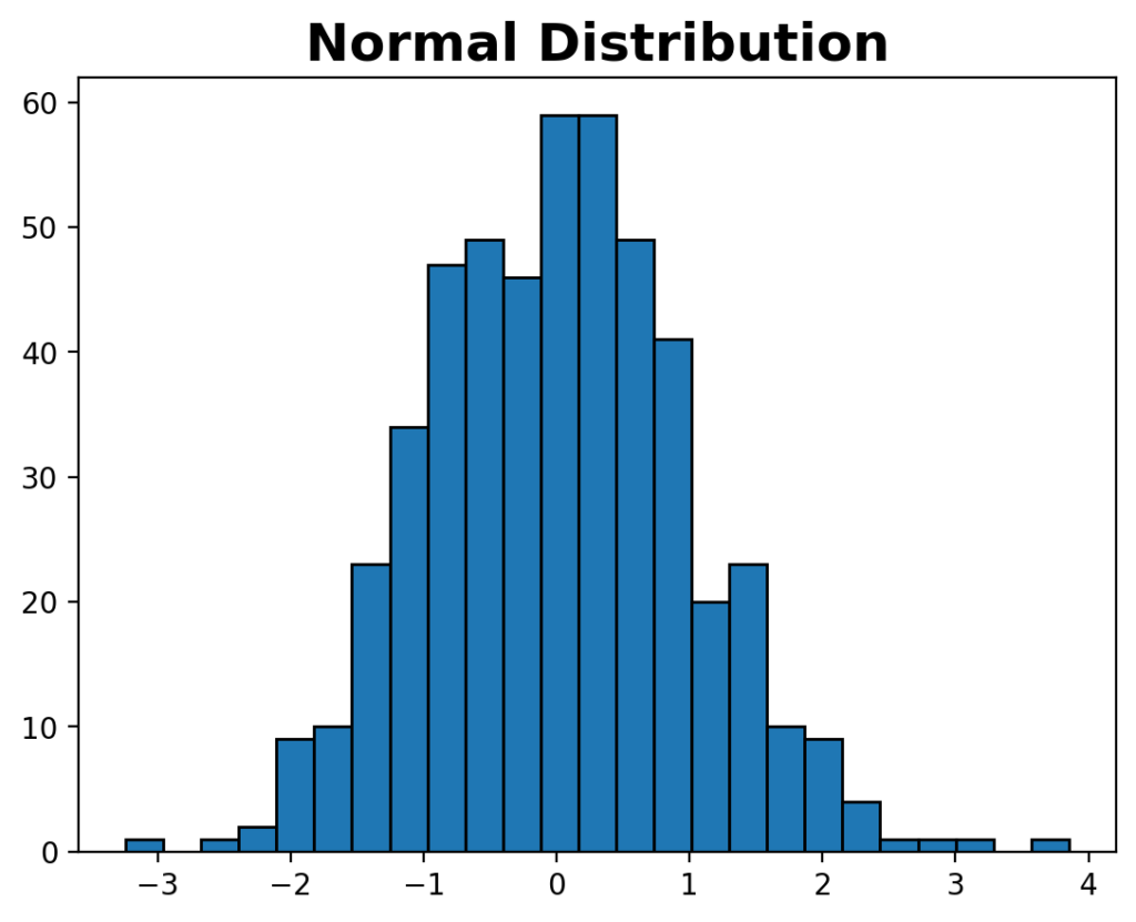
We can see that the distribution follows a bell-shaped distribution, which we can assume to be normal based on our visual check.
Let’s now take a look at what the non-normal distribution looks like:
# Plotting a Log-Normal Distribution Using a Histogram
plt.hist(lognorm_data, edgecolor='black', bins=25)
plt.title('Log-Normal Distribution', weight='bold', size=18)
plt.show()
We followed a similar approach to our normally-distribution to plot our log-normal distribution.
This returns the following histogram:
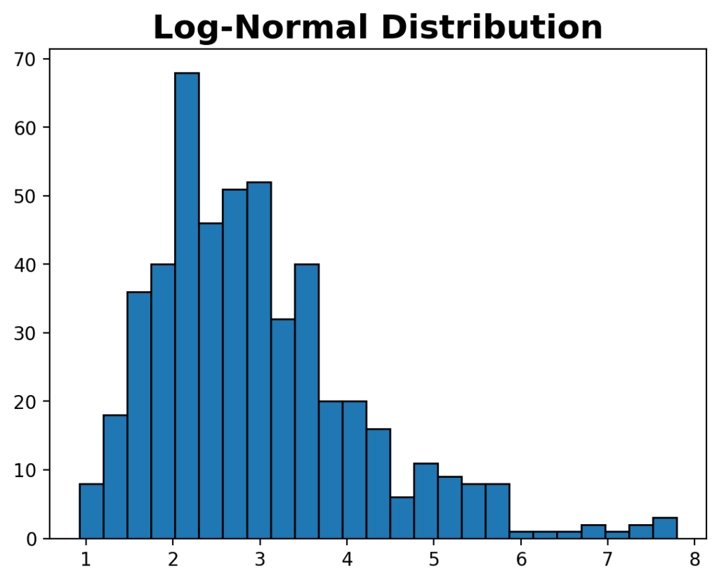
We can see that this dataset doesn’t follow the common bell-shaped distribution, indicating that the data don’t follow a normal distribution.
Using a Q-Q Plot to Check if a Distribution is Normally Distributed
A common plot used to check if data are normally distributed is a Quantile-Quantile plot (or Q-Q plot, for short).
A QQ plot, or Quantile-Quantile plot, is a visual tool in statistics for comparing two datasets, typically your actual data and a theoretical distribution like the normal distribution. First, both datasets are sorted, and percentiles are calculated for each data point to determine where they stand relative to the rest.
Then, a QQ plot is created by plotting the percentiles of your actual data on the x-axis and those of the theoretical distribution on the y-axis. If the points in the plot form a straight line, it suggests your data closely matches the theoretical distribution, while deviations from the line indicate differences. This plot is useful for assessing goodness-of-fit, detecting outliers, and understanding the distribution of your data.
In Python, we can create a Q-Q plot using the qqplot() function in statsmodel. The function takes the data distribution as its input and, by default, assumes that we want to compare it to the normal distribution. We can add the comparison line by passing in line='s'.
Let’s take a look at how we can use the Q-Q plot to see how normal our line is:
# Creating a Q-Q Plot for Normal Data
import statsmodels.api as sm
fig = sm.qqplot(normal_data, line='s')
fig.suptitle('Plotting a qqplot for Normal Data', weight='bold')
plt.show()
In the code block above, we imported the required library. We then used the qqplot() function to create our Quantile-Quantile plot. Let’s take a look at what this plot looks like:
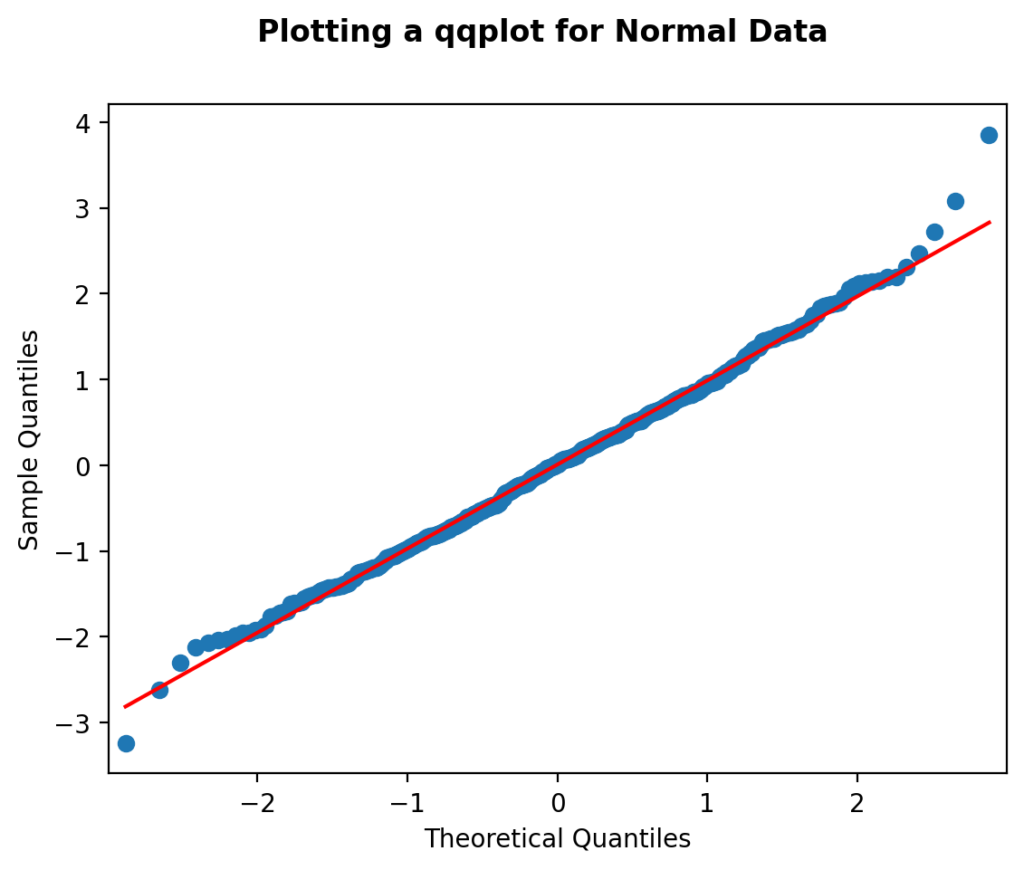
We can see that while the scatterplot doesn’t conform perfectly to the line, the data follows a more or less normal distribution.
Let’s take a look at how we can plot the q-q plot for our log-normal distribution to see what the results look like.
# Creating a Q-Q Plot for Log-Normal Data
import statsmodels.api as sm
fig = sm.qqplot(lognorm_data, line='s')
fig.suptitle('Plotting a qqplot for Log-Normal Data', weight='bold')

plt.show()
Running the code block above returns the image below.
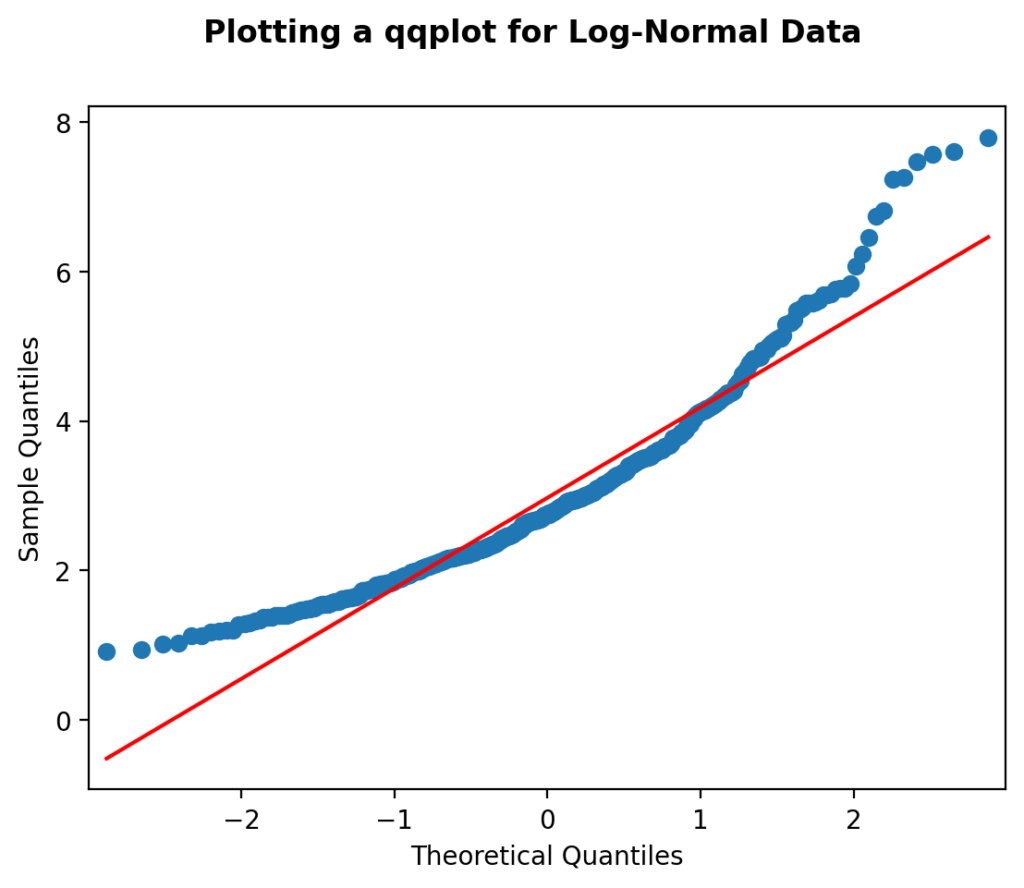
We can see how much the distribution deviates away from the perfect normal distribution (the red line). Because of this, we can safely say that the distribution is not normal.
Let’s now dive into the exciting realm of statistical tests to test for normality.
Using the Shapiro-Wilk Test to Check if a Distribution is Normally Distributed
The Shapiro-Wilk test is a statistical test that helps you check if a dataset comes from a normally distributed population. It does this by comparing the pattern of your data to what you’d expect from a normal distribution; if the p-value from the test is low (typically less than 0.05), it suggests that your data significantly deviates from a normal distribution.
In Python, we can implement the Shapiro-Wilk test using the scipy.stats module, using the shapiro function. The function returns both the test statistic and a p-value for the hypothesis.
Let’s define a function that cleanly defines whether a distribution is normal based on an acceptable alpha (or p-value threshold).
# Shapiro-Wilk Test
from scipy.stats import shapiro

# Define a Function for the Shapiro test
def shapiro_test(data, alpha = 0.05):
    stat, p = shapiro(data)
    if p > alpha:
        print('Data looks Gaussian')
    else:
        print('Data look does not look Gaussian')
In the code block above, we first imported the shapiro function. We then defined a new function that takes an array and an an alpha value (which defaults to 0.05). If the evaluated p-value is greater than our alpha, we print that the distribution is normal. Otherwise, we indicate that it’s not normal.
Let’s see what this looks like for our normal dataset:
# Running the Shapiro-Wilk Test on Normal Data
shapiro_test(normal_data)

# Returns:
# Data looks Gaussian
We can see that by passing in our normal distribution into the our newly-defined function, that the function correctly asserts that our distribution is normal.
Let’s now try it for our log-normal distribution. We can do this by passing our array of data into the function:
shapiro_test(lognorm_data)

# Returns:
# Data does not look Gaussian
We can see that, as expected, our function indicates that the data is not normal. Keep in mind that we passed in a threshold of 0.05, which can modify the behavior.
Using the D’Agostino K^2 Test to Check if a Distribution is Normally Distributed
The D’Agostino K2 test is used to create summary statistics of your data to determine whether the distribution is normal or not normal. In particular, the test calculates kurtosis and skewness and evaluates this against an expected set of values.
- Kurtosis is used to quantify how much of a distribution is in the tail, allowing us to test for normality.
- Skewness is used to quantify how much of a distribution is pushed either to the right or left, measuring the asymmetry of a distribution
The D’Agostino K2 test combines both of these statistics and returns a statistic and p-value that indicates the normality of a distribution.
Similar to the Shapiro-Wilkins test, this test is made available in the SciPy package using the normaltest() function.
In order to make the results of the function more understandable, we can wrap the function in a custom function allowing us to pass in our distribution and an acceptable alpha value. Let’s take a look at how we can build this function:
# D'agostino K2 test
from scipy.stats import normaltest

def dagostino_test(data, alpha = 0.05):
    stat, p = normaltest(data)
    if p > alpha:
        print('Data looks Gaussian')
    else:
        print('Data look does not look Gaussian')
In the function above, we created a function that accepts our distribution and an alpha value. We then pass our distribution into the normaltest() function. If the returned p-value is greater than our alpha, then we assume that the distribution is normal.
Let’s take a look at an example of how this can work:
# Using the D'Agostino K2 Test to Check a Normal Distribution
dagostino_test(normal_data)

# Returns:
# Data looks Gaussian
By passing in our normal data, the function correctly indicates that we are working with a normal distribution. Had we set our threshold differently (say, a more precise alpha) this may yield a different result.
Let’s now take a look at how the function works with our log-normal distribution:
# Using the D'Agostino K2 Test to Check a Log-Normal Distribution
dagostino_test(lognorm_data)

# Returns:
# Data does not look Gaussian
As expected, the function indicates that the distribution is not Gaussian.
Conclusion
In this tutorial, we explored various methods to assess the normality of data distributions, an essential step in statistical analysis. We began by visually inspecting data using histograms, where a bell-shaped curve suggests normality. We then used Quantile-Quantile (Q-Q) plots to compare data to a theoretical normal distribution, aiding in visual assessment.
Additionally, we discussed two statistical tests: the Shapiro-Wilk test and the D’Agostino K2 test. The Shapiro-Wilk test examines the data’s deviation from a normal distribution, yielding a p-value, and we can determine normality based on a chosen alpha threshold. The D’Agostino K2 test considers skewness and kurtosis to provide a statistic and p-value, allowing us to make conclusions about the data’s normality.
By applying these techniques to both normal and non-normal data distributions, we gained insights into how they can be used in practice. Accurate assessment of data normality is crucial for choosing appropriate statistical tests and drawing reliable conclusions in various fields of research and analysis.
To learn more about the Shapiro-Wilkins test in SciPy, check out the official documentation.