In this post, you’ll learn how to create Matplotlib bar charts, including adding multiple bars, adding titles and axis labels, highlighting a column conditionally, adding legends, and customizing with Matplotlib styles.
Table of Contents
Loading our data
For this tutorial, we’ll load our data into a Pandas dataframe. We’ll use only Pandas and Matplotlib throughout the tutorial.
If you’re using Jupyter notebooks, it might be helpful to add in the %matplotlib inline magic to see charts in line.
Let’s begin by loading our libraries and some data:
import pandas as pd
import matplotlib.pyplot as plt
%matplotlib inline

df = pd.DataFrame.from_dict(
    {
        'Year': [2016, 2017, 2018, 2019, 2020, 2021],
        'Men': [300, 320, 310, 305, 325, 330],
        'Women': [350, 325, 300, 305, 380, 355],
        'Total': [650,645, 610, 610, 705, 685]
    }
)

print(df.head())
Printing out the dataframe returns:
   Year  Men  Women  Total
0  2016  300    350    650
1  2017  320    325    645
2  2018  310    300    610
3  2019  305    305    610
4  2020  325    380    705
How to create Matplotlib bar charts?
Creating a simple bar chart in Matplotlib is quite easy. We can simply use the plt.bar() method to create a bar chart and pass in an x= parameter as well as a height= parameter.
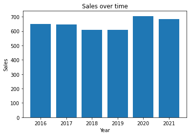
Let’s create a bar chart using the Years as x-labels and the Total as the heights:
plt.bar(x=df['Year'], height=df['Total'])
plt.show()
This prints out the following bar chart:

How to add titles and axis labels to bars charts?
It can be very helpful to add titles and axis labels in order to make the data a little easier to understand.
Matplotlib makes this straightforward by using the .title(), .xlabel(), and .ylabel() methods.
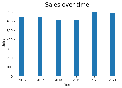
Let’s add these our existing plot. We can do this by writing the following:
plt.bar(x=df['Year'], height=df['Total'])
plt.title('Sales over time')
plt.xlabel('Year')
plt.ylabel('Sales')
plt.show()
This returns the following plot:
You may want to customize the size of the text. You can simply pass in the .fontsize= argument into the title/axis labels. Let’s give this a shot:
plt.bar(x=df['Year'], height=df['Total'])
plt.title('Sales over time', fontsize=18)
plt.xlabel('Year', fontsize=10)
plt.ylabel('Sales', fontsize=10)
plt.show()
This returns the following plot:

How to customize bars width?
There may be times you want to customize the width of your bars.
To change the width, you can pass in the width= argument into the .bar() method.
The widths are passed in as a proportion out of 1, meaning that if we wanted to change the width to 25%, we can use 0.25:
plt.bar(x=df['Year'], height=df['Total'], width=0.25)
plt.title('Sales over time', fontsize=18)
plt.xlabel('Year')
plt.ylabel('Sales')
plt.show()
This returns the following image:
This is pretty ugly, so lets change the width to point 0.9:
plt.bar(x=df['Year'], height=df['Total'], width=0.9)
plt.title('Sales over time', fontsize=18)
plt.xlabel('Year')
plt.ylabel('Sales')
plt.show()
This returns the following image:

How to customize bar charts colours?
The default Matplotlib chart colours tend be quite uninspiring. We can pass the color= argument into the plt.bar() method.
For example, let’s change the color to grey:
plt.bar(x=df['Year'], height=df['Total'], color='grey')
plt.title('Sales over time', fontsize=18)
plt.xlabel('Year')
plt.ylabel('Sales')
plt.show()
This returns the following plot:

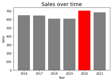
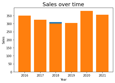
How to customize bar colours conditionally?
It’s also possible to add custom colours to individual bars. This is done by passing in a list of different colours.
For example, if you wanted to change the bar colour of the highest value, you could create a list with colours for each bar:
colors = ['grey', 'grey', 'grey', 'grey', 'red', 'grey']
plt.bar(x=df['Year'], height=df['Total'], color=colors)
plt.title('Sales over time', fontsize=18)
plt.xlabel('Year')
plt.ylabel('Sales')
plt.show()
This returns the following chart:
However, it can be tedious to write out these lists. It also doesn’t let your colouring be dynamic based on the data. However, we can do this programatically by using a list comprehension. If you want to know more about list comprehensions, check out my post here!
colors = ['r' if (bar == max(df['Total'])) else 'grey' for bar in df['Total']]
plt.bar(x=df['Year'], height=df['Total'], color=colors)
plt.title('Sales over time', fontsize=18)
plt.xlabel('Year')
plt.ylabel('Sales')
plt.show()
This returns the following image:
How to customize edge alignment in bar charts?
By default, Matplotlib will align your bars in the centre of your axis label. You can also change this to allow the bars to be aligned to the edge. This is done using the edge= parameter.
Let’s give this a shot with our plot:
plt.bar(x=df['Year'], height=df['Total'], align='edge')
plt.title('Sales over time', fontsize=18)
plt.xlabel('Year')
plt.ylabel('Sales')
plt.show()
This returns the following plot:

How to create a horizontal bar chart in Matplotlib?
Matplotlib makes it very easy to add a horizontal bar chart by using the plt.barh() method. This works quite similar to the plt.bar() method we’ve been exploring. However, instead of using x= and height= parameters, you use y= and width= parameters.
Let’s give this a shot with our current data:
plt.barh(y=df['Year'], width=df['Total'])
plt.title('Sales over time', fontsize=18)
plt.xlabel('Year')
plt.ylabel('Sales')
plt.show()
This returns the following image:

How to create a double bar chart in Matplotlib?
Using a double bar chart is quite helpful when you want to compare two series of data. For example, our dataset contains information on men and women. We can compare these two series overtime by building two separate plots, similar to our line chart example.
Let’s give this a shot:
plt.bar(x=df['Year'], height=df['Men'])
plt.bar(x=df['Year'], height=df['Women'])

plt.title('Sales over time', fontsize=18)
plt.xlabel('Year')
plt.ylabel('Sales')
plt.show()
This returns the following image:
We can see it doesn’t look great. The data are actually overlapped. What we need to do is adjust the width and move the positioning of one series’ bars over to be beside the other series.
We’ll set the width to be 40% (0.4) and add that width to the x-series of the second series.
Let’s give this a shot:
width = 0.4
plt.bar(x=df['Year'], height=df['Men'], width=width)
plt.bar(x=df['Year']+width, height=df['Women'], width=width)

plt.title('Sales over time', fontsize=18)
plt.xlabel('Year')
plt.ylabel('Sales')
plt.show()
This returns the following chart:

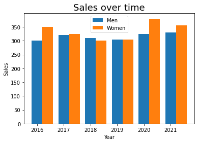
How to add a legend to bar charts?
At this point, it’s not clear what colour represents what. We can clarify this by adding a legend to the graph.
To do this, we’ll add the label= argument to each plt.bar() and assign the label we want to use. We can then pass the .legend() method to the plt object.
Let’s give this a shot:
width = 0.4
plt.bar(x=df['Year'], height=df['Men'], width=width, label='Men')
plt.bar(x=df['Year']+width, height=df['Women'], width=width, label='Women')

plt.title('Sales over time', fontsize=18)
plt.xlabel('Year')
plt.ylabel('Sales')
plt.legend()
plt.show()
This returns the following chart:
It’s possible to change the location of the legend using the loc= argument in the plt.legend() method. By default, Matplotlib will use ‘best’ to find the best location. However, we can also pass in other locations, such as lower right to set it manually.
Let’s give this a shot:
width = 0.4
plt.bar(x=df['Year'], height=df['Men'], width=width, label='Men')
plt.bar(x=df['Year']+width, height=df['Women'], width=width, label='Women')

plt.title('Sales over time', fontsize=18)
plt.xlabel('Year')
plt.ylabel('Sales')
plt.legend(loc='lower right')
plt.show()
This returns the following image:

How to add a stacked bar chart in Matplotlib?
Stacked bar charts can be a very helpful tool to visualize how data compares over a series, broken out by another.
This is a bit unusual to do in Matplotlib. We’ll add a second plot again. This time, however, we can add in the bottom= argument to set where the bars should start for the second chart.
What we’ll do is set the bottom of the second series to be the top of the first.
Let’s give this a shot:
plt.bar(x=df['Year'], height=df['Men'], label='Men')
plt.bar(x=df['Year'], height=df['Women'], bottom=df['Men'], label='Women')

plt.title('Sales over time', fontsize=18)
plt.xlabel('Year')
plt.ylabel('Sales')
plt.legend()
plt.show()
This returns the following chart:

How to add a proportional stacked bar chart in Matplotlib?
Proportional bar charts can be useful when proportions between different series are important.
The way that we can do this is by creating new series of the proportions and stacking them on top of one another.
We can write the following code to do this and create the chart:
df['Men Prop'] = df['Men'] / df['Total'] * 100
df['Women Prop'] = df['Women'] / df['Total'] * 100

plt.bar(x=df['Year'], height=df['Men Prop'], label='Men')
plt.bar(x=df['Year'], height=df['Women Prop'], bottom=df['Men Prop'], label='Women')

plt.title('Sales over time', fontsize=18)
plt.xlabel('Year')
plt.ylabel('Sales')
plt.legend()
plt.show()
This returns the following chart:

How to add a style to bar charts?
Finally, let’s take a look at an example of how to use some of Matplotlib’s built-in styles. To see what styles are available, you can print out the following:
print(plt.style.available)This returns the following: ['Solarize_Light2', '_classic_test_patch', 'bmh', 'classic', 'dark_background', 'fast', 'fivethirtyeight', 'ggplot', 'grayscale', 'seaborn', 'seaborn-bright', 'seaborn-colorblind', 'seaborn-dark', 'seaborn-dark-palette', 'seaborn-darkgrid', 'seaborn-deep', 'seaborn-muted', 'seaborn-notebook', 'seaborn-paper', 'seaborn-pastel', 'seaborn-poster', 'seaborn-talk', 'seaborn-ticks', 'seaborn-white', 'seaborn-whitegrid', 'tableau-colorblind10']
Let’s see how our chart looks with the ggplot style:
plt.style.use('ggplot')
width = 0.4
plt.bar(x=df['Year'], height=df['Men'], width=width, label='Men')
plt.bar(x=df['Year']+width, height=df['Women'], width=width, label='Women')

plt.title('Sales over time', fontsize=18)
plt.xlabel('Year')
plt.ylabel('Sales')
plt.legend(loc='lower right')
plt.show()
This returns the following chart:

To learn more about styles, check out the official documentation here.
Conclusion
In this post, you learned create Matplotlib bars charts, including adding multiple bars, adding titles and axis labels, customizing colours conditionally, adding legends, and customizing with Matplotlib styles.
To learn how to make other chart types, such as histograms check out my collection here.