In this post, you’ll learn how to create Matplotlib scatter charts, including adding multiple colors, adding titles and axis labels, changing size of markers, adding legends, and customizing with Matplotlib styles.
Table of Contents
Loading our data
For this tutorial, we’re going to use Pandas and Matplotlib. Let’s also import a dataset from Five Thirty Eight in regards to WNBA scores, which you can find here.
The dataset contains quite a bit of data and the headers aren’t the clearest, so we’ll do a little bit of cleaning up.
Let’s get started!
df = pd.read_csv("https://github.com/fivethirtyeight/WNBA-stats/raw/master/wnba-player-stats.csv",
                 usecols = ['player_ID', 'Age', 'MP', 'Tm', 'Wins_Generated', 'year_ID', 'Composite_Rating']
                 )
df = df[df['Tm'].isin(['ATL', 'CHI'])]
df = df.rename(columns={
    'player_ID': 'ID',
    'MP':'Minutes',
    'Tm':'Team',
    'Wins_Generated': 'Wins',
    'year_ID':'Year'
})

df['Team'] = df['Team'].str.replace('ATL', 'Atlanta')
df['Team'] = df['Team'].str.replace('CHI', 'Chicago')

print(df.head())
Printing out the head of the dataframe returns the following:
           ID  Year  Age     Team  Minutes  Composite_Rating  Wins
0  montgre01w  2019   32  Atlanta      949              -2.4  1.22
1  williel01w  2019   26  Atlanta      909               0.6  2.51
2  sykesbr01w  2019   25  Atlanta      880              -3.4  0.70
3  hayesti01w  2019   29  Atlanta      817              -1.5  1.45
4  brelaje01w  2019   31  Atlanta      767              -0.8  1.62
How to create Matplotlib scatter charts?
Matplotlib uses the .scatter() function to create scatterplots. You can then use x= and y= arguments to pass in data and the marker= argument to set what type of marker you want to use.
Let’s give this a shot:
plt.scatter(x=df['Minutes'], y=df['Wins'],marker='o')
plt.show()
This returns the following image:

This is just one of many markers that are available. If you want to change your marker, you can choose from the following markers:
available_markers = ['o', '.', ',', 'x', '+', 'v', '^', '<', '>', 's', 'd']How to add titles and axis labels to Matplotlib scatter charts?
Adding titles and axis labels to Matplotlib scatter charts can be done using the .title(), .xlabel(), and .ylabel() functions. Let’s add some descriptive titles to our chart:
plt.scatter(x=df['Minutes'], y=df['Wins'],marker='o')
plt.title('Minutes played vs. Games Won')
plt.xlabel('Minutes Played')
plt.ylabel('Games Won')
plt.show()
This returns the following plot:

We can change the font size of the title and axis labels by passing in the fontsize= argument into the respective functions.
Let’s try changing the titles to make it a little prettier:
plt.scatter(x=df['Minutes'], y=df['Wins'],marker='o')
plt.title('Minutes played vs. Games Won', fontsize=18)
plt.xlabel('Minutes Played', fontsize=12)
plt.ylabel('Games Won', fontsize=12)
plt.show()
This returns the following image:

How to customize scatter marker colours?
Adding color to a scatter graph can be a good way to add another dimension to your data. For example, with a single color in your plot, it’s impossible to discern which team is which. Therefore, it’s not possible to see if there are any unusual trends that relate to one team over another.
Let’s change the color of the teams to discern them:
atlanta = df[df['Team']=='Atlanta']
chicago = df[df['Team']=='Chicago']
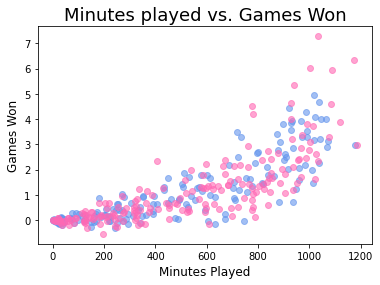
plt.scatter(x=atlanta['Minutes'], y=atlanta['Wins'],marker='o', c='cornflowerblue')
plt.scatter(x=chicago['Minutes'], y=chicago['Wins'],marker='o', c='hotpink')
plt.title('Minutes played vs. Games Won', fontsize=18)
plt.xlabel('Minutes Played', fontsize=12)
plt.ylabel('Games Won', fontsize=12)
plt.show()What we’ve done here is split the dataframe into the two different teams. This is done so that each dataframe’s plot can be assigned a single color and is then overlaid over the other. It’s not the most convenient, and it’s certainly not as streamlined as Seaborn makes this be.
This returns the following image:

To see what other colours are available, check out the official documentation as it’s fairly exhaustive.
How to change marker transparency?
Right now, the markers overlay one another and make it impossible to see what other markers are underneath. This can be accomplished by adding transparency to the markers. We can do this using the alpha= parameter in the .scatter() function.
Let’s set the transparency to 0.6, which represents 60%:
plt.scatter(x=atlanta['Minutes'], y=atlanta['Wins'],marker='o', c='cornflowerblue', alpha=0.6)
plt.scatter(x=chicago['Minutes'], y=chicago['Wins'],marker='o', c='hotpink', alpha=0.6)
plt.title('Minutes played vs. Games Won', fontsize=18)
plt.xlabel('Minutes Played', fontsize=12)
plt.ylabel('Games Won', fontsize=12)
plt.show()
This returns the following chart:
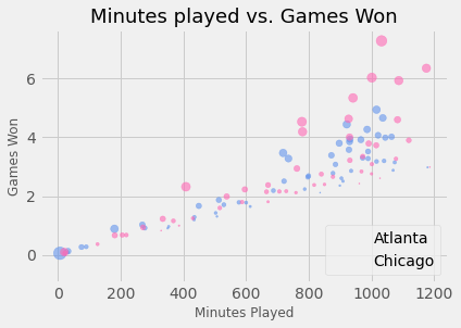
How to add a legend to Matplotlib scatter charts?
Adding color, by default, doesn’t make it possible to tell each team apart. We can add a legend by passing in label= parameters in the scatter() function and then adding the .legend(True) .
By default, Matplotlib will try and figure out where the best location is for the legend.
Let’s try this out in Python:
plt.scatter(x=atlanta['Minutes'], y=atlanta['Wins'],marker='o', c='cornflowerblue', alpha=0.6, label='Atlanta')
plt.scatter(x=chicago['Minutes'], y=chicago['Wins'],marker='o', c='hotpink', alpha=0.6, label='Chicago')
plt.title('Minutes played vs. Games Won', fontsize=18)
plt.xlabel('Minutes Played', fontsize=12)
plt.ylabel('Games Won', fontsize=12)
plt.legend()
plt.show()
This returns the following plot:

If we wanted to change the location to something specific, we can pass the loc= argument into the .legend() function. Let’s change it to lower bottom.
plt.scatter(x=atlanta['Minutes'], y=atlanta['Wins'],marker='o', c='cornflowerblue', alpha=0.6, label='Atlanta')
plt.scatter(x=chicago['Minutes'], y=chicago['Wins'],marker='o', c='hotpink', alpha=0.6, label='Chicago')
plt.title('Minutes played vs. Games Won', fontsize=18)
plt.xlabel('Minutes Played', fontsize=12)
plt.ylabel('Games Won', fontsize=12)
plt.legend(loc='lower right')
plt.show()
This returns the following plot:

How to add a grid to charts?
With all that whitespace, it can be a little difficult to determine where values are actually placed. For this reason, it can be helpful to add a grid to the plot. Matplotlib lets you do this by adding in a .grid(True) function to the plt object.
Let’s give this a shot:
Check out some other Python tutorials on datagy, including our complete guide to styling Pandas and our comprehensive overview of Pivot Tables in Pandas!
plt.scatter(x=atlanta['Minutes'], y=atlanta['Wins'],marker='o', c='cornflowerblue', alpha=0.6, label='Atlanta')
plt.scatter(x=chicago['Minutes'], y=chicago['Wins'],marker='o', c='hotpink', alpha=0.6, label='Chicago')
plt.title('Minutes played vs. Games Won', fontsize=18)
plt.xlabel('Minutes Played', fontsize=12)
plt.ylabel('Games Won', fontsize=12)
plt.legend(loc='lower right')
plt.grid(True)
plt.show()
This returns the following plot:

How to change marker size in Matplotlib scatter charts?
Similar to how adding colour to the plot adds another dimension, we can add another level of detail by changing the marker size of each data point based on another series of data.
For this, we’ll use the Composite Rating column to change the size of each dot.
Let’s do this now by changing the s= (size) parameter in the .scatter() function:
plt.scatter(x=atlanta['Minutes'], y=atlanta['Wins'],marker='o', c='cornflowerblue', alpha=0.6, label='Atlanta', s=atlanta['Composite_Rating'])
plt.scatter(x=chicago['Minutes'], y=chicago['Wins'],marker='o', c='hotpink', alpha=0.6, label='Chicago', s=chicago['Composite_Rating'])
plt.title('Minutes played vs. Games Won', fontsize=18)
plt.xlabel('Minutes Played', fontsize=12)
plt.ylabel('Games Won', fontsize=12)
plt.legend(loc='lower right')
plt.grid(True)
plt.show()
This returns the following plot:

We can see that all the plots are quite small. We can multiple each of the values by 10 to increase its size:
plt.scatter(x=atlanta['Minutes'], y=atlanta['Wins'],marker='o', c='cornflowerblue', alpha=0.6, label='Atlanta', s=atlanta['Composite_Rating']*10)
plt.scatter(x=chicago['Minutes'], y=chicago['Wins'],marker='o', c='hotpink', alpha=0.6, label='Chicago', s=chicago['Composite_Rating']*10)
plt.title('Minutes played vs. Games Won', fontsize=18)
plt.xlabel('Minutes Played', fontsize=12)
plt.ylabel('Games Won', fontsize=12)
plt.legend(loc='lower right')
plt.grid(True)
plt.show()
This returns the following, much more legible plot:
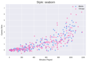
How to add a style to Matplotlib charts?
We can modify styles in Matplotlib by using the .style.use() function, with the style’s name passed in as the argument into the use function.
If you want to find out what styles are available, you can run print(plt.style.available), which returns the following list:
['Solarize_Light2', '_classic_test_patch', 'bmh', 'classic', 'dark_background', 'fast', 'fivethirtyeight', 'ggplot', 'grayscale', 'seaborn', 'seaborn-bright', 'seaborn-colorblind', 'seaborn-dark', 'seaborn-dark-palette', 'seaborn-darkgrid', 'seaborn-deep', 'seaborn-muted', 'seaborn-notebook', 'seaborn-paper', 'seaborn-pastel', 'seaborn-poster', 'seaborn-talk', 'seaborn-ticks', 'seaborn-white', 'seaborn-whitegrid', 'tableau-colorblind10']To see previews of all available styles, you can check out the official documentation here.
Let’s print out a number of different style previews using a for-loop. We’ll adjust the title of the plot by setting it to style in use:
for style in ['ggplot', 'fivethirtyeight', 'bmh', 'seaborn']:
  plt.style.use(style)
  plt.scatter(x=atlanta['Minutes'], y=atlanta['Wins'],marker='o', c='cornflowerblue', alpha=0.6, label='Atlanta')
  plt.scatter(x=chicago['Minutes'], y=chicago['Wins'],marker='o', c='hotpink', alpha=0.6, label='Chicago')
  plt.title(f'Style: {style}', fontsize=18)
  plt.xlabel('Minutes Played', fontsize=12)
  plt.ylabel('Games Won', fontsize=12)
  plt.legend(loc='best')
  plt.grid(True)
  plt.show()
This returns the following plots:


Conclusion
In this post, you learned how to create Matplotlib scatter charts, including adding multiple colors, adding titles and axis labels, changing size of markers, adding legends, and customizing with Matplotlib styles.
To learn more about other Matplotlib chart types, check out my other tutorials.
Pingback: Plotting in Python with Matplotlib • datagy