
In this tutorial, you’ll learn how to use the Seaborn jointplot() function to create informative joint plots. Joint plots allow you to create helpful visuals that plot both a bivariate distribution (such as a scatter plot), as well as the distribution of each of the individual variables.
By the end of this tutorial, you’ll have learned the following:
- What joint plots are and when you might want to use them
- How to use the
sns.jointplot()function to create informative visualizations - How to customize your joint plots in Seaborn with different visualizations, colors, titles, and more
Table of Contents
What are Joint Plots?
Joint plots allow you to plot a relationship between two variables (also known as a bivariate relationship), while simultaneously exploring the distribution of each underlying variable.
Take a look a the image below, which shows a customized joint plot created with Seaborn:
In the image above, we can see a scatterplot plotted in the middle of our visualization. What makes a joint plot different is the plotting of distributions (in this case, using KDE plots) along the outside of the chart. This allows you to better understand how variables are distributed along the x- and y-axes.
Let’s now take a look at the sns.jointplot() function and the different options it provides.
Understanding the Seaborn jointplot() Function
Before diving into creating jointplots in Seaborn, let’s take a quick moment to explore the function and the parameters that it offers. While this tutorial won’t cover all of the parameters in the function, we’ll explore all of the important ones.
# Understanding the Seaborn jointplot() Function
seaborn.jointplot(data=None, *, x=None, y=None, hue=None, kind='scatter', height=6, ratio=5, space=0.2, dropna=False, xlim=None, ylim=None, color=None, palette=None, hue_order=None, hue_norm=None, marginal_ticks=False, joint_kws=None, marginal_kws=None, **kwargs)
In the code block above, you can see the function definition. We can see that there are a large number of parameters. Let’s take a look at some of the important ones below:
data=,x=, andy=represent the DataFrame and column labels used to plot our bivariate relationshiphue=adds another semantic layer, by splitting variables into different colorskind=determines the type of plot used to show the bivariate relationship
Let’s now start diving into creating joint plots in Seaborn.
Creating a Simple Joint Plot with Seaborn
In order to create a simple joint plot in Seaborn, you need to only pass in three variables:
data=the DataFrame that you want to plot,x=andy=representing the two variables you want to plot as column labels
Let’s take a look at how we can use the 'tips' dataset that comes bundled with Seaborn:
# Creating a Sample Joint Plot
import seaborn as sns
import matplotlib.pyplot as plt
df = sns.load_dataset('tips')
sns.jointplot(data=df, x='tip', y='total_bill', palette='Set2')
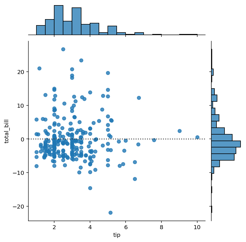
plt.show()In the code block above, we asked Seaborn to plot the relationship between the 'tip' and 'total_bill' columns. This returned the data visualization below:
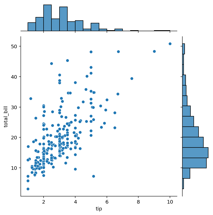
Let’s try and understand what’s going on in the joint plot above:
- The bivariate relationship is plotted using a scatterplot, showing the relationship between the two variables
- On the right edge, a histogram is plotted showing the distribution of the
'total_bill'variable - Similarly, on the top edge, a histogram shows the distribution of the
'tip'variable
In the following section, you’ll learn how to add an additional semantic layer to the plot using color.
Adding Additional Detail to Seaborn Joint Plots with Color
Seaborn allows you to add an additional variable to a Seaborn jointplot using a semantic mapping of hue. By passing in an additional variable using the hue= parameter, the mapping is added into the joint plot. Let’s see how we can pass a third variable into our plot:
# Adding Hue to a Seaborn Joint Plot
import seaborn as sns
import matplotlib.pyplot as plt
df = sns.load_dataset('tips')

sns.jointplot(data=df, x='tip', y='total_bill', palette='Set2', hue='sex')
plt.show()
In the code block we asked to break up the data into both Male and Female. In the image below, we can see that males are labeled as green while females are labelled as orange. Not only is this true for the scatterplot, but also for the newly generated KDE plots on the graph’s edges.
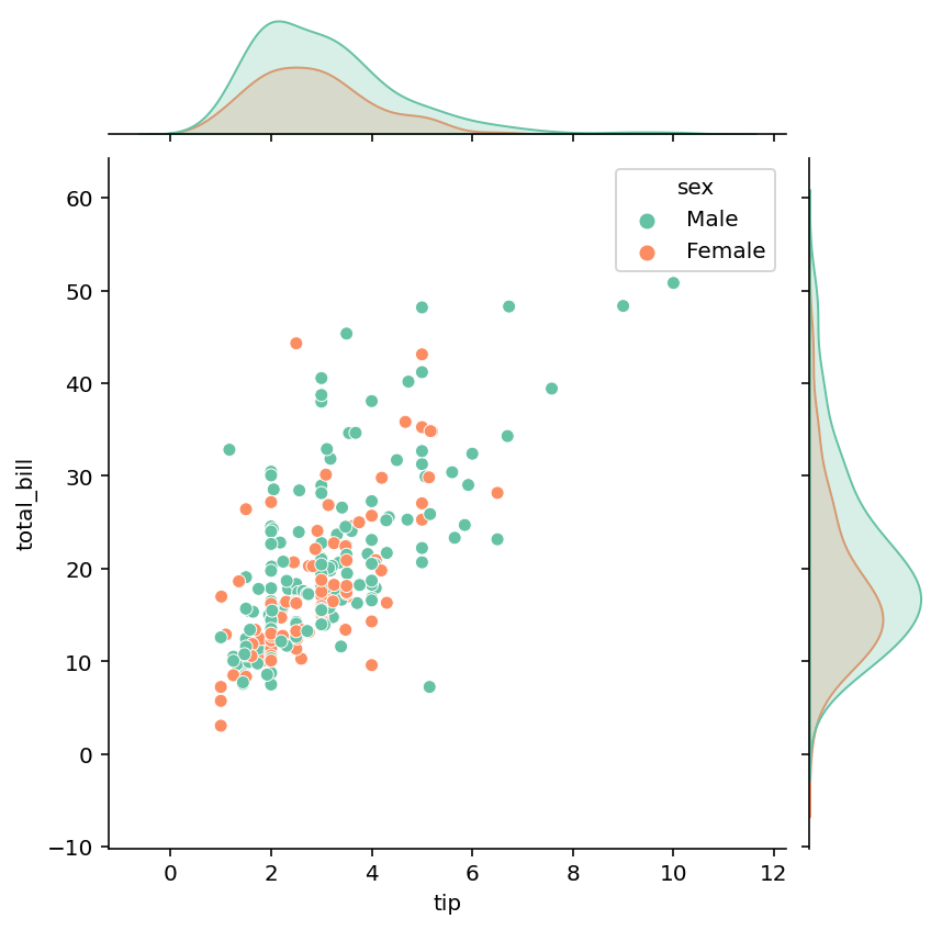
We can see that this gives us a much better sense, when overlapping values exist, where we might find values that belong to a subset.
Using KDE Plots in Seaborn Joint Plots
In order to plot kernel density estimate plots, rather than scatterplots, in a Seaborn jointplot, you can pass in kind='kde'. This will plot the kernel density estimate, even split using the color semantic.
Let’s see how we can accomplish this:
# Changing the Type of a Joint Plot to a KDE Plot
import seaborn as sns
import matplotlib.pyplot as plt
df = sns.load_dataset('tips')

sns.jointplot(data=df, x='tip', y='total_bill', hue='sex', palette='Set2', kind='kde')
plt.show()
In the code block above, we only added kind='kde', which instructed Seaborn to plot a KDE plot instead of a scatter plot. This returns the image shown below:

In the following section, you’ll learn how to add a histogram to a Seaborn jointplot.
Using Histograms in Seaborn Joint Plots
Kernel density estimate plots, while informative, can be confusing for non-technical audiences. In this case, adding a histogram may be a better option. In order to add a histogram to a Seaborn jointplot, you can pass in kind='hist', as shown below:
# Changing the Type of a Joint Plot to a Histogram
import seaborn as sns
import matplotlib.pyplot as plt
df = sns.load_dataset('tips')

sns.jointplot(data=df, x='tip', y='total_bill', hue='sex', palette='Set2', kind='hist')
plt.show()
In the code block above, we modified the argument of the kind= parameter. This allowed us to plot a histogram heatmap matrix on the plot itself, and histograms on the plot’s edges, as shown below:

Similarly, we can plot hex plots, which is what you will learn to do in the following section.
Using Hex Plots in Seaborn Joint Plots
We can take customizing our Seaborn jointplot even further by using a hexplot, rather than a histogram heatmap. This is often more visually pleasing, allowing end users to better interpret the continuous nature of some data.
In order to plot a hexplot in a Seaborn jointplot, you can pass in kind='hex' into the sns.jointplot() function. Let’s take a look at how to do this:
# Changing the Type of a Joint Plot to a Hex Plot
import seaborn as sns
import matplotlib.pyplot as plt
df = sns.load_dataset('tips')

sns.jointplot(data=df, x='tip', y='total_bill', palette='Set2', kind='hex')
plt.show()
In the code block above, we passed in kind='hex', which instructed Seaborn to generate the plot below:

We can see that by using a hexplot, the data more closely resembles a scatterplot. This can often be less intimidating for non-technical users.
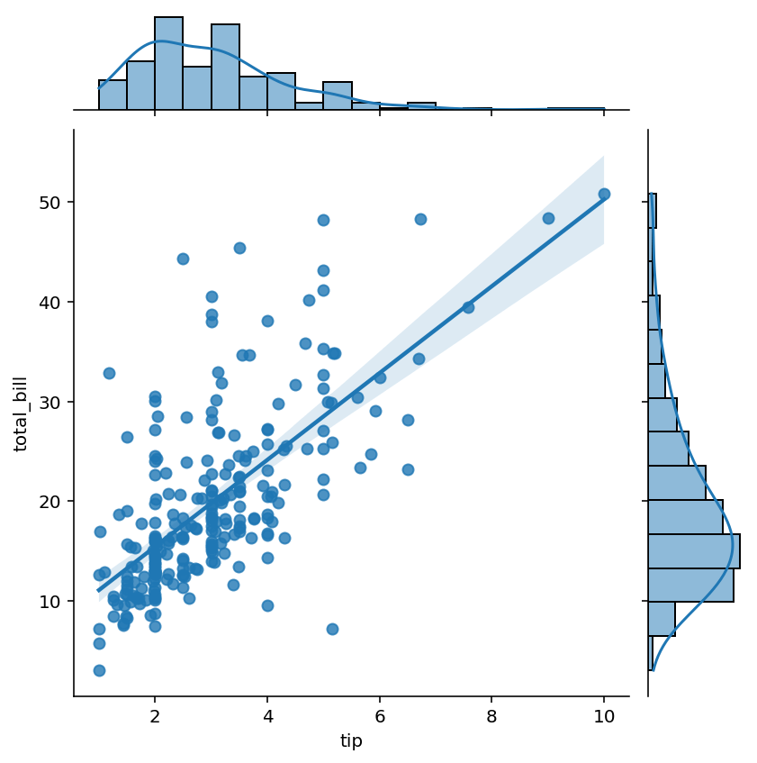
Plotting a Regression Plot in Seaborn Joint Plots
One of the most common tasks you may want to take on is plotting a regression plot between the two variables. This will allow you to better understand whether or not a correlated relationship exists between the two of them.
In order to plot a regression plot, you can pass kind='reg' into the sns.pairplot() function. This is shown in the code block below:
# Changing the Type of a Joint Plot to a Regression Plot
import seaborn as sns
import matplotlib.pyplot as plt
df = sns.load_dataset('tips')

sns.jointplot(data=df, x='tip', y='total_bill', palette='Set2', kind='reg')
plt.show()
By using a regression plot in the pair plot, two key things will be modified:
- A regression line with a confidence interval will be added to the scatterplot
- A KDE line will be overlayed on the histograms along the edge of the graph
Doing this returns the image below:
In the following section, you’ll learn how to plot a residual plot in Seaborn joint plots.
Plotting a Residual Plot in Seaborn Joint Plots
Now that you know how to plot a regression plot in a Seaborn joint plot, you may also want to plot residual plot. The residual plot will show the residuals along a calculated regression line, allowing you to better understand the accuracy of the regression line.
In order to plot a residual plot in a Seaborn jointplot, you can pass in kind='resid' into the sns.pairplot() function. This is shown in the code block below:
# Changing the Type of a Joint Plot to a Residual Plot
import seaborn as sns
import matplotlib.pyplot as plt
df = sns.load_dataset('tips')

sns.jointplot(data=df, x='tip', y='total_bill', palette='Set2', kind='resid')
plt.show()
By plotting a residual line, a resulting scatterplot is created. However, rather than showing the absolute values, the difference from the calculated regression line is shown for each data point, as shown below:
In the following sections, you’ll learn how to customize your joint plot by modifying the size and by adding customized titles and labels.
Modifying the Size of a Seaborn Joint Plot
In order to change the size of a Seaborn jointplot, you can use the height= argument. The figure will always be square, meaning that you don’t need to worry about the width of the size.
By default, Seaborn will use a size of 6. Let’s see how we can change it to a size of 5:
# Changing the Size of a Seaborn Joint Plot
import seaborn as sns
import matplotlib.pyplot as plt
df = sns.load_dataset('tips')

sns.jointplot(data=df, x='tip', y='total_bill', palette='Set2', hue='sex', height=5)
plt.show()
By changing the height of our joint plot to five, we return the image shown below (note that it’s slightly smaller than before):

In the final section below, you’ll learn how to customize a Seaborn jointplot with a title, axis labels, and a legend.
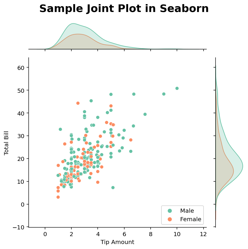
Customizing a Seaborn Joint Plot with Title, Axis Labels, and Legends
By adding and customizing titles and axis labels, you can make your graphs much easier to read. Seaborn provides significant flexibility in adding and customizing titles and axis labels. Similarly, by modifying a Seaborn legend, you can allow attention to be drawn to particular elements better.
# Customizing a Seaborn Joint Plot
import seaborn as sns
import matplotlib.pyplot as plt
df = sns.load_dataset('tips')

joint = sns.jointplot(data=df, x='tip', y='total_bill', palette='Set2', hue='sex')
joint.set_axis_labels('Tip Amount', 'Total Bill')
joint.fig.suptitle('Sample Joint Plot in Seaborn', weight='bold', size=18)
joint.fig.tight_layout()
plt.legend(loc='lower right')

plt.show()
In the code block above, we customized our axis labels using the set_axis_labels() method, which accepts labels as strings. We then added a title using the fig.suptitle() method, as we’re drawing a figure-level object. Finally, we placed the legend in the lower right. This returns the image below:
We can see from the image above that our visual is now much clearer. This can be an important task to take on when you’re preparing data visualizations for presentation purposes.
Conclusion
In this tutorial, you learned how to use the Seaborn jointplot() function to create informative joint plots. Joint plots allow you to create helpful visuals that plot both a bivariate distribution (such as a scatter plot), as well as the distribution of each of the individual variables. You first learned how to create simple joint plots. Then you learned how to customize the underlying graph type. Finally, you learned how to customize the plot using size, titles, and axis labels.
Additional Resources
To learn more about related topics, check out the resources below: