
In this tutorial, you’ll learn how to create a residual plot using Seaborn by using the sns.residplot() function. Residual plots let you evaluate the residuals of a regression fit by easily understanding their differences.
By the end of this tutorial, you’ll have learned the following:
- What a residual plot and how to create them using the
sns.residplot()function - How to change the order of the the underlying regression fit
- How to customize residual plots in Seaborn using colors and Lowess lines
Table of Contents
What is a Residual Plot?
A residual plot is used to plot the residual values after plotting a linear regression model. By doing this, you can easily identify how good the fit of a regression model is.
In the image below, we first plot a regression plot on the left and the remaining residuals on the right. By comparing the two graphs, you can see how the residual plot can be useful to better understand how well a model fits.
In the following section, you’ll learn how to understand the important parameters of the sns.residplot() function.
Understanding the Seaborn residplot Function
Before diving into plotting residuals, let’s take a moment to explore the sns.residplot() function. As you can see in the code block below, the function has many different parameters and default arguments. While we won’t explore all of them in this tutorial, you’ll learn about the important ones.
# Understanding the Seaborn residplot() Function
seaborn.residplot(data=None, *, x=None, y=None, x_partial=None, y_partial=None, lowess=False, order=1, robust=False, dropna=True, label=None, color=None, scatter_kws=None, line_kws=None, ax=None)
Let’s explore some of the important parameters of the sns.residplot() function:
data=represents the Pandas DataFrame from which you want to plot datax=andy=represent the column labels of the independent and dependent variables in the datasetlowess=uses a boolean value to draw a Lowess line
Now that you know about some of the more important parameters of the function, let’s dive into plotting a residual plot.
Plotting Regression Residuals in Seaborn with residplot
In this section, you’ll learn how to plot a residual plot. Let’s plot a distribution and fit the linear regression model using the sns.regplot() function. For this, we’ll use the 'tips' dataset built into Seaborn. Take a look at the code box below to see how this can be done:
# Creating a Sample Regression Plot
import seaborn as sns
import matplotlib.pyplot as plt
df = sns.load_dataset('tips')
sns.set_palette('Set2')

sns.regplot(data=df, x='total_bill', y='tip')
plt.show()
In the code block above, we’re asking Seaborn to plot the bill amount versus the tip amount, assuming that the bill has an influence on the tip amount.Take a look at the regression model that’s returned below:

While we can see how far values are away from the regression line, it isn’t the most intuitive way to see how well the model fits the data. Instead, we can plot a residual plot that shows the residual for each data point by using the sns.residplot() function.
# Creating a Residual Plot
import seaborn as sns
import matplotlib.pyplot as plt
df = sns.load_dataset('tips')
sns.set_palette('Set2')

sns.residplot(data=df, x='total_bill', y='tip')
plt.show()
In the code block above, we only changed the function to residplot(), keeping the parameters the same. This is one of the benefits of Seaborn: the simple API for its functions is largely consistent.
Take a look at the graph below to see what is returned:
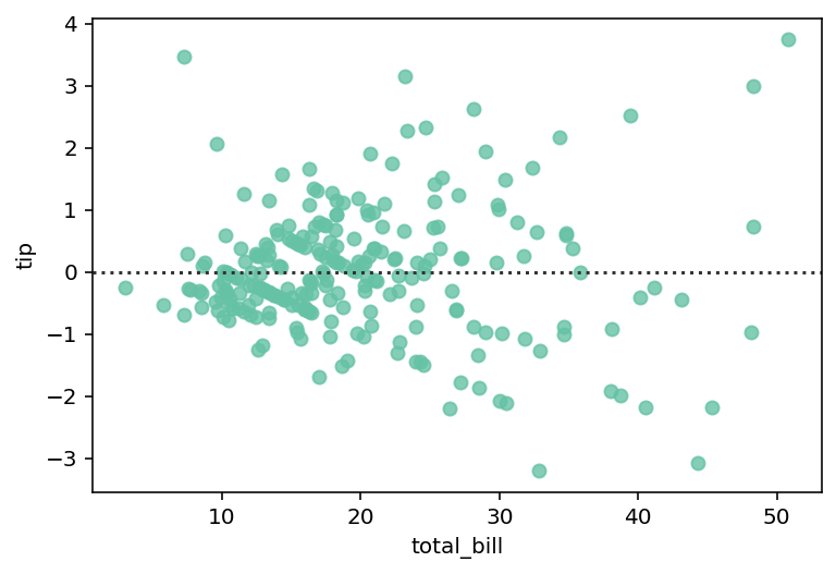
We can see that there is now a dotted horizontal line. This line represents the regression model. Each dot, then, is represented by the residual between the line and the line of best fit. As the value for r-squared gets closer to 1, values will also be closer to the dotted line.
In the following section, you’ll learn how to change the order of the regression model.
Changing the Order of the Regression Residuals in Seaborn residplot
One of the benefits of plotting a residual plot is that it can highlight an ill-fitted model. For example, if a regression model should be of a different order, plotting the residuals will highlight this.
In the code block below, we load a new dataset. We then plot the horsepower of a car against its miles per gallon:
# Residual Plots Can Show the Underlying Fit
import seaborn as sns
import matplotlib.pyplot as plt
df = sns.load_dataset('mpg')
sns.set_palette('Set2')

sns.residplot(data=df, x="horsepower", y="mpg")
plt.show()
By using the code above, we return the data visualization below:

In the image above, we can see that there is a curve in the data. Because of this, it may be more practical to use a different order for the regressive model.
To change the order of the underlying regression mode in a Seaborn residual plot, you can use the order= parameter. Let’s change the order of the model to 2:
# Changing the Order of a Residual Plot
import seaborn as sns
import matplotlib.pyplot as plt
df = sns.load_dataset('mpg')
sns.set_palette('Set2')

sns.residplot(data=df, x="horsepower", y="mpg", order=2)
plt.show()
By modifying the order of the residual plot, we can see that the plot’s values are much more accurately fitted, as shown in the plot below:

In the following section, you’ll learn how to plot a Lowess line to a Seaborn residual plot.
Adding a Lowess Line to Seaborn residplot
Seaborn allows you to add a lowess line to a Seaborn residplot by passing in lowess=True. A LOWESS line stands for locally weighted scatterplot smoothing. The line creates a smooth line through a plot to help you better understand the relationship between the two variables.
Let’s take a look at how we can use Seaborn to add a lowess line:
# Adding a Lowess Line
import seaborn as sns
import matplotlib.pyplot as plt
df = sns.load_dataset('mpg')
sns.set_palette('Set2')

sns.residplot(data=df, x="horsepower", y="mpg", lowess=True)
plt.show()
In the code block below we plotted the previous relationship using the first order. We also asked Seaborn to plot the lowess line. This returned the visualization below:

We can see that the line forms a quadratic curve, letting us know that we may want to use a different order.
In the following section, you’ll learn how to color the lowess line.
Coloring a Lowess Line in a Seaborn residplot
By default, Seaborn will use the same color for the lowess line as the underlying scatterplot. This means that the line can be a little difficult to see. In order to customize the properties, such as the color, of the lowess line you can use the line_kws= parameter.
The parameter accepts a dictionary of keyword arguments to be passed into the underlying line function. Let’s see how we can change the color of the line.
# Coloring a Lowess Line
import seaborn as sns
import matplotlib.pyplot as plt
df = sns.load_dataset('mpg')
sns.set_palette('Set2')

sns.residplot(data=df, x="horsepower", y="mpg", lowess=True, line_kws={'color': 'cornflowerblue'})
plt.show()
In the code block above, we passed in line_kws={'color': 'cornflowerblue'}, which instructs the line to be colored as light blue.

We can see how much easier the line is to see now, making the underlying trends much clearer.
Customizing a Seaborn residplot with a Title and Axis Labels
In this final section, you’ll learn how to customize a Seaborn residual plot using a title and axis labels. Seaborn provides a lot of flexibility in adding titles and axis labels. By adding a title and customizing the axis labels, you can make your visualization much easier to understand.
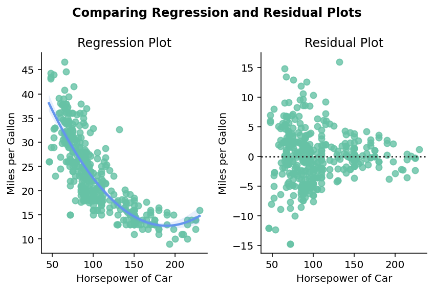
Let’s take a look at how we can customize our graph by plotting the graph at the beginning of the tutorial, which contains the regression plot and the residual plot.
# Customizing a Seaborn residplot
import matplotlib.pyplot as plt
import seaborn as sns

df = sns.load_dataset('mpg')
sns.set_palette('Set2')

fig, axs = plt.subplots(ncols=2)
sns.regplot(data=df, x="horsepower", y="mpg", order=2, ax=axs[0], line_kws={'color':'cornflowerblue'})
sns.residplot(data=df, x="horsepower", y="mpg", order=2, ax=axs[1])

fig.suptitle('Comparing Regression and Residual Plots', weight='bold')
fig.subplots_adjust(top=0.85)
axs[0].set_title('Regression Plot')
axs[1].set_title('Residual Plot')
for ax in axs:
    ax.set_xlabel('Horsepower of Car')
    ax.set_ylabel('Miles per Gallon')

fig.tight_layout()
sns.despine()
plt.show()
In the code block above, we plotted two plots using the subplots() function. We then plotted the two plots to each of the underlying axes objects. Finally, we added a title and axis labels. We also used the Seaborn despine function to remove the right and top borders of each plot.
In order to set the overall title, we use the suptitle() method since we need to apply the title to the entire figure. Then, we use the .set_title() method on each of the axes objects by accessing the indexed value. Finally, we loop over each axes and use the .set_xlabel() and .set_ylabel() methods.
This returns the image below:
We can see that by adding and customizing titles and axis labels we’re able to create an informative visualization.
Conclusion
In this tutorial, you learned how to create a residual plot using Seaborn by using the sns.residplot() function. Residual plots let you evaluate the residuals of a regression fit by easily understanding their differences.
You first learned how to create residual plots using a simple linear regression model. Then you learned how to change the order of the underlying regression model. From there, you learned how to add and customize a LOWESS line. Finally, you learned how to add a title and customize axis labels in a Seaborn residual plot.
Additional Resources
To learn more about related topics, check out the resources below: