In this tutorial, you’ll learn how to use Seaborn to plot regression plots using the sns.regplot() and sns.lmplot() functions. It may seem confusing that Seaborn would offer two functions to plot regressive relationships. Don’t worry – this guide will simplify all you need to know.
By the end of this tutorial, you’ll have learned the following:
- How to use the Seaborn
regplot()andlmplot()functions to plot regression plots - How to understand the differences between the two functions
- How to customize the plots with small multiples, titles, and axis labels
- How to plot logistic regression plots and plot regression relationships in Seaborn jointplots
Table of Contents
Understanding the Seaborn regplot() and lmplot() Functions
Seaborn provides two functions to create regression plots: regplot and lmplot. While this may seem redundant, the two functions provide different functionality.
The main differences between the two regression functions are:
sns.lmplot()returns a figure (a FacetGrid, to be exact) and can be used to plot additional variables using the color semanticsns.regplot()returns an axes object, meaning you can easily apply axes level methods
Let’s take a look at how we can use the sns.lmplot() function can be used to plot a linear relationship:
# Creating a Simple lmplot in Seaborn
import seaborn as sns
import matplotlib.pyplot as plt
df = sns.load_dataset('penguins')
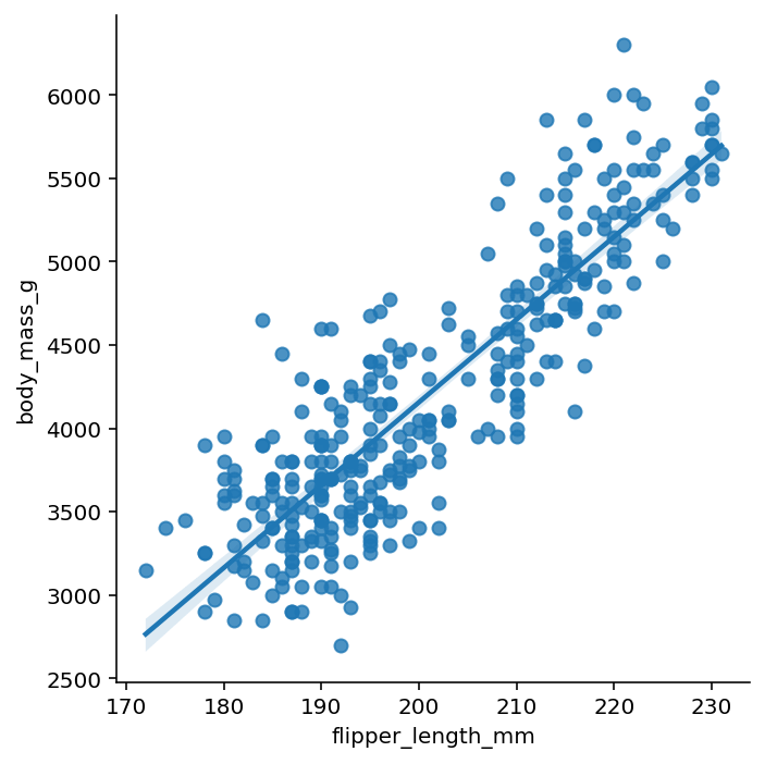
sns.lmplot(data=df, x='flipper_length_mm', y='body_mass_g')
plt.show()In the example above, we loaded the penguins dataset that is built into Seaborn. We then used the lmplot() function to plot the relationship between flipper length and body mass. This returned the image below:
Now, let’s see how we can use the regplot() function to plot the same relationship:
# Creating a Simple regplot in Seaborn
import seaborn as sns
import matplotlib.pyplot as plt
df = sns.load_dataset('penguins')
sns.regplot(data=df, x='flipper_length_mm', y='body_mass_g')
plt.show()
In the code block above, we simply switched the function to use the regplot() function. This returned the following image:
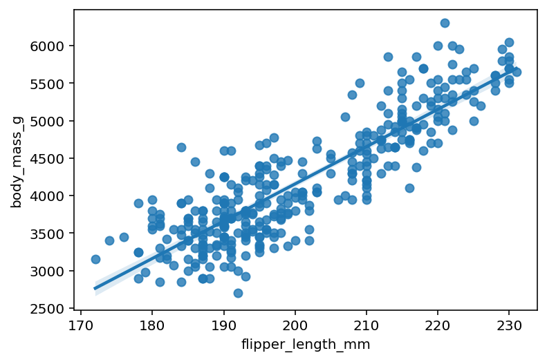
We can see that by comparing both of the plots that they show the same relationship, though they’re visually different. For example, the lmplot() function returns a graph that has been despined and is sized differently.
As the line better fits the data, the r-squared value of the regression output will get closer and closer to 1.
How to Plot Different Orders to Relationships Using Seaborn lmplot
Both the Seaborn regplot() and lmplot() functions allow you to plot regression relationships of different orders. In order to do this, we can use the order= argument, which allows you to pass in different orders in either functions.
Let’s load a different dataset which uses a quadratic relationship. In the code block below, we’ll pass in a different order:
# Modifying the Order of a Seaborn Regression Plot
import seaborn as sns
import matplotlib.pyplot as plt
df = sns.load_dataset('mpg')
sns.lmplot(data=df, x='horsepower', y='mpg', order=2)
plt.show()
By modifying the order to 2, we return the graph below, where the curve better represents the data:

In the following section, you’ll learn how to add an additional variable by using the color semantic.
Adding Hues of Variables in Seaborn lmplot
In order to add an additional variable using the hue semantic, you can pass the hue= parameter into the lmplot() function. This is a major difference between the two functions: only the lmplot() function allows you to pass in an additional variable to plot it by color.
Let’s take a look at how we can split the data by a different variable. As an added bonus, we’ll add in splitting the data using different markers. This allows us to make the data more accessible, especially if printing in black and white.
# Using Hue to Add an Additional Variable to Seaborn lmplot()
import seaborn as sns
import matplotlib.pyplot as plt
df = sns.load_dataset('penguins')
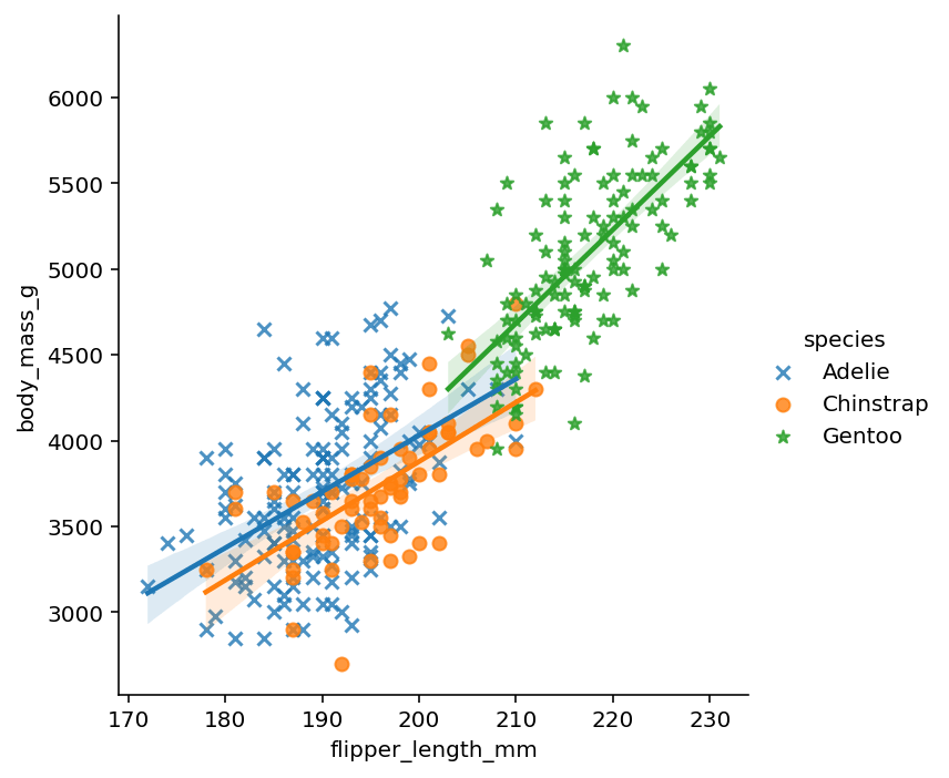
sns.lmplot(data=df, x='flipper_length_mm', y='body_mass_g', hue='species', markers=['x', 'o', '*'])
plt.show()In the code block above, we split the dataset using the hue= parameter. This allows you to pass in an additional column label, which splits the data into different colours. This also plots a separate regression line for each subcategory of data.
In the following section, you’ll learn how to plot a logistic regression relationship in a Seaborn lmplot.
Plotting Logistic Regression in a Seaborn lmplot
Both the Seaborn regplot() and lmplot() functions allow you to plot a logistic regression curve by using logistic=True.
In order to model this, let’s take a look at the relationship between the gender of the penguin and its body mass. To make the data clearer, let’s also add some level of vertical jitter, which shows the distribution better:
import seaborn as sns
import matplotlib.pyplot as plt
df = sns.load_dataset('penguins')
df['sex'] = df['sex'].map({'Male': 1, 'Female':0})
sns.lmplot(data=df, x='body_mass_g', y='sex', logistic=True, y_jitter=0.05)
plt.show()
In the code block above, we instructed Seaborn to plot a logistic regression line as well as adding some jitter to the scatter plots. This returns the following image below:

In the following section, you’ll learn how to plot small multiples (rows and columns) of visualizations.
Creating Small Multiples (Rows and Columns) of Regression Plots
One of the most impressive of the Seaborn library is to add small multiples very easily. Because this plots multiple visualizations, we need to use the figure-level lmplot() function. Let’s first take a look at adding columns of graphs by using the col= parameter.
# Creating Small Multiples of Regression Plots
import seaborn as sns
import matplotlib.pyplot as plt
df = sns.load_dataset('penguins')
sns.lmplot(data=df, x='flipper_length_mm', y='body_mass_g', col='species')
plt.show()
In the code block above, we added col='species'. This extracts each species into its own graph and plots the relationships, as shown below:

What’s great about this approach is that we can layer in even more information by using the color semantic. In order to do this, we can use the hue= parameter, as shown below.
# Using Hue to Add an Additional Variable to Seaborn lmplot()
import seaborn as sns
import matplotlib.pyplot as plt
df = sns.load_dataset('penguins')
sns.lmplot(data=df, x='flipper_length_mm', y='body_mass_g', col='species', hue='sex')
plt.show()
By splitting the data using the hue= parameter, we can see how the data is split across both the species and the gender of the penguin, as shown below:

Finally, we can also split our small multiples by using the row= parameter. This allows you to create a row and column matrix of visualizations, split out by two different variables. Let’s see what this looks like:
# Adding Rows and Columns of Data in Seaborn lmplot
import seaborn as sns
import matplotlib.pyplot as plt
df = sns.load_dataset('penguins')
sns.lmplot(data=df, x='flipper_length_mm', y='body_mass_g', col='species', row='sex')
plt.show()
By doing this, we break the data out into columns and rows using the species and gender variables. This returns the following visualization:

In the final section below, you’ll learn how to plot a regression relationship using a Seaborn jointplot.
Plotting a Regression Plot in a Seaborn Jointplot
Seaborn also allows you to plot regression relationships using a joint plot. This allows you to visualize the regression line, while also getting a sense of the distribution of each of the variables’ values. Let’s take a look at how we can do this:
# Plotting a Joint Plot with Regression Context
import seaborn as sns
import matplotlib.pyplot as plt
df = sns.load_dataset('penguins')
sns.jointplot(data=df, x='flipper_length_mm', y='body_mass_g', kind='reg')
plt.show()
In the code block above, we used the sns.jointplot() function and used the kind='reg' argument to plot a regression line. This returned the image below:
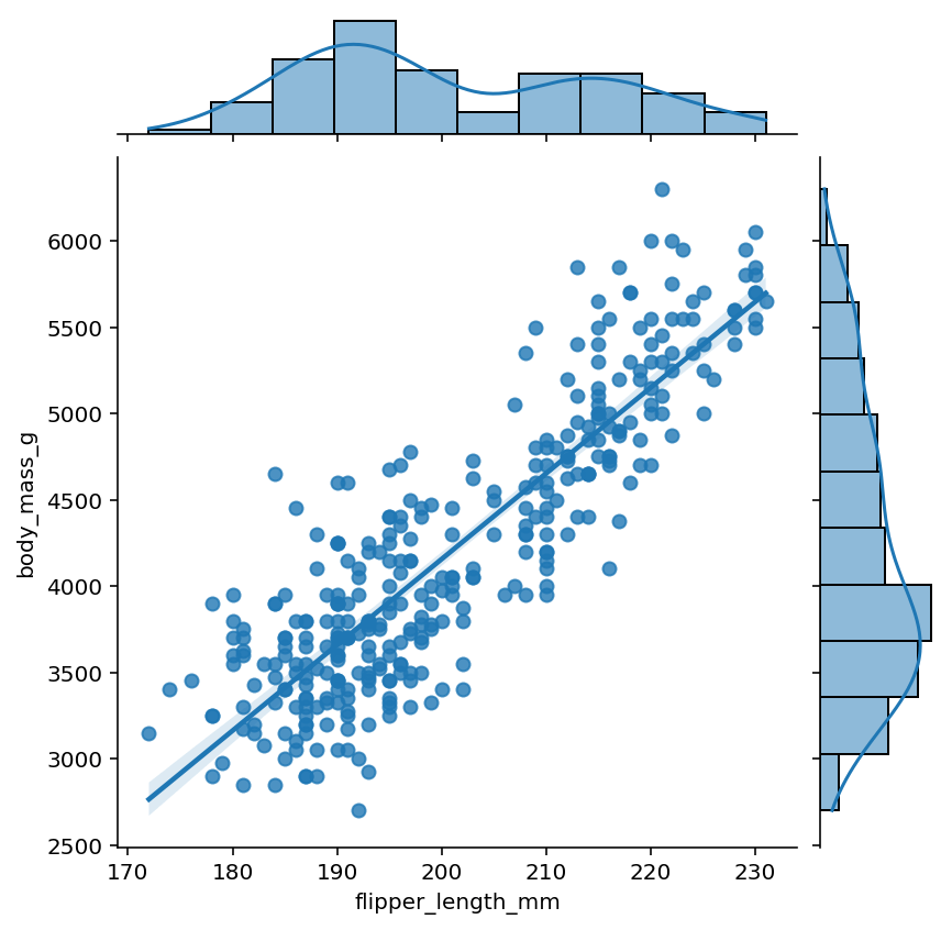
In the graph above, we plotted a jointplot with a regression line while also plotting histograms of the data along the edges of the graph.
Conclusion
In this tutorial, you learned how to use Seaborn to plot regression plots using the sns.regplot() and sns.lmplot() functions. You first learned the differences between the two functions. Then, you learned how to plot simple regression plots. Then, you learned how to change the order of the relationship, as well as plotting logistic regression models. Finally, you learned how to plot small multiples of visualizations as well as using joint plots to plot regression lines.
Additional Resources
To learn more about related topics, check out the tutorials below: