In this guide, you’ll learn how to use the Seaborn histplot() function to create histograms to visualize the distribution of a dataset. Histograms are valuable tools to visualize how datasets are distributed, allowing you to gain strong insight into your data. In this tutorial, you’ll learn about the different parameters and options of the Seaborn histplot function.
By the end of this tutorial, you’ll have learned the following:
- How the Seaborn
histplot()function works - How to customize your Seaborn histograms using color, kernel density estimates, and different bins
- How to visualize two continuous variables using the Seaborn histplot function
If you want to learn how to check if a distribution is normal, check out my guide on using Python to test for normality.
Table of Contents
Understanding the Seaborn histplot Function
Before diving into creating histograms in Seaborn, let’s explore the sns.histplot() function. Take a look at the code block below to see the various parameters the function has to offer:
# Understanding the Seaborn histplot() Function
seaborn.histplot(data=None, *, x=None, y=None, hue=None, weights=None, stat='count', bins='auto', binwidth=None, binrange=None, discrete=None, cumulative=False, common_bins=True, common_norm=True, multiple='layer', element='bars', fill=True, shrink=1, kde=False, kde_kws=None, line_kws=None, thresh=0, pthresh=None, pmax=None, cbar=False, cbar_ax=None, cbar_kws=None, palette=None, hue_order=None, hue_norm=None, color=None, log_scale=None, legend=True, ax=None, **kwargs)
We can see that the function offers a huge variety of parameters. While this guide won’t cover all of them, you’ll learn about the most important ones, including:
data=provides the data to plot via a Pandas DataFramex=andy=provide the variables to plot on the x- and y-axis respectivelyhue=adds an additional variable to plot via a color mappingbinwidth=andbins=determine how wide and how many bins should be plotted, respectively
Now that you have a good understanding of the parameters the sns.histplot() function offers, let’s dive into creating histograms.
Creating a Seaborn Histogram with histplot
In order to create a histogram in Seaborn using a Pandas DataFrame, you only need to use two parameters:
data=refers to the DataFrame you want to plot, andx=refers to the column label that you want to create a histogram of
Let’s see what this looks like:
# Creating a Simple Histogram
import seaborn as sns
import matplotlib.pyplot as plt
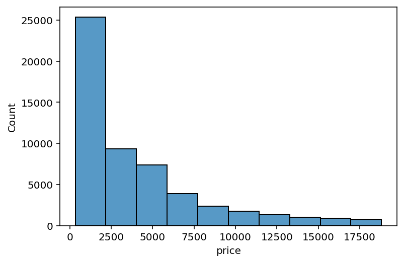
sns.histplot(data=df, x='price')
plt.show()In the code block above, we imported both Seaborn and Matplotlib. We then created a histogram using the sns.histplot() function, returning the visual below:

We can see that Seaborn automatically created bins for us. This is something that you’ll learn how to customize shortly. However, for now, let’s focus on rotating the data to create a horizontal histogram.
Creating a Horizontal Histogram in Seaborn
In order to rotate the histogram and create a horizontal histogram in Seaborn, you can simply map the column label you used to the y= parameter. This will create lengths of bins, rather than heights of bins.
Let’s see what this looks like in Python:
# Creating a Horizontal Histogram
import seaborn as sns
import matplotlib.pyplot as plt

sns.histplot(data=df, y='price')
plt.show()
In the code block above, we simply switched the x= and y= parameters. This allowed us to plot the graph horizontally, rather than vertically.

Now, let’s dive into some of the more exciting pieces of the function and explore how we can modify the bin width in histograms.
Modifying Bin Width in Seaborn Histograms
In order to modify bin widths in a Seaborn histogram, you can use the binwidth= parameter. The parameter accepts a number that represents how wide each bin should be.
By default, Seaborn will attempt to find the most appropriate bin width. However, being able to customize this will allow you to modify this representation. Let’s see how we can use the histplot() function to create bins that are 500 wide.
# Modifying Bin Width in a Seaborn Histogram
import seaborn as sns
import matplotlib.pyplot as plt

sns.histplot(data=df, x='price', binwidth=500)
plt.show()
In the code block above, we only modified the binwidth= parameter, passing in 500 as the argument. This returned the image below:

In the image above, we customized the bin width of our histogram. We can see that this changed some of the details of our visualization, while the overall trend and skew remained the same.
Modifying Bin Counts in Seaborn Histograms
Similarly, we can modify the number of bins, rather than just their width. This can be incredibly helpful when you want to create a set number of bins. In order to modify the number of bins in Seaborn histograms, you can pass the bin number into the bins= parameter.
Let’s see how we can instruct Seaborn to create ten bins. By doing this, we no longer control the bin width, meaning that Seaborn will create evenly-spaced bins.
# Customizing Bin Count in a Seaborn Histogram
import seaborn as sns
import matplotlib.pyplot as plt

sns.histplot(data=df, x='price', bins=10)
plt.show()
In the code block above, we instructed Seaborn to create a histogram with only ten bins. Take a look at the image below for the result of this. While we now have a set number of bins, this may result in less “clean” bins, as shown below:
In the following section, you’ll learn how to add a kernel density estimate to the visualization.
Adding a Kernel Density Estimate in Seaborn Histograms
Seaborn allows you to easily draw a kernel density estimate on top of a histogram. This allows you to get a sense of how the data are distributed, which can be helpful for more complicated histograms.
In order to draw a kernel density estimate onto Seaborn histograms, you can set the kde= parameter to True. By default the argument is set to False, meaning that the estimate isn’t drawn.
# Adding a Kernel Density Estimate to the Histogram
import seaborn as sns
import matplotlib.pyplot as plt

sns.histplot(data=df, x='price', kde=True)
plt.show()
Let’s see what Seaborn returns when we ask it to draw the kernel density estimate:

In the following section, you’ll learn how to add additional data using color to Seaborn histograms.
Adding Additional Data with Color in Seaborn Histograms
We can add additional detail to a Seaborn histogram by plotting another variable using color. While the underlying distribution won’t change, the detail that is represented will give you greater insight into the data.
In order to add an additional variable using color, you can pass the column label of the column into the hue= parameter.
# Adding Additional Detail with Hue
import seaborn as sns
import matplotlib.pyplot as plt
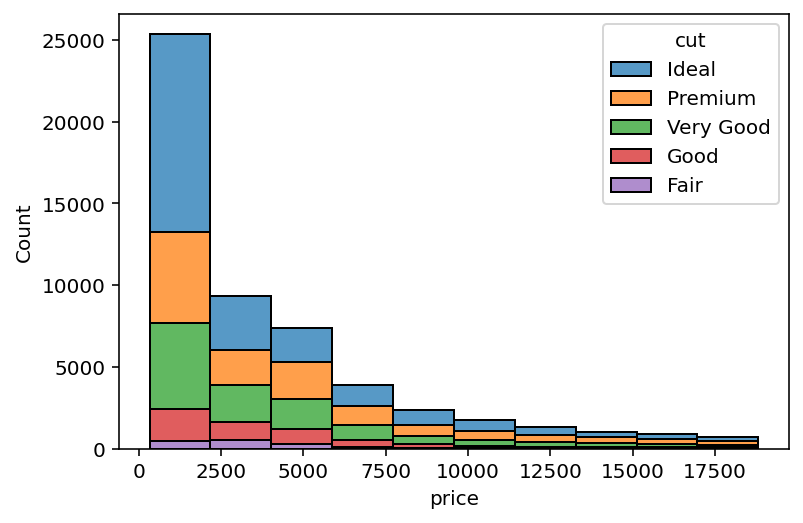
sns.histplot(data=df, x='price', bins=10, hue='cut')
plt.show()In the code block above, we added the 'cut' column to our visualization. This returns the visualization below.

We can see that while the data elements have been added, the elements are overlapping. This can be very difficult to discern. Let’s see how we can modify this approach in the following section.
Stacking Additional Colors in Seaborn Histograms
In order to stack data points split up by color, we can use the multiple='stack' argument. Rather than creating overlapping bars, this will instruct Seaborn to stack overlapping values on top of one another.
Let’s see what this looks like:
# Stacking Additional Detail with Hue
import seaborn as sns
import matplotlib.pyplot as plt

sns.histplot(data=df, x='price', bins=10, hue='cut', multiple='stack')
plt.show()
By stacking each category, Seaborn’s histogram will look following a similar spread to the one without adding hue=. However, the distribution will be split across the different categories, as shown below:
In the following section, you’ll learn how to show percentages rather than counts.
Showing Percentages Rather than Counts in Seaborn Histograms
By default, Seaborn histograms will show counts in the y-axis. However, we can modify this behavior to show percentages instead. In order to show percentages rather than counts in Seaborn histograms, we can pass in stat='percent'.
Let’s see what this code looks like:
# Showing Percentages Rather Than Counts
import seaborn as sns
import matplotlib.pyplot as plt

sns.histplot(data=df, x='price', bins=10, stat='percent')
plt.show()
In the code block above, we modified the behavior to calculate percentages rather than counts, returning the image below:

Seaborn allows you to calculate a number of different statistics. You can use the following arguments in the stat= parameter:
count: show the number of observations in each binfrequency: show the number of observations divided by the bin widthprobabilityorproportion: normalize such that bar heights sum to 1percent: normalize such that bar heights sum to 100density: normalize such that the total area of the histogram equals 1
In the following section, you’ll learn how to use a log scale in a histogram.
Using a Log Scale in a Seaborn Histogram
In some datasets, it will make more sense to plot values on a log scale. This allows you to better understand the distribution without needing to create very stretched visualizations.
In order to plot a histogram using the log scale, you can pass in log_scale=True. This will modify the scale of the axis to be along a log scale instead:
# Using a Log Scale Rather Than an Absolute Scale
import seaborn as sns
import matplotlib.pyplot as plt

sns.histplot(data=df, x='price', log_scale=True)
plt.show()
In the code block above, we added instructions to plot the data on a log scale instead. This returned the image below:

We can see that this returned a tidy visualization on a log scale.
Create a Cumulative Histogram in Seaborn
So far, you have learned how to create histograms that show the distribution at each bin. However, we can also create a cumulative distribution, which will show the distribution cumulatively.
In order to create a cumulative histogram in Seaborn, you can pass in cumulative=True into the sns.histogram() function. This will continue to cumulative add values into the histogram.
# Showing Cumulative Distributions
import seaborn as sns
import matplotlib.pyplot as plt

sns.histplot(data=df, x='price', cumulative=True)
plt.show()
By creating cumulative histograms, you’re able to more easily see how a distribution changes over the course of the bins. For example, you’re able to easily see large jumps in data, in a more intuitive way, as shown below:

Seaborn can also plot two continuous variables into a histogram. Let’s take a look at what this looks like in the following section.
Creating a Seaborn Heat Map Histogram
By plotting two continuous variables in the Seaborn histplot() function, Seaborn will create a heat map, rather than a traditional histogram. In order to accomplish this, we can pass two column labels into both the x= and y= parameters.
Let’s see what this looks like:
# Showing 2 Continuous Values Creates a Heat Map
import seaborn as sns
import matplotlib.pyplot as plt

sns.histplot(data=df, x='carat', y='price')
plt.show()
In the code block above, we passed the 'carat' column into the x= parameter and the 'price' column into the y= parameter. This returned the heatmap below:
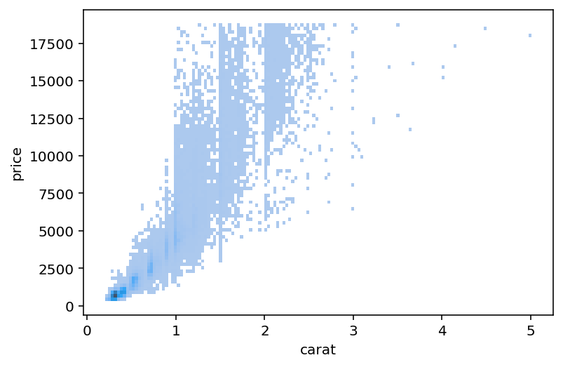
In the visualization above, the darker elements are more frequent, while lighter elements are less frequent. This allows you to see a histogram on two dimensions, giving you a sense of where the clustering of two variables happens.
We can also extend this by adding another variable using the color semantic. In order to do this, we can use the hue= parameter.
# Showing 2 Continuous Values Creates a Heat Map with Color
import seaborn as sns
import matplotlib.pyplot as plt

sns.histplot(data=df, x='carat', y='price', hue='cut')
plt.show()
By doing this, we’ve added a categorical variable. This means that individual categories in the 'cut' column are shown as separate colors. This allows you to see where clustering of different cut types fall.
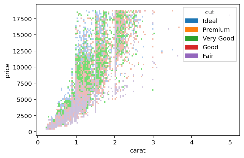
At this point, we’ve added a lot of information to our data visualization. Keep in mind that a data visualization is only as effective as its ability to actually communicate data.
Conclusion
In this guide, you learned how to use the Seaborn histplot() function to create informative histograms in Seaborn. Histograms allow you to get a strong understanding of the distribution of data. While similar to the Seaborn countplot, they provide significant flexibility in terms of customizing your data visualization.
You first learned what the Seaborn histplot function offers in terms of parameters and default arguments. Then, you learned how to create simple histograms. From there, you built on what you learned to create more complex and informative histograms by adding colors, changing scales, and more. Finally, you learned how to create two-dimensional histograms in the form of heatmaps.
Additional Resources
To learn more about related topics, check out the resources below:
- Plotting a Histogram in Python with Matplotlib and Pandas
- NumPy Histogram: Understanding the np.histogram Function
- Seaborn displot – Distribution Plots in Python
- Seaborn kdeplot – Creating Kernel Density Estimate Plots
- Seaborn rugplot – Plotting Marginal Distributions
- Seaborn ecdfplot – Empirical Cumulative Distribution Functions
- Seaborn histplot() – Official Documentation