In this tutorial, you’ll learn how to create Seaborn violin plots using the sns.violinplot() function. A violin plot is similar to a box and whisker plot in that it shows a visual representation of the distribution of the data. However, the violin plot opens much more data by displaying the data distribution. Violin plots are particularly useful when you want to compare the distribution of multiple datasets and be able to identify outliers.
By the end of this tutorial, you’ll have learned the following:
- What violin plots are and when you’ll want to use them
- How the
sns.violinplot()function works - How to create simple violin plots in Seaborn
- How to customize violin plots in Seaborn by splitting by color to add additional variables
- How to create advanced violin plots in Seaborn by trimming, adding detail lines, and changing how the width of a violin plot is calculated
Table of Contents
Understanding Violin Plots
A violin plot is very similar to a box and whisker plot, which you can also easily create in Seaborn. The plot allows you to see the distribution of quantitative data, split by one or more categorical variables. Unlike, a box plot, however, the graph is a kernel density estimate of the underlying data.
Let’s take a look at what a violin plot can look like:
Let’s break down some of the key components of the violin plot:
- The white dot in the center of the plot shows the median of the distribution
- The thicker black bar shows the interquartile range of the data
- The thinner black bar shows the data that extends to 1.5 times the interquartile range
- The wider the plot is on a given data point, the more likely a point will fall into the range
We can see that the data looks quite smooth. This is because the data is that kernel density estimation. However, for larger sample sizes, this can be a very accurate representation of how data are distributed.
While a box plot can show us high amounts of details, violin plots take this even further!
Understanding the Seaborn violinplot Function
Seaborn uses the sns.violinplot() function to generate violin plots. The function has a total of 21 parameters. While this may sound intimidating, you’ll learn about the important ones in this guide. In fact, you don’t need many to generate meaningful violin plots, since Seaborn helps abstract away much of the complexity.
The table below breaks down the parameters of the sns.violinplot() function, as well as their default arguments and accepted values:
| Parameter | Default Argument | Description | Accepted Values |
|---|---|---|---|
data= | None | The dataset to plot. If x and y are not included, the dataset is interpreted as wide-format. | DataFrame, array, list of arrays |
x=, y=, hue= | None | Inputs for plotting long-form data | String, vector |
order=, hue_order= | None | The order to plot categorical levels in. If left blank, inferred from the data. | list of strings |
bw= | 'scott' | The reference rule or the scale factor to use when calculating the kernel bandwidth. | {‘scott’, ‘silverman’, float} |
cut= | 2 | How far to extend the density past extreme data points (in terms of bandwidth) | float |
scale= | 'area' | The method used to scale the width of each violin | {'area', 'count', 'width'} |
scale_hue= | True | When violins are nested using hues, this determines how the scaling is calculated (whether by each major grouping or all violins) | boolean |
gridsize= | 100 | Number of points in the discrete grid used to compute the kernel density estimate | integer |
width= | 0.8 | Width of a full element when not using hue nesting | Float |
inner= | 'box' | The representation of the datapoints in the violin interior | {“box”, “quartile”, “point”, “stick”, None} |
split= | False | When using hue nesting with a variable that takes two levels, setting split to True will draw half a violin for each level | Boolean |
dodge= | True | When nesting by hue, whether the elements should be shifted | Boolean |
orient= | None | How to orient the plot | 'v', 'h' |
linewidth= | None | The width of the gray lines that frame the plot | Float |
color= | None | Single color for all the elements of the plot | Matplotlib color |
palette= | None | Colors to use for the different levels of the hue variable. | palette name, list, dict |
saturation= | 0.75 | Proportion of the original saturation to draw colors at. Setting at 1 uses the full saturation. | Float |
ax= | None | Axes object to draw the plt on | Matplotlib axes |
As you can see from the table above, the function offers a lot of parameters to help you customize the violin plots that you create. Don’t be intimidated, however. This guide will make creating violin plots simple and intuitive. Let’s dive in.
Loading a Sample Dataset
For this tutorial, we’ll use the 'tips' dataset that comes bundled with Seaborn. The dataset breaks down bill and tip amounts for a number of different transactions. The dataset also provides information on the time and day and additional information about the transaction.
# Loading a Sample Dataset
import seaborn as sns
df = sns.load_dataset('tips')
df.head()

# Returns:
#    total_bill   tip     sex smoker  day    time  size
# 0       16.99  1.01  Female     No  Sun  Dinner     2
# 1       10.34  1.66    Male     No  Sun  Dinner     3
# 2       21.01  3.50    Male     No  Sun  Dinner     3
# 3       23.68  3.31    Male     No  Sun  Dinner     2
# 4       24.59  3.61  Female     No  Sun  Dinner     4
Now that you have an understanding of how we can start building our violin plots with Seaborn.
How to Create Python Seaborn Violin Plots
Let’s see how we can create a simple Seaborn violin plot using the sns.violinplot() function. The function makes it easy to build either single or multiple violin plots. Let’s first explore how we can create a single violin plot using Seaborn.
How to Plot a Single Violin Plot in Seaborn
The Seaborn violinplot() function uses a similar format to all plotting functions in the library. This means that we can pass in a dataset in the form of a Pandas DataFrame and then plot data using familiar x= and y= parameters. In order to create a single violin plot in Seaborn, simply pass the DataFrame into the data= parameter and a column header into the y= parameter.
Let’s see what this looks like in Seaborn and Python:
# Creating a Violin Plot with Seaborn
import seaborn as sns
import matplotlib.pyplot as plt
df = sns.load_dataset('tips')

sns.violinplot(data=df, y='tip')
plt.show()
In the code block above, we passed our DataFrame, df, into the data= parameter. We also passed the column header for 'tip' into the y= parameter. With this, we’re telling Seaborn we want to plot the distribution of the 'tip' column. This returns the visualization below:
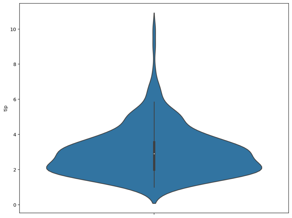
The visualization shows the data split out by the tip amount. Note that we actually only have a single axis populated – the y-axis showing the overall tip amount. The spread of the data (i.e., the kernel density function) shows how many data points fall under the different distribution points of a given tip amount.
We can learn quite about the visualization here. For example, the median is around $3, and half of the data falls between roughly $1.75 – $2.75. Let’s see how we can break this dataset down further by adding multiple violin plots.
How to Plot Multiple Violin Plots in Seaborn
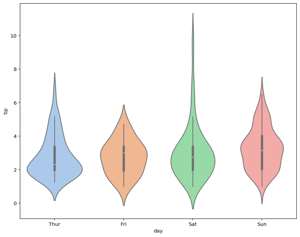
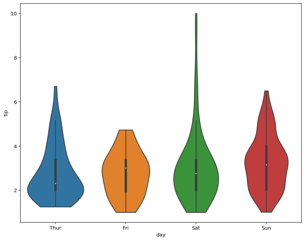
In order to plot multiple violin plots in Seaborn, you can pass an additional column label into the x= parameter. This will split a categorical variable into separate violin charts using labels on the x-axis. Let’s see how we can add multiple violin plots, broken out by the day of the week:
# Creating Multiple Violin Plots with Seaborn
import seaborn as sns
import matplotlib.pyplot as plt
df = sns.load_dataset('tips')

sns.violinplot(data=df, x='day', y='tip')
plt.show()
In the example above, we added one additional argument: x='day'. This instructs Seaborn to split the visualization by the categorical day variable and creates one violin plot per unique day of the week. This returns the following image:
We can see that because the dataset has data for four different days, four violin plots are created. This allows you to better visualize the distribution of tips for each of these four days. For example, we can see that while the median tip is higher for Fridays than Thursdays, there are higher outliers for Thursdays.
How to Add Color to Seaborn Violin Plots with Hue
We can further split out Seaborn violin plots by splitting categorical variables into subcategories. For example, while we have split our data by day, we can further split day by gender. In order to split violin plots by color, you can use the hue= parameter. This will add one additional violin plot for each split. Let’s see what this looks like:
# Adding Additional Variables to Seaborn Violin Plots with hue
import seaborn as sns
import matplotlib.pyplot as plt
df = sns.load_dataset('tips')

sns.violinplot(data=df, x='day', y='tip', hue='sex')
plt.show()
We can see from the example above that we added an additional argument, hue='sex'. This instructs Seaborn to split the data for each split further by the sex variable. Because the data has values for Male and Female in that column, we add two additional splits and return the following image:
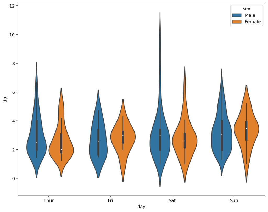
In the visualization above, we added an additional split into our violin plot. Note also that Seaborn automatically added the legend to the visualization, indicating which color refers to which sex. Seaborn allows you to customize this differently by splitting each violin in half, rather than creating additional violin plots.
How to Split Seaborn Violin Plots into Variables
Rather than creating separate violin plots for each sub-variable, we can split each violin in half. This allows you to better visualize the differences between each category. In order to do this, we can pass in the split=True argument.
# Splitting Additional Variables with Hue
import seaborn as sns
import matplotlib.pyplot as plt

df = sns.load_dataset('tips')
sns.violinplot(data=df, x='day', y='tip', hue='sex', split=True)
plt.show()
Keep in mind that we’re still splitting our data by using the hue= parameter. However, by passing in split=True, each violin is split in half. This returns the image below:

While this shows the same data as before, it’s now much easier to understand the differences between each gender.
In the following section, you’ll learn how to rotate violin plots horizontally.
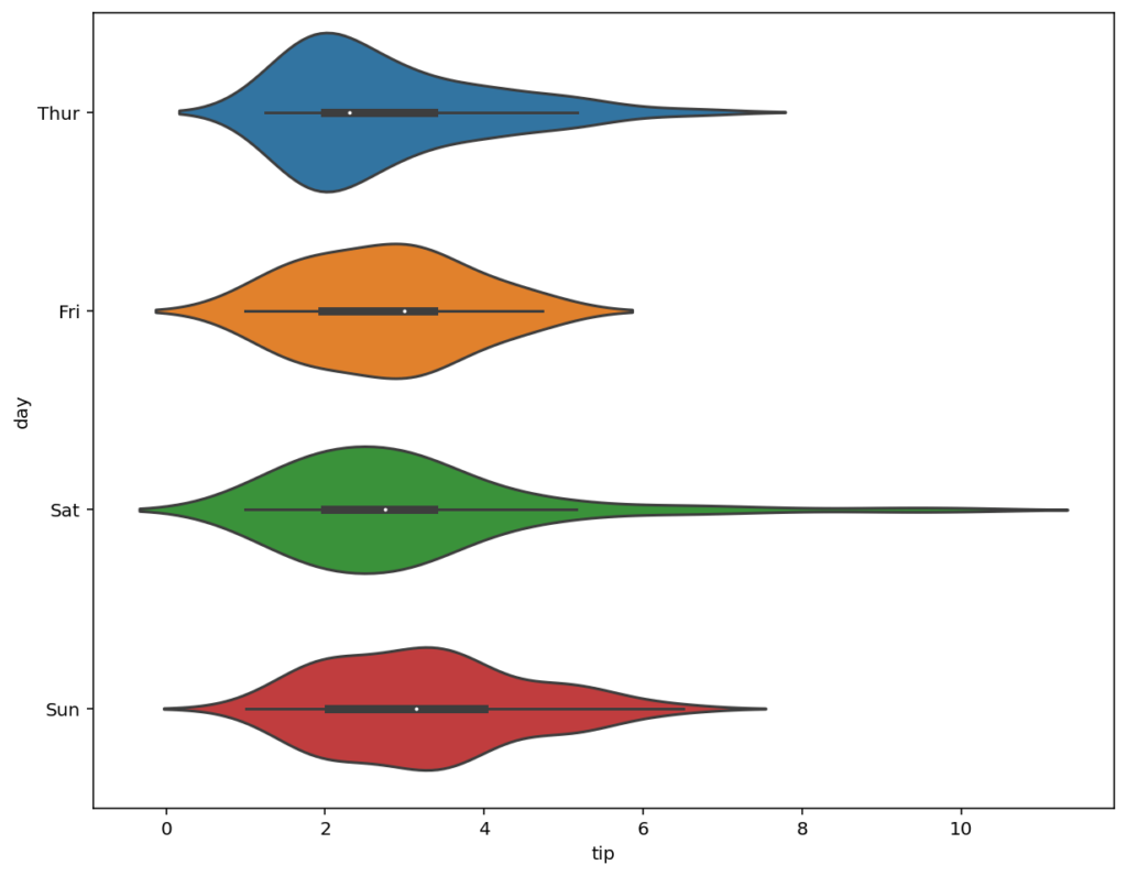
How to Rotate Seaborn Violin Plots to Horizontal
In some cases, you may want to rotate your Seaborn violin plots so that the shapes are horizontal, rather than vertical. This can allow you better see the spread for some types of distributions. In order to do this, we need to reverse the x= and y= parameters. In most cases, Seaborn will infer the orientation. However, if you want to be more explicit, you can pass in orient='h'. Let’s see what this looks like:
# Rotating a Seaborn Violin Plot
import seaborn as sns
import matplotlib.pyplot as plt

df = sns.load_dataset('tips')
sns.violinplot(data=df, x='tip', y='day')
# sns.violinplot(data=df, x='tip', y='day', orient='h')
plt.show()
By rotating our violin plot, we return the image shown below:
In the following section, you’ll learn how to plot violin plots to subplots.
How to Add Seaborn Violin Plots to Subplots
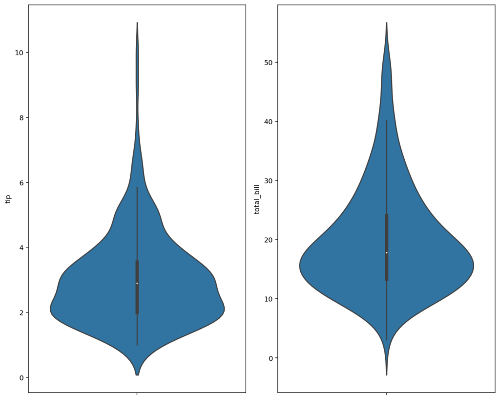
In some cases, you’ll want to create multiple Seaborn plots using subplots. This allows you to show different distributions in the same figure. For example, we can visualize how the distribution for the tip and total_bill columns differ. Let’s see how this can be done:
# Using Subplots with Seaborn Violin Plots
import matplotlib.pyplot as plt
import seaborn as sns

df = sns.load_dataset('tips')
fig = plt.figure(figsize=(10, 8))
grid = fig.add_gridspec(1, 2)

ax = fig.add_subplot(grid[0, 0])
sns.violinplot(data=df, y='tip')

ax = fig.add_subplot(grid[0, 1])
sns.violinplot(data=df, y='total_bill')

fig.tight_layout()
plt.show()
In the example above, we used subplots to add two different distributions to the same figure. We did this by creating a grid spec, which has one row and two columns. From there, we were able to add axes objects to the grid spec by using the add_subplot() function. This returns the following image:
In the following sections, we’ll explore how to show different data elements in violin plots.
How to Show Data in Seaborn Violin Plots
Seaborn provides many different options to show data in violin plots. For example, you can show data as points using strip plots. Additionally, you can show data as concentrated lines showing the distribution across an axis.
Let’s dive into how this can be done in Seaborn!
How to Show Data as Points in Seaborn Violin Plots
To show data as points within the Seaborn violin plot, we can layer in an additional plot, the strip plot. Because Seaborn returns an implicit axes, Seaborn can map to the same axes by calling two functions. Let’s see how this works:
# Show Data as Points in Seaborn Violin Plots
import seaborn as sns
import matplotlib.pyplot as plt

df = sns.load_dataset('tips')
sns.violinplot(data=df, x='day', y='tip')
sns.stripplot(data=df, x='day', y='tip', color='black', alpha=0.5)
plt.show()
In the code above, we used the same parameters for data=, x=, and y=. We added additional customizations for the strip plot to make the data more visible when points overlap. This returns the image below:
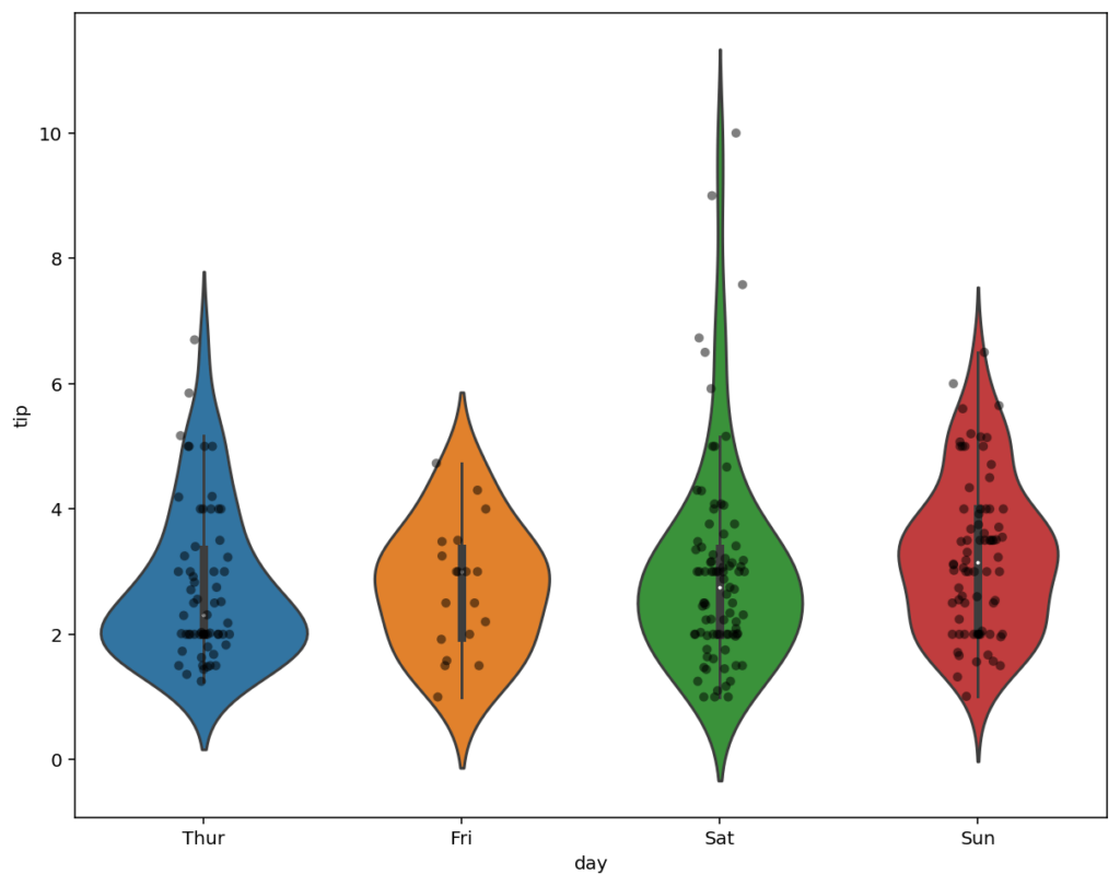
In the image above, the distribution is shown as both a violin plot and as data points, relative to their distribution. We can also show our data as lines, rather than points, which is what you’ll learn in the following section.
How to Show Data as Lines in Seaborn Violin Plots
The Seaborn violinplot() function also allows you to show data as horizontal lines using the inner= parameter. By passing 'stick' into the inner= parameter, the function will add horizontal lines at a density proportional to the kernel density.
# Show Data as Lines in Seaborn Violin Plots
import seaborn as sns
import matplotlib.pyplot as plt

df = sns.load_dataset('tips')
sns.violinplot(data=df, x='day', y='tip', inner='stick')
plt.show()
The inner= parameter accepts some different options. 'stick' and 'point' will return lines and points, respectively. 'quartiles' will return lines representing the interquartile range and 'box' will return a small inner boxplot (and is the default argument). By passing in 'stick', we return the image below:

In this following section, you’ll learn how to remove outliers from Seaborn violin plots.
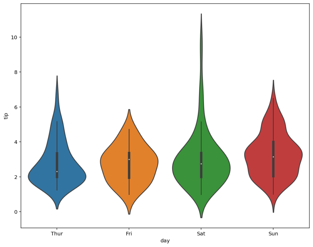
How to Cut or Include Outlier Values from Seaborn Violin Plots
By default, the Seaborn violin plot will extend to two times the interquartile range of the plot. This means that some outliers will be cut. However, violin plots are excellent tools for identifying outliers. Because of this, we can use the cut= parameter to remove (or include) certain outliers.
For example, if we wanted to include all data points in our violin plot, we could use cut=0, which includes all outliers. If we modified the value to be 1.75, the violin plot would include values up to 1.75 times the interquartile range.
Let’s see how we can include all values from our distribution:
# Include Outliers in Seaborn Violin Plots
import seaborn as sns
import matplotlib.pyplot as plt

df = sns.load_dataset('tips')
sns.violinplot(data=df, x='day', y='tip', cut=0)
plt.show()
In the image below, it may look like we’re cutting our graph off early. However, we’re actually removing the smoothing that Seaborn implies when generating the violin. By default, the line will extend to 2 times the interquartile range to create a smoothed effect. However, by passing in 0, we cut the values at their true start and end points.
In the following section, you’ll learn how to modify how Seaborn calculates the width of each violin plot.
How to Change the Scaling Rule in Seaborn Violin Plots
Seaborn allows you to modify how the violins are shaped using the scale= parameter. In fact, it provides three different options for this parameter:
'width'indicates that each violin should have the same width,'area'indicates that each violin should have the same area (and is the default parameter), and'count'indicates that the width should be scaled by the number of observations in each bin
Let’s take a look at how we can modify the parameter to scale each violin to be the same width:
# Modify the Scaling Rule for Seaborn Violin Plots
import seaborn as sns
import matplotlib.pyplot as plt

df = sns.load_dataset('tips')
sns.violinplot(data=df, x='day', y='tip', scale='width')
plt.show()
By setting this parameter, each violin plot will now have the same width. This allows you to see where the greatest values exist in each distribution, even if those total values are different among the categories.
In the final sections, you’ll learn how to customize your violin plots. First, we’ll take a look at how to add titles and labels to the plots and then how to modify the color palette of your visualization.
How to Add Titles and Labels to Seaborn Violin Plots
Seaborn makes adding titles and axis labels to your visualizations simple and intuitive. By using Matplotlib axes methods, we can easily set these customizations. For example, we can use the following parameters in the .set() method:
| Parameter | To Set |
|---|---|
title= | The title of our visualization |
xlabel= | The x-axis label of our visualization |
ylabel= | The y-axis label of our visualization |
ax.set() method to customize titles and labelsLet’s see what this looks like in Python:
# Add Titles to Seaborn Violin Plots
import seaborn as sns
import matplotlib.pyplot as plt

df = sns.load_dataset('tips')
ax = sns.violinplot(data=df, x='day', y='tip')
ax.set(
    title='A Violin Plot Made in Seaborn',
    xlabel='Weekday',
    ylabel='Tip Amount'
    )
plt.show()
In the code block above, we customized the title and axis labels of our violin plot. This returned the following visualization:

In the section below, you’ll learn how to use Seaborn’s built in color palettes to customize the coloring of the charts.
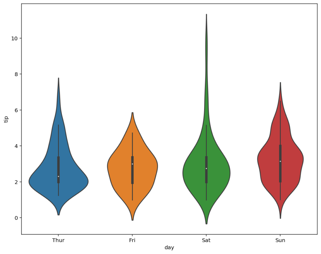
How to Change the Color Palette in Seaborn Violin Plots
Seaborn provides a number of different color palettes. You can learn all about how these palettes work and how to apply them in this guide. However, to keep things simple and actionable, you can easily pass in a palette into the palette= parameter.
# Change the Color Palette in Seaborn Violin Plots
import seaborn as sns
import matplotlib.pyplot as plt

df = sns.load_dataset('tips')
sns.violinplot(data=df, x='day', y='tip', palette='pastel')
plt.show()
In the code block above, we passed in palette='pastel', which indicates that we want to use that specific palette. This returns the following image below:
Seaborn provides a lot of flexibility in terms of customizing how we want to style our data visualizations. Using palettes is a simple option to easily add style to your data.
Conclusion
In this guide, you learned how to use the Seaborn violinplot() function to create informative violin plots in Seaborn. You first learned what violin plots are and when you may want to use them. From there, you learned about the sns.violinplot() function and its various parameters.
Then, you began to walk through hands-on examples. We first created a number of different simple violin plots. From there, we customized the visualizations by adding additional details using color and inner data representations. Finally, we modified the axes objects by customizing titles, axis labels, and the color palette.
Additional Resources
To learn more about related topics, check out the resources below:
- Seaborn catplot – Categorical Data Visualizations in Python
- Seaborn Boxplot – How to Create Box and Whisker Plots
- Seaborn barplot() – Create Bar Charts with sns.barplot()
- Seaborn Countplot – Counting Categorical Data in Python
- Seaborn swarmplot: Bee Swarm Plots for Distributions of Categorical Data
- Seaborn Pointplot: Central Tendency for Categorical Data
- Seaborn stripplot: Jitter Plots for Distributions of Categorical Data