The Seaborn stripplot function allows you to create data visualizations that easily and effectively show the numeric distribution of data over categories. There aren’t many functions that allow you to do this: the boxplot and violin plots are two of these functions, but they can be intimidating to non-technical audiences.
This is where the strip plot (or jitter plot) comes to the rescue! In fact, the strip plot can be combined with the box and whisker plot or the violin plot to add additional detail. In this guide, you’ll learn how to use the Seaborn stripplot function to create jitter scatter plots to easily graph numerical distributions over categorical variables.
By the end of this tutorial, you’ll have learned the following:
- How to understand and use the Seaborn
sns.stripplot()function - When jitter plots are a good alternative to simple scatter plots, box plots, and violin plots
- How to customize Seaborn strip plots to add more detail with color and marker shapes
- How to customize labels, titles, and more
Table of Contents
What are Strip Plots and When Would You Want to Use Them?
Before diving into creating Seaborn strip plots, let’s dive into what they are why they are useful. Visualizing numeric distributions over categorical variables can be a challenging task. For example, using techniques like bar plots means you need to aggregate values into a single value. Using visualizations such as scatter plots leads to results that can be hard to understand (just take a look at the top right visual below).
Take a look at the graphs below, that compare the different visualization options available, including strip plots, scatter plots, violin plots, and box and whisker plots.

This is where strip plots are useful. They add a certain amount of jitter to the dots so that you can better understand the distribution of different data points. This is quite similar to the swarmplot function, which provides a more structure jitter to the plots.
Understanding the Seaborn stripplot Function
The Seaborn stripplot() function offers many different parameters. These allow you to customize the plots to a significant extent. Let’s take a look at the parameters available in the Seaborn stripplot function:
seaborn.stripplot(data=None, *, x=None, y=None, hue=None, order=None, hue_order=None, jitter=True, dodge=False, orient=None, color=None, palette=None, size=5, edgecolor='gray', linewidth=0, hue_norm=None, native_scale=False, formatter=None, legend='auto', ax=None, **kwargs)We can see that there are a large number of parameters. Let’s break down the important parameters of the Seaborn stripplot() function:
data=defines the data that we want to use, such as a Pandas DataFramex=andy=define the data series or column labels that we want to use for the x-axis and y-axis respectivelyhue=adds another dimension to the plot by using different colors for different variablesalpha=allows you to modify the transparency of the dots. Note that this isn’t an explicit parameter of the function, but can be passed in using the additional keyword arguments of the Matplotlib scatterplot function.
Now that you have a good understanding of the important parameters of the Seaborn stripplot function, let’s dive into creating a plot with the function.
How to Create a Strip Plot in Seaborn
In order to create a strip plot in Seaborn, you can pass a Pandas DataFrame and two column labels (for the x-axis and y-axis) into the sns.stripplot() function. Because Seaborn uses a common structure for its functions, creating a strip plot is simple and intuitive. Let’s see how we can create a simple jitter plot in Seaborn:
# How to Create a Seaborn Split Plot
import seaborn as sns
import matplotlib.pyplot as plt
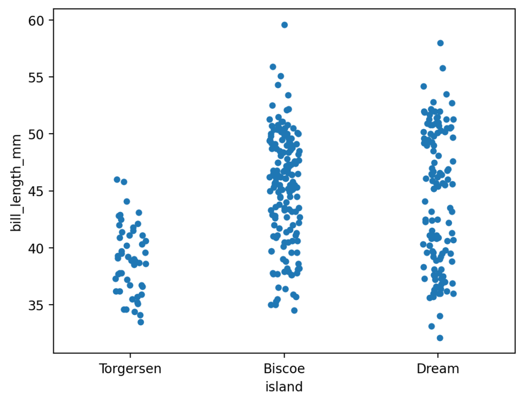
df = sns.load_dataset('penguins')
sns.stripplot(data=df, x='island', y='bill_length_mm')
plt.show()In the code block above, we passed our DataFrame, df, into the data= parameter. Similarly, because we’re using a Pandas DataFrame, we can pass in the column labels as strings into the respective x and y-axis parameters. This returns the following image:
In the following section, you’ll learn how to add additional variables to strip plots using additional colors.
How to Add Color for Additional Variables in Seaborn Strip Plots
In the strip plot we generated above, we created a plot that contained information on two dimensions. We can add a third variable to the plot by using the hue= parameter. This adds an additional column of data by splitting the variable into different colors.
# How to Add Another Variable with Color to a Seaborn Split Plot
import seaborn as sns
import matplotlib.pyplot as plt
df = sns.load_dataset('penguins')

sns.stripplot(data=df, x='island', y='bill_length_mm', hue='sex')
plt.show()
In the code above, we added hue='sex', which split the values in that column into different colors. This returns the image below, where the points have been split into different colors.
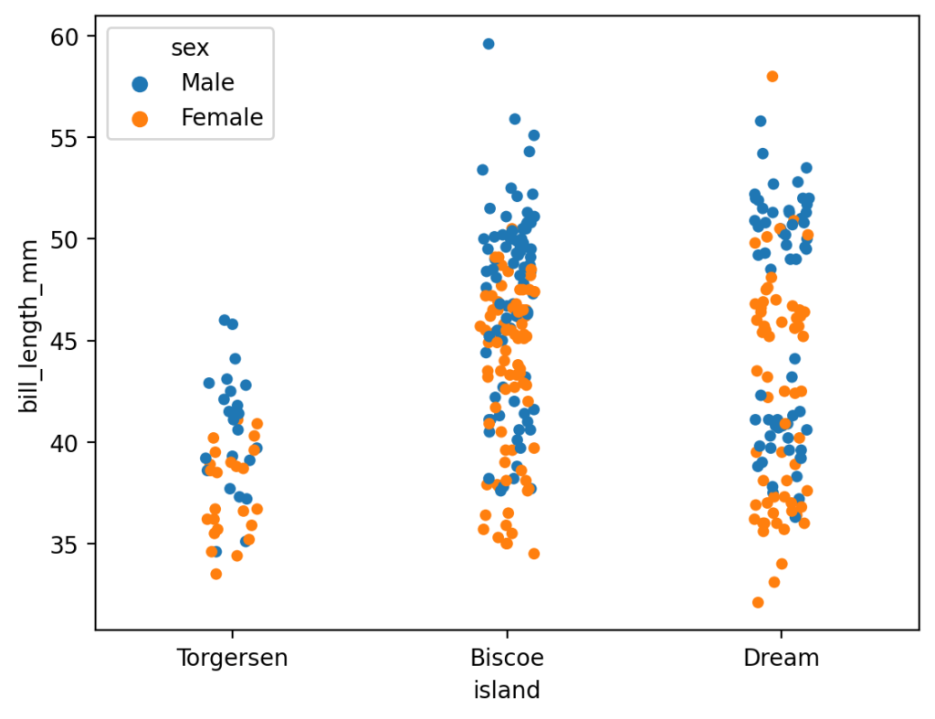
We can see that the dots have been added. However, because they are fully opaque, it can be difficult to see where they are clustered. You’ll learn how to address this in the following section.
How to Modify Transparency in Seaborn Strip Plots
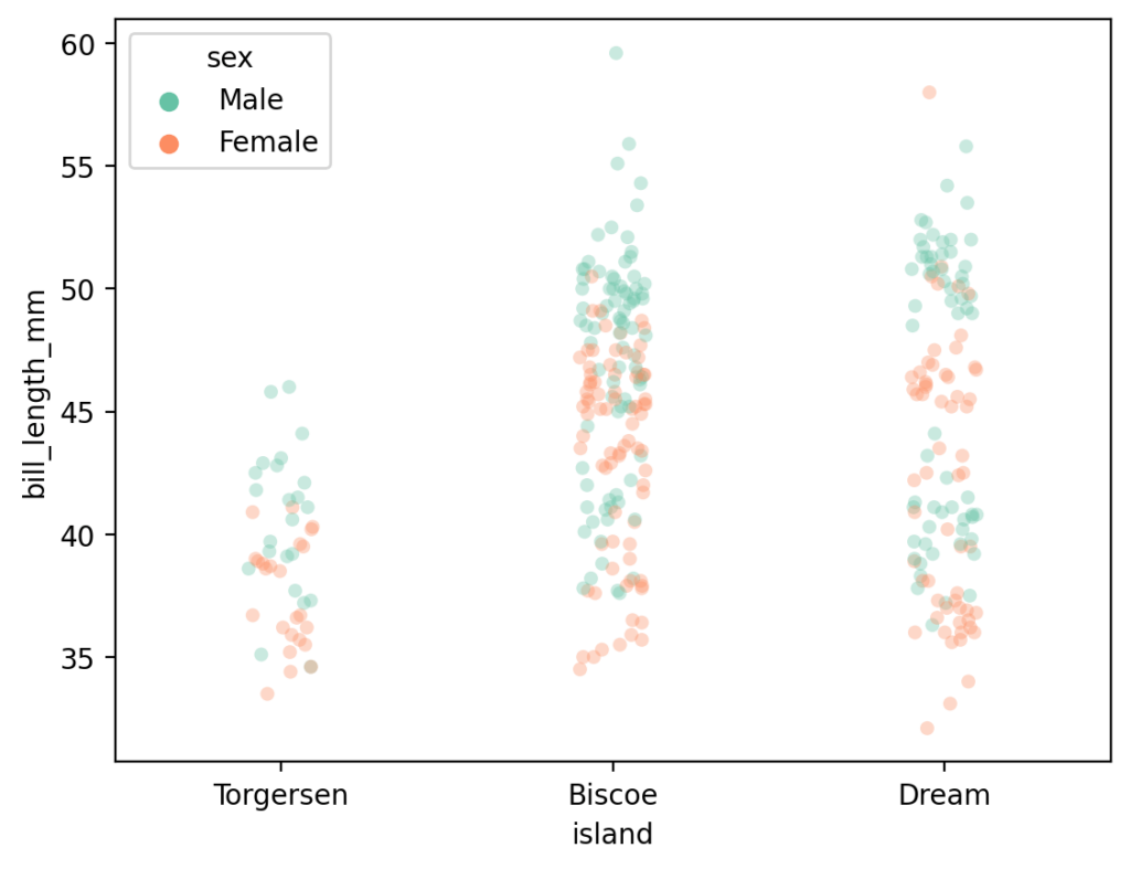
By default, the dots in a strip plot are fully opaque. This can make seeing the different values’ clusters difficult. In order to address this, we can modify the transparency of each marker using the alpha= parameter. The parameter accepts a value between 0 and 1, where lower values are more transparent.
# How to Change the Transparency of a Seaborn Split Plot
import seaborn as sns
import matplotlib.pyplot as plt
df = sns.load_dataset('penguins')

sns.stripplot(data=df, x='island', y='bill_length_mm', hue='sex', alpha=0.35)
plt.show()
In the code block above, we passed in alpha=0.35, which sets the transparency at 35%. This returns the image below, where overlapping values are much clearer.

In the following section, you’ll learn how to use jitter plots creatively by adding them to violin plots.
How to Add Strip Plots to Seaborn Violin Plots
We can combine a strip plot with a Seaborn violin plot to help users better understand the violin plot. Seaborn makes this simple by simply calling both functions. Seaborn will then add the plots to the same axes object. Let’s see what this looks like:
# How to Overlay a Strip Plot over a Violin Plot in Seaborn
import seaborn as sns
import matplotlib.pyplot as plt
df = sns.load_dataset('penguins')

sns.violinplot(data=df, x='island', y='bill_length_mm', )
sns.stripplot(data=df, x='island', y='bill_length_mm', alpha=0.25, color='black')
plt.show()
By calling both the violin plot and strip plot functions, Seaborn maps both of these to the same visualization. This returns the data visualization below:

We can see that this allows users to better understand the underlying distribution of the Seaborn violin plot.
How to Change the Palette of a Seaborn Strip Plot
Seaborn makes changing the color palette of your plot very simple. One of the ways in which you can do this is by calling the sns.set_palette() function and passing in a named palette. In the example below, we’ll pass in 'Set2' as the palette to use.
# How to Change the Palette of a Seaborn Strip Plot
import seaborn as sns
import matplotlib.pyplot as plt
df = sns.load_dataset('penguins')
sns.set_palette('Set2')
sns.stripplot(data=df, x='island', y='bill_length_mm', hue='sex', alpha=0.35)
plt.show()
By passing in the palette 'Set2', Seaborn creates the following image:
In the following section, you’ll learn how to add titles and axis labels to your Seaborn jitter plot.
How to Add Titles and Axis Labels to Seaborn Strip Plots
By default, Seaborn doesn’t include a title but will add column labels as the x- and y-axis labels. We can modify this by using the following axes methods:
ax.set_title()to set the title,ax.set_xlabel()to set the x-axis label, andax.set_ylabel()to set the y-axis label
There are many different customization options which allow you to add flexibility to how your Seaborn titles and axis labels are styled. Let’s take a look at what this looks like:
# How to Add a Title and Axis Labels to a Seaborn Strip Plot
import seaborn as sns
import matplotlib.pyplot as plt
df = sns.load_dataset('penguins')
sns.set_palette('Set2')
chart = sns.stripplot(data=df, x='island', y='bill_length_mm', hue='sex', alpha=0.35)

chart.set_title('Bill Length by Island', fontdict={'size':18})
chart.set_xlabel('Bill Length (mm)', fontdict={'weight':'bold'})
chart.set_ylabel('Island', fontdict={'weight':'bold'})
plt.show()
We can see that we were able to add both a label and customize the label using the fontdict= parameter. The parameter allows you to pass in customizations based on Matplotlib text styling options.
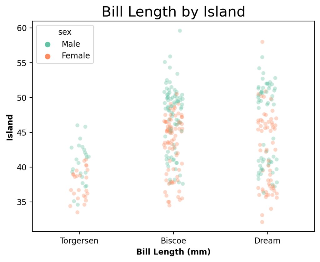
We can see that this adds a lot more detail to the plots in Seaborn, making it much clearer to the reader what the plot is displaying.
Conclusion
In this tutorial, you learned how to create strip plots in Seaborn using the sns.stripplot() function. Strip plots, or jitter plots, are scatter plots that display continuous data over categorical data. By adding some amount of jitter to the dots to make the data more easily visible.
You first learned how the parameters of the function work and what the most important parameters are. Then, you learned how to create a simple scatter plot and enhance it by modifying the colors used. Then, you learned to make the graph clearer by adding transparency. From there, you overlayed the strip plot over a violin plot to make it easier to understand for non-technical audiences. Finally, you learned how to customize the plots by modifying the color palette and by adding titles and axis labels to the plot.
Additional Resources
To learn more about related topics, check out the resources below:
- Seaborn catplot – Categorical Data Visualizations in Python
- Seaborn Boxplot – How to Create Box and Whisker Plots
- Seaborn Violin Plots in Python: Complete Guide
- Seaborn barplot() – Create Bar Charts with sns.barplot()
- Seaborn Countplot – Counting Categorical Data in Python
- Seaborn swarmplot: Bee Swarm Plots for Distributions of Categorical Data
- Seaborn Pointplot: Central Tendency for Categorical Data
- Seaborn stripplot(): Official Documentation