Welcome to this comprehensive tutorial on data visualization using Matplotlib and Seaborn in Python. By working through this tutorial, you will learn to plot functions using Python, customize plot appearance, and export your plots for sharing with others.
Throughout this tutorial, you’ll gain an in-depth understanding of Matplotlib, the cornerstone library for generating a wide array of customizable plots to visualize data effectively. As you become familiar with the basics, we’ll progress to Seaborn. This library builds on Matplotlib’s features and brings clear advantages in terms of visual aesthetics and ease of use.
Here’s a sneak peek of what you’ll learn:

Table of Contents
How to Plot a Function in Python Using Matplotlib
In order to plot a function in Python using Matplotlib, we need to define a range of x and y values that correspond to that function. In order to do this, we need to:
- Define our function, and
- Create a range of continuous x-values and map their corresponding y-values
Let’s see how we can accomplish this. First, we’ll need to import our libraries:
# Importing libraries
import matplotlib.pyplot as plt
import numpy as np
In order to plot a function, we need to import two libraries: matplotlib.pyplot and numpy. We use NumPy in order to apply an entire function to an array more easily.
Let’s now define a function, which will mirror the syntax of f(x) = x ** 2. We’ll keep things simple for now, simply by squaring our input. Let’s see how we can define this function:
# Define a Function
def f(x):
    return x ** 2
Now that we have a function, let’s define our x-range and y-range. In order to do this, we’ll use the NumPy linspace function, which creates a range of evenly-spaced numbers. Let’s see what this looks like:
# Create x and y Ranges
x = np.linspace(-5, 5, 1000)
y = f(x)
Because we defined a NumPy array, we can simply pass the array into a function and it will be applied element-wise. Now that we have these arrays, let’s plot our chart:
# Plot the Data
plt.plot(x, y)
plt.show()
This returns the following image:
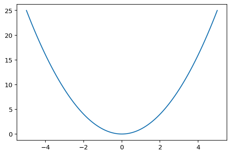
We can see that the data goes from -5 to +5, though the plot ends before then. Because the function f(x) = x ** 2 actually extends beyond these values, we should modify our plot to be cut off earlier. Let’s see how we can do this:
# Modify the Axes Limits
fig, ax = plt.subplots()
ax.plot(x, y)
ax.set_xlim(-5, 5)
ax.set_ylim(0, 25)
plt.show()
Let’s explore what we did in the code block above:
- We modified the plot to use the object-oriented approach by using the
subplots()function - We then plotted our function on the axes
- Finally, we used the
.set_xlim()and.set_ylim()methods to modify the bounds of our plot
This returned the following image:

In the following section, you’ll learn how to customize your plot by adding a legend and title to your functions.
How to Add a Legend and Title to Matplotlib Plots
In this section, you’ll learn how to add a legend describing the function and a title to a Matpltolib plot. In order to do this, let’s go a little wild and define a section function. Take a look at the code block below, where we plot two functions:
# Define an Additional Function
def sin(x):
    return 5 * np.sin(x)

# Create x and y values
x = np.linspace(-5, 5, 1000)
y1 = f(x)
y2 = sin(x)

# Plot both functions
fig, ax = plt.subplots()
ax.plot(x, y, label='f(x)=x**2')
ax.plot(x, y2, label='f(x)=5sin(x)')
ax.set_title('Plotting Functions in Matplotlib', size=14)
ax.set_xlim(-5, 5)
ax.set_ylim(-5, 25)
plt.legend()
plt.show()
Let’s break down what we did in the code block above:
- We defined a second function and calculated our x-range and y-ranges
- We then created our figure and axes and plotted both functions to the axes
- Notice that we passed in the
label=parameter, which allows you to label the range in the visualization - We then used the
.set_title()method to set a title on our plot’s axes
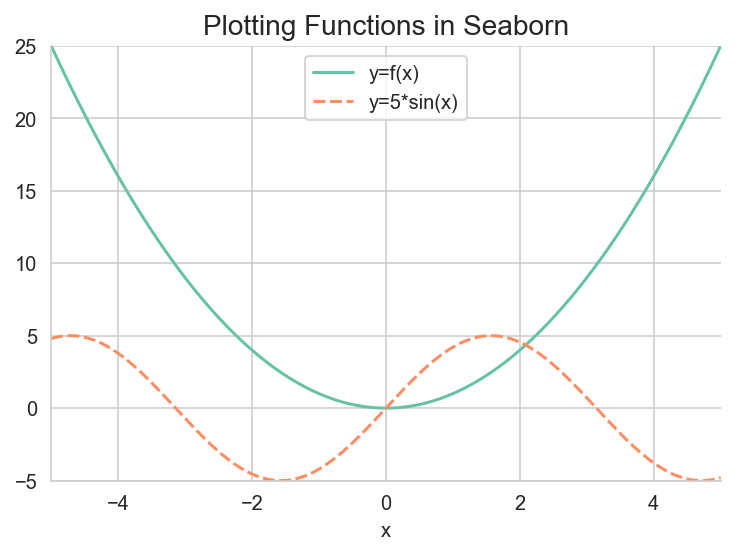
This returns the following image:
Phew! Ok, we’ve been able to plot two functions on the same chart and then add the functions’ descriptions to the plot’s legend. In the following section, you’ll learn how to do this with Seaborn as well.
How to Plot a Function Using Seaborn
In this section, you’ll learn how to use Seaborn to plot two functions. Since this process is very similar to using just Matplotlib, I won’t cover every detail, but rather explain what is different from our Matplotlib implementation. Take a look at the code block below:
import seaborn as sns
import numpy as np
import pandas as pd
import matplotlib.pyplot as plt

def f(x):
    return x ** 2

def sin(x):
    return 5 * np.sin(x)

x = np.linspace(-5, 5, 1000)
y1 = f(x)
y2 = sin(x)

df = pd.DataFrame(zip(x, y1, y2), columns=['x', 'y=f(x)', 'y=5*sin(x)']).set_index('x')
fig, ax = plt.subplots()

# Plot sns.lineplot() to the ax
sns.set_palette('Set2')
sns.set_style('ticks')
sns.lineplot(df, ax=ax)
ax.set_title('Plotting Functions in Matplotlib', size=14)
ax.set_xlim(-5, 5)
ax.set_ylim(-5, 25)

# Despine the graph
sns.despine()
plt.show()
Let’s break down what we did in the code block above:
- We imported Seaborn and Pandas, since we’ll work with a Pandas DataFrame
- We declared our two functions and passed the three arrays into the Python
zip()function, which allows you to iterate over arrays element-wise - We used some Seaborn helper functions to set a style and a palette, and plotted our two functions using the Seaborn lineplot function. Because our x-values are the DataFrame’s index, we can pass in a wide-format dataset
- Finally, we use the Seaborn despine function to remove the top and right borders of our graph
This returns the following image:
This allows us to easily add some styling to our visualization, which would take significantly longer in Matplotlib!
Conclusion
In conclusion, plotting a function using Python’s Matplotlib and Seaborn libraries can be a powerful way to visualize data and gain insights into relationships between variables. By using NumPy’s linspace function, we can easily create x and y values to represent the function. With Matplotlib, we can plot the function, add a title and legend, and customize the appearance of the graph.
Seaborn provides similar capabilities for plotting functions with more advanced statistical analysis and visualization tools (lineplot official documentation). These libraries allow us to quickly and easily generate plots that can help us to better understand our data and make more informed decisions. Overall, understanding how to use these libraries for function plotting is a valuable skill for anyone working with data in Python.
Thx, that was amazing.
Thanks so much, Ali!