In this tutorial, you’ll learn how to use Pandas to make a scatter plot. Under the hood, Pandas uses Matplotlib, which can make customizing your plot a familiar experience. Pandas allows you to customize your scatter plot by changing colors, adding titles, and more. In more recent versions, Pandas included the ability to use different backends for plotting data. In this tutorial, we’ll explore the default of Matplotlib, though most of the tutorial can extend to different backends.
Being able to visualize your data easily is an important step in determining where to take your analysis. In many cases, looking at your data through data visualization can have important benefits in understanding the distribution of your data.
By the end of this tutorial, you’ll have learned:
- Loading a Sample Pandas DataFrame
- How to make a scatter plot
- How to customize colors in a scatter plot
- How to add titles to your scatter plot
- How to modify the size of points on your scatter plot
- How to change colors for hues in Pandas scatter plots
Table of Contents
Loading a Sample Pandas DataFrame
To follow along with this tutorial line-by-line, I have provided a sample dataset that you can load into a Pandas DataFrame. Feel free to use your own data, though your results will of course look different.
# Loading a Sample Pandas DataFrame
import pandas as pd
from matplotlib import pyplot as plt

df = pd.read_csv('https://raw.githubusercontent.com/datagy/data/main/KNN_data.csv')

print(df.head())

# Returns:
#           x         y   Label
# 0  5.539907  2.780370  Medium
# 1  5.309798  3.342864   Large
# 2  4.367271  4.551839   Large
# 3  3.812863  2.447711   Large
# 4  5.213783  5.133856   Large
In the code above, we imported both Pandas and the pyplot library. We then used the Pandas .read_csv() function to load the dataset and explored the first five rows with the Pandas .head() function.
How to Make a Scatter Plot in Pandas
To make a scatter plot in Pandas, we can apply the .plot() method to our DataFrame. This function allows you to pass in x and y parameters, as well as the kind of a plot we want to create. Because Pandas borrows many things from Matplotlib, the syntax will feel quite familiar.
Let’s take a look at what the .plot() function looks like:
# The Pandas Plot Function
df.plot(
    x=None,         # Values to use for x axis
    y=None,         # Values to use for y axis
    kind='line',    # The type of chart to make
    title=None,     # The title to use
    legend=False,   # Whether to show a legend
    xlabel=None,    # What the x-axis label should be
    ylabel=None     # What the y-axis label should be
    c=None,         # The color to use for the dots
    s=None          # How to size dots (single number or column)
)
There are many more parameters in the function, but these represent most of the key parameters to be aware of. We’ll be exploring these parameters throughout the tutorial.
Let’s see how we can create our first Pandas scatter plot using the .plot() function:
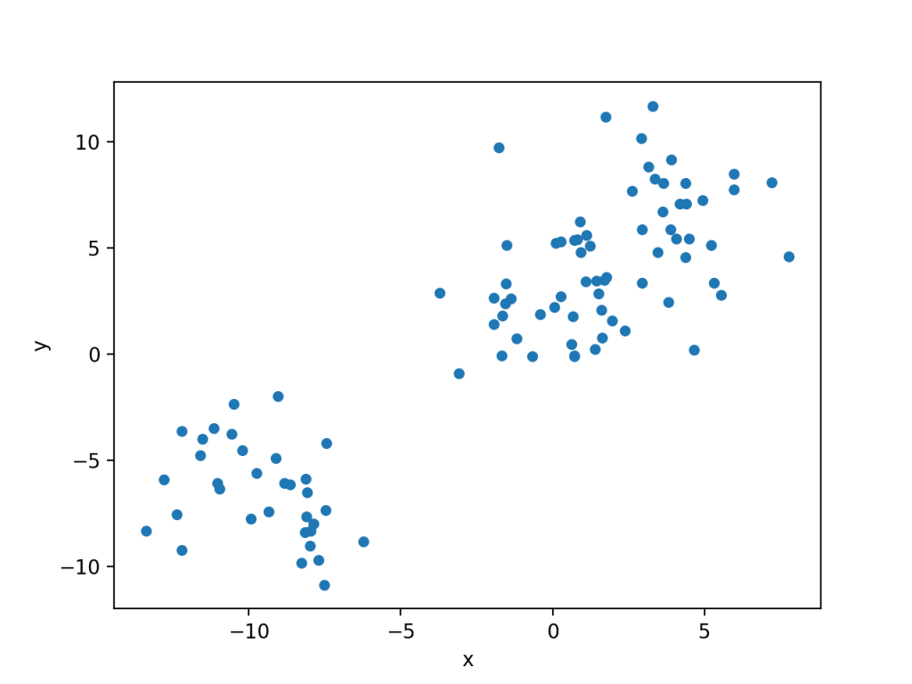
# Creating your first scatter chart in Pandas
df.plot(
   x='x',
   y='y',
   kind='scatter'
)

plt.show()
This generates the following image:
Customize Colors in a Scatter Plot in Pandas
Pandas makes it easy to customize the color of the dots in your plot. We can do this using the c= parameter, which allows you to pass in the name of a color or a hex value.
Let’s see how we can use the color 'cornflowerblue' in our scatter plot points:
# Changing the color of our scatter plot
df.plot(
   x='x',
   y='y',
   kind='scatter',
   c='cornflowerblue'
)

plt.show()
This returns the following image:

Add Titles to your Pandas Scatter Plot
Pandas makes it easy to add titles and axis labels to your scatter plot. For this, we can use the following parameters:
title=accepts a string and sets the titlexlabel=accepts a string and sets the x-label titleylabel=accepts a string and sets the y-label title
Let’s give our chart some meaningful titles using the above parameters:
# Adding titles to a Pandas Scatter Plot
df.plot(
    x='x',
    y='y',
    kind='scatter',
    c='cornflowerblue',
    title='Making a Scatter Plot in Pandas',
    xlabel='Our x-axis title',
    ylabel='Our y-axis title'
)

plt.show()
This returns the following image:

Modify the Size of Points on your Pandas Scatter Plot
One of the meaningful modifications we can do is add sizes to our scatter plot. In order to do this, we can pass in either an integer that represents the size of the dots we want to use. Alternatively, we can pass in a column name that determines the size of the points.
We can do this using the s= parameter. In order to pass in a column we need to use a numerical column. We can use the Pandas .map() function to convert our 'Label' column to a numeric column.
# Changing the size of our scatter plot points
df['Size'] = df['Label'].map({'Small':10, 'Medium':20, 'Large':50})

df.plot(
    x='x',
    y='y',
    kind='scatter',
    c='cornflowerblue',
    title='Making a Scatter Plot in Pandas',
    xlabel='Our x-axis title',
    ylabel='Our y-axis title',
    s='Size'
)

plt.show()
This returns the following image:

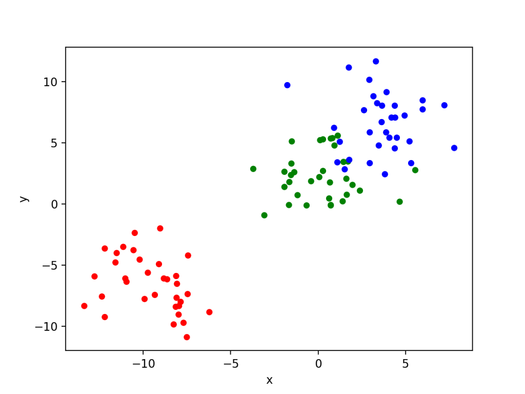
Add a Multiple Colors to Your Pandas Scatter Plot
In order to add multiple colors to a scatter plot, you can add multiple plots to the same axes. In order to do this, we can split the DataFrame into multiple DataFrames based on their Label column.
We can then create an Axes object when we’re first plotting and then simply add to that Axes in successive calls.
# Adding multiple data labels
df1 = df[df['Label'] == 'Small']
df2 = df[df['Label'] == 'Medium']
df3 = df[df['Label'] == 'Large']

ax = df1.plot(x='x', y='y', kind='scatter', c='r', label='Small')
df2.plot(x='x', y='y', kind='scatter', ax=ax, c='g', label='Medium')
df3.plot(x='x', y='y', kind='scatter', ax=ax, c='b', label='Large')
plt.show()
By adding the label= parameter we can automatically generate a legend for our graph. The code above returns the image below:
Conclusion
In this tutorial, you learned how to use Pandas to create a scatter plot. You learned how to use the .plot() function to create a basic scatter plot. Then, you learned how to customize the color of the chart, add titles and axis labels, change the size of the points, and add multiple different data labels.
Additional Resources
To learn more about related topics, check out the tutorials below: