
In this post, you’ll learn how to calculate the interquartile range in Pandas with Python. When working with data, it’s important to understand the variability of your dataset. The IQR represents the spread of the middle 50% of the data, allowing you to get a good sense of the variability of data.
In this post, you’ll learn how to calculate the IQR in Pandas for a single column as well as for an entire DataFrame. You’ll also learn what the IQR is and how to interpret it. Finally, you’ll also learn how to visualize the IQR using the popular Seaborn library.
Table of Contents
The Quick Answer: Use Pandas quantile()
To calculate the interquartile range for a Pandas column, you can use the Pandas .quantile() method. This allows you to calculate the percentiles for the 75th and 25th percentiles. Because the IQR represents the difference between these two, you can then subtract them.
Take a look at what this looks like below:
# Calculating the IQR of a Pandas Column
quartiles = df[col].quantile([0.25, 0.75])
iqr = quartiles[0.75] - quartiles[0.25]
print(iqr)

# Returns: 16.5
What Is the Interquartile Range?
Definition of the Interquartile Range
The interquartile range (IQR, for short) is a measure of statistical dispersion, which represents the spread of the data. The interquartile range is also referred to as the midspread, the middle 50%, or the H-spread.
Mathematically, it represents the difference between the 75th and 25th percentiles of the data. The interquartile range is often used to find outliers in data. Outliers here are defined as observations that fall below Q1 − 1.5 IQR or above Q3 + 1.5 IQR.
Calculation of the Interquartile Range
To calculate the IQR, the dataset is divided into quartiles. These Quarters are denoted by Q1 (the lower quartile), Q2 (the median), and Q3 (the upper quartile). Because the lower quartile corresponds with the 25th percentile and the upper quartile corresponds with the 75th percentile, the IQR is calculated as:
IQR = Q3 - Q1Loading a Sample Pandas DataFrame
To follow along with the tutorial, I have created a sample Pandas DataFrame that includes the scores of different students in various courses. Feel free to copy and paste the code block below into your favorite code editor to follow along:
# Loading a Sample Pandas DataFrame
import pandas as pd
df = pd.DataFrame.from_dict({
    'Student': ['Nik', 'Kate', 'Kevin', 'Evan', 'Jane', 'Kyra', 'Melissa'],
    'English': [90, 95, 75, 93, 60, 85, 75],
    'Chemistry': [95, 95, 75, 65, 50, 85, 100],
    'Math': [100, 95, 50, 75, 90, 50, 80]
}).set_index('Student')
print(df)

# Returns:
#          English  Chemistry  Math
# Student
# Nik           90         95   100
# Kate          95         95    95
# Kevin         75         75    50
# Evan          93         65    75
# Jane          60         50    90
# Kyra          85         85    50
# Melissa       75        100    80
Let’s now dive into how to calculate the interquartile range with Pandas for a single column.
Calculating the Interquartile Range with Pandas for a Single Column
In order to calculate the interquartile range (IQR) for a Pandas DataFrame column, you can use the Pandas quantile method. The Pandas quantile method can be used to calculate different quantiles – in this case, we’ll use it to calculate the 25th and 75th quartiles.
Let’s see what this looks like:
# Calculating Percentiles of a Column
print(df['English'].quantile([0.25, 0.75]))

# Returns:
# 0.25    75.0
# 0.75    91.5
# Name: English, dtype: float64
We can see that this returns a Pandas Series, containing the 25th and 75th quartiles. We can now subtract these two values to get the interquartile range:
# Calculating the IQR of a Pandas Column
quartiles = df['English'].quantile([0.25, 0.75])
iqr = quartiles[0.75] - quartiles[0.25]
print(iqr)

# Returns: 16.5
In the code block above, we assigned the quantiles to a variable, quartiles. We then calculated the IQR by indexing the 25th and 75th percentiles. Finally, we printed it out to get the value of 16.5.
Let’s now take a look at how we can calculate the interquartile range with Pandas for an entire DataFrame.
Calculating the Interquartile Range with Pandas for a DataFrame
In order to calculate the interquartile range (IQR) for an entire Pandas DataFrame, we can apply the quantile method to get the 75th and 25th percentiles and subtract the two.
This method works in a similar way as the previous example. We first calculate the 75th and 25th percentiles. Then, we subtract the two Series by indexing them.
Note: rather than applying the quantile method to the DataFrame, we apply the method twice. This is because we want to return two Series objects, rather than a DataFrame.
Let’s see what this looks like:
# Calculating the IQR for a DataFrame
Q1 = df.quantile(0.25)
Q3 = df.quantile(0.75)
IQR = Q3 - Q1

print(IQR)

# Returns:
# English      16.5
# Chemistry    25.0
# Math         30.0
# dtype: float64
In the code block above, we created two Series objects, representing the quantiles for the DataFrame. We then subtracted the two in order to return a Series that includes the IQR for each of the columns in the DataFrame.
Interpreting the Interquartile Range
The IQR is a measure of variability, which allows us to identify the spread of a dataset. In general, a larger IQR indicates greater variability in the data, while a smaller IQR indicates less variability. However, the interpretation of the IQR depends on the distribution of the data.
For example, if the data is normally distributed, we can use the IQR to identify outliers that fall outside the range of 1.5 times the IQR below Q1 or above Q3. The IQR can be used to identify outliers, which are data points that fall outside the range of 1.5 times the IQR below Q1 or above Q3.
However, if the data is skewed, the IQR may not be a good measure of variability, and other measures such as the standard deviation may be more appropriate.
In addition to identifying outliers and comparing variability, the IQR can also be used to identify the shape of the distribution. For example, if the IQR is small and the median is close to the mean, the data is likely to be normally distributed. On the other hand, if the IQR is large and the median is far from the mean, the data is likely to be skewed.
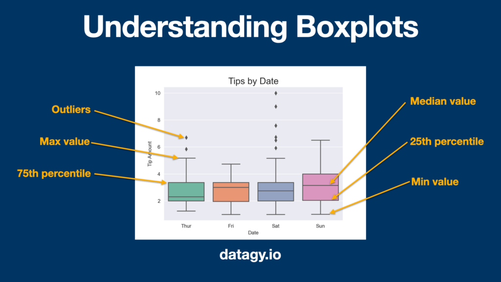
Visualizing the Interquartile Range with Boxplots
Boxplots are helpful charts that clearly illustrate the distribution in a dataset, by visualizing the range, distribution, and extreme values. A boxplot is a helpful data visualization that illustrates five different summary statistics for your data. It helps you understand the data in a much clearer way than just seeing a single summary statistic.
In this section, we’ll explore how to create boxplots in Seaborn.
Specifically, boxplots show a five-number summary that includes:
- the minimum,
- the first quartile (25th percentile),
- the median,
- the third quartile (75th percentile),
- the maximum
Let’s take a look at how boxplots are developed:
Creating a boxplot in Seaborn is made easy by using the sns.boxplot() function. Let’s start by creating a boxplot that breaks the data out by Class column on the x-axis and shows the Grade column on the y-axis. Let’s see how we’d do this in Python:
# Creating a Boxplot in Python
import seaborn as sns
import matplotlib.pyplot as plt

df = df.reset_index().melt(
    id_vars='Student',
    var_name='Class',
    value_name='Grade'
)
sns.boxplot(data=df, x='Class', y='Grade')
plt.show()
In the code block above, we first reset our DataFrames index. We then used the melt method to unpivot our DataFrame, turning it into a long dataset. Finally, we created a boxplot with the sns.boxplot() function. This returned the image below:
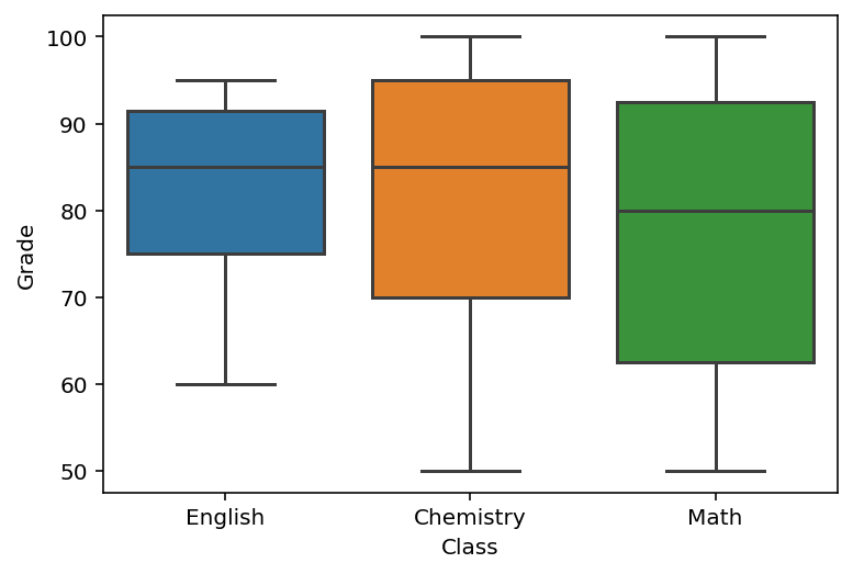
We can see that the English class has much less variability, while the Math class has the highest variability.
Conclusion
The interquartile range (IQR) is a measure of statistical dispersion that represents the spread of the data. It is a useful tool for identifying outliers, comparing variability across datasets, and identifying the shape of the distribution. In this blog post, we explored how to calculate the IQR for both a single column and an entire Pandas DataFrame using the quantile() method. We also discussed how to interpret the IQR and how to visualize it using boxplots in Seaborn. By using these techniques, you can gain insights into the distribution of your data and make more informed decisions in your data analysis.
To learn more about the Pandas quantile method, check out the official documentation here.