In this tutorial, you’ll learn how to make 3D scatterplots using Matplotlib. Being able to visualize data in three dimensions can be an important step in clearly articulating data, especially in science and machine learning.
By the end of this tutorial, you’ll have learned:
- How to plots 3D scatterplots using Matplotlib
- How to change size, opacity, and color of data points in three dimensions
- How to add titles and axis labels to your 3D scatterplot in Matplotlib
Table of Contents
Creating a 3D Scatterplot in Matplotlib
In order to create 3D scatterplots in Matplotlib we can import some additional helper modules from Matplotlib. This allows us to easily project data onto a third dimension. Let’s begin by importing our libraries and setting up some variables to plot.
# Loading libraries and data
from mpl_toolkits import mplot3d
import matplotlib.pyplot as plt
import numpy as np

x = np.arange(0, 25, 0.1)
y = np.cos(x)
z = np.sin(x)
Let’s see how we can plot our data. We’ll first set up our figure, fig, and axes, ax, to hold our visualization. Our axes will specify that we’ll want to project the data onto three dimensions, by passing in projection='3d'.
From there, we can easily create a 3D scatterplot using the ax.scatter3D() function:
# Creating out first 3D scatterplot in Matplotlib
fig = plt.figure()
ax = plt.axes(projection='3d')

ax.scatter3D(x,y,z)
plt.show()
This returns the following image:

Let’s break down what we did:
- We imported our libraries and created some variables containing data
- We then created our figure and axes
- We plotted a scatter3D plot on our axes, passing in the three arrays of data
- Finally, we showed the plot using
plt.show()
Changing Color of Points in 3D Scaterplots in Matplotlib
It can be quite helpful to add color to a 3-dimensional plot. Three dimensions can be quite difficult to visualize and adding color to this can be quite helpful. This allows us to better understand the third dimension.
In order to do this, we can use the c= parameter. This allows us to either pass in a single color, in case we wanted to do keep the same color for all points, or an array of numbers to color based on value.
With sequential data, as we have in our example, we can pass in color maps. This allows us to create a gradient to show how the data moves forward. You can find the various color maps that Matplotlib offers here.
Let’s see what happens when we use our x array as our colors and use the 'Blues' colormap.
# Adding Color to our 3D Scatterplot
from mpl_toolkits import mplot3d
import matplotlib.pyplot as plt
import numpy as np

x = np.arange(0, 25, 0.1)
y = np.cos(x)
z = np.sin(x)

fig = plt.figure()
ax = plt.axes(projection='3d')

ax.scatter3D(x,y,z, c=x, cmap='Blues')
plt.show()
This returns the following image:

Changing Size of Points in 3D Scaterplots in Matplotlib
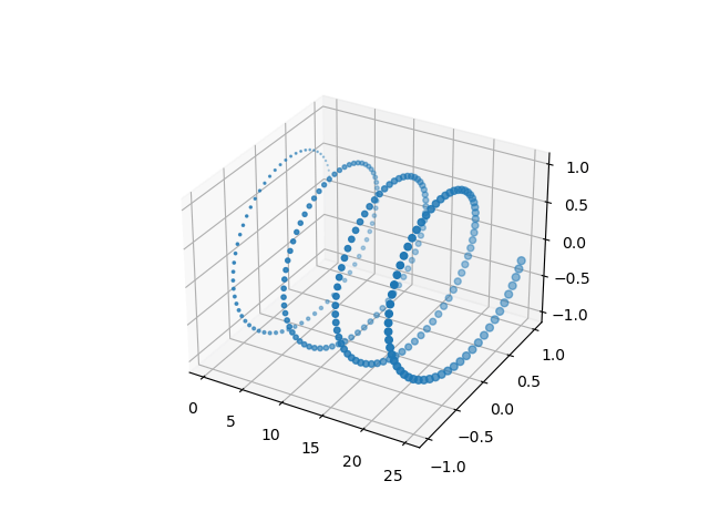
Similar to using color to communicate extra information, we can also use marker size to provide more information to the reader. This is done using the s= parameter. This allows us to pass in either an integer for all points to be the same size or an array of numbers to modify individual point sizes.
Let’s use the x variable to declare the size of our points:
# Changing Marker Size in a 3D Scatterplot
from mpl_toolkits import mplot3d
import matplotlib.pyplot as plt
import numpy as np

x = np.arange(0, 25, 0.1)
y = np.cos(x)
z = np.sin(x)

fig = plt.figure()
ax = plt.axes(projection='3d')

ax.scatter3D(x,y,z, s=x)
plt.show()
This returns the following image:
Changing Opacity of Points in 3D Scaterplots in Matplotlib
By default, Matplotlib will use the opacity of points to illustrate how “far” away points are from you. This is done to help readers visualize the third dimension on only two-dimensional screens. However, this can also lead to misinterpretation.
Because of this Matplotlib also allows us to customize the opacity of each of the points. This is done using the alpha= parameter, which allows us to pass in a float. 0 represents full transparency, while 1 represents no transparency.
Let’s see how this works:
# Changing Opacity of Markers in a 3D Scatterplot
from mpl_toolkits import mplot3d
import matplotlib.pyplot as plt
import numpy as np

x = np.arange(0, 25, 0.1)
y = np.cos(x)
z = np.sin(x)

fig = plt.figure()
ax = plt.axes(projection='3d')

ax.scatter3D(x,y,z, alpha=0.7)
plt.show()
This returns the following image:

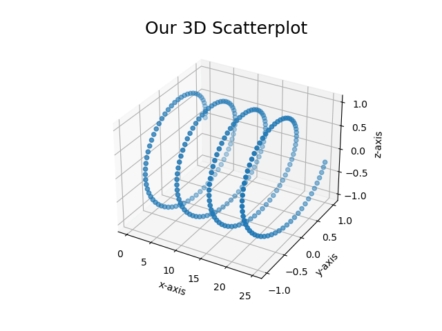
Adding Titles and Axis Labels to 3D Scatterplots in Matplotlib
Because the 3D scatterplots use Matplotlib under the hood, we can easily apply axis labels and titles to our charts. For this, we can use the following attributes:
plt.title()to set the titleplt.set_xlabel()to set the x-axis labelplt.set_ylabel()to set the y-axis labelax.set_zlabel()to set the z-axis label
Let’s add some titles and labels to our chart:
# Adding a title and axis labels to our 3D Scatterplot
from mpl_toolkits import mplot3d
import matplotlib.pyplot as plt
import numpy as np

x = np.arange(0, 25, 0.1)
y = np.cos(x)
z = np.sin(x)

fig = plt.figure()
ax = plt.axes(projection='3d')

ax.scatter3D(x,y,z)
plt.title('Our 3D Scatterplot', size=18)
plt.xlabel('x-axis')
plt.ylabel('y-axis')
ax.set_zlabel('z-axis')
plt.show()
This returns the following image:
Conclusion
In this tutorial, you learned how to create 3D scatterplots in Matplotlib. You learned how to use helpers modules in Matplotlib in order to project onto a third dimension. You then learned how to create 3D scatterplots. Then, you learned how to modify color, size, and opacity of these plots. Finally, you learned how to add a title and axis labels to your plot.
Additional Resources
To learn more about related topics, check out the tutorials below: