In this tutorial, you’ll learn how to analyze spatial data in Python. Working with spatial data can reveal powerful insights into location-based trends, relationships, and patterns often hidden within traditional datasets. In Python, a primary tool is the GeoPandas library which allows you to load, transform, manipulate, and plot spatial data.
In this tutorial, you’ll learn the basics of spatial analysis in Python. We’ll walk through practical examples that will highlight:
- The different types of spatial data,
- How to load spatial data in GeoPandas,
- How to plot spatial data and create interactive maps,
- How to create spatial joins, and
- How to create choropleth (heat) maps.
Table of Contents
Getting Started with GeoPandas
The GeoPandas library is, as the name implies, built on top of Pandas. This allows you to work with spatial data in a familiar way.
Because GeoPandas isn’t part of the standard library, we first need to install it. This can be done using pip or conda. For the purposes of this tutorial, we’ll use pip to install the library:
pip install geopandasOnce the library is installed, we can import it. Conventionally, the library uses the alias gpd:
import geopandas as gpdNow that you have imported the library, let’s dive into exploring how we can use it to plot spatial information.
Understanding Different Types of Spatial Data
For the purposes of this tutorial, we’ll focus on how to use vector data. This type of data represents spatial features using points, lines, and polygons. Let’s explore these in a little bit more detail:
Each of these vector features can be combined additional attributes. For example, a point can have a location name, such as 'CN Tower'. Similarly, a line can be labelled as 'Highway 407' or can have a 'toll' attribute, which can be set to a boolean of True.
This is where GeoPandas comes in: it allows us to combine underlying spatial information with attribute information.
Understanding How to Load Spatial Data
GeoPandas can work with several different file formats. Most commonly, you’ll encounter shapefiles or geojson files.
Shapefiles have been around for quite a long time and are usually contained in a .zip file. Within this .zip file, you’ll find different files. Included are a .shp file that contains the actual geometry, a .dbf file whcih contains attributes for each geometry and a .shx file that holds the index to link the geometry and the attributes.
GeoJSON files, on the other hand, hold everything in a single file, in a familiar JSON-style format.
Let’s take a look at loading a GeoJSON file. For this tutorial, we’ll use a boundary map of the City of Toronto. You can download the file here. Be sure to download the GeoJSON file.
Let’s take a look at our GeoJSON file to better understand what’s going on:
{
    "type": "FeatureCollection",
    "name": "City Wards Data - 4326",
    "crs": {
      "type": "name",
      "properties": {
        "name": "urn:ogc:def:crs:OGC:1.3:CRS84"
      }
    },
    "features": [
      {
        "type": "Feature",
        "properties": {
          "_id": 1,
          "AREA_ID": 2457740,
          ...
          "AREA_NAME": "Humber River-Black Creek",
        },
        "geometry": {
          "type": "MultiPolygon",
          "coordinates": [
            [
              [
                [
                  -79.4910534106931,
                  43.7635021528307
                ],
                ...
                [
                  -79.4405222106235,
                  43.7637589981351
                ],

              ]
            ]
          ]
        }
      },
I have truncated the file quite a bit but I wanted to highlight a few items. The file contains several important keys, including the name key, which provides information on the dataset itself. It also contains coordinate information, stored in the crs key. Finally, it contains the features, which hold attribute information and the geometries of each feature.
You don’t need to understand the inner workings of a GeoJSON file to be able to work with them. However, I find it helps make the process a little less abstract.
We can import this GeoJSON file into a GeoPandas DataFrame by using the read_file() function. Let’s see what this looks like:
gdf = gpd.read_file('City Wards Data.geojson')
print(gdf.head())
In the code block above, we used the read_file() function to import our GeoJSON file into a GeoPandas DataFrame using the alias gdf. We then printed the GeoDataFrame, as shown below:
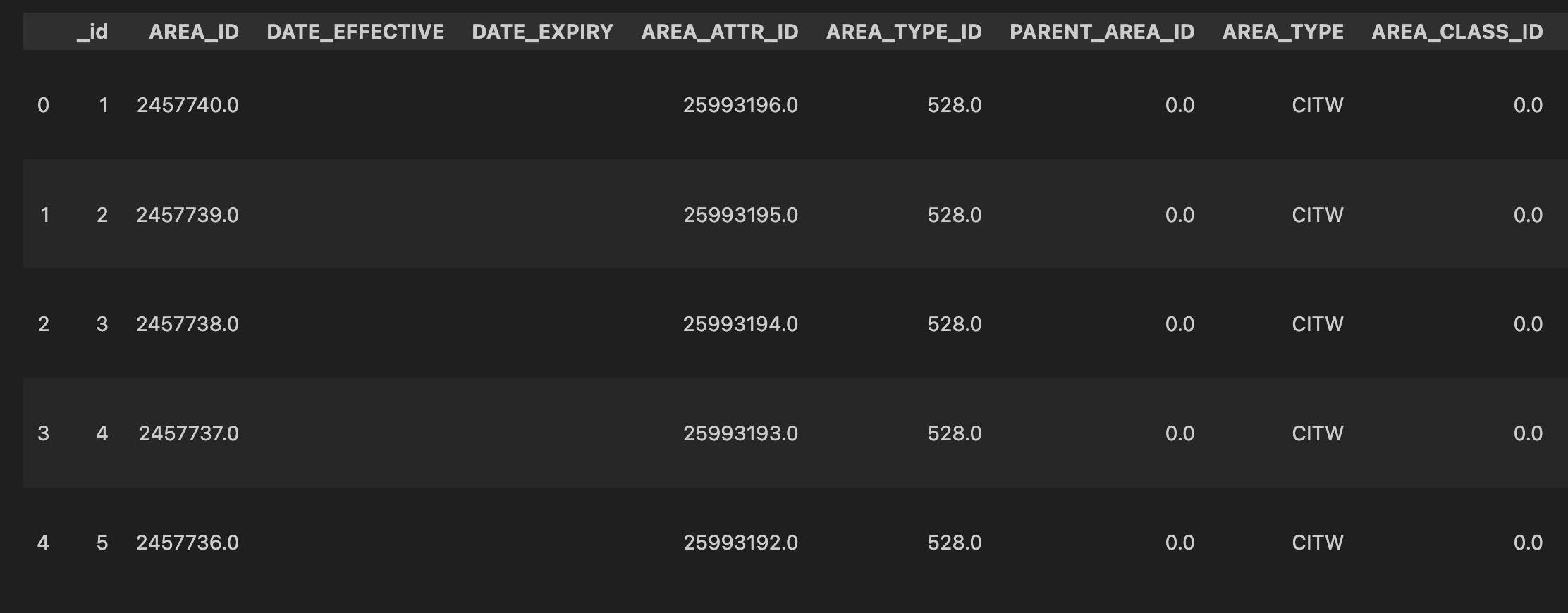
Because GeoDataFrames are subclasses of regular Pandas DataFrames, we can access a lot of information about them. For example, we can use the .columns attribute to print its columns.
print(gdf.columns)

# Returns:
# Index(['_id', 'AREA_ID', 'DATE_EFFECTIVE', 'DATE_EXPIRY', 'AREA_ATTR_ID',
#        'AREA_TYPE_ID', 'PARENT_AREA_ID', 'AREA_TYPE', 'AREA_CLASS_ID',
#        'AREA_CLASS', 'AREA_SHORT_CODE', 'AREA_LONG_CODE', 'AREA_NAME',
#        'AREA_DESC', 'FEATURE_CODE', 'FEATURE_CODE_DESC', 'TRANS_ID_CREATE',
#        'TRANS_ID_EXPIRE', 'OBJECTID', 'geometry'],
#       dtype='object')
Understanding GeoDataFrames
GeoDataFrames are made up of three distinct components:
- Geometry column: this stores the spatial information of each feature and allows for spatial operations like calculating distances, finding areas, and checking intersections.
- Data columns: just like Pandas DataFrame columns, this might include data about each feature, such as names, categories, population counts, etc.
- Coordinate Reference System (CRS): The CRS specifies how the geometry’s coordinates relate to positions on Earth’s surface.
Knowing that a GeoDataFrame builds on top of Pandas DataFrames means we can do much of what you’re probably used to with a regular DataFrame.
We can, for example, see the unique values in a column by using the .unique() method. Let’s see what all of the unique values in the geometry column are:
print(gdf['geometry'].unique())

# Returns:
# <GeometryArray>
# [<shapely.geometry.multipolygon.MultiPolygon object at 0x7ff1f1217580>,
#  <shapely.geometry.multipolygon.MultiPolygon object at 0x7ff1f12171f0>,
#  <shapely.geometry.multipolygon.MultiPolygon object at 0x7ff1f12172b0>,
#  <shapely.geometry.multipolygon.MultiPolygon object at 0x7ff1f0980e20>,
# ...
We can see that the column contains a shapely geometry object for each ward in the city. We can take this one step further by inspecting the type of the column:
print(type(gdf['geometry']))

# Returns:
# <class 'geopandas.geoseries.GeoSeries'>
We can see here that the Series is a GeoSeries. This is what makes up a GeoDataFrame. The GeoPandas documentation provides an overview of what this looks:
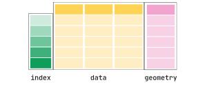
So far, we have seen the data columns and, now, the geometry column. However, we haven’t explored the coordinate reference system. This crs, as it’s often abbreviated, stores information on how the spatial information is projected. We won’t dive too far into coordinate reference systems yet, but for now, let’s just see how we can access our GeoDataFrame’s coordinate reference system:
print(gdf.crs)

# Returns:
# epsg:4326
We can see that this GeoDataFrame uses the espg:4326 coordinate reference system. This crs uses latitude and longitude, which can create challenges when you want to measure distances (since they don’t account for the curvature of the Earth). We can modify this to another crs by using the .to_crs() method. For example, we can use the espg:3978 crs, which is tailored specifically for Canada:
gdf = gdf.to_crs(epsg=3978)
print(gdf.crs)

# Returns:
# epsg:3978
Now that we have modified our crs, we can access different attributes that are directly built-into GeoDataFrames. For example, if we wanted to know the area of each ward, we could use the .area attribute:
print(gdf.set_index('AREA_NAME').area.head())

# Returns:
# AREA_NAME
# Humber River-Black Creek    3.218015e+07
# York Centre                 3.706234e+07
# Willowdale                  2.070877e+07
# University-Rosedale         1.426333e+07
# Beaches-East York           1.762407e+07
# dtype: float64
In the code block above, we first set the index to be the ward’s name (represented by the 'AREA_NAME' column). We then chain on the .area attribute and print out the first five records using the .head() method.
Right now, these values are represented as square meters. Let’s convert them to square kilometers to make them a bit more readable:
print(gdf.set_index('AREA_NAME').area.div(1_000_000).head())

# Returns:
# AREA_NAME
# Humber River-Black Creek    32.180149
# York Centre                 37.062341
# Willowdale                  20.708773
# University-Rosedale         14.263327
# Beaches-East York           17.624072
# dtype: float64
In the code above, we chained in the .div() method to divide the values by a million (which allows us to convert to square kilometers). This returns much more understandable metrics.
Now that we’ve covered the basics of GeoDataFrames, let’s dive into how we can create maps using GeoPandas.
Plotting a Simple Map with GeoPandas
In this section, we’ll explore how to plot a map with GeoPandas. Similar to Pandas, GeoPandas has a .plot() method, which we can apply directly to an existing GeoDataFrame. Let’s see how we can load an image of our DataFrame:
gdf.plot()Running this code returns the image below:
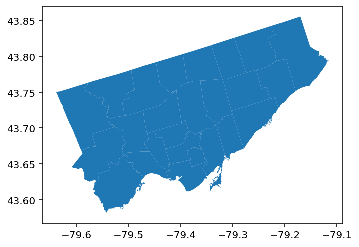
We can see that this returns a matplotlib representation of our map. By default, our shapes are coloured as blue, while our borders are colored as white. We can modify this using two important parameters:
color=will modify the color of the shape, andedgecolor=wil modify the color of the borders.
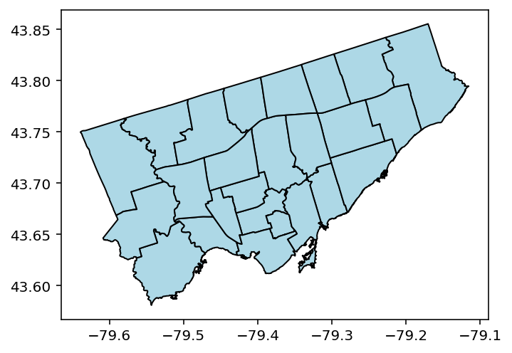
Let’s give this a try and modify our shapes to 'lightblue' and our borders to 'black':
gdf.plot(color="lightblue", edgecolor="black")Running this code returns the following image:
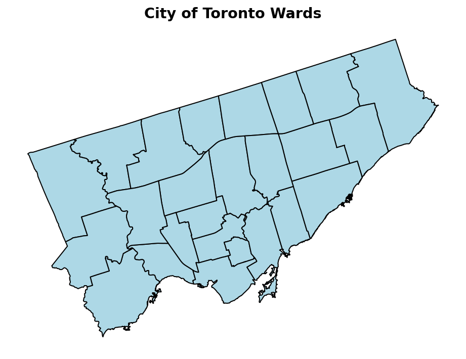
By default, GeoPandas will use matplotlib to create images. This gives us a lot of flexibility to modify how these images are returned. Let’s modify our image by:
- Making it larger,
- Removing the x- and y-axis,
- Set a title
Let’s see how we can do this:
import matplotlib.pyplot as plt
fig, ax = plt.subplots(figsize=(8,10))
gdf.plot(color="lightblue", edgecolor="black", ax=ax)
ax.set_axis_off()
ax.set_title('City of Toronto Wards', weight='bold', size='x-large')
plt.show()
This returns the following image:
Working with Line Data in GeoPandas
Similar to loading shapes, we can also load line information. For this, we’ll load a dataset that contains the cycling network in the City of Toronto. This will allow us to see how line information is represented. You can donwload the GeoJSON file here.
Let’s load the file into its own GeoDataFrame. We’ll call this one gdf_bike to be able to tell them apart.
gdf_bike = gpd.read_file('cycling-network - 4326.geojson')
print(gdf_bike[['_id', 'geometry']].head())

# Returns:
#     _id geometry
# 0    1   MULTILINESTRING ((-79.40351 43.69526, -79.4030...
# 1    2   MULTILINESTRING ((-79.40364 43.63499, -79.4035...
# 2    3   MULTILINESTRING ((-79.27522 43.74158, -79.2751...
# 3    4   MULTILINESTRING ((-79.46772 43.77208, -79.4675...
# 4    5   MULTILINESTRING ((-79.54812 43.59027, -79.5480...
In the code block above, we first loaded our dataset into its own GeoDataFrame. We then selected only two columns and printed the first five records. We can see see that the geometries here are represented as MULTISTRING objects, rather than MULTIPOLYGONS.
Knowing this, we can expect that when we draw this GeoDataFrame onto a map that we should see lines, rather than polygons. Let’s give this a try!
gdf_bike = gpd.read_file('cycling-network - 4326.geojson')
gdf_bike.plot()
Running the code above returns the following image:
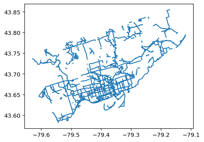
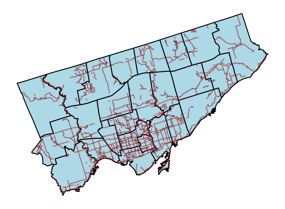
We can see that we’ve now drawn lines, but without much reference. This, by itself, can feel quite uninformative. However, we can actually layer both of our current maps on top of one another!
For this, we’ll load each of the maps onto the same axes object. Let’s take a look at how this works:
fig, ax = plt.subplots(figsize=(8,10))
gdf.plot(color="lightblue", edgecolor="black", ax=ax, linewidth=1.5)
gdf_bike.plot(edgecolor='darkred', ax=ax, alpha=0.5)
ax.set_axis_off()
plt.show()
In the code block above, we first created an axes object, ax. We then plotted both of our GeoDataFrames on the axes. We also modified some of the stylistic parameters to make the shapes and lines easier to differentiate.
This returned the following image:
Let’s now take a look at the final type we’ll learn about: points.
Working with Point Data in GeoPandas
Similar to loading lines, we can also load point information. For this, we’ll load a dataset that contains the cycling parking areas in the City of Toronto. This will allow us to see how point information is represented. You can donwload the GeoJSON file here.
Let’s load the file into its own GeoDataFrame. We’ll call this one gdf_bike_parking to be able to tell them apart.
gdf_bike_parking = gpd.read_file('Street bicycle parking data - 4326.geojson')
print(gdf_bike_parking[['_id', 'geometry']].head())

# Returns:
#     _id geometry
# 0    4480643 MULTIPOINT (-79.41149 43.64145)
# 1    4480644 MULTIPOINT (-79.49983 43.77077)
# 2    4480645 MULTIPOINT (-79.44025 43.63981)
# 3    4480646 MULTIPOINT (-79.40013 43.65306)
# 4    4480647 MULTIPOINT (-79.50354 43.76862)
Once again, we see that the geometry column is represented in a different manner. In this case, we have a column containing MULTIPOINT objects. These represent a single location, as is reflected in them containing only a single set of latitude and longitude.
Were we to print out just the points, we’d run into a similar situation as before where the data may not feel as meaningful. So, instead, let’s directly layer this on top of our current map. That way, we’ll see all three of our data types layered on top of one another!
fig, ax = plt.subplots(figsize=(8,10))
gdf.plot(color="lightblue", edgecolor="black", ax=ax, linewidth=1.5)
gdf_bike.plot(edgecolor='darkred', ax=ax, alpha=0.5)
gdf_bike_parking.plot(ax=ax, markersize=0.75, color='darkgreen', alpha=0.25)

ax.set_axis_off()
plt.show()
This returns the following map:
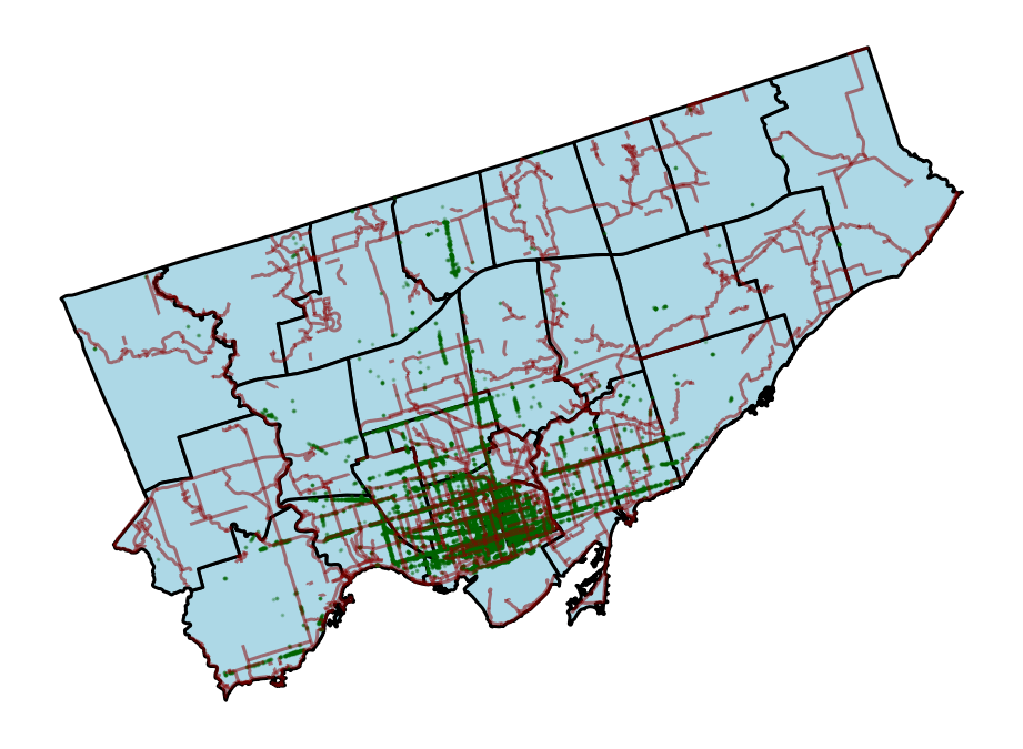
We can see that we’ve been able to layer all of our information on top one another. However, at this point, the visualization has become quite dense. What if we could zoom in and out and get more information about each of the data elements? That’s what we’ll learn about in the next section.
Creating Interactive Maps in GeoPandas
The maps we’ve created so far have been using default GeoPandas settings, which resulted in Matplotlib visualizations being created. However, GeoPandas integrates with the folium package, which allows you to create interactive visualizations. For this, you may need to first install Folium, which you can do using the following terminal command:
pip install foliumOnce you have installed it, it’s as simple as modifying the .plot() method to the .explore() method. Let’s see what this looks like with our original shapes:
gdf.explore()When we run this, we get an interactive element returned. This overlays our shapes onto an OpenStreetMap map, allowing us to zoom in and out, and hover over shapes to explore their elements.
This interactive window looks like this:
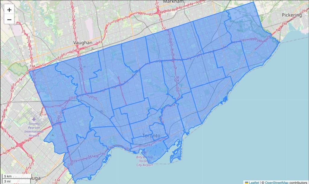
Right now, it’s not beautiful and hovering over a shape will show all of the columns. We can customize our map using a huge number of parameters. For now, we’ll focus on a few important ones:
tooltip=accepts a column name as a string or a list of columns to determine what columns to show in the tooltipcolor=determines the color of the resulting datatiles=is used to set the underlying map style
Folium uses a number of built-in styles/tiles:
- “OpenStreetMap”: Default tile style (street map view).
- “Stamen Terrain”: Terrain view with natural landscape details.
- “Stamen Toner”: Black-and-white high-contrast map, great for overlaying with colored layers.
- “CartoDB positron”: Light-themed minimalist map.
- “CartoDB dark_matter”: Dark-themed map, excellent for night views or high-contrast overlays.
Let’s customize our map a little bit further:
gdf.explore(tooltip='AREA_NAME', color='green', tiles='CartoDB positron')This returns the following image:
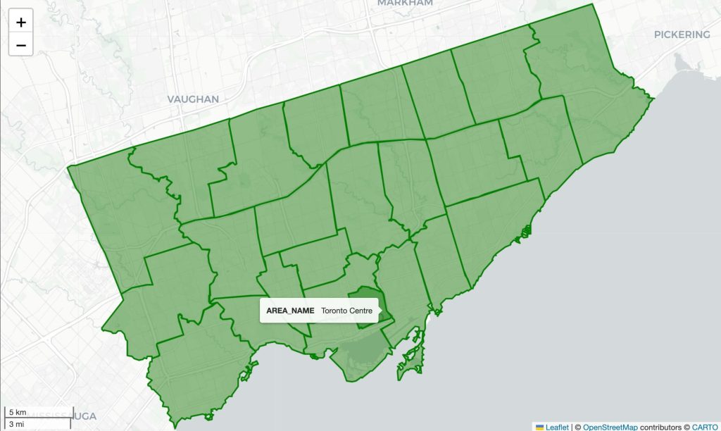
We can see that the map is now a little less messy and our tooltip has been cleaned up as well.
Let’s take this one step further and plot our remaining datasets as well! For this, we’ll need to adjust our approach a little bit and first create a Folium Map object. We can think of this as creating a Matplotlib axes that we build on top of:
m = gdf.explore(tooltip='AREA_NAME', color='green', tiles='CartoDB positron')
gdf_bike.explore(m=m, color='black', style_kwds={"opacity": 0.7}, tooltip=['STREET_NAME', 'FROM_STREET', 'TO_STREET'])
gdf_bike_parking.explore(m=m, color='maroon', style_kwds={'fillOpacity': 0.25, 'opacity': 0.25,  'radius': 0.5})
In the code block above, we first defined a Map object, m. We then added on top of this object with different GeoDataFrames. Running this code displays the following map (which I have zoomed into to show the detail):
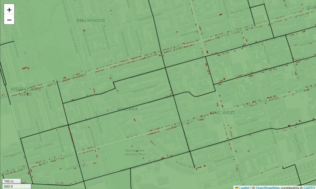
Being able to explore this data visually while layering on different information makes the data so much more informative.
Spatial Joins in GeoPandas
Spatial joins are powerful operations that combine two datasets based on their spatial relationships, rather than by matching attribute values or keys. This means that when doing a spatial join, records are joined from one dataset are merged with records from another based on their location. Following our earlier example, we could do a spatial merge on our ward boundaries and the bicyle parking. This would merge the datasets based on a parking spot based on its location relative to a ward boundary.
There are several types of spatial relationships that can be used in spatial joins:
- Containment: Joins features based on whether one geometry contains another. For example, finding which cities fall within each state.
- Intersection: Joins features that intersect each other, such as finding which parks intersect a floodplain area.
- Proximity: Joins features based on distance, like attaching the nearest hospital to each neighborhood.
Following our earlier example, let’s do a spatial join to combine our ward dataset, gdf, with our bike parking dataset gdf_bike_parking.
To do a spatial join in GeoPandas, we use the .sjoin() method. The method is applied to a single GeoDataFrame and takes a number of arguments, including:
df=is the only required argument and represents the GeoDataFrame to join on,how=represents what type of join to make (i.e., left, right, or inner) and defaults to'inner',predicate=, represents how to match values (i.e., “intersects”, “contains”, “within”, “touches”, “crosses”, “overlaps”) and defaults to'intersects'
Because the only required parameter is the df argument, let’s give this a try by leaving everything else unchanged:
gdf_joined = gdf.sjoin(df=gdf_bike_parking)
print(gdf_joined[['_id_left', 'AREA_NAME', 'ID', ]].head())

# Returns:
#    _id_left                 AREA_NAME        ID
# 0         1  Humber River-Black Creek  BP-10499
# 0         1  Humber River-Black Creek  BP-12471
# 0         1  Humber River-Black Creek  BP-09733
# 0         1  Humber River-Black Creek  BP-11900
# 0         1  Humber River-Black Creek  BP-11141
In this case, we’re completing an inner join between the two GeoDataFrames, returning only records that intersect with one another. This means that if any points existed outside the boundaries of any of the wards, it would be excluded. Since we’re dealing with point data, we want to make that a point exists within a boundary.
In the code block above, we returned a new GeoDataFrame, gdf_joined, which contains all the records. Notice that we have a lot of repeating values now. Each ID represents a bike parking area and each _id_left represents a ward.
It’s likely that because of our 'inner' join that some records were dropped. Let’s see how large our datasets were before and how they compare:
print(f'{len(gdf)=}')
print(f'{len(gdf_bike_parking)=:,}')
print(f'{len(gdf_joined)=:,}')

# Returns:
# len(gdf)=25
# len(gdf_bike_parking)=17,326
# len(gdf_joined)=17,322
We can see that the original gdf_bike_parking contained 17,326 records. However, the joined GeoDataFrame only contains 17,322 records. This means that we lost 4 parking spots because they were contained outside of the ward boundaries.
Now that we have joined the datasets, we can do some interesting calculations. For example, we can see how many spots are contained within each ward. Because GeoDataFrames are subclasses of Pandas DataFrames, we can run a .groupby() method to determine how many spots are within each ward:
counts = gdf_joined.groupby(gdf_joined.index).size()
print(counts.head())

# Returns:
# 0      16
# 1      36
# 2     240
# 3    3642
# 4     717
# dtype: int64
In the code block above, we calculated how many records exist per individual index. We can take this a step further by merging it back into the ward dataset. Let’s see how we can accomplish this:
gdf['bike_parking_count'] = gdf.index.map(counts).fillna(0).astype(int)
print(gdf[['AREA_NAME', 'bike_parking_count']].head())
# Returns:
#                   AREA_NAME  bike_parking_count
# 0  Humber River-Black Creek                  16
# 1               York Centre                  36
# 2                Willowdale                 240
# 3       University-Rosedale                3642
# 4         Beaches-East York                 717
We can see that we were able to merge in our counts for each ward. If a ward didn’t contain any bike parking, we filled the data using a 0 value.
Now that we have these values, wouldn’t it be great if we could merge them back into our original gdf? Because we have the same we can map the values of our new Series object to the original gdf. Let’s see what this looks like:
gdf['bike_parking_count'] = gdf.index.map(counts).fillna(0).astype(int)
print(gdf[['AREA_NAME', 'bike_parking_count']].head())
# Returns:
#                   AREA_NAME  bike_parking_count
# 0  Humber River-Black Creek                  16
# 1               York Centre                  36
# 2                Willowdale                 240
# 3       University-Rosedale                3642
# 4         Beaches-East York                 717
We can see that our original GeoDataFrame now contains these values. We can take this a step further and plot these new values using a choropleth map.
Choropleth Maps in GeoPandas
Choropleth maps use divided geographical areas and styles each area in relation to a data variable. For example, We can use our new bike_parking_count column to shade each ward in a color relative to how many bike parking areas it has.
Creating a choropleth map in GeoPandas is simple: we used the .plot() method similar to how we did before. However, we also pass in a column= argument, representing the column we want to style.
Let’s take a look at how this works:
gdf.plot(column='bike_parking_count')This returns the following plot:
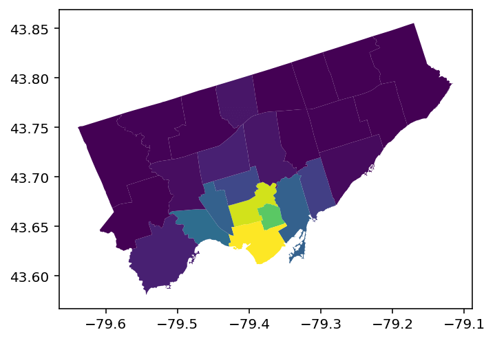
We can see that we returned a map that, without knowing the data underneath, isn’t the most informative. Let’s add a bit more detail, like a more intuitive color-scheme and a legend.
fig, ax = plt.subplots(figsize = (10, 8))
gdf.plot(
    column='bike_parking_count', ax=ax, legend=True, cmap='YlGn', edgecolor='black',
    legend_kwds={"label": "# of Bike Spots", "orientation": "horizontal", "shrink": 0.5})
ax.set_axis_off()
ax.set_title('Bike Parking in Toronto', weight='bold', size='x-large')
plt.show()
In the code block above, we created a Figure and Axes objects. We then added the choropleth to our Axes. To change the colors, we used the cmap= argument, passing in one that goes from yellow to green. Similarly, we added a legend using the legend= parameter and we styled is using the legend_kwds= parameter.
This returns the following image:
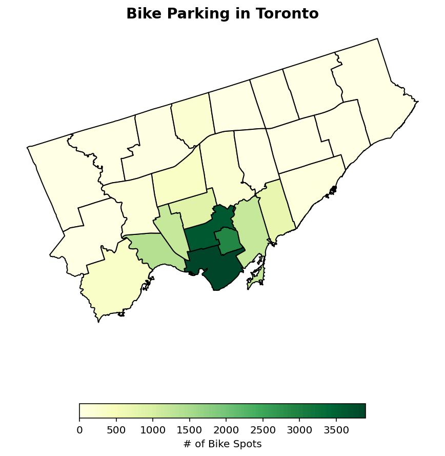
This styled map helps guide the reader much more than before!
Conclusion
Working with spatial data can reveal powerful insights into location-based trends, relationships, and patterns that are often hidden within traditional datasets. In this tutorial, you dove into the important GeoPandas library. This library allows you to load, manipulate, and plot spatial information in a familiar interface.

