Spatial joins are used to join attributes from one dataset to another based on their spatial relationship. In many real-world scenarios, we need to understand how different geographic elements interact with one another. This can include how they intersect, overlap, and fall into a specific radius.
In this post, we’ll explore how to use GeoPandas to perform spatial joins and buffer analysis, step-by-step. We’ll use real-world examples, focusing on practical applications. By the end of this tutorial, you’ll have learned:
- What spatial joins are and how they’re implemented in GeoPandas
- What buffer analysis is an how it can be done in Python
- How to visualize your results in static and interactive maps
Table of Contents
What are spatial joins?
Spatial joins are GIS operations that allow us to combine information from spatial datasets based on their geographic relationships. While regular joins depend on some type of common key to make a join, a spatial join matches data based on how specific geographic objects (such as points, lines, or polygons) related to one another.
Throughout this tutorial, we’ll follow an example of using:
- Point data that represents child care centers and subway locations, and
- Polygon data that represents wards and city boundaries of the City of Toronto.
In GeoPandas, spatial joins are especially useful for tasks that involve analyzing proximity, containment, or intersection between geographic features. For example, you might want to identify which points fall into which geographic area, such as what ward a child care center falls into.
Spatial Joins in GeoPandas
In GeoPandas, we can use the sjoin() function to perform spatial joins. The function allows you to join based on different types of relationships. These relationships are set using the predicate= parameter, which determines a binary predicate relationship, including:
- Intersects: Returns all objects that intersect with each other, even if they only share part of their boundaries.
- Within: Finds points or polygons that fall entirely within another polygon.
- Contains: Identifies polygons that contain other geographic objects.
Let’s take a look at a few more of the function’s primary parameters:
left_df,right_dfdescribe the GeoDataFrames to merge,howdescribes how the join should be done (left, right, and inner)
Let’s load some datasets and see how we can join them:
import geopandas as gpd
import pandas as pd
import matplotlib.pyplot as plt
from shapely.geometry import Point

crs = 3978
child_care = gpd.read_file('https://ckan0.cf.opendata.inter.prod-toronto.ca/dataset/059d37c6-d88b-42fb-b230-ec6a5ec74c24/resource/4f5ef49d-15ee-4d73-8b66-90303c5ef746/download/Child%20care%20centres%20-%204326.geojson').to_crs(epsg=crs)
child_care['geometry'] = child_care.centroid

toronto = gpd.read_file('https://ckan0.cf.opendata.inter.prod-toronto.ca/dataset/841fb820-46d0-46ac-8dcb-d20f27e57bcc/resource/41bf97f0-da1a-46a9-ac25-5ce0078d6760/download/toronto-boundary-wgs84.zip').to_crs(epsg=crs)

wards = gpd.read_file('https://ckan0.cf.opendata.inter.prod-toronto.ca/dataset/5e7a8234-f805-43ac-820f-03d7c360b588/resource/737b29e0-8329-4260-b6af-21555ab24f28/download/City%20Wards%20Data%20-%204326.geojson').to_crs(epsg=crs)
In the code block above, we imported the libraries we’ll use throughout the tutorial, We also loaded three datasets into GeoDataFrames. Note that we modified the coordinate reference system for each of them. For the child care center dataset, we also modified the actual geometry to only reflect the centroid.
Let’s explore what these datasets contain:
child_carecontains information on all of the child care centers that exist in the City of Toronto,torontocontains the city boundarieswardscontains the ward boundaries of the city
Let’s take a look at what these datasets look like:
fig, axes = plt.subplots(2, 2, figsize=(10, 10))
child_care.plot(ax=axes[0, 0], markersize=1, color='grey')
axes[0, 0].set_title('child_care')

toronto.plot(ax=axes[0, 1], edgecolor='black', color='grey')
axes[0, 1].set_title('toronto')

wards.plot(ax=axes[1, 0], edgecolor='black', color='grey')
axes[1, 0].set_title('wards')

for ax in axes.flatten():
    ax.set_axis_off()
plt.show()
Running the code above returns the following image:
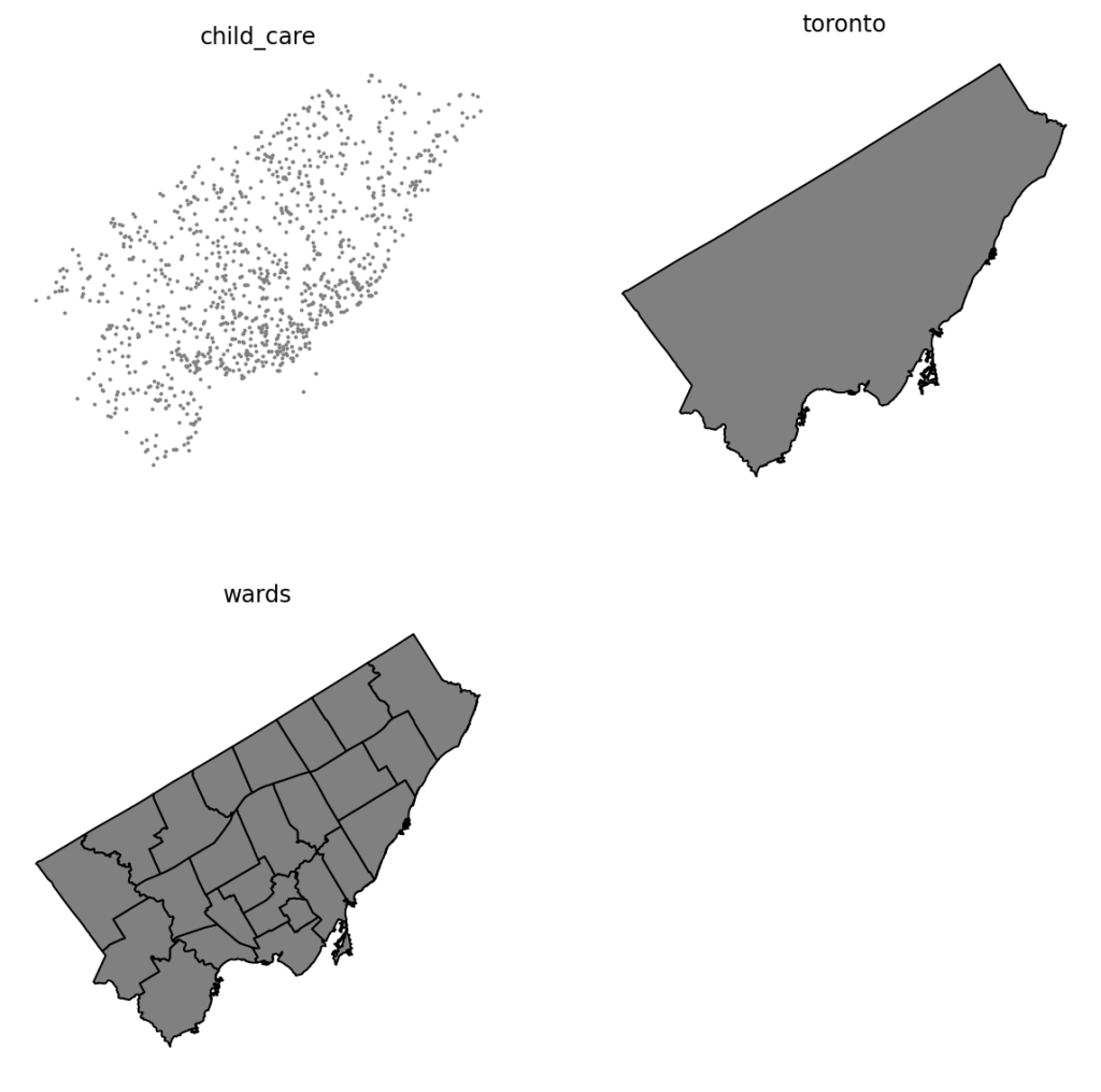
We can see here that we have three different datasets, each covering the same broader geography, but with different details.
Practical Example: Mapping Child Care Centers to Geographies
In this section, we’ll take a look at a practical example of how the sjoin() function can be used to join data based on spatial attributes.
We’ll map our ward information to each child care center, which will enable us to, for example, understand the distribution of centers across different boundaries.
Let’s take a look at how we can accomplish this:
child_care = gpd.sjoin(child_care, wards[['AREA_NAME', 'geometry']])
print(child_care[['LOC_NAME', 'AREA_NAME']].head())

# Returns:
#                                         LOC_NAME            AREA_NAME
# 0          Lakeshore Community Child Care Centre  Etobicoke-Lakeshore
# 10                 Alderwood Action After School  Etobicoke-Lakeshore
# 24           Martin Luther Child Care - Superior  Etobicoke-Lakeshore
# 27  Early Adventures Nursery School & Child Care  Etobicoke-Lakeshore
# 44                           Park Lawn Preschool  Etobicoke-Lakeshore
In the code block above, we used the sjoin() function to conduct a spatial join on the two GeoDataFrames. Note that we only joined two columns from the ward dataset: the 'AREA_NAME', which represents the ward name and its corresponding geography polygon.
Because we’re using all the default arguments, let’s explore what’s happening under the hood:
how='inner'instructs the function to look for only the records that intersect on both GeoDataFrames,predicate='intersect'instructs the function to ensure that the points at least partially intersect.
In the code block, we also printed out two of the columns: the name of the child care center, LOC_NAME, and the name of the ward, AREA_NAME. We can see here that for each center, we were able to get a ward name.
Adding Counts of Points in a Polygon
We can take this one step further and add the count of child care centers into each ward record in the ward GeoDataFrame. This can be helpful to better understand the distribution throughout the city and can lend itself to different municipal planning projects.
In order to do this, we’ll generate a new DataFrame that counts how many times a center exists in each ward. We can do this using the powerful .groupby() method.
child_care_counts = child_care.groupby('AREA_NAME').size()
print(child_care_counts.head())

# Returns:
# AREA_NAME
# Beaches-East York    60
# Davenport            38
# Don Valley East      45
# Don Valley North     46
# Don Valley West      49
# dtype: int64
In the code block above, we grouped out child_care GeoDataFrame by the 'AREA_NAME' column and aggregated to return the size (or number or records) of each group. By printing this, we can see that this returned a Series that contains each ward name and the number of child care centers in it.
Let’s now map this data back into our original ward GeoDataFrame:
wards['Num Child Care'] = wards['AREA_NAME'].map(child_care_counts)
print(wards[['AREA_NAME', 'Num Child Care']].head())

# Returns:
#                   AREA_NAME  Num Child Care
# 0  Humber River-Black Creek              35
# 1               York Centre              43
# 2                Willowdale              34
# 3       University-Rosedale              41
# 4         Beaches-East York              60
Many GIS applications provide the option of doing this in one method. Let’s see how we can chain our analysis to speed it up, without needing to define multiple different objects.
wards['Num Child Care'] = (
    wards['AREA_NAME']
        .map(
            gpd.sjoin(child_care, wards)
                .groupby('AREA_NAME')
                .size()
            )
    )
The code block above accomplishes everything we did before, but in a single operation. While this loses some readability, it allows us to avoid creating superfluous objects.
Mapping Spatial Joined Data in GeoPandas
Now that we have our counts generated, wouldn’t it be great to see which wards have higher counts of child care centers, relative to other wards? Thankfully, GeoPandas allows us to easily create choropleth maps.
Let’s take a look at how we can accomplish this:
fig, ax = plt.subplots(figsize=(10, 8))
wards.plot(column='Num Child Care', ax=ax, cmap='YlGn', edgecolor='grey')
ax.set_axis_off()
plt.show()
In the code block above, we created matplotlib graph objects, including a Figure and an Axes. We then used the .plot() method to plot our wards GeoDataFrame, passing in the column we want to create a heat map of. We also passed in some optional parameters for styling, indicating we want colours to go from yellow to green and that the edges should be grey.
Running the code above returns the following image:
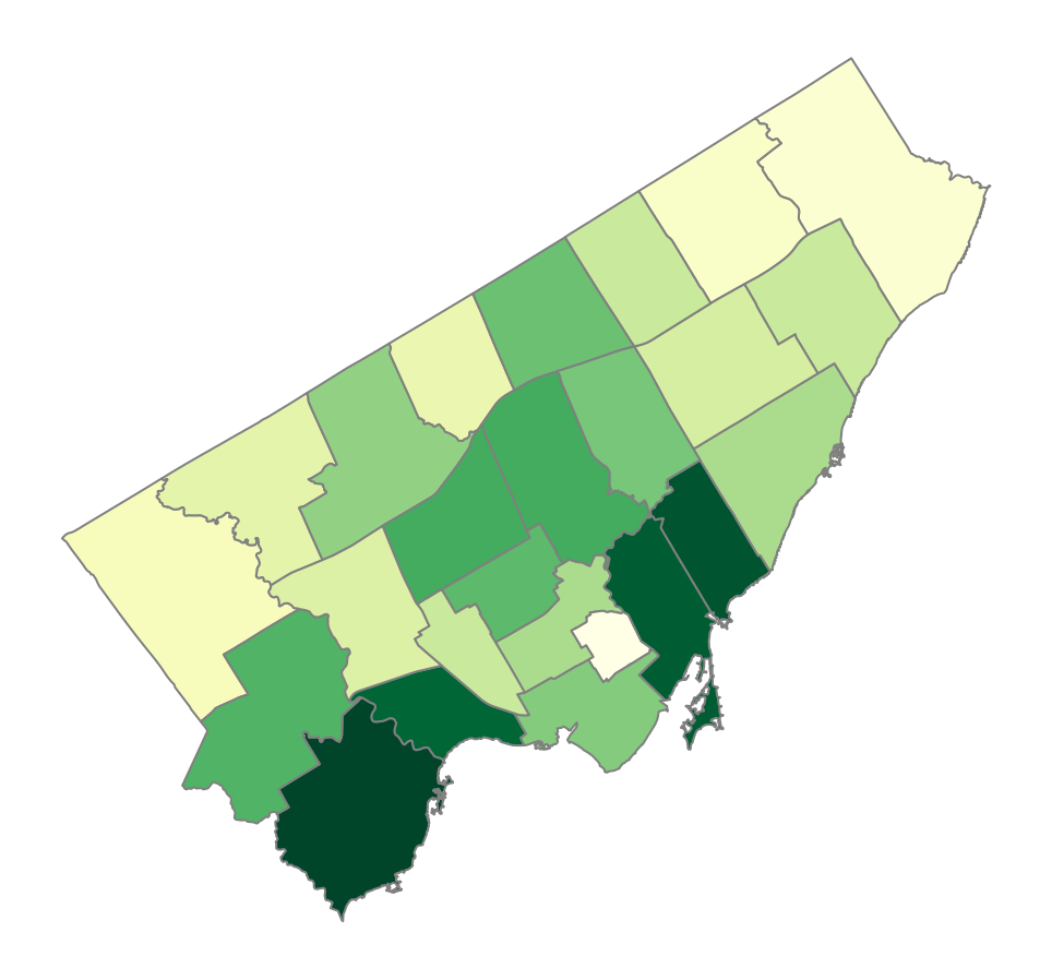
The darker the green, the more child care centers exist in a specific ward. Inversely, the more yellow a ward, the fewer child care centers exist.
Right now, this information is helpful, but it still leaves a lot of unknowns for most people. We can’t, for example, easily tell which ward is which. Nor can we easily tell how many centers exist in each ward.
To solve this problem, we can use the .plot() method instead, which allows us to create interactive maps. Let’s change our code to reflect this:
m = wards.explore(
    column='Num Child Care',
    cmap='YlGn',
    edgecolor='grey',
    tiles='CartoDB positron',
    tooltip=['AREA_NAME', 'Num Child Care'],
    style_kwds={'color': 'black', 'opacity': 0.25}
    )

m
When we run this code, we return a Folium map, which allows us to easily interact with the map itself. Give it a try below!
Let’s now move onto another topic: buffer analysis.
Buffer Analysis in GeoPandas
Buffer analysis is a spatial operation that creates a zone around a specific geographic feature, whether a point, line, or polygon, within a specified distance. By creating this zone, we can then run a proximity analysis to see what types of features are nearby. For example, we can find the number of grocery stores near a house or the number of transit lines near a workplace.
Further to these examples, buffer analysis can be useful for the following scenarios:
- Finding nearby amenities, such as finding the number schools or grocery stores near a given point, such as a home you’re interested in purchasing
- Environmental impact assessment, such as identifying noise pollution from an airport and highway, and
- Service area coverage, such by creating buffers around paramedic dispatch to identify gaps in service access.
In GeoPandas, we can apply a buffer to a geometry (including points, lines, and polygons) using the .buffer() method. The method generates a new geometric feature based on the distance you specify.
Let’s create a new GeoDataFrame by geocoding the Bloor-Yonge subway station, which has the highest daily ridership.
subway = gpd.tools.geocode('Bloor Yonge Station', user_agent='Sample', provider='Nominatim').to_crs(epsg=3978)
subway['geometry'] = subway['geometry'].buffer(3000)
subway = subway.unary_union
After loading the data, we reprojected the GeoDataFrame so that we can use meters, instead of degrees. We also modified the 'geometry' column by buffering it by 3000m. Finally, we ensured that there is only a single geometry that is merged by using the .unary_union attribute. This ensures that we don’t encounter indexing issues when we later merge the datasets.
Let’s plot what this looks like against the backdrop of the outline of the City of Toronto:
fig, ax = plt.subplots(figsize=(10, 8))
toronto.plot(color='grey', edgecolor='grey', ax=ax)
gpd.GeoSeries(subway).plot(ax=ax, color='darkblue')
ax.set_axis_off()
plt.show()
Running this code returns the image below:
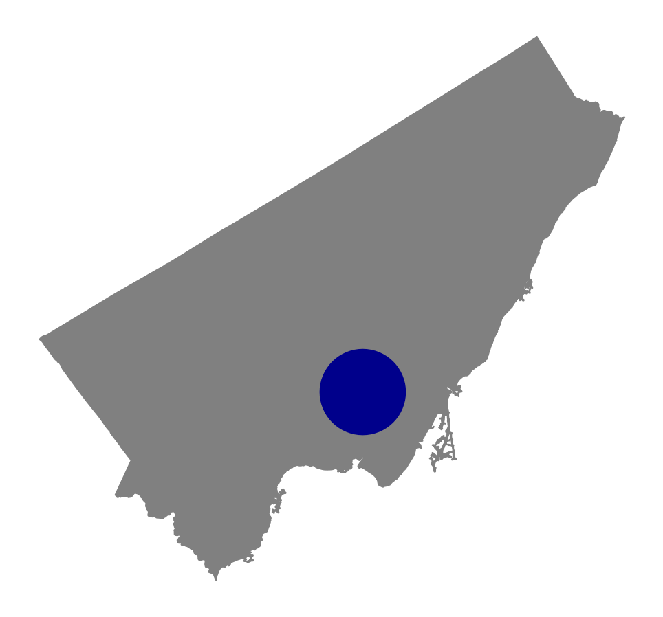
Now that we know that this code works, let’s learn how we can calculate whether a center falls within this 3km buffer.
In order to accomplish this, we can apply the .within() method onto the GeoDataFrame we want to inspect, child_care. This will return a boolean Series, which we can use to generate a new column in our GeoDataFrame.
child_care['bloor_yonge_3k'] = child_care.geometry.within(subway)
print(child_care[['LOC_NAME', 'bloor_yonge_3k']].head())

# Returns:
#                                             LOC_NAME  bloor_yonge_3k
# 0              Lakeshore Community Child Care Centre           False
# 1            Alternative Primary School Parent Group           False
# 2     Cardinal Leger Child Care Centre (Scarborough)           False
# 3  George Brown - Richmond Adelaide Childcare Centre            True
# 4  Woodland Nursery School (Warden Woods Communit...           False
In the code block above, we assigned a new column to the original GeoDataFrame.
If we wanted to know, for example, how many centers fell within this buffer, we could simply add up this column. Because True is equal to 1 and False is equal to 0, we’ll return the count of centers:
print(child_care['bloor_yonge_3k'].sum())

# Returns: 107
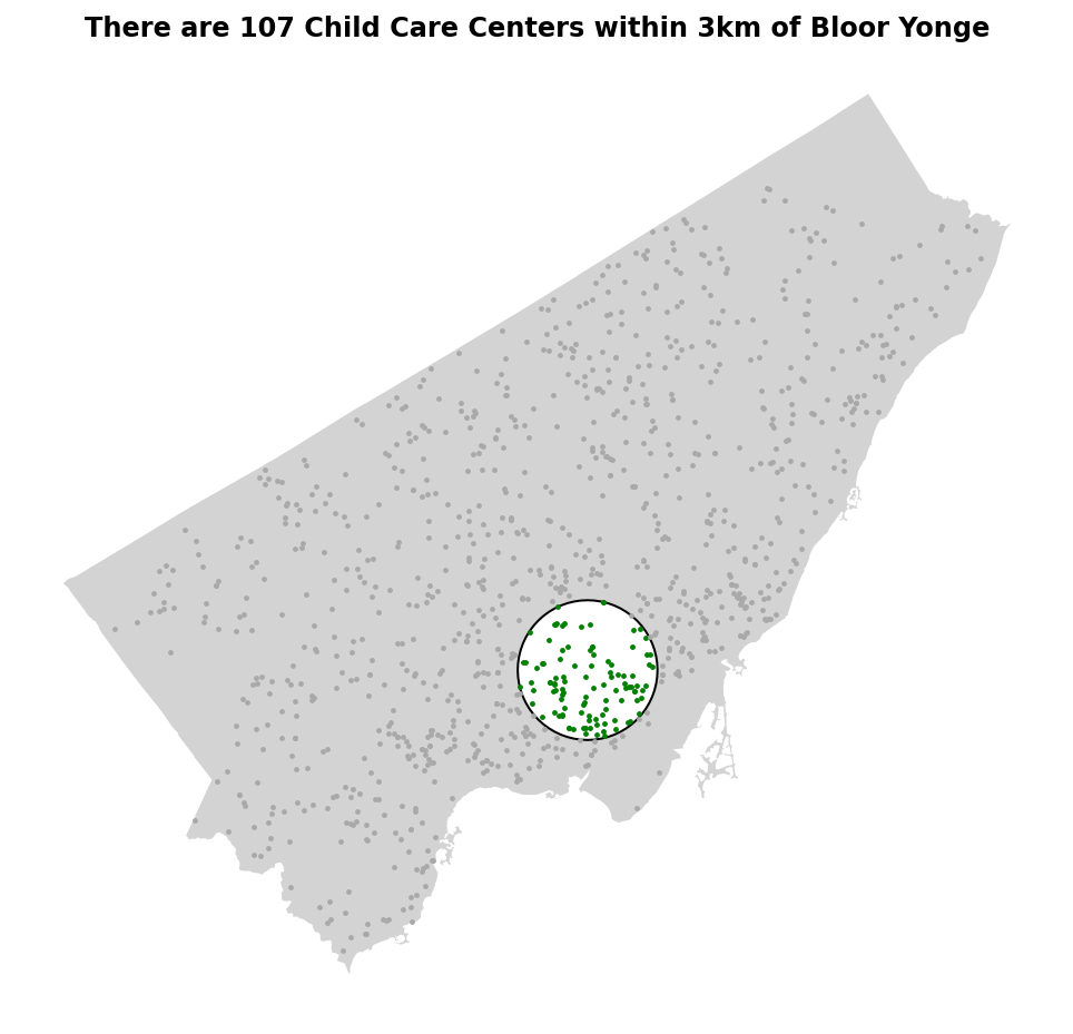
We can see from the code block above that we have 107 centers within 3km of that subway station.
It can be helpful to visualize this. In the code block below, we’ll plot the city boundaries. Then, we’ll filter and plot the child_care GeoDataFrame twice: once with the centers that fall within the range and once without, using different colours.
# Plot child care centers within the buffer in red
fig, ax = plt.subplots(figsize=(10, 8))
toronto.plot(ax=ax, color='lightgrey')

gpd.GeoSeries(subway).plot(ax=ax, edgecolor='black', color='white')
child_care[child_care['bloor_yonge_3k']].plot(ax=ax, color='green', markersize=2, label='Within Buffer')

child_care[~child_care['bloor_yonge_3k']].plot(ax=ax, color='darkgrey', markersize=2, label='Outside Buffer')

ax.set_title(f'There are {child_care["bloor_yonge_3k"].sum()} Child Care Centers within 3km of Bloor Yonge', weight='bold')
ax.set_axis_off()
plt.show()
Running the code below returns the following image:
Similar to our example before, wouldn’t it be great if we could map this as an interactive map? For this, we can use the .explore() method again. Let’s give this a try here:
m = toronto.explore(tiles='CartoDB positron', color='lightgrey', tooltip=False, style_kwds={'opacity': 0.1})
child_care[child_care['bloor_yonge_3k']].explore(m=m, tooltip=['LOC_NAME'], color='green')
child_care[~child_care['bloor_yonge_3k']].explore(m=m, tooltip=['LOC_NAME'], color='grey')
gpd.GeoSeries(subway, crs=crs).explore(fill=False, m=m, style_kwds={'color': 'black', 'weight': 1})
Running the code above follows similar conventions to our static example. However, keep in mind that this returns a Folium Map object instead, so we need to use different arguments to stylize. Running the code above returns the map shown below:
Being able to zoom in and hover over different centers gives you much more flexibility. We have also customized what’s included in the hover using the tooltip= parameter, which now only displays the name of the child care center.
Conclusion
In this tutorial, we’ve covered the essentials of spatial joins and buffer analysis using GeoPandas. We explored how spatial joins enable us to combine geographic data based on spatial relationships. We also explored buffer analysis, which allows us to create proximity zones around geographic features.

